Overarching questions
- What are "Drupalists"?
- Should "Drupal Core" really be called "Drupal Core" or is that too much tech jargon for insiders? (please just reply at the linked issue).
Questions and changes for Mark Boulton Design (2009-04-08)
- How does the "Follows" functionality differ from "Friends" on the Dashboard - are they the same? It appears that when you 'Follow' someone that their updates will show up in your 'Friends' Updates' block? If you 'follow' a user, does that make them your 'friend'? Terminology may be confusing. (Mark says: You're right, this is confusing. I suggest we keep things really simple. If you follow someone, you see what they're up to. Follows shows people who are following you who are not your friends. If you Follow them, they become your friends. You don't have to be someone's Friend to follow them. Make sense?).
- The page title hierarchy on single documentation pages and single module pages seems not intuitive (with the section title styled the same as page titles elsewhere on the site while the actual page title is smaller and grayed out). Is there any way to emphasize the actual page title more? (Mark says: There are two things here. Semantic hiearchy, and visual. The grey title is not so bad when you're deep in the seciton, but I'd be a bit concerned on the landing page if it's that small.)
Marketing and SEO questions
*The marketing link in the header points to path /services. Why is this? Should we make the link and the URL consistent? Ideally, it would use a keyword as both the link and the path. After some keyword research using google's adwords tool, here are some suggestions: “Hosting & Services”
Themers' questions
IMPORTANT: Unless truly stuck, themers should come up with their own ideas and comps and present them to Mark Boulton Design for review at a later date. See the TODO list for more information.
Possible "Phase 2" work from Mark Boulton Design
Sent in an email re: scope 2009-04-08:
Will the following be included in Phase 2?
- Messages (status, error, warning, help): Color palettes, icons, and bullet color/images.
- Table rows: Color palette and icon needed for "warning/caution" status.
- Default avatar needed.
Sent in a second email re: scope 2009-04-08
We're lacking comps for the following pages. Will they be delivered in Phase 2, or should we roll our own?
- Login / Register
- User profile
- Contact a user
- Admin pages
UPDATE 2009-06-12: We will roll our own. --Todd
Developers' questions
On http://infrastructure.drupal.org/drupal.org-style-guide/prototype/commun...
- What does live search search in?
- What types of stuff recent activity is designed to show?
- If it is the same as the activity with the map on the homepage, do we reuse color coding here?
- What should be in the dropdown besides "Group"?
- How does these + signs work? Do they expand to "Add to dashboard"?
Dashboard
(we are internally using OpenSocial terminology, each page contains gadgets)
- How are gadgets added? Is there a way to do it from the page itself, with a library of everything available?
- Where do Location, Language & Keywords in Preferences link to? We do have lists like http://drupal.org/profile/country/Eritrea that Wales, English & UX could link to.
- Is the Preferences gadget provided as an example or is it positionally important? Something that tells you your own user profile seems not relevant for top-left positioning.
Events!
- The Community & Support page has a navigation tabs for Events, but the events page has a complete different set of tabs. So clicking on the navigation gets the user out of context. I think this was an oversight.
- The articles section doesn't scale (too many pages) and is hard to use (browse by title is hard). See http://drupal.org/node/372666 for details.
- Re: sparklines -- I proposed some other ideas for useful things to visualize. You agreed, and said I should "go nuts" with data visualization. That's great. However, where do these live in the project UI design? Do we want them so prominent (e.g. above the download table, pushing everything else down)? Should we put maybe the 3 or 4 most useful sparklines in there with the rest hidden and a "view more graphs" link that expands them in place? Do we really want the sparklines to be that big? That's at the outer limit of what I'd consider a sparkline. I think we could visualize a lot more useful data in the same space -- but I don't know if you think that'd get too busy/overwhelming/cluttered. My plan is for all sparklines to display a data point of a given metric over each week for the previous year. So, every x axis position on all the lines is the same week. Therefore, stacking them vertically so you can compare different metrics at the same time period would be an important feature in the UI. More clarity on how multiple sparklines should look/work would be great. Thanks! (MB says: That's a little difficult to answer or suggest at this stage given we've given them not much thought. I htink your plan is good, and stacking vertically might be a better representation. I guess the bottom line for me would be it's all fine unless the introduction of the sparkline hampers legibility, content hierarchy or flow.)
- why does the prototype for the core Drupal project include a huge block of maintainers in the top right, whereas on the regular contrib projects that info is inline with the content? It seems like it'd be better to be consistent about this, no? If so, which version should we use? Also, this list can be quite long -- should we only display the top N most active or latest commiters, then provide a link to the full page view (or a link to expand the info inline)? (MB Says: I guess this is a case of which is the most scalable. We don't want a block with a bazzillion people in it, so maybe inline would be more suitable.)
- currently, project pages on d.o have a few tabs. Visitors see at least "View" and "CVS instructions". Maintainers also get "Edit" (obviously), and owners get a "CVS access" tab. Can we still use project-specific tabs? If so, how should that look when you're at a project detail page in the redesign? If not, how do we handle these other pages related to each project? (MB Says: Hasn't there been some traction on a sub tab design by the theming team? Might be best to see if they're still working on including it.)
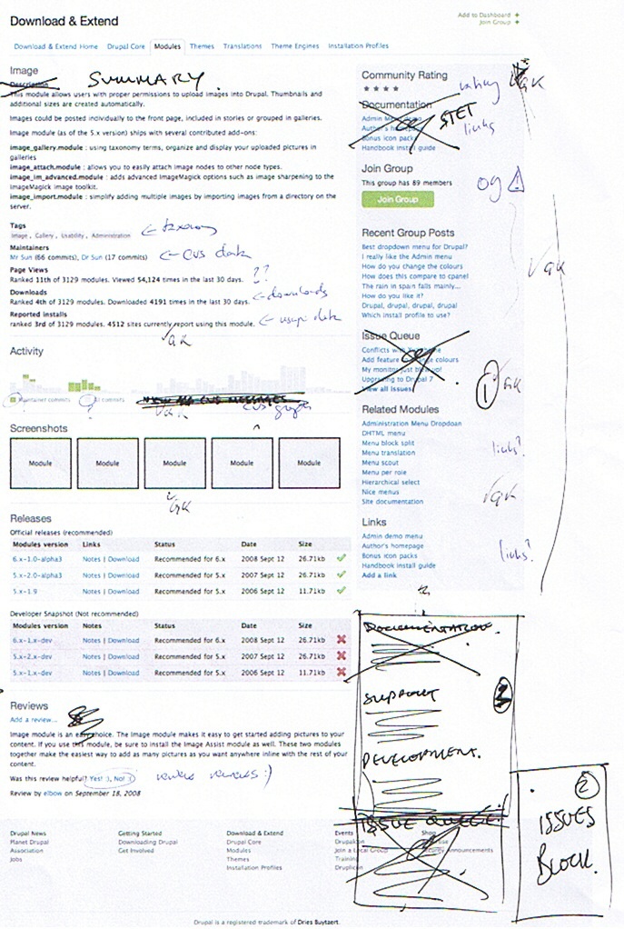
- I know we agreed on the issues cockpit block. I just don't remember the fate of the "Issue Queue" block (better title: "Recent issues"?). It looks crossed out at the latest scanned copies of the prototype printouts but we were doing a lot of editing on that poor piece of paper when we met in DC, and it's unclear exactly what we want in the final product. ;)(MB Says: I can't remember that either. Obviously, Recent Issues is pretty important to show visibility on problems with a project. Maybe it should stay?)
- on the module page, what kind of link should the "Links" block display?
- Are the "Related modules" auto-generated or does anyone have control over what those are?
- Should the list of maintainers be more visible (higher on the page) than the issue blocks? See the [development] Issue queue links from project pages? thread and the replies on the devel list for more...
- The navigation form needs a submit button of some kind. ;) Where should it go, what should it say, and what should it look like?
- Can we add an "Order by" drop-down element to the form, like we have at (for example) the search results page?
- On the current version of this page there's a "Search modules" box, which is an immensely popular feature. Any objection to keeping a search box in the "Find a module" navigation form to further refine the search (without bumping out into the main search workflow)?
- Can we get your feedback on #377736: Module filter or sort by release should impact what information is displayed?
- "Posted in Events" contains a link. Where does it go?
| Attachment | Size |
|---|---|
| project-breadcrumbs-subtasks-1.png | 311.22 KB |
| project-breadcrumbs-subtasks-2.png | 310.8 KB |
| project-breadcrumbs-tasks-1.png | 308.53 KB |
| project-breadcrumbs-tasks-2.png | 309.19 KB |