Issue Queue (all issues belong in the Blue Cheese project)
The Mark Boulton designed theme aka Bluecheese (http://drupal.org/project/bluecheese)
How to contribute as a themer
(team, please edit this)
Comps are being stored and shared at http://www.wuala.com/drupal-redesign. Anyone can download the comps to begin theming, but users must be members to upload.
To Do's for Themers
Themers: We need you to turn the contents of this page into issues! Be proactive!
Here's what to do:
- Look through the list of tasks below and find one you understand and can describe. It doesn't have to be one you want to solve yourself.
- Even if you think you can solve the problem yourself quickly, make an issue! We need to maintain accountability in case the problem needs to be re-addressed later.
- Create a new issue here: [[http://drupal.org/project/bluecheese]]
- --
- Category will usually be Task but choose whatever is most appropriate.
- --
- Priority, Assigned, and Status can be left alone.
- --
- Edit this wiki page to note that you have created an issue for a TODO item, with a link to its issue.
Typography
- In MBD's prototype the titles for items in the news feed are h3 and in Drupal they are h2 by default.
- Depends on this issue: http://drupal.org/node/427960
- Mark says: The prototype takes precendence
- Documentation article example page and Download & Extend > Module example: What level header is the section title ("Documentation" and "Download & Extend")?
- Mark says: Keep the Section title as the larger text, regardless of which header it uses
- Todd says: We should make the title of the node -- i.e., the piece of documentation or the module -- the h2. The section title should be an h3 or not a header at all.
- Issue started: http://drupal.org/node/428060
- Headings need to be more distinguishable -- especially h5 and h6
- Missing from style guide/prototype: Line heights for headings
- General rule, more space above the header than below. Spacing should be proportional per header.
- Missing from style guide/prototype: Definitions lists
- Missing from style guide/prototype: Lists
- Bullet lists to use an image bullet in grey with a tint of yellow as per the table header grey
- Numbered/lettered lists would be as per the text colour
- Lists should be indented in regular content, as opposed to columns and blocks
- Theming UL/LI within the content area (documentation) http://www.drupal.org/about
- Theming UL/LI menus in blocks and menu areas. http://www.drupal.org/about
- Teasers: Since node teaser titles are h2's, maybe the h2's in the teaser body should be sized as h3's. This would waterfall down for the remaining header sizes. This will avoid having an h2 in the teaser body be the same size as the h2 teaser title. Mark approves.
- Issue created: http://drupal.org/node/427940
Regions
- Identify and name site-wide regions
- Issue filed: http://drupal.org/node/428446
Search field
See issue: http://drupal.org/node/395528
* Search button does not align vertically with search field. (Note that this is also styled separately for .front)
* Mark says: Align "Refine your search" button on the right side of the search field.
* Make the size of the text larger when the search box is in focus. Mark approved.
Also see issue: http://drupal.org/node/430966
* The style of the search fields (home page and interior page) shouldn't be modified at this point unless it's a change of functionality
* Direction is to use form-radios, not form-checkboxes as shown in the prototype (again, see issue 430966).
Accessibility
- Add skip links to page.tpl files.
- Issue created: http://drupal.org/node/394814
Sidebars
- Identify all versions of the right sidebar
- Style versions of the sidebar
- Issue created: http://drupal.org/node/397868
Landing pages
- We will work to the line height of list-items and select an appropriate padding-bottom for li tags that will clearly separate list items. We also need to remove all bullets as per the prototype.
- Issue created: http://drupal.org/node/397804
Documentation
- This page needs to be built based on the prototype. Use drupalorg-documentation.tpl.php
- Issue created: http://drupal.org/node/396442
- Added comps to existing issue: http://drupal.org/node/430456
Marketplace
- How will a business' information be collected?
- We should probably convert existing listings from http://drupal.org/services which are book pages into their own content type
News
Aggregator feed items (Planet Drupal and Drupal Association)
- In Drupal the titles will be h2 and they should be styled as h2 as opposed to the current h3
- The author and date should be formatted to resemble other nodes i.e. Posted by John Smith on the 14th of February, 2009 -- Issue
RSS feeds - NEEDS INPUT
- How many feeds will there be?
- We will discontinue the current solution for the feed, which is populated by all content promoted to the the front page
- Instead, we will create feeds using Views (since that is what is populating the News page) and its related Views using arguments
- We need a way to specify which pages will display the RSS icon (in the browser location bar) and for which feeds
- Feed Path Publisher solves this but may need some bugs fixed before being using on d.o
Breadcrumbs and local tasks/subtasks
- Breadcrumbs are very useful on project pages (and admin pages, too). We'd like to keep them.
- Breadcrumbs will be restricted to only a few sections, e.g. Handbook, Forums, and Project/Issue pages.
- Local tasks/subtasks (aka "primary tabs" and "secondary tabs" in Drupal theme-speak) aren't included in the comps.
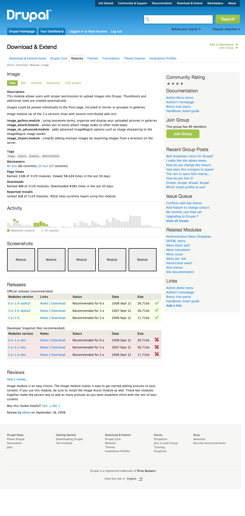
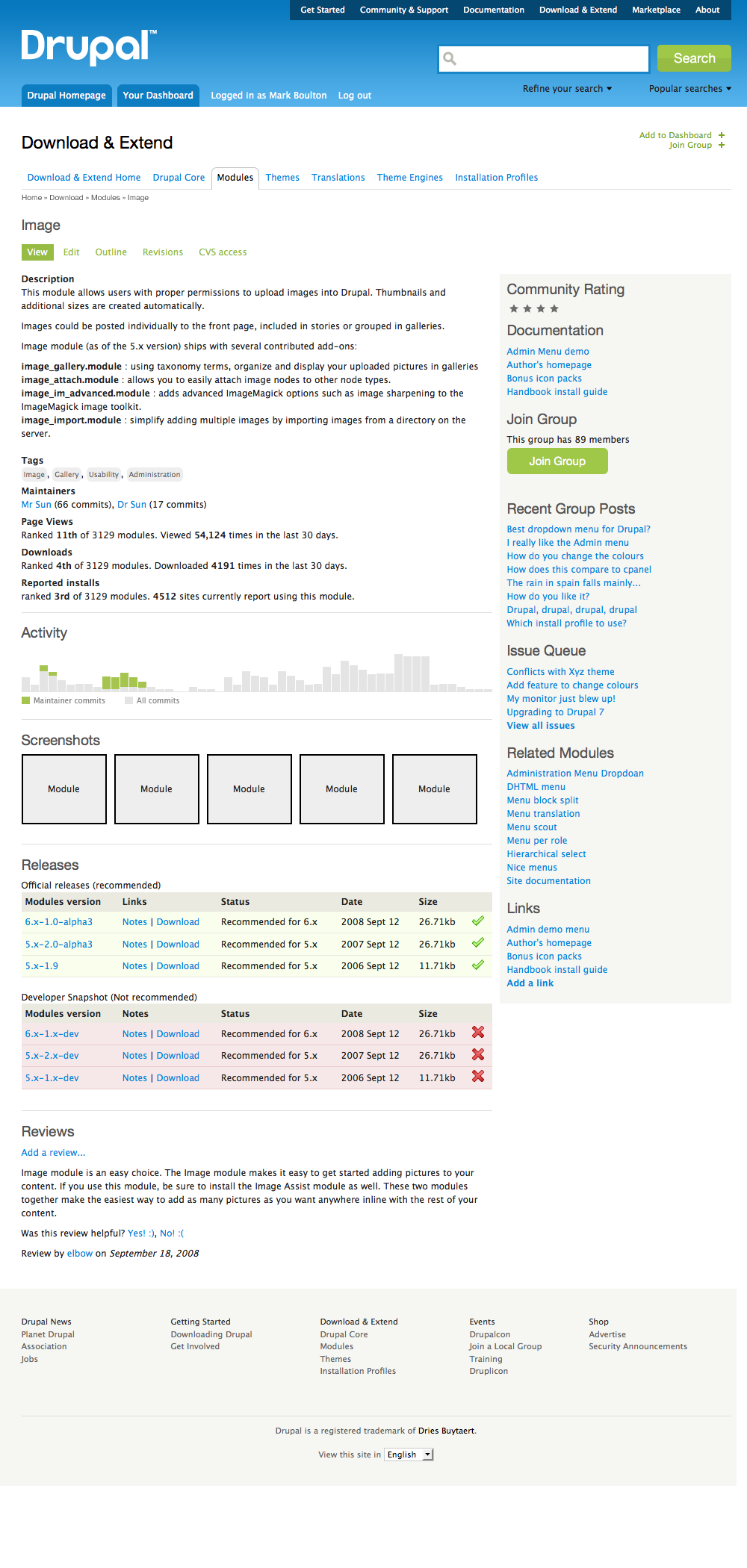
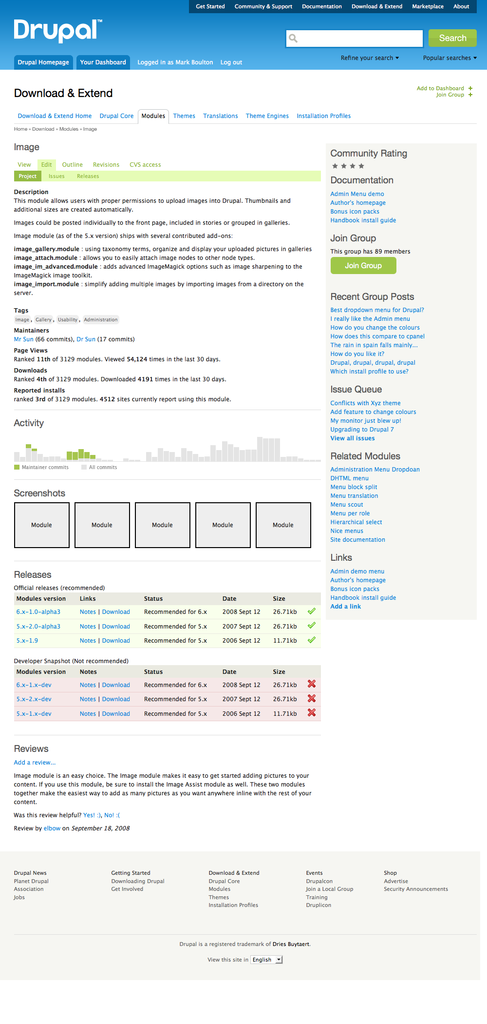
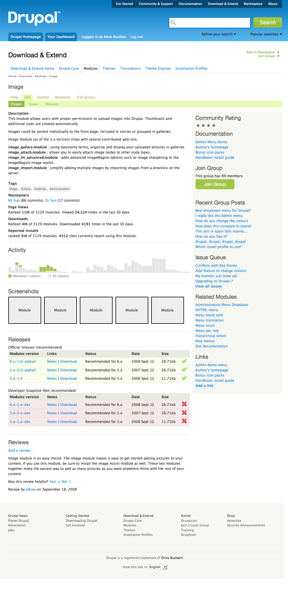
Here are some comps that address the two issues above. By no means do we prefer the look/feel of these elements. We need Mark's input to make them prettier (and perhaps more functional):
- Breadcrumbs + Tasks 1: Right column aligned with title of project.
- Breadcrumbs + Tasks 2: Right column aligned with description of project.
- Breadcrumbs + Subtasks 1: Right column aligned with title of project, cutting off the subtasks bar.
-
Breadcrumbs + Subtasks 2: Right column aligned with description of project, allowing subtasks bar to extend the full width of the page.
-
Styling of local tasks and subtasks on nodes (aka "tabs").
- Only the Documentation article comp displays local tasks, and they're shown in a way that may be incompatible with other nodes.
- See http://groups.drupal.org/files/Picture%2033.png for current implementation
- Paris update: Todd and Klaas developed a style for these. It's currently implemented.
- DC update: Need to work with Mark on implementing a better solution. He likes the direction so far.
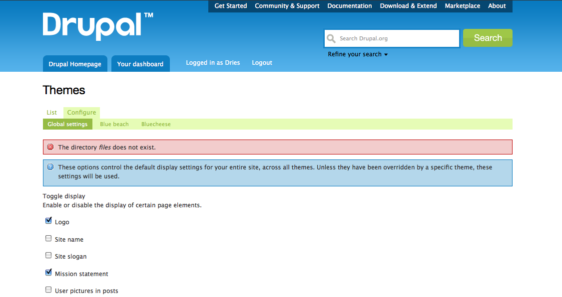
Messages (status, warning, error, help)
- Need icons for "help" and "warning" messages.
- Issue created: http://drupal.org/node/490026
- Background colors
- Consider changing the red color values to match the page furniture's red "X"
- What green should be used for the "status" message backgrounds?
- What colors should be used for "help" and "warning"? Usually these are blue and yellow/orange, respectively.
- Maybe add a page curl to distinguish these boxes from other boxes on the site
- We need to comp this. Let's make an issue to look into this.
Nodes
- "Read more" should be removed from node links and- inserted into the end of the teaser. This will be achieved using the Read more module. I have filed several issues related to streamlining the operation and UI. --Todd
- Issue filed to install and enable ed_readmore.module: http://drupal.org/node/428226
Book node
- Feature tags
- Discussion alerts
Comments
- Missing from style guide/prototype: "NEW" text for new comments
- Missing from style guide/prototype: $links
- "reply" to comment in $links
- admin functions "edit" and "delete" in $links
- Missing from style guide/prototype: "submit" and "preview" buttons
- Need input: Now that we are displaying user avatars next to comments, we should have a default avatar for users which have not set one. What should this be? Example: http://bit.ly/slZk
- Need input: How should we handle styling user signatures in comments? Default appearance is ugly and confusing. (related issue for Drupal 7 http://drupal.org/node/132446)
- Mark Says:
- Zebra with light gray background color of replies inherited from parent comment
- Use Lucida Sans first for italic elements (like dates), since this is a real italic rather than oblique
Information architecture
- Determine list of content types and map them to MB's comps. Make sure there are no gaps between the two. If a single content type seems to take on more than one appearance or functionality in MB's comps, we need }to determine the rules that determine when/where the different "versions" of the content type appear.
- Documentation
- API tab will link to api.drupal.org.
- In-depth discussions are moving to the developer handbook.
User interface
- Reconcile shift in search/heading interface as the user moves from the front page to any other page on the site.
Layout and templates
- Create function to generate big tab links. Must (1) detect active state; (2) wrap links in rounded corners; (3) detect logged-in user and display different markup accordingly.
Javascript footer placement. Look at http://drupalbin.com/7944 for an example. This places the js at the bottom of the page, yet still respects the contents of the page. Also JS placement does not happen unless it needs to happen (i.e. short pages).- Another footer issue: Mark Boulton says that he wants the footer to be broken into 5 columns of equal width rather than 4, as it is presently. (It is okay that this doesn't fit into the 960 grid layout.) Note that this content is generated and split into columns in the drupal_crosssite module, in drupalorg_crosssite_preprocess_page.
- Issue created: http://drupal.org/node/427992
Forums
- Replacement icons
- Use as few icons as possible, maybe only for sticky and locked posts
- To highlight new/updated posts, use text instead of an icon, i.e. "New" and "Updated"
- Use colored backgrounds (sticky = orange, locked = red, new = green)
- Use same colors as the messages (see above)
- Mark says: use best/common practices for forum design
Text style (actual text, not typography)
The MBD prototype displays post dates as "...on the 4th November 2008" but I assume we want to use "...on November 4th, 2008" instead -- to comply with the "American English" rules outlined in the style guide.