Last updated by riddhi.addweb on Thu, 2016-08-11 14:22


This style guide proposal for Drupal 8 core and contributed modules is intended to help shape and direct administrative UI development, with the goal being a theme- and brand-consistent administrative user experience. This node introduces design element proposals and related discussion. The evolution of the project can also be followed at:
Meta issue: https://drupal.org/node/1986434
Related issues: https://drupal.org/project/issues/search/drupal?issue_tags=styleguide
Motivation and Principles
At this point in the Drupal 8 development cycle many additions and changes have been made to Drupal’s administrative user interface, and more will be required as new features are completed. The existing changes have been completed in relative isolation from each other. Although each change and addition has been a step in the right direction, the result is a UI that lacks consistency.
This is largely for lack of a guidebook for Drupal’s admin UI. Even though great, coherent UX work was done for Drupal 7, and we have functional UI standards, there remains no central guide for the visual conventions used in Drupal’s core admin theme, Seven. We need something to help us maintain visual consistency when changing and extending the UI. We need a style guide for Drupal’s default admin theme.
Ry5n, Yoroy and Bojhan have been collaborating on IRC to create such style guide for the Seven theme. After a lot of iterations, where ry5n took a leading role with reviews and proposals from Bojhan and Yoroy going back and forth many times, we now have an initial proposal.
The goals of this draft style guide are:
- Identify Drupal core values that we can use to determine the look & feel for the Seven theme.
- Unify the visual language in Seven and ensure the overall look-and-feel supports the core values.
- Identify the visual and UI patterns used by Drupal core so that they form a conscious, shared language for us to built upon.
- Provide guidelines and rationale for others (e.g., contrib) to build upon as new interactions, styles and platforms emerge.
Although the guide presents as much rationale as possible for each design decision, it is not polished; design details are still in flux. But at this point we wanted to get it out for more feedback.
Seven theme is a special case that has to cover a lot of ground:
- It has to be completely accessible
- Mobile friendly
- Provide consistency across 20.000 modules
- Stand the test of time – as it is often the main way people interact with Drupal and one of the main ways people come to understand the Drupal brand.
This is a proposal, so we hope to receive loads of feedback.
Basic principles #
The development of the Drupal brand has come a long way in the past few years. With the introduction of an administration theme and toolbar we now have important places where people interact with Drupal visually. For a lot of people who use Drupal but don’t visit Drupal.org, the administrative interface is their only interaction with our brand.
We looked into words that describe Drupal’s brand:
powerful, adaptable, empathetic, direct, democratic, accessible, clear, concise, natural.
Part is this brand is also the community values we express:
welcoming/respectful, open, informal, collaborative, transparent, responsive, credible.
Much of this is captured in Mark Boulton and Leisa Reichelt’s earlier work describing the brand at https://infrastructure.drupal.org/drupal.org-style-guide/brand.html.
How should we express these principles? #
Having a set of adjectives to describe Drupal, we tried to give those terms visual expression using basic design elements and principles. First, we mapped each adjective to a set of possible visual characteristics:
- powerful: confident, precise shapes and strong contrast, especially for user-controllable elements.
- empathetic, responsive: choose calming colors and rounded forms; give emphasis to what matters;
- clear, direct, concise: use crisp lines and simple, decisive shapes; avoid patterns, texture, and ornamentation; each element should serve a clear purpose; make measured use of whitespace: room to breathe, but avoid sterility and emptiness; use rules/boxes sparingly.
- accessible, transparent: appeal to the greatest possible number of people; choose a legible typeface; set text for optimal readability; emphasize what matters; use consistent visual cues for affordances.
- natural: desaturated tones: avoid neon/artificial colors; organic rather than geometric forms; choose a typeface that retains a trace of the human hand.
- friendly, collaborative, democratic, respectful: choose cheerful colours; avoid high contrast at large scales (too bold/aggressive); prefer well-known design patterns, iconography and affordances; avoid visual indulgence, ensure visual style is extensible and flexible.
Some of these design elements would be in conflict with one another: powerful shapes and too much contrast might make the UI unfriendly or even disrespectful. In these cases, a careful balance is needed. In other cases, there is a clear common thread.
Summary: the Seven Graphic Style #
- A primarily light tone to appear bright and open
- A neutral, desaturated color palette, both friendly and calming.
- Legible, readable typography. Employs a typeface with some humanist characteristics in a few weights and styles.
- Crisp lines and sufficient contrast, but not jarring. No large areas of bold colour.
- Bold shapes reserved for headings and action elements.
- Some rounded forms to communicate friendliness and naturalness.
- Little or no ornamentation: no patterns, textures, gradients or shadow/emboss effects – except to communicate affordances.
- Borders and background tone as grouping devices only: to clarify relationships and emphasize important elements.
- Generous and consistent use of whitespace.
- Aesthetically appealing, though minimal graphic style; should appeal simple but not sterile; gracious rather than opinionated; confident without overspeaking.
On Contrib #
In addition to articulating the foundation and expression of the Seven theme and core modules, this style guide aspires to be a help to Drupal’s contrib developers and themers as well.
For contrib module developers, this guide hopes to provide design patterns and styles that can be used as templates for a module’s administrative UI, creating consistency beyond the default Drupal install.
We also hope to inspire theme developers with a consistent, beautiful, well-thought-out administration theme.
Color Palette #
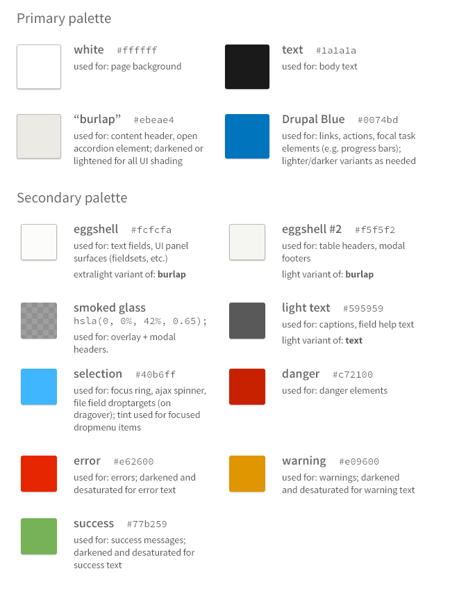
The proposed guide makes few changes to the existing Seven color palette while still supporting the principles and graphic elements we identified above.
Seven uses three primary colors: white, “burlap” and “Drupal blue”. White provides openness and serves as the ground for other elements. Burlap is a yellow-tinted gray, providing friendliness and energy while maintaining neutrality. Drupal blue associated the theme with the Drupal graphic identity as well as being a naturally calming color.
Drupal blue is used for links, primary buttons, and other interactive elements such as the labels on tabs. Interactive elements that use Drupal blue and have an active state use a darker shade of that colour (#004f80). Burlap is used for background tints and fills in several shades (always at 51° hue).
Red is used sparingly, and only to communicate an error state or danger action (e.g. delete). A strong yellow-orange is used for warning messages and a grass green for success messages.
We chose colour combinations that pass WCAG 2 AA contrast guidelines for accessibility, so that text can be read and elements distinguished by everyone who uses Drupal. Some challenges in finding contrasting colors for different states remain, we still have to further tune a few of these.
Iconography #
In Drupal 7, the core icon set makes use of multiple colors per icon, gradients and other effects. In accordance with our new updated graphic style, we propose replacing core’s existing icons with simpler, more definitively iconic versions. Not only is this more stylistically consistent, it enables us to use a webfont for scalable, re-colorable icons.
Please note: most icons in the current design mockups are not from the admin icons project. Some are from the Symbolset (SS Standard) icon font and some are custom-drawn. Symbolset was used for convenience during development, but cannot be used with Drupal since it is not open-source. The Symbolset icons would need to be replaced with alternates during implementation.
Individual Components #
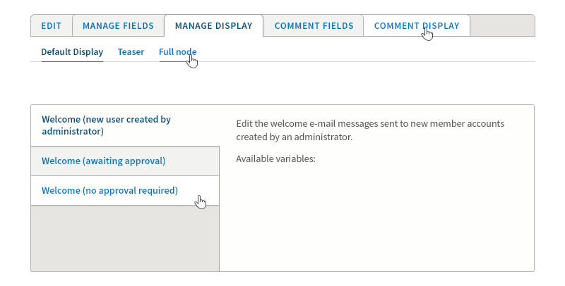
Content Header #

In D7, the “add to shortcuts” icon is a circled plus symbol. This symbol is commonly associated with an add or create action, but there is nothing to indicate the connection to shortcuts. We propose using the star icon globally for shortcuts in Seven to make it more recognizable and understandable to a wide audience. Most people will be familiar with the use of the star icon for bookmarks/favourites from their web browser (IE, Chrome, Firefox) and from popular services such as Twitter.
The various states for the shortcut add/remove component are shown inset, from left to right: inactive, inactive:hover, activated, activated:hover and finally inactive again.
Here, the header background is #ebeae4 or hsl(51, 15%, 91%).
Typography #
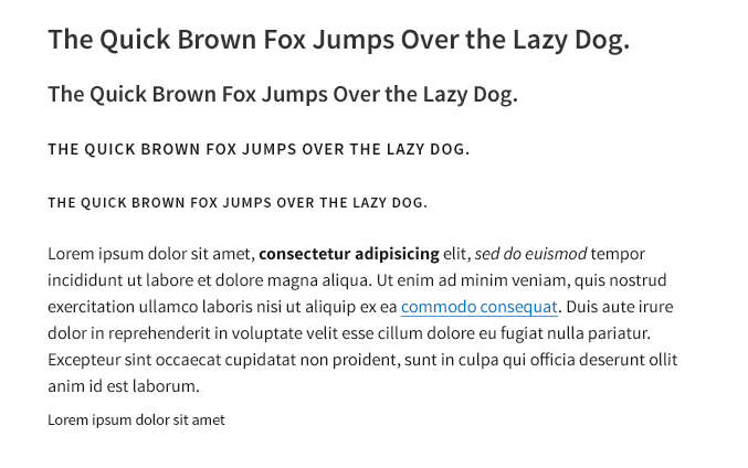
This guide proposes all text be set in Source Sans Pro from Adobe. Similar in character to Lucida Sans (the existing typeface specified by Seven), Source Sans is a professionally designed, fully open-source type family that falls into the general category of “humanist sans-serif”. Fonts of this type combine the modern geometric and industrial-age characteristics of sans-serif typefaces with the calligraphic and handwritten qualities of Renaissance letterforms. This balance of the engineered and the human matches well with the Drupal brand.
Seven’s original choice of Lucida was a good one for those same reasons, but also for a very practical one: legibility in UI. Source Sans is arguably even better in this respect, with glyphs such as lowercase L and upper/lower I all easily distinguishable from one another, even at small sizes. This is one of many details to consider when choosing a typeface for UI work, and where some common choices – like Helvetica – fare poorly.
Source sans also provides a versatile set of weights, including a semibold.
- Body text is 16px/24px Regular. All text is 90% black (#1a1a1a) unless otherwise noted. A baseline grid of 24px is used throughout, relatively strictly for running text and for spacing between elements, less strictly within some UI components where other requirements come into play.
- Four heading levels are proposed, set semibold to provide some solidity. There is also a greater range of type sizes than currently in D7, allowing for a clearer visual hierarchy. Heading levels (using the font-size/line-height shorthand) are:
- 26px/30px Semibold, 80% black (#333); suggested exclusively for page titles.
- 21px/24px Semibold, #333; suggested for subheads, modal dialog titles, etc.
- 15px/24px Semibold all caps with ~0.1em letterspacing; suggested for fieldset legends and small subheads.
- 13px/18px Semibold, all caps with ~0.1em letterspacing; suggested for table headers, primary tabs and other tight spaces.
- Caption text is 14px/18px Regular, and can be further de-emphasized by lightening to 67% black or #555. This guide recommends text not be set smaller than 14px (or 13px all caps).
- Links and are colored #0074bd and lightened slightly on hover. In running text links should always be underlined. When contained within bordered elements where the underline adds visual clutter, it is usually omitted).
License issue
Finally, Source Sans is one of the few professionally-designed typefaces that is not only free but open source, available under the SIL Open Font License (OFL). However, it is unclear whether the OFL would allow it to be included as part of Drupal core. The Wikipedia page on OFL states that it is not GPL-compatible. However, SIL’s own FAQ states, under a question about bundling with GNU/Linux that “Fonts licensed under the OFL can be freely included alongside other software under FLOSS (Free/Libre and Open Source Software) licenses. Since fonts are typically aggregated with, not merged into, existing software, there is little need to be concerned about incompatibility with existing software licenses.”
Provided the OFL license is compatible and the community supports it, this guide proposes that a webfont version of Source Sans Pro be included with the Seven theme. To keep file size and HTTP requests down as well as to simplify the design system, not all of the fonts that make up the complete type family would need to be included. This guide uses the Regular, Italic, Semibold and Bold fonts.
Text fields #
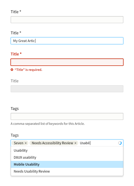
“Title” field, top to bottom: 1) normal text input; 2) hover state; 3) invalid state with inline error message; 4) disabled.
“Tags” field, top to bottom: 1) autocomplete input with help text; 2) autocomplete in use, showing “tokenized” input, active spinner and dropdown menu.
Text inputs are styled to be recognizable but not garish, with a subtle background tint (#fcfcfa). A slight softening of text inputs is achieved with a 2px border-radius; this is a subtle refinement that we use throughout form elements to subtly soften otherwise harsh corners. For consistency, we propose changing the D7 “throbber” to a “spinner” styled similarly to the progress bar component (see below) for consistency. To reduce UI clutter, the spinner would appear only while awaiting a response from the server.
Note that the required field marker is no longer red, both to reduce UI clutter (without removing information) and to allow red to be reserved exclusively for error states and danger actions.
Search field #
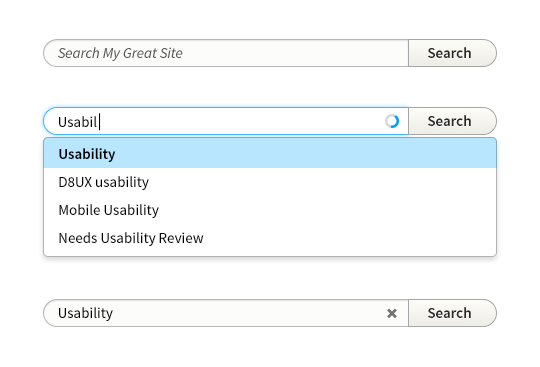
Top to bottom:
- Search input with placeholder text and attached submit button
- Search input with active autocomplete results
- Search input with a user-supplied value, showing non-italic text and “clear” button
The search field is rounded both as another opportunity to introduce friendliness into the UI, but also follows a tendency for search fields to be rounded in some browsers and operating systems.
The dropdown menu is intentionally designed as a distinct component (see the section Dropdowns and Popovers) for modularity of the design and code reusability. Visually and in terms of implementation, merging or joining the search field with the dropdown is both awkward and not strictly necessary for usability.
Basic Form Controls #
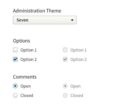
Customized controls for <select>, <input type="checkbox"> and <input type="radio"> (disabled state on the right)
There are challenges associated with customizing these particular form controls, especially around accessibility. However, we feel there are a number of ascetic gains that can be made if we choose to implement this.
Similar to the text fields we use slightly rounded corners on these form elements to capture the softness we wish to express. We additionally styled the checkbox/radio’s somewhat special to accommodate the idea of brand consistency across platforms.
Buttons #
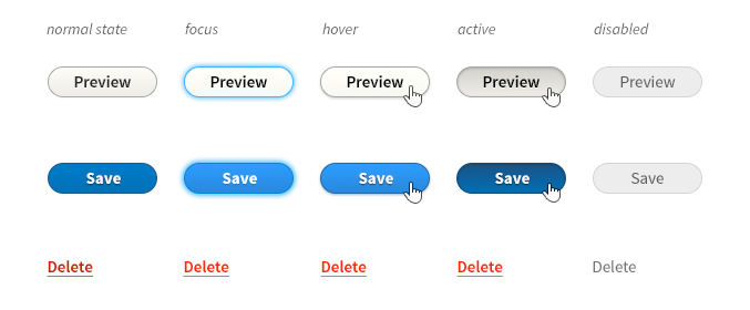
Row 1: standard button;
Row 2: primary button;
Row 3: danger button
Buttons should be clearly identifiable as such, with normal and primary actions inviting interaction. At the same time – for visual conciseness – graphic effects are limited to a subtle gradient (and border, where necessary for contrast with a background). For an informal, friendly appearance, identifiability among other UI controls, and for continuity with Drupal 7, discrete buttons have a fully rounded “pill” shape.
As with input fields, focus is communicated with a blue halo. The hover state brightens the button (optically, light colours ‘advance’) and adds a small shadow beneath, causing it to ‘stand up’ and invite a click. Primary buttons – the save button on a node form, for example – are emphasized using Drupal blue. This carries through the main brand colour, and, since blue is a calming colour, the added emphasis remains respectful, not yelling or rushing the action.
Delete buttons – those that perform a destructive action such as deleting a node – are colored red, since they must call attention and signal caution. However, they should not draw the eye away from more common actions, so their border and background is removed, appearing instead as a plain link. An underline provides an affordance, since danger buttons have neither the standard link colour nor the standard button style.
Note that all button colours pass WCAG 2.0, except for the primary button’s hover state, which warrants some consideration.
Split Buttons and Dropbuttons #

Additional button styles allow for variants whose appearance remains consistent with the normal button style. Shown here:
- A proposed “split button’ (rows 1 and 2) would replace the current core dropbutton. There are several advantages to the proposed design:
- Style is consistent with standard buttons;
- Position and size of the button does not change when a dropdown menu is disclosed (a problem with the current dropbutton, which causes the mouse pointer to require re-positioning to close the menu);
- The dropdown menu itself is not custom (see the next section “dropdowns and popovers”). This decouples the menu from the button component, allowing for more maintainable and re-usable front-end code.
- A proposed “dropbutton” (row 3): a single button that discloses a dropdown menu.
Note that the split button configuration is really nothing more than a 'button group' of two, comprised of 1) a standard button and 2) a dropbutton with an icon label. Button groups of 3 or more buttons could be implemented identically to the split button.
Dropdowns and Popovers #
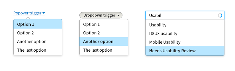
Left to right: popover, dropdown and “attached” dropdown.
This guide proposes an independent UI component for disclosable menus.
Please note: The selected menu item background does not pass WCAG standards for contrast against white; the type is bolded to provide an accessible visual queue. This design decision needs accessibility review.
Small Controls #

Left to right: small button (with icon); small split button; small select element (with left-aligned label).
Sometimes tight spaces recommend the use of smaller controls. Such situations include WYSIWYG toolbars, filter forms and table rows.
When touch support is detected, this guide proposes small controls revert to their full-size counterparts to improve touch-target sizes.
Progress #
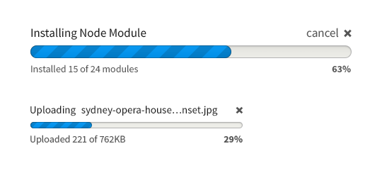
To appear more cheerful – for the same reason a lobby or waiting room should make an extra effort to be pleasant – progress bars are fully rounded. The progress bar retain much of its current values, e.g. always animated to be scrolling and clearly outlined activity and percentage on each side of the horizontal axis.
File Field #
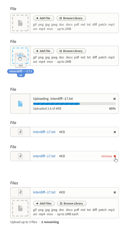
In terms of interaction, file fields could be a lot more accessible. This guide proposes both a new appearance and a new interaction design:
- Files can be added from the local filesystem using drag-and-drop, or using the traditional click-browse-attach workflow (which hands the action off to the OS and back)
- Files upload automatically once added by dropping or browsing.
- Uploaded files provide a preview where possible (images) or a file-type-specific icon where not.
- File fields with multiple attachments use progressive disclosure to reveal each additional slot in turn. They should support dropping multiple files onto a single dropzone to upload multiple files at once.
- The “Browse Library” functionality is speculative at this time, but designed to accommodate contrib.
An important reason to encapsulate much of this functionality, is that it tends to scale much better amongst many items and especially if placed between forms it can serve as a clear visual landmark.
Image Field #
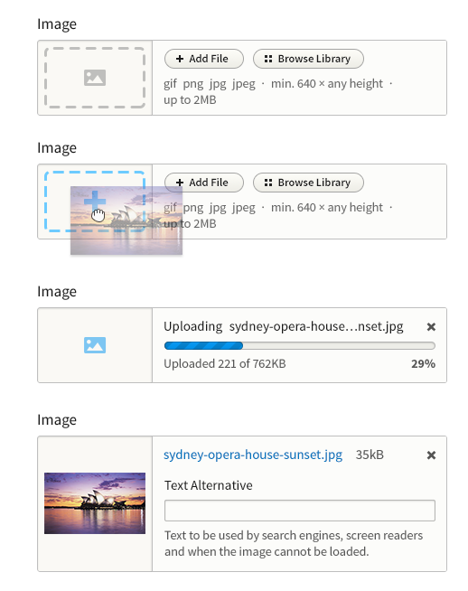
We made a design for the image upload field, we imagine a small version of the image can be rendered as thumbnail. We also styled a “drop-in” style, depending on how far WYSIWYG goes this could be part of that initiative.
Fieldset #
Details and Accordion #
The file and image fields, fieldset, details and accordion are all container elements to some degree, having a number of sub-elements in relation to one another. They all use a background tone and slightly darker border to contain these sub-elements and visually signal their grouping. They do this with as light a touch as possible while remaining distinguishable. To soften them slightly, a 2px border-radius is applied to the outer corners.
This is a style that would require more real-world prototyping, to see the impact on various forms.
Navigation Tabs #
Horizontal tabs include a number of proposed changes:
- Left-align both primary and secondary tabs, including those attached to the overlay (see below). This is intended to resolve issue #763720 (Visibility of primary & secondary navigation) by placing all tabs on the primary scan line (left margin).
- The negative space created where two rounded tabs are joined can be a visual distraction. The proposed style retains the border radius but removes the negative space by “extending” the tabs underneath one another.
- Secondary tabs are re-styled in an attempt to create a better connection between them and the primary tabs, while both linking them to and separating them from the content below.
The primary rationale for this redesign is the large disconnect we created by the right alignment of tabs, which were often missed. Similarly the secondary tabs because of their decreased visual prominence were missed even more. With a redesign of the overlay and modal, we can now accommodate a different style and placement of tabs.
Vertical Tabs #
Vertical tabs use essentially the same design as D7, just updated for consistency of details.
Table #
To improve the ratio of information to UI chrome, this guide recommends removing zebra striping and using thin rules to separate table rows. A progressive enhancement creates a subtle highlight on the hovered table row, allowing the eye to more easily move horizontally along the row, even when large stretches of whitespace appear between cells contents. (Note that this effect, being an enhancement, has no planned touchscreen equivalent and does not pass WCAG contrast standards.) For similar reasons, this style also removes left and right borders from the table and table cells.
The style used here for the sort-active table header cell is a motif carried through to other elements, such as secondary tabs and pagination. This consistency is both good for usability and for Drupal’s credibility (part of the brand).
Pagination #

To simplify the UI and focus on the 80% use case, this guide envisions removing the “first” and “last” links from the pagination component and also the text labels for “previous” and “next” links. This change is contingent on positive user testing.
Nav List #
The Nav List is used on “hub” pages to provide an on-page navigation menu with help text. This component is not greatly changed from D7, with only minor typographic finessing and a rounding of the “fancy bullet” used to mark the list items, in keeping with the friendliness of the brand.
Messages #
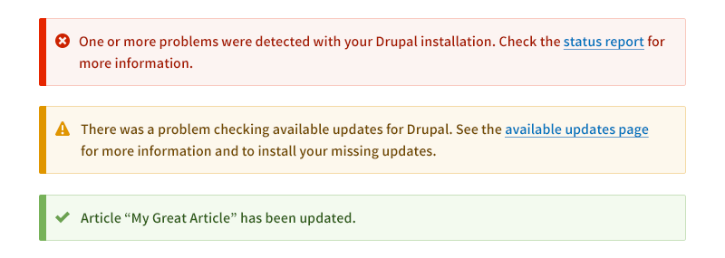
Messages are proposed to follow closely from a style proposed for D7. This style attempts to make messages very noticeable (with a bright colour bar and icon(s) at the left margin) while preventing them from being visually overwhelming (avoiding a full border). Message colors are slightly modified from current values, both for contrast with white and to distinguish one from another.
The messages also propose simplified (one-color) versions of the existing icons and the theme-wide 2px border-radius.
Overlay #
Drupal’s existing overlay style has a number of drawbacks:
- The overlay title floats above the overlay container itself, which creates a certain amount of disconnect between the overlay content and the page title.
- Tabs – especially secondary tabs – are placed on the right side of the overlay and not styled very prominently, which can cause the eye to miss them when scanning the page.
- The overlay’s close button sticks out the right side of the overlay, which forces extra margin to be allotted one the right of the viewport. Because the overlay already requires additional margin on the left and right to hint at the origin page below, this leads to significant loss of layout space overall.
The proposed changes address these drawbacks by positioning both the overlay title and the overlay close control on a semitransparent panel joined to the main overlay content, and by maintaining the new tab style of left-aligned tabs (see Tabs section above).
In additional to usability improvements, this arrangement also simplifies the visual elements themselves, specifically the close button and the silhouette of the overlay panel itself.
Modal Dialog #
We currently have no real styling for the modal in core, it was placed in with little to no styling. We propose to align this styling with the overlay, because conceptually they are not very different. Users often interact with the overlay just like a modal, and the modal is often something placed on top of the overlay (e.g., views).
The only difference is the use of heading style B rather than A for the header.
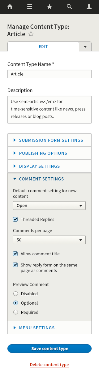
Case Study: Mobile Screen #
To demonstrate the proposed styles in-use, and to help visualise what they might look like for small and narrow screens, this is what the page at /admin/structure/types/manage/article might look like:
We look forward to your feedback!
Source Files #
Source files are PSD (Photoshop CS6 recommended). Although we would like to move forward with iterations and changes in HTML/CSS/JS, the source files may be useful. Since some are too large to attach here, you may download them here:
Seven Elements (23MB): https://drive.google.com/file/d/0BwPrMtcLgOljZkxiek05ZU5adnM/view?usp=sh...
Mobile Case Study (1.3MB): https://www.dropbox.com/s/5tk63gtqa417b5d/admin-structure-types-article-...
| Attachment | Size |
|---|---|
| seven_photoshop_palette.tar_.gz | 815 bytes |
Comments
Fantastic work
Fantastic work guys, it's a nice evolution of the Seven design. I'm very excited at where this direction is going.
Detailed comments
The overlay looks great, I think keep the modal styling consistent makes sense, it would be good to see more direction on when to use one over the other.
Is that a new AJAX loading animation I see? I'd love to explore this further.
The new alignment of primary and secondary tabs is good. A strong left alignment helps a lot.
I like the thick line motif to signify active states, I like the vertical thick line used on messages despite conveying a different state, I wonder if we can utilise this motif elsewhere (vertical tabs?)
Although there are very few colours in full use there are more colours I spotted that are used sparingly (messages, dropdown hovers etc) that are not completely documented. I think leaving these minor colours undocumented will only cause confusion, acknowledging them will allow us to keep the colours in harmony and provide direction.
I'm curious about the decision to continue the horizontal tab navigation styling beyond the last tab, presumably to fill the width of the viewport. It feels a bit misleading.
The vertical tab styling feels slightly inconsistent with the horizontal tabs; typography, rounded corners, and drop shadows look different to me.
I noticed that the majority of the documentation is desktop focused, which is fine, but the only use case is for mobile? This use case introduces patterns that weren't documented elsewhere. When documentation is expanded to cover mobile then it makes sense but for now maybe stick with a desktop use case?
General comments
The limited color palette is bold, and feels modern.
The typography and the icons fit well, I like. Let's hope we can find a consistent icon set that we can use.
I would like to see the style guide expand to cover UI components that may not be used by core. Complex Contrib modules struggle to contain their UI within Core's existing patterns and some end up pushing them to breaking point (Context, Panels, Rules) or jump off piste and create their own patterns (Views, Token).
I've mentioned this before but as this I see some intentionally set widths and alignments in this guide it would be really nice to consider a simple grid system. It would help unify the different components by preventing us from picking pixel units at random, which is easy to do in separate issues. It would also help us further down the road when more complex components are created and the style guide expands.
Mildly disappointed that this was being kept behind closed doors until now, from an objective point of view I don't think a grand reveal is beneficial for a proposal that touches every area of the UI. From a personal point of view, I've been dying to work on something like this for some time.
Really great work guys, I'm excited see this move forward.
All great points. We’re aware
All great points. We’re aware that some portions of the guide need expanding, and that there are UI components we haven’t covered, including common needs in Contrib. Colours need better documenting, and once we have something road-tested (preferably in the browser) we can start nailing down some of the finer points. I think after the feedback here we can start looking at a bunch more screens on mobile and desktop and start designing a grid system. It’s something we should have for Seven.
That is a new ajax animation! It’s also something that needs testing and iteration.
The horizontal tabs have a “backdrop” that might look too much like an empty tab; it’s one of those things I went with in order to make the outer silhouette fill the space, but it has downsides. So that’s up for consideration and alternatives. For vtabs, I did try a style closer to the htabs, but to my eye it did not look good at all (the border radii almost touch when the tab label is one line, a bit like a bunch of popsicle sticks), so I’ve stuck closer to the current style for now.
The mobile screen was something we felt would help us visualise these things in situ, and we definitely need to expand so we cover desktop and figure out if for example the idea for collapsing htabs that way is going to work.
Lastly, we’re not trying to bypass the community process with this proposal. The work isn’t done by any means. We simply wanted to provide some vision and focus, and some touchstones we can use to validate this work and/or make departures from it.
RE:Lewis
We should indeed document all the different colors, the added value that we provide better guidance to module maintainers who need to use more colors. Same for when to use the overlay/modal, other ui components we will need to decide on a best-practice policy there, because we don't want contrib to use all the different patterns there are (since it won't improve the actual usability in many cases).
We can probably experiment with removing the backdrop on the horizontal tabs, I am not sure if we need to retain the silhouette so strongly.
Much of this work started around the time you opened those issues, we didn't really plan on taking so long at all - but as you know we are volunteers and perfectionists - figuring out brand principles is not something done very quickly. We did cover this several times in the UX meetings and posted in http://drupal.org/node/1862442, so I am not sure if it was completely behind closed door. But as always doing UX meetings only reaches a small audience. We could have figured out ways to be more transparent, its always a hard balance between opening and being complete enough to get the right kind of feedback.
This
This actually looks really, really good. Very impressed and grateful that you've put time into this. Pretty equals usable, and this is a big step up in usability.
Well done
Tremendous work, everything looks sharp and smart, never falling into overemphasis, conveying Drupal's values (which is a much harder tasks than we might think).
I couldn't find anything to fault with so far...
This would greatly benefit to be transposed into a set a reusable styles and widgets (e.g. Bootstrap, x-tags, ...) like it's been discussed in the issues queue, so there's no room for interpretation and would especially speed up modules development.
On the icons, if we find a way to get those designed, I could help generating the font out of it.
@LewisNyman made a great point about size (widths) and a simple grid system.
Thanks for the offer to help
Thanks for the offer to help with an icon font. There is a discussion to be had about going with the Admin Icons project or not; this style guide proposes not, but it bears discussion.
This is absolutely great!
This is absolutely great!
I really love this. Fantastic work!
Awesome!
I love all of the concepts and UI elements proposed here. The color scheme is ultra-modern, simple and clean and definitely brings out Drupal's core values.
A few things I especially love:
(1) The improved file uploads. Being able to take advantage of HTML5 file uploads via drag-and-drop is huge and will definitely improve the overall user experience and usability of adding files/images. Being able to upload multiple files by dragging multiple files into the file field is a huge time saver.
(2) The mobile case study. This really shows off the potential of the style guide. That UI really limits the number of options available to the user at any given time, which is important for mobile.
(3) The modal dialog styling. I love how clean the modal dialogs are, only showing the text/fields relevant to the user's task.
Amazing
Amazing work.
The form styling (in particular for file fields and image fields) is particularly welcome, but in my experience is always a challenge to get a consistent look throughout browsers. Do you already know how to do that? Is there any JS involved?
What's the light blue you are using in the hover state? I feel like it should be part of the color palette.
Yes, and no
About styling form fields, I have a lot of experience styling most form field types, but the file/image fields will need quite a bit of custom work, with JS involved for sure. We’ll need some JS folks to help implementing that, and it’s a challenge for accessibility as well. And user testing!
And yes, the light blue for selected items is one of the colours not in the current palette; as we move forward and get more sure that we’re on the right track we’ll need to formalize more of them. Also, that particular treatment might need changing to pass WCAG contrast requirements.
Form fields
A good place to start with form fields is formalize by Nathan Smith (http://formalize.me/). It's responsive and it unifies the look of form elements across platform/browser, and I'm pretty sure it is works for a11y.
hi, great work folks, i like
hi, great work folks, i like the general feeling of the style guide very much!
here's some feedback:
RE: 1, 2, 3, 5: A table of
RE: 1, 2, 3, 5: A table of contents and some better structure is something we definitely need as we move this forward, and some images and/or more concise text would help. We’ll get there! Also, I adjusted the markup in the post to better reflect the document hierarchy.
Typography should be moved up, I agree.
That’s mainly for accessibility; the buttons brighten on hover, so their normal state needs to be a bit darker to pass color contrast requirements.
7, 8. Yup, a well-designed grid and the ability to view and test styles is something we should do. Ultimately I hope the style guide will live in code, so it’s less a document and more a set of tools, with guidelines attached on usage, rationale and how to extend them.
On the grid
As we start to get back in to layout module work for Spark we will be exploring how the introduction of twig works with layout module on both admin and front-end themes. I would like to start a discussion on standardizing on a grid framework (don't panic, Morten). Ideally the framework would be flexible enough to cover a very wide variety of layouts but unified enough to make layouts more portable between themes.
If we can reach some consensus on this, whatever framework we arrive at should become the basis for the grid of seven as well.
What I'm suggesting is that discussions on grid and layout should perhaps take place at a higher level and cascade down to both admin and front-end themes. At least that's what makes sense to me.
Yes
To me this means a grid framework in core, used by core, able to be used by any contrib or custom theme (or not). I am guessing this would mainly benefit tech-savvy casual users (who might choose WordPress.org) and hosted services like Drupal Gardens. In this scenario, swapping themes on a populated site is more likely, and having layouts “just work” is a big plus. Also, it could potentially create a foundation on which to build more complex features like Squarespace’s Layout Engine, which would benefit the same audience plus site builders. Professionals and web shops using Drupal are likely rolling their own themes and it should be easy to simply not use the core framework.
However, this shouldn’t hold up designing a grid system for Seven. First, since grids are best derived from content needs, we could design a grid for Seven, even prototype it if we want, and use that to help evaluate potential grid frameworks for core. Second, the main benefits of a grid system in core are for non-admin themes. So, I think our efforts should happen in parallel, and neither should block the other.
I should say
I should say: the main benefits of a standardized, default grid system are for non-admin themes (since the use cases I mentioned don’t involve changing the admin theme).
bookmarks added to OP
1+
As a reference document, I'd really like to see linkable #anchors so that if we start to reference design decisions in the wider world we can link directly to "I made this design decision because #this".
.. So I've gone and done this to the page. Sorry if # hurts your eyes, you designer-types, it's just a handy convention. Feel free to improve on it if you want.
Not at all
Lovely, thanks! I’m a designer, and I always love having the anchors on a long post :)
Style guides are definitely
Style guides are definitely the way forward, with the advent of responsive design, being able to do much more with CSS3 & HTML5 and the realisation that websites are not just designed once but a collection of evolving design patterns.
Fantastic work on getting something this comprehensive down. I think that the specifics of the guide itself can be iterated upon, there's clearly a lot of input from many people already and there will continue to be. But I think it's important to build the guide in a framework which can be easily accessed and updated by many people.
I've been working on a project which may be helpful to do this, it's essentially a methodology for building front-end style guides using SASS in a very modular way. It may not be a perfect fit but I'm willing to discuss this approach to see if there's a methodology we could create to make it feasible and maintainable for many developers to work together on this.
I really like some of the new styles introduced in this proposed guide, I think with some of these added UI nicenesses that have been put forward and the consistency aimed to be achieved by this initiative a much more usable and better looking Drupal should come out of this. Great work!!
CTO @ Settled
http://www.hedleysmith.com
Next step
An important next step to this will be to implement it into Drupal core, so your help is probably most useful in that next step. The feedback here looks very promising so we are hoping to push forward on that soon.
These are beautiful!!
These are beautiful!!
--
Cameron Eagans
http://cweagans.net
Things that may be missing
First of all, this is an excellent piece of work. Well done. I wish I lived in a reality where we already had all of this. In the spirit of being helpful and productive in these comments, here are the following criticisms:
Elements that appear to be missing:
Field types that appear to be missing:
Software Engineer @ The Nerdery
Bookmarked :)
Thanks, this list is something we’ll need to reference :)
Some notes, questions:
Definitions
sure:
Blocks
Missing from the style guide is a demonstration of what the block styles should look like. Specificially what should the combination of the block header and text look like. What should the markup that encapsulates the contents of the block look like?
It seems that your style guide focuses on the administrative theme, where there typically isn't any use of blocks. So these points may be moot.
If the style guide is intended to be used for non-administrative themes, I would expect to see the inclusion of block styles.
Shortcuts
Looks like we have nailed the action of creating shortcuts. But after they are created how are they accessed. What's should the UI for that look like?
Menu
Missing from the style guide is how they menu should look like. Now I'm coming to understand that this style guide is for an administrative theme and therefore the styles for the menu have been omitted because that is the job of the new responsive toolbar. If that's the case we can drop this section.
Other elements and crazy ideas
Trees
I would have loved to see someone take a shot at what a tree structure would look like in this style guide. Trees could be used when visualizing the relationships between taxonomy terms, the complex structure of content. We see trees in how the menus are constructed but I'm not sure if those styles would work well for things that aren't menus.
Teasers
It would have been cool to see ideas for what node teasers could be styled as. Perhaps this is sufficiently handled by the typography section, which assumes no other markup would be used when showing teasers. But I think it would be good to do an image that shows a teaser so that the number, and kind of fields used in the teaser would be declared. We can all imagine what the teaser looks like or we can make an image that shows it so their isn't confusion or multiple interpretations.
Lists
As long as we're demonstrating what common elements should look like, you could provide an example that shows what ordered, unordered, and definition lists should look like. Right now it's difficult to know if you would prefer rendering lists like radio items or like a series of links.
Nodes
As long as we're showing teasers, we could also show what a common node would look like. Now everyone's node is likely to be different but we could use the default config of a node to show what that would look like and use that as a starting point for talking about how each field looks like. Sometimes it's very helpful to see how the individual parts look like and then show what the assembled unit looks like.
Software Engineer @ The Nerdery
I think this surpasses the
I think this surpasses the whole idea of the admin interface. When we are starting with defining how nodes should look like by default we are transcending into the front end of the website. I think this falls outside the scope of this project.
With regards to trees, I think there is a proposal for that (indents), but it might be interesting to see a nested list of options (when you talk about taxonomy trees, they can become quite large).
Drupal trainer and developer
Style Guides @ Drupalcon Sydney
There was a great talk titled "Improving Your Responsive Workflow with Style Guides" by @lukebrooker.
This one hour talk showed off a few great tools to help designers with developing and visualising style guides.
Character sets and language support
This Style guide proposal is amazing and very detailed. Thanks all of you for your hard work on it!
May I ask something about choosing a 'non web safe' font for Drupal 8 UI?
It is widely accepted that due to Microsoft era Arial, Georgia, Verdana and Lucia have become the four De Facto fonts of the web and nowadays every web designers and front end developers want to ditch those fonts and choose better and fresh ones.
I really like the Source Sans Pro and Source Code Pro from Adobe but how much will Source Sans Pro support languages beside English?
There are only Latin and Latin Extended character sets if I am not mistaken:
(http://www.google.com/webfonts#UsePlace:use/Collection:Source+Sans+Pro)
On the other hand Open Sans supports the following character sets: Latin, Latin Extended, Cyrillic, Cyrillic Extended, Greek, Greek Extended, Vietnamese
(http://www.google.com/webfonts#UsePlace:use/Collection:Open+Sans).
What about the bandwidth and page load? Will it somehow effect Drupal sites?
How can a non web safe font support all languages and what is the best solution for this tough problem? Should be there fallback fonts or what do you suggest?
Please, don't take offense and I hope you will find my concerns constructive enough.
Again, Thank you!
Non-Latin character sets, yes!
Thanks so much for reminding us we need to think of non-Latin/Extended Latin character sets. That’s definitely going to factor into the decision.
Basically, we want to include a more beautiful, readable typeface in the Seven theme as a webfont. That means that any Drupal site using Seven will load the webfont on the admin side. We’d carefully choose the weights and styles we need, and keep the total webfont assets small, definitely under 100K. We might also consider not serving the webfont to small screens (as a proxy for bandwidth).
Does anyone know if fallbacks (in our CSS font stack) would take effect for Unicode characters not in the currently loaded webfont? A quick Google didn’t tell me.
Yes, unicode fallback
Really great point, Robert, about non-latin character sets, and wide language support in general. So important for a product like Drupal.
I do like Source Sans, but this is a very high priority consideration.
In answer to your question about font fallbacks for unicode characters, ry5n, yes, a browser will use another font to render unicode characters that don't exist in the first font in the stack. For example, ☂ is not in many fonts, but will end up being rendered by the Mac, Linux, or Windows fallback unicode font.
That said, I seem to recall in my testing a couple years ago that there was a discrepancy between browsers on how they chose the fallback font for missing characters, whether it was next in stack or the system fallback font straight away.
There's also the consideration that a fallback font might be okay for ✿, but may be jarringly dissimilar for ⅜ or ᴙ in a fallback font.
I'll be on vacation in a few days and I'm willing to do some tests on fallback fonts during that time if no one is able to provide links to current research (my initial googling didn't turn up anything worthwhile either).
Also, sidenote: Awesome work here, I'm excited about the craft and quality you've put into this so far!
@ryanmiglavs Thanks, that
@ryanmiglavs Thanks, that would be useful, if no one else can tell us here. The font stack I’d pick would go something like this, if it helps:
font-family: "Source Sans Pro", "Calibri", "Lucida Sans", "Lucida Grande", sans-serif;Good start
But I would suggest:
font-family:
"Source Sans Pro",
"Segoe UI" -Windows phone and windows 7+
"Droid Sans" -Android and many flavors of linux
"Lucida Grande" -Mac and IOS
"Liberation sans" -the rest of Linux
sans-serif;
All but Liberation are Solidly in the Humanist Sans category and quite attractive. Lucida is far down the list on the off chance that Segoe or Droid are found on individual users' Mac.
I gotta say I'm not keen on
I gotta say I'm not keen on the idea of using an external font file so extensively either, though for another reason; they make pages load perceptively slow. Perhaps for headings and such it's acceptable, but it annoys me to no end when I have to wait a few moments for a font file to load before I can read anything when browsing sites on slower connections and/or devices.
Okay, so Lucida Grande is overused. It's also easy to read and doesn't require any additional bandwidth or processor overhead to display. Given the choice between that and any given external font, I'd prefer the former.
External fonts are turning into one of these things that are working towards the detriment of the web because people just aren't using them wisely. (See also frames Flash, and bgsound or blink if you want to go old-skool.
(Yes, I do wish there were an iPhone port of Lynx. And?)
The Boise Drupal Guy!
Speed is a must
We should not sacrifice page load speed, but I hope that won’t prevent us from using webfonts here. Images, JS and CSS all require bandwidth too, so it’s a balance of all these things, and testing to make sure load time is snappy on most connections (and acceptable with very low bandwidth). Keep in mind also that we’re talking the Seven theme only, which means that admins – repeat visitors by definition – will most often have these assets in browser cache.
Cyrillic planned
I was just looking to confirm that Source Sans is hinted, and it is. I also stumbled on this comment from Paul Hunt, the typeface’s designer:
That comment was written on the original Adobe release post from August last year, so we may see Cyrillic soon. Not something we should count on, but it does bear consideration and/or follow-up.
+1 For amazing work so far
I love it - and have used similar ideas on other projects but having it 'ready made' within Drupal is fantastic. And a huge help as a point of departure for new themes being created.
Source Sans vs Open Sans is a worthwhile examination. Both work well and have tons of good work in them, but the character set issue is a real one. Licensing is another. Neither one is licensed under GPL, but both are open in some sense and do have licenses that may be compatible.
There are a number of services out there that would allow us to create our own icon font as well so the whole thing could be self-contained. I'd also recommend (and be happy to contribute) some work I've done with FontAwesome to make the use of icons more semantic (i.e. having a text label that appears if the font fails to load rather than some random character).
Thanks guys!
Jason Pamental
[ @jpamental ]
I think I'm going to cry.
This is a fantastic achievement.
There are some points to quibble about and some missing details (the newly-added reference, link, phone number and date/time fields; presentation of multivalue fields in core could use some love, etc), but it's a huge improvement. I've been looking over the work done for the Shiny theme that ships with Drupal Commerce 2.0, and feel that it's a big improvement over Seven. Coincidentally, they're pushing towards a lot of the same design directions that this style guide moves in.
That’s likely because Bojhan
That’s likely because Bojhan designed Shiny, and has had lots of input on this :)
Speaking of input, is there anything we should keep in mind (user-experience-wise, content-wise) with the field types we’ve left out? Some of them I don’t have a lot of experience with.
Thoughts on those extra fields
I don't have a lot of input on the email or phone number fields, as I believe their primary purpose is to leverage native HTML5 widgets rather than storing complex information. The others, though -- entity references, links, and date/times -- share some of the same challenges as the file upload widget.
I... feel like I'm asking Santa Claus for extra presents on January 1st after the documentation you posted above, but as long as you're asking, those are some of the things I've been pondering lately! ;-)
Also, I'm forehead-slapping remembering that, yes, Bojhan did design Shiny. It's currently my go-to admin theme in D7; nice work!
All things to those who ask :)
I want to get all of these covered too! Actually, I feel like I’m the one getting presents, what with all this good feedback.
I’ll read through the date/time field issue. It’s one of the ones I already knew we needed to cover.
Reference fields, that’s for noderefs, correct? Any recommendations on which contrib modules do the best job in terms of UI?
Finally, for all of these, especially multivalue fields, do you (or anyone) know of a module or some other way I can get all of these fields on one admin page? Would be great to be able to see present state and functionality.
Extra fields
@eaton Thanks! It's great to get this kind of feedback :)
Those fields are now in core, so we can provide more specific UI styles. However it is important to remember that, we always wanted to optimise those special kind of fields - even in D7, but changing how form-elements behave is extremely tricky from an accessibility perspective. ARIA has made this significantly easier, but its still quite hard.
Reference fields for example, we would love to move towards something like Chosen JS - but for now the accessibility part of that has kept us from doing so, see http://drupal.org/node/1271622#comment-4962028. However providing textual feedback in combination with visual feedback, should be possible if we go with a highly accessible library and/or build our own.
I think you raise an important point, that some of this work can only be evaluated in real use - because Drupal tends to inherit styling from all over. Especially if you consider more complex forms, where contrib can occasionally put forms inside a form.
Good points
Tangentially related. I just had a very interesting discussion with Stephane Corlosquet about http://drupal.org/project/efb. If in the future fields are more closely coupled with RDFA/Schema.org, presentation of the correct device keyboard etc. becomes more automatic.
Great work here all Love it!
Great work here all
Love it!
I'm a Mac user. All of my
I'm a Mac user. All of my windows have their close buttons on the left side. For native Mac apps (that is, not cross-platform UI messes like Firefox), all tab and such have close buttons on the left side too. Now that the overlay close widgets aren't going to be hanging off the side of the overlay weirdly, now maybe it will be easier to style them to put the close widgets for those on the left side too, to avoid one particularly jarring habit of web apps.
The Boise Drupal Guy!
Right, well
How is it a fault of web apps to have the close button on the Right?
Native Mac represents somewhere between 10 and 20% of the entire OS distribution on average. (and I'm being very generous)*
I don't see how re-inventing the web's idea of how apps and elements are closed for the benefit 1/5th of the web is a smart thing at all.
Contrary to popular belief Mac users don't rule the world. This is an ecosystem, and design elements that the majority of users are used to, are what work.
*Source
Great work
Really a great step forward -- I updated for very minor style and spelling adjustments but had no substantive changes. Kudos!!
Managed File Fields
I tend to work with lots of managed file fields in custom forms as I develop. Some of the issues I've had with the managed file field in D7 are:
1 and 2 seem to be, more or less, solved with this new approach. Cool! 3 is always going to be an issue, to some extent, with a larger form element like this.
Something that I see in the screenshots above that is potentially problematic is the "alt text" field being inside of the upload box. Those kinds of fields can quickly ruin the direction of this form element – imagine having fields for alt, title, and anything else that might be needed. This ends up being much more content inside of the box than I'm sure the design is intended to handle. It would be nice to have the meta information for an uploaded file handled in a collapsed fieldset or something similar. Just a thought.
I have to say, I'm very excited about the direction that this is headed in. The emphasis placed on the form elements, in particular, gets me most excited about the new aesthetic of D8.
File metadata – good input
The file metadata would get unruly with the current design. Perhaps an attached footer would do the trick, possibly collapsible. Something we’ll need to work out in implementation, I think.
File metadata – good input
The file metadata would get unruly with the current design. Perhaps an attached footer would do the trick, possibly collapsible. Something we’ll need to work out in implementation, I think.
Why?
IMHO putting this kind of form element in a table is strange anyway. Feels like it should be a link to a modal.
Styling Select Elements
I don't see anything in this guide about how D8's primary admin theme plans to style the select elements. Seeing as how these are typically not stylable outside of things like font styles, width/height, etc., what is the approach here? To hide the select and replace it with markup?
Implementing custom form fields
I think it was a good choice not to talk about implementation details in the guide. Of course, we do need to discuss it. When implementing this in the past, I’ve started with this approach: http://www.456bereastreet.com/archive/201111/an_accessible_keyboard_frie...
Good point! I guess this
Good point! I guess this primary admin theme would simply override theme_select() and add the span and CSS as the linked method suggests (or whatever of the many ways of achieving this). Whatever is done, I'm sure the result will be cross-browser compatible & elegant, and therefore other themers can see it as a "best practice" to be used in their own themes.
Or
We could simply employ much of the same CSS and js as is already used in drop-button but with the style and affordances from the guide.
As suggested above
We could follow that approach of Nathan Smith's "formalize" (http://formalize.me/)
Sorry, but formalize is not a
Sorry, but formalize is not a good idea. In fact, there are good reasons why form elements should not be styled to an extent where you need to use hacks like that. It potentially destroys the user experience on mobile devices which have their native form elements highly optimized for touch interactions or similiar. Avoiding formalize or similiar libraries is always a good idea if you ask me.
I agree with Fubhy. Any
I agree with Fubhy. Any photoshopped designs of form elements should be taken as a 'best case' design goal. Let's not try and force control over elements that adapt themselves to different contexts.
Second Read Thoughts
Without a doubt, this looks great. Love the clean style and the font stack.
Now on to some thoughts after a second read.
Text Fields:
Mandatory field star (*) is easily overlooked. Why not set it to red so it is more noticeable out of the gate?
The invalid state with error message - I am not sure it is highlighted enough. Maybe wrap the field in the same way an error message is wrapped (left border, background...) and set the message to a more noticeable place like right above the field name, or in line with the field?
Search Field and Buttons:
Maybe I am the only one, but I am not crazy about mixing styles. I don't think that it should have a different radius than the other fields. Same thing with buttons, while I get that by changing the corner radius they are more distinct than a field, but too me they look like they are from two different applications.
This is only extended in dropbuttons with the menu is extended. All of a sudden the button and the dropped menu do not look like they belong to one unit.
Delete Button:
While I agree that they should not draw too much attention to themselves I am not sure that making them so special is a good way to go (I also admit a personal bias to big, red, delete buttons). I would like to see them shown as a regular button, in all their red text glory, maybe with a red border on hover & active to further indicate danger?
Image/File Field:
I would much rather see a remove/delete label than a plain X. People are better at identifying stuff by name than by an icon. Also, it would send a clearer message as to what will happen (Will it remove the image from the post? Delete it from the server?) when they interact with the control.
Pagination:
I am really curious to see the results of that user testing, as I like the removal, but my speculation is that the labels, even if unused, help the users with paging through the content.
Very happy to see all this
Very happy to see all this great feedback. I love how this proposal draws out detailed descriptions of tasks that you have seen people struggle with, really insightful!
I see feedback on missing items. Great, we can work on incorporating those. Especially all the Spark-initiated interfaces haven't been touched upon yet because a lot if that was (is) still in heavy flux.
Seems like it wasn't completely clear that this is a style guide for the admin theme. Not sure what to do about that, but publishing the final document in the right context of the d.o. handbooks should help.
The other kind of feedback I see is detailed suggestions for changes, improvements, alterations etc. Also great! I do think we're hitting a point there where we should try and evaluate these items in a real life context, so as part of a real UI, not as a listing of seperate elements. The interplay of multiple elements combined will be interesting to observe and learn from!
I want to thank ryan for putting in all this work, developing the rationale and designing all these assets. And props to bojhan for seeing things through to completion. He's good at that :)
We'll need help in translating this guide into an actual updated admin theme. Seems that getting that battle plan figured out is the next step!
Battle Plan
@yoroy Totally agree we need to see this in the browser to move forward.
The changes proposed here will need to alter more than just CSS: they’ll need changes to markup and JS, too. My biggest question in drafting a battle plan would be: do we go straight to work on a branch of Seven, or do we hammer out static HTML/CSS/JS and then integrate?
I know I personally would be happy as a clam (and faster) hand-coding this outside of Drupal and then integrating. We could break issues out by UI component. However, that may not be the best plan.
Should we create a new issue, or pick up and run with [meta] Seven theme battle plan for D8 (only 13 comments)?
Given that the theme system
Given that the theme system is still being worked on, I think the best way to go is to do this in static HTML so we can establish our perfect world implementation without the politics of core.
I think that good documentation is really important, more important than giving Seven a new lick of paint. I think we could build better documentation in HTML then we can in Photoshop. I've been working a framework for creating responsive style guides, maybe it makes sense to hold a hangout or discuss direction over usability happy hour?
i think working in HTML makes
i think working in HTML makes sense and there should be some communication with the twig people as they are working on cleaning up the markup anyways.
it would also make sense to follow the newly established css coding standards for drupal 8.
i'm just laying out references here, but taking a look at snugug's work on style tiles could support this process
Totally agree
HTML CSS and javascript should be done independently of Drupal.
One brief comment on css/js, our approach should be founded on the principle that nothing that can be accomplished using just css should be done with js. Provided of course that all supported browsers are covered.
Couldn’t agree more
Yay! I agree that making this useful as a documentation resource is at least as important as brushing up the Seven UI.
One of the steps for the documentation part would be gathering a list of existing tools we might use, like Snugug’s style tiles project, and also agentrickard’s Drupal module.
Another step is actually designing the styleguide itself. We haven’t done that! In other words, figure out how it can be of use to core and contrib devs, and what documentation they need. I think the ideal is:
a) a demo of the component, live on the page, including some ability to test how each component responds to different screen widths;
b) code samples of the required markup, CSS and JS
c) documentation of any variants and JS options
c) code sample of how the component can be created on the back end (Drupal API, template file, etc.)
BTW, if you haven’t seen it yet, I got a start on code already (demo). It’s just a proof-of-concept to test the new coding standards, but it happens to implement some of the components from this guide. The code for the demo is available here.
We'll need help in
@Ry5n regarding Yoroy's statement, a good first step would be for you to share the document. I can start writing some CSS right away if I have it. Is it in photoshop or fireworks?
Source Files Posted
I posted the source files (PSD) at the bottom of the OP. I think some planning might be useful to all get us working on markup, CSS and JS together, a sandbox project or something similar. In the meantime, I started as a proof-of-concept.
Style guide was discussed at lat Mobile Initiative meeting
The Mobile Initiative is ramping up to apply the new CSS coding standards across Drupal and this style guide came up as a related effort. We're really excited to implement the styles in these guides.
Software Engineer @ The Nerdery
Awesome work
Just wanted to add a few fine points in addition to comments I made inline above.
Core goals
I think we need to go one level up here, above the seven theme. What I mean is that there are some fundamental UX patterns that any admin theme must have, not just Seven, and that those should be separated out into a "Pattern guilde" that covers all admin themes.
This document would be much smaller but it would be important because it would set certain rules for commonalities. For example, while different admin themes my choose to use an error icon that is larger or smaller or has a gradient or a shadow or slightly different shade of red, the error icon in all admin themes should be an "x" that is red.
Iconography
Very early in the spark development process we integrated a custom icon font into work that we were doing on our custom version of Aloha toolbar. We will be reviving that work as we build on toolbar and entity toolbar. For both admin theme and module developers we need to take a more systematic approach to this that does the following things:
This would simplify the process for developers and themers, improve performance and resolve issues with high resolution displays.
Typography
If we can resolve the licence issue, @font-face fonts should be included in the theme and optimized using subsetting, gzipping and js preloading. Getting these fonts in will mean a VAST improvement to humanizing Drupal and we should be proactive about performance so that those who don't share our enthusiasm about type don't beat us with that stick to get the fonts killed.
PSD?
Do you have a PSD or other base files that contain the images of this style guide. In Two weeks we're going to do an overnight website challenge and it would be nice to have these assets during this event.
Software Engineer @ The Nerdery
Source Files Posted
I posted links to the source files in the OP. I mentioned there that we’d like to move forward by iterating in HTML now. However, they are there for anyone interested.
A living CSS Style Guide with Kalei
I just found out about this wonderful self-documenting style guide system called Kalei, written entirely in CSS, where code-snippets and markdown in the cssdoc is parsed inline. I grabbed the HTML from this proposal and converted it, partially as a proof of concept, but also partially in the hopes that that could provide a unified place for people to start converting those static images into real working examples with real html and css.
http://jameswilson.github.com/SevenStyleGuide/
One drawback, is that the markdown version they are using doesnt support the URL fragments added to this g.d.o wiki page by someone above, however as a workaround, I moved the various styles into separate stylesheets and some groupings for clarity.
This could really facilitate turning those static embedded images into real-life html+css examples.
I went ahead and replicated the first images using Kalei system:
http://jameswilson.github.com/SevenStyleGuide/#/style/guide/color.css
http://jameswilson.github.com/SevenStyleGuide/#/style/guide/typography.css
Have a look at the CSS files for an example of how this all works:
https://github.com/jameswilson/SevenStyleGuide/blob/master/css/guide/col...
https://github.com/jameswilson/SevenStyleGuide/blob/master/css/guide/typ...
Looks awesome, but confused
It appears that the css that is included in those files are for the creation of the presentation of the style guide and not the style guide itself.
Is there a place were we can get the styles that the style guide describes so we can use them in our own themes?
Software Engineer @ The Nerdery
Where to follow progress / help out?
I'm looking into how much work it would take to implement a this style guide for Drupal 7 this weekend. We're doing the overnight website challenge and we'd love to use the ideas here.
How do I find out if there has been progress in implementing this style guide (for drupal 8 or drupal 7) and how can I contribute to that effort?
Software Engineer @ The Nerdery
Sandbox for static html
Ryan has a standbox here: http://drupal.org/sandbox/ry5n/1932040
We want to mock up some complete UIs to see if the individual components play well together. We'll see if we want to adapt the design based on that.
As for implementing this for Seven in d8, we're def. need suggestions on how to best to go about that. It'll be quite a challenge!
Update
Quick update: a few of us have started prototyping these components in the Seven Style Guide sandbox.
There is also a meta issue in the Sandbox about further planning: http://drupal.org/node/1934534.
If you’re interested in getting the style guide into Drupal 8, please jump in!
Font licensing
Bojhan asked me to weigh in on the font licensing question above.
Disclaimer: IANAL, TINLA, etc.
Since the font is not comingling with our GPLed PHP or JS code, I don't think it would cause any legal concerns. Vis, the SIL quote above is correct.
However, we have a Drupal policy of only including GPL and GPL-compatible code in our repository. That is, what you download in the drupal.tar.gz file is all GPL, or else something like MIT/BSD (Symfony and jQuery) that could be relicensed as GPL so there's no problem. Adding a font file that is not GPL-compatible would violate that policy.
So we couldn't include that font in core without first getting an exception from TPTB, which is some combination of Dries, the infra team, and the Drupal Association. (I'm not actually sure which it is these days.) We'd also need to appropriately document that. It's an entirely internal question.
I'd like to point out that if
I'd like to point out that if we relicensed to GPL3, Open Sans would definitely be back on the table with minimal effort, since Apache code can be relicensed as GPL3.
--
Cameron Eagans
http://cweagans.net
Is GPL3 already being
Is GPL3 already being considered for Drupal? I had thought it wasn’t. But if so, then Open Sans is probably my next choice. Plus, it has Cyrillic.
RE: Font licensing
@Crell Thanks so much for helping with this. I understand the issue much better now. I guess we’ll need to decide if we want to ask for such an exception.
It is lovable and clean
It is lovable and clean Seven. Thanks.
Have you considered genericons? It is not complete, but it's GPL and maybe a good start for inclusion in core.
laught, light n laughter
Genericons
@gausarts Thanks, I wasn’t aware of the Genericons project. My first impression is… so-so. Many of the glyphs don’t strike me as particularly nice-looking, and sizing of icons seems inconsistent. However, it’s worth considering; if we made a push could contribute to the project until it met our needs.
Another icon set: Font Awesome
What about the Font Awesome icon set? http://fortawesome.github.io/Font-Awesome/
The license is SIL OFL 1.1 - not sure what that means but it's also used in Bootstrap, is pretty complete and well constructed. Even has code to make it work in IE7.
Jason
Jason Pamental
[ @jpamental ]
RE: SIL
Unfortunately SIL is not compatible with the GPL. It’s the same issue we have with Source Sans: https://drupal.org/node/1986082.
RE: SIL
Unfortunately SIL is not compatible with the GPL. It’s the same issue we have with Source Sans: https://drupal.org/node/1986082.
Drupal Blue color invalid hex code #0074bg
The letter g is not a valid hex character. :/
Senior Drupal Developer for Lullabot | www.davereid.net | @davereid
Fixed drupal blue hex value
Should have been #0074bd
Pagination is a complete regression!
The pager proposed here is a complete regression.
A style guide must not break core components. So that if Seven implements this pager, it should not break the core pager.
/* http://www.xmacinfo.com */
Beautiful direction and great start. Back-port to Drupal 7?
Love the direction on the design and general UX. I think it's off to a wonderful start, enough so that we've incorporated some of the principles on a recent project. This is a Drupal 7 project. Is there any interest or thought towards back-porting some of this work to Drupal 7's Seven?
Here's a photo to give you an idea of the extent we've pulled pieces together:
Follow me: http://christopherrcooper.com
Daymuse's Drupal-related Blog: http://www.daymuse.com/blog
@chrisrcooper Great work!
@chrisrcooper Great work! We're still working through some of the implementation issues, [#1986418] needs some work.
https://groups.drupal.org/nod
https://groups.drupal.org/node/283223#Content_Header
This element has two states: "on" and "off." It is not clear why, when you mouse hover, add additional icons-tips. The maximum, that it is necessary - it is an intermediate state "star" when the mouse (now semi-transparent)
Does someone has the
Does someone has the attachments saved so that they could be used? Dropbox attachments seems to not be available anymore
+++
That's a freaking great guide - thank you guys !!
Frontender at Billiginternet.nu
Wow, I like where this is
Wow, I like where this is going! Especially the file upload fields and the new dropbutton. Really clean and consistent design. I guess we should rename Seven to Eight now :D (This actually makes sense, since we have a stable 8.x core, and Seven is just sooo old and boring...)
Some things which have come to my mind since theming Drupal sites (some of these might already have an active issue, but sorry for not reading through all of that).
Spinner: Remove the ugly AJAX throbber, and use a class instead (e.g.
<button type="submit" class="button use-ajax is-loading">Upload</button>), with an animated SVG spinnerbackground-image.Icons: Convert all icons to SVG, replace the simpler ones with CSS pseudo-elements and border trickery (e.g. arrows). If not possible, then use a single PNG sprite. Don't use font icons, currently the cross referenced SVG symbols are the best solution. See this article
Tabledrag: its functionality has always looked a bit weird for me, we should improve on that. Maybe use the HTML
draggableattribute and a polyfill (extensive article about this), or a similar approach as http://dbushell.github.io/Nestable/. If possible, we should avoid the robust and outdated jQuery UI solutions.Delete button: Personally I dislike the "link display" of the buttons which have a destructive purpose. They should have the same button style as the primary and default ones, but with the danger color scheme. It's weird that we have two
<button>s (Save and Preview), and an<a>(Delete) not even styled to look like a UI control element. Also this would mean removing the redirection to delete confirmation, but really we should open a modal dialog for this, and the Confirm button would submit the delete action.What do you think?