Last updated by varunity on Sun, 2014-12-07 16:59
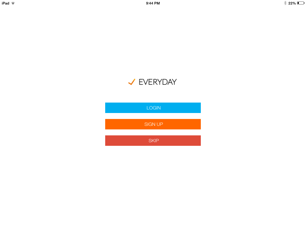
EveryDay has very good user interface elements for managing their content, some of this can be used as inspiration for Drupal's mobile user interface. This apps functionality is to organize tasks and activity. The app has an excellent CMS that focuses on simplicity and minimal design. The app has a very good functionality because of the organisation of the minimal Icons. Below is the three best parts of UX in the EveryDay app.
-
The app has a minimalist design only giving needed information
-
Icons were small and clearly described the task
-
The same functionality and buttons were but in the same place in many different screens
This picture highlights the clear and minimalist design taken by the app. This is the home screen with the different functionality listed.
The Second Screen is the home page. This design carries throughout the whole app adding continuity.
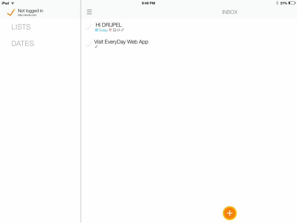
Conclusion: The CMS on the Everyday system is very clean and highlights a high functionality and low clutter design.
| Attachment | Size |
|---|---|
| IMG_0045[1].PNG | 22.22 KB |
| IMG_0050[1].PNG | 33.28 KB |
![IMG_0045[1].PNG](https://groups.drupal.org/files/IMG_0045[1]_1.PNG)
![IMG_0050[1].PNG](https://groups.drupal.org/files/IMG_0050[1].PNG)