Revised: May 2, 2010
If you are just coming in to read about this, we've gone through quite a few versions and the below text no longer represents the latest collective vision. Please view the highest revision file and read through the comments to get an idea of the current status of this.
I'm kinda jumping in here, but here goes nothing! I'm a designer/programmer/themer who put together some workflow ideas for Views in Omnigraffle. I believe people are used to guided setup conventions, whether they use them or not - it's found on many interfaces including wireless routers, and software such as Dreamweaver when setting up a new site. The edit page could be structured very much like a new node creation page, as we can assume that a node might be created first and they are already comfortable with this type of process. The different steps would be housed inside of the vertical tab switcher, allowing the user to click back at any point while editing the view to change or view relevant settings. The groupings I chose were based on a rough MVC separation where one would first set up the data linkage (model), configure sorting and filters (controller), and lastly the output display (view). I took a piece of the UI from the new d7 dashboard and put the view displays up top. This is a radical change from what is there now and I'm sure some might not like it, but I was just playing around with some ideas.
Naming view and choosing 'View Type'
This would be the first tab - I think the 'View Description' field should be listed first in the form, as people generally tend to expect the 'title' as being the first thing they fill out when making new content. The 'View name' (which is really only for the system to use) would be listed second, less prominent, and auto-filled with a suggested name based on the description. I personally think this should happen system-wide in the case of unique internal names. I'm willing to bet a great many people get the error message and have to go back and change the unique name after reading al the fine print. Perhaps it could be set up much like the url alias on a node creation page, where a box can be checked to make one automagically. I would really love to hear your feedback on this!
The same tab would contain the 'View type' selector. I didn't change this part much, but it could still use some more attention.
After this step in the way Views is currently setup, the next page could be overwhelming with nearly every option available on screen at once. This is great from the standpoint of those familiar with Views, but for a beginner it's not optimal.
Tab 1: View settings
Simply a grouping of some of the different settings. Paging removed from here and grouped with the other output display elements.
Tab 2: Data
It seemed logical to try and put the 'row style' or as I called it 'data retrieval' here with relationships, but there are some things that need to be ironed out as far as separating the fields from any visual style elements. For now I just put the configure button in here and also in the display style in a later tab. This would would also house other types of data sources as Views expands to include more in the future. This could use a better name as well, perhaps 'Data sources' ?
Tab 3: Arguments
Tab 4: Filters and sorting
This is almost structured so far like an actual sql query - most things past this point are dealing with how things are shown on screen. I've also thought about the idea of having some things already put in by default, such as a filter for node:published, and ordering by post date. Users would have a filter for if they are active... again, just tossing ideas out there.
Tab 5: Output Display
I tried very hard to think about how to group things, and this seems very logical to me - header up top, content in middle, empty text, and footer below. The pager settings are also in here, as they are tied to the display of the content. This area encompasses the 'view' from the MVC idea.
So that's it - the bottom part would act the same, and you can see how it looks partially on the 'Output display' tab. Views is amazing, and personally I could work with how it looks just fine - but I really wanted to come at this from the standpoint of ultimate usability and a great user experience for view creation and editing. Brining in some new d7 conventions are important, as I think there should be consistency across the entire admin interface.
To me, this was a great exercise in learning more about UX, and I am not expecting anything from this. I believe it's important to open our minds to new workflows, and reach beyond what is there already.
| Attachment | Size |
|---|---|
| views3x_workflow_ideas.pdf | 630.34 KB |
| drawer-on-side-minwidth700px.png | 113.39 KB |
| view-add-auto-machine-name-widget.png | 68.49 KB |
| views_workflow_rev2.pdf | 412.35 KB |
| views_workflow_rev3_wider.pdf | 373.08 KB |
| views_workflows_rev4.pdf | 475.65 KB |
| views_workflows_rev5.pdf | 591.64 KB |
| views_workflows_rev6.pdf | 561.35 KB |
Comments
This is great stuff and I
This is great stuff and I really like the direction we're taking. First comments:
1) The Data tab doesn't feel right to me. Fields are part of the output display. Relationships are an odd man out there.
2) With much less data being displayed at once, we can theoretically put the form on the right. Maybe some javascript sliding so that the form causes the settings area to narrow or something while it's there.
3) There's no way to get a visual overview of what the view does. Perhaps a 'summary' page where you can see (but not edit) an overview of the fields? Not sure about this part, as it could easily get in the way too. The one in Panels has a bunch of shortcut links.
4) "Output display" is more natural as "Output"
Analyze may be in the wrong place. Perhaps it should actually be down by save, because it analyzes the whole view, not just the display. I think being next to the remove button will cause it to disappear in people's minds.
I think that 'output display'
I think that 'output display' makes more sense as 'display settings' - it's differentiating it from the data output of the view. The top already has 'view settings'; settings specific to the actual view. Settings for the display of that view feels more consistent to me than 'output'
I feel like 'output' isn't specific enough to exactly what you're trying to accomplish in that part of the UI. The entire view (display and all) is the output; that's not what's being changed in that final screen. You're just changing the way the display looks. Maybe I'm just being too picky :)
'display settings' seems like
'display settings' seems like a better fit to as well. I'm using this in the next mock :)
gear icon
Also - i think we may want some line differentiation if the gear icon is that far separated from the text that it is configuring. I waver on it, but with no line to track across the screen, sometimes I have trouble figuring out what thing the icon goes with :D
Nice
This looks like an excellent start. I really like the switch to put the displays up top. I also like that this looks like the UI will fit "above the fold" on a laptop-size screen in most situations (e.g. all bets are off if you have 20 fields to list, but otherwise). This is an excellent start, and I'm really excited to see this kind of collaboration starting to happen around front-ending some of the most awesome (but often misunderstood) code in Drupal! :)
https://pantheon.io | http://www.chapterthree.com | https://www.outlandishjosh.com
Little to no scrolling
One thing that I have noticed with the current Views 2 UI and this suggestion is that when you open up the dialog for each item, like picking fields or choosing title, you often have to scroll down to really see that dialog in its entirety. This can be very confusing for a first time user and is inconvenient for seasoned users. Ensuring that 90% of the UI can fit into a typical screen size is important; there is just too much clicking around and configuration to be scrolling.
A couple ideas for a solution:
1) Use two horizontal rows of tabs, Display and the tabs you describe in the post here being put vertically below Displays. This would open up for two columns of dialogs.
2) Have a three column method, where you choose the Setting Type Tab, choose your setting, then to the right of that, the dialog will show.
This is definitely a tough UI problem as there is just so many options. But you have definitely taken it in a good direction.
--
zzolo
I'd like to explore these
I'd like to explore these layout suggestions as well. Yoroy and I had discussed something similar, so I imagine I'll be working on other workflows after this one that involve keeping more of the column layout, but moving the drawer up top. Thanks!
The UX folks are gonna scream
The UX folks are gonna scream that this is misuse of Vertical Tabs. In my experience, they don't provide any better alternative. Vertical tabs works for me here.
Local actions will be links,
Local actions will be links, right?
One big advantage of using forms currently is that you can cache the display-id and the view in the form, so everything can be done with the form submit function.
If we would have a link, the dynamic reload would be a bit harder, i guess.
Something I notice in tutorials
For what it's worth, in every Views tutorial I've seen the instructor always chooses Filters first. Then they usually go to Arguments and Fields. Settings like row styles are usually last. Just something I've noticed. Maybe indicative of how people actually use views.
I'll say it is because it's
I'll say it is because it's normal to build the content you want first and then style it. It's like building a site. Usually you work to get what data you'll want and then work to style that data.
Let me start out with that I
Let me start out with that I really like this layout. I know this mainly deals with rearranging of the data, but while we are talking about UX. I would like to see the removal of the override button. I think if you change the value it should be considered overridden. After you change the value then the Use Default button should appear.
Just something that's bothered me for a while. Tell me if this is discussed elsewhere or if I should open another thread.
I agree about the override.
I agree about the override. I'm not a views noob but I have some type of brain freeze and regularly miss the override and then blow my defaults.
I build websites, push pixels, move type, make media, plan camps, tap mana, roll for initiative, eat like a boss, chase food trucks and like an #eggoneverything. Sponsor my travel and I will record and post your camp sessions!
I too sometimes forget about
I too sometimes forget about the override thing although I'm not sure I'd want any change I make to override as sometimes I have several page displays and wouldn't want to go to the default one to change a setting.
Have you considered or is it possible to have an override toggle? so you switch it and from then on changes are overriding the defaults and you switch it off to go back to your changes modifying the defaults. I'm sure I would still forget if it's on or off although css could help here.
Just throwing it in here for debate really!
For what it's worth, in every
This includes every workshop and the DVDs on Views that Lullabot has published. It does totally make sense for some reason from a basic mental perspective. Usually however that immediately means that the Fields section (or more accurately the live preview) then screams at you. It would make a lot of sense to move the row-style option (fields or nodes) to the fields section and have nodes be the default. If a single field is added, then automatically switch the row style. Right now with Row style in the "Output display" tab, it's a real stretch to make the connection between the two of them.
Speaking of combining things, it also makes sense that Arguments and Filters are combined. In every explanation I give the word "Argument" means little, so I usually interject the phrase "Dynamic filter" to explain it. Not sure if that would be a feasible subtitute though considering the (thankfully consistent) use of the term "Argument" throughout Drupal.
Yes this is complete abuse of Vertical Tabs. Just a quick mention of the purpose: Vertical tabs are essentially meant to cram infrequently used settings into a small area while providing a reasonable at-a-glance summary of all the settings they contain. The current use of Vertical Tabs in these mocks is exactly the opposite: all the settings are important and there is absolutely no at-a-glance summary provided. As Moshe said though, utilizing the summary text within each tab should help minimize this problem, though it will push everything down further on the page, once again causing scrolling.
A completely different alternative (not to slight the work that has been done here) is to put the tabs across the top if we're trying to gain space and not interested in showing summaries. If Vertical tabs do get used, lets at least make sure summaries are in place.
I'll also say with the view
I'll also say with the view types; block,page, default; across the top it has a better chance of running out of room quicker since I can rename those to whatever I want. The fact that there is a fairly known, excluding other languages, length for the settings makes it a better fit for horizontal tabs.
I had imagined the top area
I had imagined the top area would behave like the new Dashboard header, where overflow would go to the next line. I should work up a mock to show since it's pretty important.
I'm not sure I'm upset by
I'm not sure I'm upset by 'abusing' vertical tabs. I was using them at least a year before anyone put them in core, so I'm not sure I feel the need to be held to core's usage of vertical tabs.
Thanks for the great
Thanks for the great feedback! this is exactly what I was hoping would happen - I should have spent more time on the vertical tabs to include more of a summary. I am going back to rework things with everyones suggestions. Thanks again :)
Merlinofchaos and I spoke
Merlinofchaos and I spoke before about the 3 main issues people seem to be having, based on general feedback and support requests in the views issue queue:
'Filters first' sounds like a good example of a tweak that would help with nr. 1.
And a general comment to help this thread succeed, it would be great if people could put up mockups, sketches, wireframes with their feedback. I know that's easier said than done for many of you, but it's essential we explore multiple directions now and not only focus on reviewing a first exploration.
Great job so far raskull!
Thanks!
Everything I've read so far on here is great - stirring things up and getting people talking. There's no way we'll get this right the first time, but I think we'll come to something that works for everyone! I'll be working on more revisions to the workflows and will be posting them shortly.
Don't forget that while
Don't forget that while making things simple for newbies, we can make lives of advanced users harder. With "show summary only than dive in details" design all actions require more clicks to complete. So it would be best if "single page, all settings together" approach was kept for advanced users, in a something like "advanced mode".
This was a topic of
This was a topic of conversation - Views power users will most likely want something similar to what is there now. Perhaps there is a more robust overview page that has shortcuts to edit settings? An 'advanced mode' sounds good to me, but two interfaces will add their own problems. Definitely a tough one to figure out :)
I'm generally against
I'm generally against 'advanced modes' because they are an admission that your UI has failed and you've given up solving problems by just doing two different UIs. Rarely are they truly effective, and you can't usually use one to train for the other.
It really is going to be
It really is going to be frustrating for power users, though, to have everything scattered across a half-dozen pages. Too much clicking and too many page loads. The Views 2 interface may not be newbie-friendly, but it surely is efficient.
TBH, what I could have used as a newcomer to Views was not a simplified interface, but more comprehensible and detailed documentation (What the heck were "relationships" and "arguments" and where did they come from and how did they work? Where did the User fields and filters come from in a Node view? From the current user? The author?).
I disagree. Main UX principle
I disagree. Main UX principle is you design for main audience. Newbies and power users are too different audiences to please with single UI.
Not always
"Faceted seach" is an example how to please newbies and power users with a single UI instead of having "basic search" and "advanced search".
Sadly I see no parallels that
Sadly I see no parallels that we can draw.
First Screen
For some reason, we can't attach files to comments, which makes this hard. Below I've included an image hosted on my server.
I would like to take the first screen when creating a view and make it more "default" and remove some of the "extra configuration" into checkboxes that hide or display that functionality should a user choose to use it.
Comments welcome.
I don't like the Add Tags
I don't like the Add Tags checkbox. I don't use tags at all, but adding an extra row for tags doesn't take that much space and it seems weird for me to click a checkbox just for one additional field. If we are going to require an extra click we might as well use vertical tabs. Something like:
---------------------------------------------------------------------------------------|Views Name --------------------------------------------- |
|test-view | | |
--------------------- --------------------------------------------- |
|Tags | |
|my, view, tags | View name help text |
--------------------- |
|View Type | |
|node | |
--------------------------------------------------------------------------------------
One issue with this is that I
One issue with this is that I already get a LOT of support requests (often pretending to be bug reports) because people have selected 'node' when they really wanted 'user' or 'comment' view type. I doubt this would make their experience better.
What if there was something
What if there was something visual next to the choices - some icons that people can identify with immediately? Node would have a document, users would have a silhouette of a person, etc... Anything we can do to help them know what they are choosing as a base table.
Auto-generate
What about using the widget in core? http://img.skitch.com/20100425-ni6qad6u1msy7khj5pgatr24b.jpg
Yes. Why create a new
Yes. Why create a new interface, when there is an already accepted and (imo) decent solution.
very cool
I love this... makes good sense to me and it also compresses the initial edit screen
Great work
This looks great and I'm excited.
I think the live preview functionality would be improved if it was on-demand and in a modal dialog.
Instead of having a ubiquitous live preview always generating and slowing down my views work, have a preview button that would generate a modal dialog and steal focus so that I can be in charge of when I see the preview.
modals
I am thinking the same thing about the preview - it should only show up after a few more steps, or after clicking a preview button. Modals certainly have their uses, but the backlash over using them in Views was so strong that they aren't even being considered.
In the very latest release of
In the very latest release of Views, the live preview updates a little less often. So some of the issues being raised do not occur as often.
You can actually turn off the
You can actually turn off the auto preview in the preferences.
good to know, thanks!
good to know, thanks!
I'd like to see the preview
I'd like to see the preview on demand but a modal could be overkill especially inside the overlay.
What if we load it in a separate page and provide a back button?
I don't see how a separate
I don't see how a separate page would be better than scrolling down.
If I think about my workflow
If I think about my workflow (and I understand it's just one use case) the preview is a feature I use only at a specific point of the view creation. Specifically after having tweaked all the main settings (filters, fields, display etc.) because there's nothing to preview before. So by putting it in a separate page/modal we avoid polluting the main UI.
It's great to have the preview on the same page but there are too many elements on the screen right now and the preview seems like the right candidate to be visible only on demand.
Does it make more sense, now?
I dunno. I really like the
I dunno. I really like the preview where it is. The automation can be turned off, and because it's downscrolling it's not really polluting anything.
On the other hand, if you stick it behind a button then you have to fill out arguments and click again, plus, you won't be able to easily preserve arguments from the last preview. I feel like that would massively dilute the utility of preview, and it's a feature that I personally use a lot.
yeah, the live views preview
yeah, the live views preview is essential when developing views.
though one could provide an extra preview-button in order to visualize the view result externally (pop-up). this would be useful when i for example use a theme where the content.area is too small in admin-mode.
How about just making the
How about just making the preview collapsible (and collapsed by default)?
A mockup without live preview and dipslays on a select element
I moved the displays from the dashboard-like tabs to a select element and created a button to preview the display on a separate page or modal.

What do you think?
The select stuff leads to an
The select stuff leads to an additional click to change a display. Additional you have no chance to look at the existing displays without any clicks.
If i speak for myself, i really really often look at this, to get an overview of a view.
I don't see a big advantage/disadvantage of the add a new display link remove the display link. One problem will be here, that we would have to render at least the remove this display link once for every display. The interface should still work for non-js users.
I'm willing to think about
I'm willing to think about displays on a select element. I am as yet unconvinced that live preview should have additional click barriers.
I had actually started off
I had actually started off the very first comp with a dropdown menu for Displays, but it never made it into a comp file. I'm not sure what my thinking was at the time, but it had something to do with being able to visually see all of the current displays in a similar manner to what is currently being used in Views. I also really liked the look of the top buttons, so I wanted to work them in somehow :)
This idea is certainly much cleaner and will compress the space, and as long as it acts as a jump menu where it instantly changes the information beneath it, then it seems like it would work. I love this forward movement, great collaboration!!
Edit drawer on side
Here is a comp with the drawer on the side, and a few more suggestions added. It looks like 700 pixels is the minimum width in the Seven theme so this would be an example of the most compressed layout for 800x600 users. Some of the edit screens will be very tight though, but for the majority of users on larger screens the experience will be fine.
We could save a considerable
We could save a considerable amount of horizontal space if "Filter, sorting and arguments" was renamed to something much shorter (or wrapped). Not that I have a better suggestion for a tab title however…
Revised create page
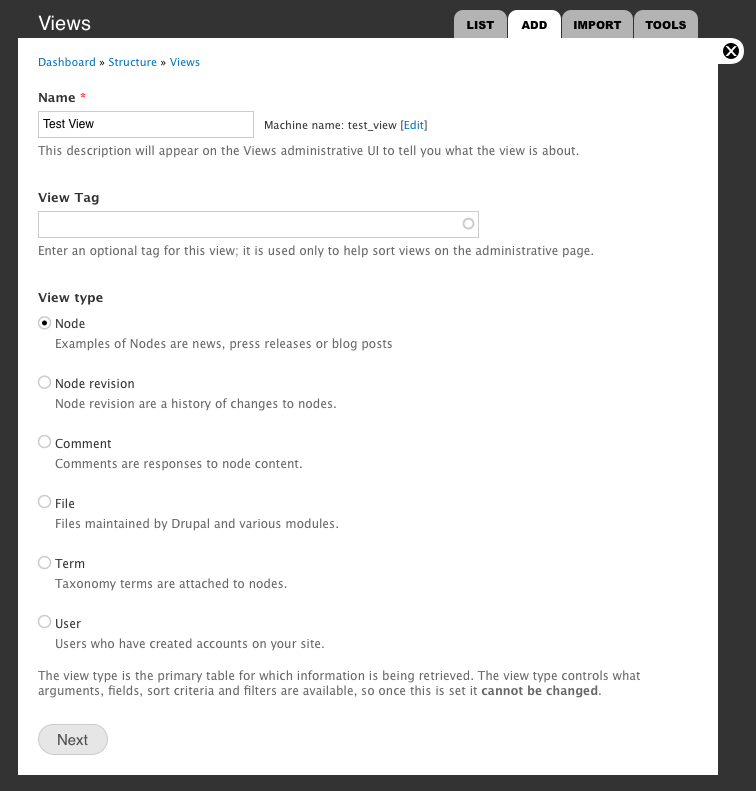
Here is a revised creation page that includes the core widget for auto-generating the machine name.
What if we use a select
What if we use a select element to choose the view type?
view type as a select element mockup
I think the first step would be really clean like this.
merlinofchaos mentioned many
merlinofchaos mentioned many people put support requests in becaus they chose 'node' when they really wanted 'user' or 'comment'. As long as we can work on the idea of clarifying what a 'Node' is, and make it crystal clear what they are choosing then I think this works. The wording is going to be a big thing here, and I am thinking that the word 'Node' will be replaced with something more along the lines of 'Content'. I am no expert on the right wording to use, but the description should come next to the first word to help people make their selection.
I think trying to simplify
I think trying to simplify and streamline the Views UI is a great idea.
But what this current mockup does is turn in into a 3-tier rather than 2-tier UI. (Or 3 to 4 if you could the displays.)
I'm really not sure this is a good idea; unless as merlinofchaos suggests in the first comment, we put the whole form to the right of the first column of vertical tabs.
Good start
Just like the Views 2 UI needed a lot of experiments, this one won't be quicker.
I actually like the idea of multiple nested tabs.
The problem is to make sense of that.
In the Views 2 UI what I have gotten used to is the vertical tabs represent displays. Somehow the vertical tabs are a memorable visual element and to the utmost right, so it helps me with orientation.
Use of Color and maybe some icons for certain portions could help to seperate out the different layers of nesting, so they become somehow three-dimensional to the eye (say yellow would always be the displays area, green was actions, blue was different parts of settings like filter, fields and general). Read colors as very soft colors, no full blue or red ;)
Different shades of grey, borders and font sizes also help in orientation.
Raskull already did this in the upper part of the UI: it are basically three columns of tabs that look each totally different (almost too different :P) so one can easily memorize them and after a while you will find the right set of tabs for certain settings with ease.
The lower part with the nitty-gritty settings needs more contrast ad seperating out IMHO, it feels like one grey area with random text.
Even better would be if one had some kind of visual reference as to what different parts refer, but with this abundance of settings this will be a losing battle (think of an optical equivalent for displays or for fields).
No doubt is having it all in one place like in the Views 2 UI is overwhelming. So breaking it up into at least three or four areas is sure better.
Life is a journey, not a destination
Interesting stuff. Just keep
Interesting stuff. Just keep in mind that the 'Default', 'Page', 'Block' tabs across the top could end up with several pages and several blocks, perhaps with customized, longer, names. The Calendar view, for instance, has numerous displays. That could easily end up being too much to fit in a single row. What will is look like if there are two (or more) rows of tabs across the top? With displays as vertical tabs this wasn't a problem.
Care to share a screenshot?
Care to share a screenshot? Goes for others as well, show some of your 'regular' views and maybe some over the top ones. Where are the bottlenecks in the current UI?
Total_control module installs
Total_control module installs a view with a display per content type. Which on any big site is at least 10. The javascript stops working and scrolling become an issue.
It's not uncommon for our Site Administrator views to have 10-15 displays. Sometimes we have to break it up to get around the limitations in the UI, but conceptually they do belong in the same view.
display wrap
I've always imagined that it would act like the new Dashboard, where the buttons would just flow to the second or third lines. I am working on a new comp that will show what I'm thinking.
data-first?
i just saw versions 1,2 and 3 and i really like the design proposal!
according to the removed data-section, now where did the relationships go?
i personally believe that there are two approaches, a view is being developed. either you start by filtering or you start by defining fields/relationships/the-data. the recent proposals 2 and 3 seems to support the generally adopted approach of starting by the filtering as several people mentioned already most tutorials teach to start with. this approach is useful when displaying standard drupal nodes. on the other hand side my undestanding of views-3 is globalizing the data/data-sources aspect of views, as we can have external data providers and so on. this is why i like the data-first approach which version 1 proposed by providing a data-tab.
just some thoughts, i'm not quite shure how, but i definitely think the views-3 UI should at least optionally allow for defining data first as this is a natural approach i normally take.
regards josef
forgot
I realized that I forgot to put the relationships back in here when the 'data' tab went away. Perhaps the data tab could be put back, and it would show what type of data they selected (node, user, comment) and then have a place for relationships. When data sources become open to other types, it could go in there. I'm working on another comp that will go up soon.
new mock
New mock up that illustrates how displays overflow to the next line. I've also put back a data sources tab where the relationships can go, and also maybe it would house where other types of data would be defined in upcoming versions. Other UI tweaks were put in as well.
Think you might haver
Think you might haver forgotten to attach the mockup
Apologies, I should have been
Apologies, I should have been more clear about where the attachment was :)
It's fine I think I made the
It's fine I think I made the comment, before the attachment went up because I swear I looked there.
You can find the mockups
You can find the mockups attached to the initial post
Good Work!
Is it possible to group similar display types together?
Or somehow visually indicate the display type.
More of a feature request that an UI issue possibly, but would it possible to re-order displays.
Where I have a view with more than a few displays, I usually would prefer them in a particular order.
@alanburke Thats already
@alanburke
Thats already possible in views3.
@rasskull
It would be cool if you could integrate clone display and reorder display into the mockup
In general as i said already, i really like this stuff.
dashboard drag-and-drop
Going back to the dashboard drag-and-drop header piece, I think the display re-ordering could work the same way. Instead of the buttons always being drag-able, you'd have to click a link that would reveal the cross graphic. That would be pretty cool imho, and more importantly fit in with existing UI conventions in the new admin.
As for clone display, I need to read back and see where the controls could go.
Copy the display is a
Copy the display is a button.
Also reorder display is a button(what you call link :))
I think we shouldn't change this, because something like drag-able tabs would need quite a bit of work.
overview page - dashboard
I'm really interested in the overview page. In troubleshooting with end-users, they can currently screenshot the Views 2 screen. I can see some basic settings. I can also screenshot and send them a guide.
This is handy for tutorials, in how-tos, etc. So I'm curious about the overview page.
Of course we can output the View, and I can read it OK, but it's not very handy for end users. And sometimes you can't export a View because the context isn't there for the end user.
I'd like it to show all settings, including defaults which weren't changed.
Trying to think how I'd show this. I can picture a dashboard, giving a quick look at all the modified settings. Not everything that is possible, but just the stuff that is changed. I still think you need to see the stuff that isn't altered somehow though.
I see the mention of adding links on the overview page, but then we'd be back to the original Views 2 layout?
Thanks for sharing these drawings. I'm sorry I can't make one to visualise what I am describing above. If it's not clear I could give it a whack.
overview page - very important
I've been reluctant to tackle this so far, but I need to get on it. The overview page is so important to be able to get an overall feel for the View without having to look around in different tabs. Good ideas here - even if you could put together a very rough hand sketch it would complement your ideas and tie things together visually. I'm working on new comps this weekend so I'll be posting those soon.
new comp - v5
I tried to work in as many of the things as I could - sorry if I missed anything! I left out the select fields for View type, as well as for choosing a display type until we can discuss those further. Here are some of the things changed:
views_workflows_rev5.pdf
Regarding the first screen, I
Regarding the first screen, I still believe a select list makes more sense and we could separate basic types (node and user) using optgroups. Moreover there's some inconsistency in the label naming. Since the first label is "Name" the others shouldn't contain the "view" prefix. We're creating a view I don't think we need to remaind it in every label.
Talking about the overview tab in the second screen it's like saying that the new UI isn't good enough for everybody. I guess we should choose one way or another.
I put the dropdown in the
I put the dropdown in the latest version - I added some descriptive text to make it more clear what is being chosen. 'View' prefix also removed from the Tag element. Overview needs work for sure... not quite sure what to do there.
good work again! i would
good work again!
i would recommend joining both grey bars in order to align all display-related buttons. though they are distinguished into global-display-actions (add, re-order) and specific-display-actions (clone, remove) i think having them next to each other would help finding them quicker. we might also think about eliminating the "display" suffix of those by providing a displays-title indicating the whole area including buttons and display-items.
so my proposed structure would be:
View "Test View", displaying items of type Node
Displays: Add, Re-Order, [Clone, Remove] (greyed out if no display selected)
Display-Listing
if the only use case of the overview is taking screenshots, it could be realized using a pop-up because here we don't need the lefthandside sections.
having the buttons separate
having the buttons separate seems like it would be less confusing to me - unless there was something to make it very clear which ones affected the overall display and which affected the specific display. Sounds like something we can put out there for people to respond with what would be best. I am never sure if I am way off :)
The overview can definitely use some work - it's basically the current views setup without links to edit things. Modal pop-ups are not an option, so we could explore other ways to present it. I am gonna put up a new comp, but I think it's about time to move to completely new direction and see what other ideas are out there. Thanks for your help!
another usability issue as we
another usability issue as we have section-tabs: you don't see which values have been overridden at first sight. so maybe a special (italic) formatting for such values if useful in order to indicate override-status at the left-hand-side section-tabs.
New templates and some suggestions
Nice work!
I would like to suggest two missing screens:
First: Create a new (field, relationship, filter, etc) after click the plus icon. Some users told me that they expect that "something" happen after click this icon, but they don't see anything because ajax is load in the bottom of the browser. Maybe with this tab approach we can load it into the last column and make it more visible.
For other side, filters and sorts can be exposed in views 3. Maybe is a good chance to make their more visible (I don't know how), with less horizontal space put the entire string "exposed" could be excessive.
Related to the first screen (rev 5), maybe "More views types" is better than "View more options", from my perspective, "More views options" can include a lot of other options, not only "views types".
The other missing screen that I didn't found was configuration of a basic field. I mean, with all this options (like overwrite the output of this field, and link this field as link) this options contains hidden options. Right now an arrow indicates that this options contains more options, but again, with less horizontal space, this layout could be modified to fit better.
Mariano D'Agostino
http://cuencodigital.com
Time to explore other paths
I've just posted another revision based on more feedback:
views_workflows_rev6.pdf
I know it's not anywhere near done, but I think it's time to move on to a new idea and explore other options. It would be great to have 3 or 4 solid workflows and come back to see which one works best, and if we can swap parts around to come up with a close fit. Thanks to everyone for your very useful feedback - this first round was nowhere near as painful as I thought it would be, and I look forward to seeing what we can all come up with in the next rounds!
Overview page - remove left tabs
Maybe remove the overview link from the left control tabs? Make it accessible from the top bar. Not sure...
Here's two sketches, see if they give you an idea?
I thought removing the left tabs might make it feel more like an overview, rather than a disabled editing screen.
http://skitch.com/heatherjames/dn2wg/overview-sketch2.jpg-2-documents
http://skitch.com/heatherjames/dn2wn/overview-sketch1.jpg-2-documents
Maybe will spark an idea for you.
I continued/restarted
I continued/restarted conversation about Views 3 UI and these concepts at http://groups.drupal.org/node/90854
Bevan/
OUTPUT of VIEW...
What about getting really customized output. For example, spitting out JSON data? I would like to try something other than services.