Put up your ideas/prototypes/mock-ups here in this wiki page.
Lewis' Full HTML Prototype 3 Version 2 - Sandbox
| Attachment | Size |
|---|---|
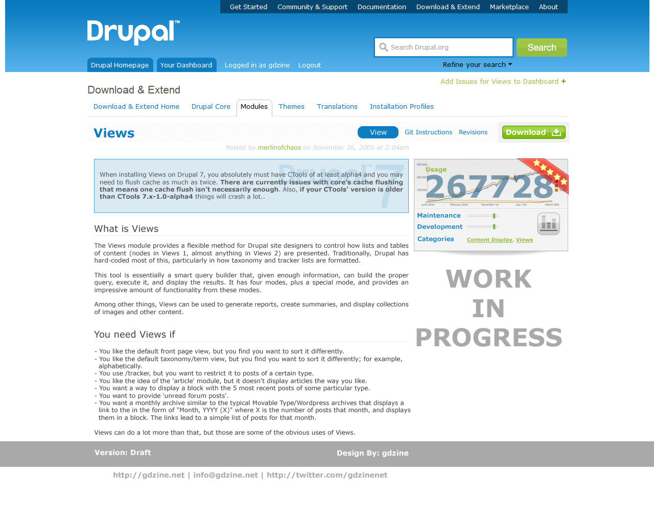
| modules-page-2-APR-2011.jpg | 201.42 KB |
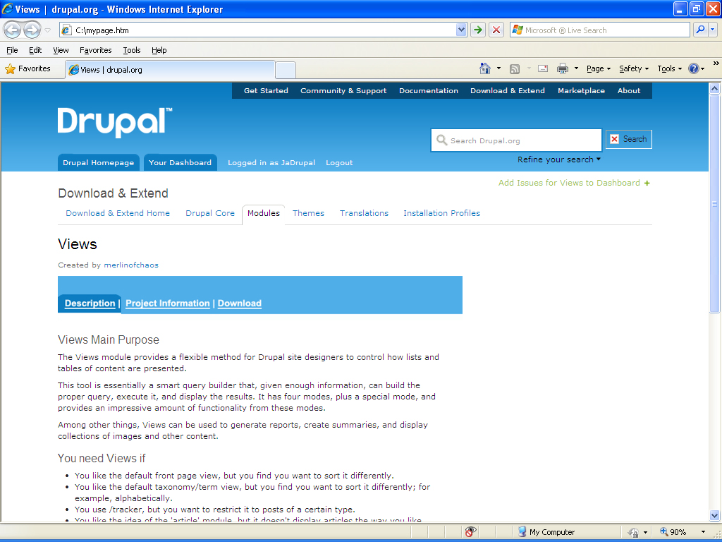
| MyPage.jpg | 454.84 KB |
Put up your ideas/prototypes/mock-ups here in this wiki page.
Lewis' Full HTML Prototype 3 Version 2 - Sandbox
| Attachment | Size |
|---|---|
| modules-page-2-APR-2011.jpg | 201.42 KB |
| MyPage.jpg | 454.84 KB |
Comments
I like the addition of a
I like the addition of a download button at the top. I wonder if there is a way with the usage statistics to say which release is being downloaded the most often. Although, that could be a bit of a self-fulfilling prophecy.
Ryan Price
DrupalEasy Podcast
I submitted mypage.jpg as a
I submitted mypage.jpg as a prototype for the layout of the modules page. The whitespace on the right could be used to host a demo video of the module - would be great for newbies or usage stats as gdzine mentioned. I've used tabs as it splits the module information instead of having all the information on one page. The project information tab could have all the technical info re the module. In regards to messages from the developer that are usually at the top of the module - they could be placed elsewhere; in my prototype these would be placed in the Download tab. One more tip - the required modules could be listed in full on the download page; i've had issues where i've downloaded a module and then have to hunt for two more before i can get the first module to be enabled.
Nicky
I don't think think we can
I don't think think we can get away with just a download button, since multiple version of a module need to be accessible. I also think people probably won't like downloads being on a separate tab, because it will create an extra step to getting to want they want. I like being able to see the versions available to me immediately.
Cross referencing post
It looks like we have a bit of a split going on so I'm going to point to here:
http://groups.drupal.org/node/137914#comment-457969
I can't attach mine because it's a full html page but I will post up a link to the latest version.
Yeah, this is a problem. Can
Yeah, this is a problem. Can we merge these conversation, please?
The numerous versions listed
The numerous versions listed at the bottom of the module description actually was a turnoff to me because i didn't know which one i should download and also it took a lot of scrolling down to get to it. It has gotten easier for me now as i've figured it out but for a newbie it is confusing - hence the tab in my prototype. We could work out a hybrid however of the different ideas as we all want it to be easier for users to get to what they want newbies and vets.
Nicky
Well, the multiple version
Well, the multiple version list is a necessity. you can't favor one over the other. I do, though, agree that scrolling down to get to the downloads is a pain. I think they should be at the top and the description below.