
Posted by starbow on November 18, 2008 at 12:40am
I recently got frustrated enough with the admin/settings/filters page to build a module to rebuild it for Drupal 6. Input Format Manager
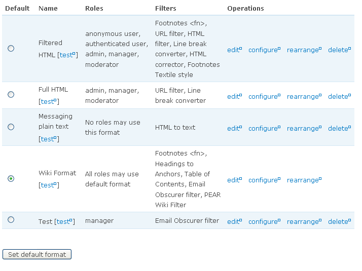
My three significant changes to the default page are:
- Putting all the links on to one page. The default admin page currently forces you to click "configure" and then "configure" again on the next page to set the individual filter options.
- Even crazier, the click flow for turning on a new filter is "configure" -> submit -> "configure" -> "rearrange", just to see where the new filter was put in the stack. My new admin page shows an ordered list of the filters that make up each format.
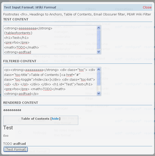
- My new page also add a test link to each format, that allows you to put in markup and see how the filter stack transforms it.
New Admin Page
Format Test Page
| Attachment | Size |
|---|---|
| filter-test.png | 94.8 KB |
| format-admin.png | 60.82 KB |
Comments
Information overload
It needs to be toned down a notch so that the user can quickly scan the page and find what they need to use. For instance some of the less-common actions can be removed, such as the delete and rearrange links. The list of filters in each row is a big contributor to the amount of [in my opinion] unnecessary information too, so it could probably be removed.
In a way, testing the format is the equivalent of 'looking' at it, so perhaps remove the word 'test' and make the name a link (like viewing a node from the content list).
My whole point is to move
My whole point is to move all this info and controls to a single page, so I am not too excited about your suggestions to re-remove the stuff I wrote the module to put there.
I kind of like the idea of making the name the test link, but I wonder if new users would figure that out. Along those same lines, the filter list could be the rearrange link, if there was a good way of letting a new use know about it. Maybe just a note on the top of the page?
You said the reason you want
You said the reason you want to move everything to the main page is because it requires too many clicks to configure the filters. That doesn't explain why everything else has to be on that page though.
By all means keep the edit, configure and rearrange links on the main page, but the delete link isn't as important. Nor is the list of filters, as they can be found by clicking the configure/rearrange links. Taxonomy's vocabulary listing doesn't show every term for instance, because there's a separate page to list the terms. The content types list doesn't show every field, etc...
If you throw too much information on one page the user won't be able to quickly grasp what the page is about, so keep it simple.
Maybe change 'Default' to 'Default selection'.
Also, configure and rearrange sound like they ought to be the same thing, although I haven't played with input formats for a while so I'm not sure what the difference is.
On another note, the fact that all your links trigger popups leads me to believe that your design may be biased towards that expected behaviour. Would you have designed the page the same way if you weren't using the Popups API?
but the delete link isn't as
but the delete link isn't as important.
Well, I can see this argument in the abstract, but real world, if I pull the delete link off this page I have to put it somewhere else. Which means adding a form_alter and a custom submit hander to the module, and not much pay back for the effort.
The truth of the mater is that this redesign doesn't go nearly far enough. I think the format edit form should get broken down into three separate forms (format name, permissions and filter enable), and I think the filter enable form should be combined with filter ordering form (the results would look kind of like the blocks admin page). Then we could start to get an intuitive design. But that is more work than I have time to take on.
Nor is the list of filters, as they can be found by clicking the configure/rearrange links. Taxonomy's vocabulary listing doesn't show every term for instance, because there's a separate page to list the terms. The content types list doesn't show every field, etc...
See the thread with Ber. I believe that a huge majority of Drupal admins don't understand that an Input Format is an ordered stack of input filters. And trying to administer input formats wiithout that understanding can be really frustrating. Of course, showing the filters-per-format starts to get ugly past about a dozen formats, which is why this approach does not work for taxonomy, but I have a hard time imagining a site with more than a dozen formats.
On another note, the fact that all your links trigger popups leads me to believe that your design may be biased towards that expected behaviour. Would you have designed the page the same way if you weren't using the Popups API?
Possibly not. Since I am the guy that wrote Popups API, it probably effects my thinking. But the core idea is that the design of this page, and the design of the Popups API are both informed by my belief that administrating drupal could be made faster and simpler.
good concept
There are a few things I really like:
1. You seem to be one of the few who keep the idea of "formats consist of filters" in tact
2. By making it tables, you gain consistency with e.g. content-types interfaces etc.
There is one thing that could use improvement.
I have found that many users have problems with the concept of "default". Too many bloggers or site-owners switch a format to default with the reasoning: "I no longer have to change it every time I post something". Only last month I had two clients with PHP set to default. Not knowing that it opened up PHP formatting to every commentor!
This is not dealt with in your mockups. IMO it should be renamed from "default" to "for all users" or something better.
I am not sure what the square next to a link means, but it is inconsistent with the rest of Drupal.
Why not place the [test] link with the other actions. After all, its just an acion such as "configure, edit or reaarange".
Users hardly grok the difference between "configure and edit", both are fuzzy concepts that can mean the exact same.
1. why do they need to be different?
2. if they really are different, then name them after what they do.
http://www.webschuur.com | http://bler.webschuur.com
http://www.webschuur.com | http://bler.webschuur.com
1. You seem to be one of the
1. You seem to be one of the few who keep the idea of "formats consist of filters" in tact
Thanks, that was a core idea. It took me a long time to realize that a format was just an ordered stack of filters, and I wanted to make that fact more obvious.
2. By making it tables, you gain consistency with e.g. content-types interfaces etc.
Actually it is already a table by default, just with less info.
There is one thing that could use improvement.
I have found that many users have problems with the concept of "default". Too many bloggers or site-owners switch a format to
default with the reasoning: "I no longer have to change it every time I post something". Only last month I had two clients with PHP
set to default. Not knowing that it opened up PHP formatting to every commentor!
This is not dealt with in your mockups. IMO it should be renamed from "default" to "for all users" or something better.
Yeah, that is a huge issue. I use the filter_default module, which is incorrectly named, but very useful. It allows per-role defaults. I like your idea of changing the table name from "Default" to "Used by Everyone" or something like that.
I am not sure what the square next to a link means, but it is inconsistent with the rest of Drupal.
The squares mean the links have been popup enabled, by the Popups API module. That is why the test page is in a popup. But that is optional.
Why not place the [test] link with the other actions. After all, its just an acion such as "configure, edit or reaarange".
Yeah, that was first thought, but then it seemed like all the other Operations modifed that Format, so maybe it didn't belong there. And the table was getting very wide.
Users hardly grok the difference between "configure and edit", both are fuzzy concepts that can mean the exact same.
1. why do they need to be different?
Yeah, this is a pain. In the default Drupal 6 admin, both links are called "configure" but are on different pages, and do different things!!!
edit -> page where you can set the user roles that can use the format (if it isn't default) and what filters are enabled in the format.
configure -> page where you can set per-format filter options (ex: what html tags the filtered html filter lets through). I bet 99% of drupal users don't even know this page exists.
It's an odd setup, but it will take more work to straighten out than I am going to take on right now :)
2. if they really are different, then name them after what they do.
I am open to suggestions. Changing the "configure" link to "per-format filter options" would be a little awkward.
what about "edit filters"
what about "edit filters" and "edit format"?
http://www.webschuur.com | http://bler.webschuur.com
http://www.webschuur.com | http://bler.webschuur.com
Sure. Not perfect, but a
Sure. Not perfect, but a step in the right direction.