Posted by timswezy on June 15, 2011 at 11:39pm
Tonight at the TriDUG MeetUp, I presented new variations of ideas for a logo for our Drupal Meetup Group. Please see the attached presentation and leave your comments below. Since this is the next to final round, please limit your comments to verbal questions, concerns, and comments. This will allow for smoother development so that the next phase will truly be the last phase. :)
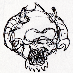
Bonus: I've attached my sketch of what it might look like if you put the Druplicon, UNC's Rameses, Duke's Blue Devil, and NC State's Tuffy the wolf in a room, locked the door, and somehow they managed to have a baby… a horrible, terrifying baby that eats too much and wrecks your carpet… I call him Chimericon.
| Attachment | Size |
|---|---|
| options.pdf | 66.82 KB |
| chimericon.png | 136.87 KB |
Comments
Chimericon FTW
I like options 1 and 2.
I like option 1 because it incorporates the Drupalicon.
I like option 2 because it draws from the three universities in the Triangle area, however, it doesn't alienate anyone not affiliated with the universities--from a visual perspective, which would hopefully lead to participation with the group. I don't like option 2 because although it has the outline of the drupalicon, it doesn't have the face. I think that part is pretty important.
The color pallete for both is great. The font and layout is easy to read.
I think we have a solid direction here to move forward with one of these options.
Jason
The decision to go with the
The decision to go with the local school's colors was enlightened, we're definitely sticking with that. My favorite by far would be #3. It's crisp and it doesn't involve an obvious Druplicon, which I think is a bit over-utilized in the community.
I choo, choo, choose Option 3
Agree the drupalcon is overexposed.
chimericon needs to be fully realized here: http://www.customplushtoys.com/
:P
Option 1
I like #3, but if it were up
I like #3, but if it were up to me, I would make the text as tall as the triangle, tighten up the leading and rotate the drops in the triangle 120 degrees clockwise. This would position the red lower right, light blue lower left and dark blue on top. That would orient the colors more geographically (my cartography brain creeping in). I can post a picture (which is worth a thousand words), but I refrained and am using my words.
#3 for me too
I really like #3, and #1 is my second favorite. I was going to suggest the same thing as Frank, that #3 would look a little better if the triangle height matched the text height. Nice work!
Thanks Tim
First, thanks Tim for doing this, giving us great options, and most importantly, dealing with community input!
Personally, I like option 3 best... it's clean, bright, and sort of a "pictograph" of our name with the Triangle shape and the Ubuntu-ish users circle done with the Drupal outline.
Option 1 is my second choice but it just seems a little too Drupal focused and less on Triangle and Users.
Options 3 also gives a lot of options as to placement with text... e.g. Stack it on top of Triangle Drupal User Group or just TriDUG for a vertical T-Shirt logo... or angle "Triangle" "Drupal" and "Users Group" along the edges of the triangle.
Another benefit is that it can easily be "reproduced" in formats/sizes that might be needed for printers, banner makers, t-shirts and the like. I've seen many nice Logos that end up only existing in jpeg format because the original vector art was lost/impossible to reproduce.
Also, doesn't Dries hold the TM / Copyright to the Drupal Icon?... If we use this we might need to get his "blessing".. but if we use just the outline we don't.
One minor nit... Your "Duke Blue" isn't quite right... the "official" html color is #002B70 (Oh, to be seventy). I'll let the State and UNC folks comment on their colors...lol
Some ideas if you want to doodle some more...
What would it look like if the triangle shape was the "regional" triangle shape used ( see rtp.org )
I noticed that if you shrink it to about 100 Px, the center starts to look like 3 circles. I wonder if there is anyway to make the "top knots" more visible at a smaller size?
Thanks again.
Carolina Blue is #56A0D3
Graphic Identity Standards
Thank you for all of your efforts.
They are very much appreciated.
I didn't know we were allowed to critique :)
ok, I'll jump in with more idea iterations for 3. Take it as you may.
You could push the triangle to the right and rotate slightly clockwise so a flat side is running vertically sitting against the text. Of course then, make the text as big as the triangle.
Or, keep the text smaller and the triangle bigger - then you have an "arrow" motif.
In this scheme the arrow is pointing "backwards" so maybe you want to throw the triangle at the end of the text.
Looking at it more - there is a lot being said in such a simple design. It's really very elegant and clean, conveys the region. Very well done.
Wolfpack red is #CC0000