Last updated by silverwing on Sat, 2011-12-17 16:45
Over the past months we've had many discussions here in the d4d group, at various Drupal camps, IRC and in the issue queues. I have kept notes and references to most of these discussions and based on those prepared a proposed design brief for the design initiative. It would be good if someone can enable comments on this wiki page, so we can discuss this and make changes etc to the brief. This is my initial idea - what is missing is a link to a demo site (I am setting that up today, I have a pretty good boilerplate site thats a good starting point).
The idea to include actual screenshots is rather new, originally the plan was to include a set of wireframes as well - I have those wireframes ready however they need refinement - you can see them by visiting the relevant issue: http://drupal.org/node/1205044 - help with these would be much appreciated!
We could add some basic stuff on mobile and responsive design - I say maybe - this is more a focus of the theme development and here we are writing a design brief, however it might be valuable to venture into this discussion to the designers understand from the get go that it must support a fluid type layout.
Drupal 8 Theme Design Brief
The Challenge
Drupal core requires a beautiful, modern theme to showcase Drupal 8. The challenge is to come up with a stunning new design to make thousands of Drupal sites look great, easy to use and be able to grow with the ever changing demands of web.
Client
Drupal 8 Core
Deadline
April 30th 2012
Key Contact
Jeff Burnz - Design Initiative Owner
http://drupal.org/user/61393
Ph: +46709600416
Email: jeff@adapivethemes.com
Skype: jmburnz
Submission Guidelines
Submission should include one or more full web page designs utilizing the Design Requirements guide.
Submit your design file by posting a “Design” post and attach your design files (must be in png, jpg or gif format). You have to be a member of Drupal.org and be logged in.
The deadline is April 30th 2012, but don’t leave it to the last minute - the longer your design is up the longer the community gets to see it.
Licencing
The design that is selected to be Drupal 8’s next theme will become licenced under GNU General Public License.
Resources
We have set up X number of example sites using Drupal to show various use cases. You can view these sites live online and use them as living wireframes to build your design around.
[Needs Work]
Selection Criteria
So as to ensure a high quality of submissions all design submissions will be subject to a basic set of selection criteria. Early feedback on all designs will concentrate on encouraging designers to meet these baselines:
- Basic accessibility - must pass basic contrast and font size requirements (1)
- Basic UX (2)
- Must be able to support multiple color schemes (2)
- Must be an original work
- Must have layered design files available in a suitable format
1. Contrast levels should be 4.5:1 for all elements. Default font size should not be smaller than 12px, with small text no smaller than 10px.
2. Subject to User Experience Gate Requirements.
3. All core themes use the color module, while you do not need to provide alternative color schemes in the initial submission, the design should take into account that it will be required to support alternatives.
Current Situation
In Drupal 5, circa Jan 2007, Drupal core introduced the Garland theme. This was the first professionally designed theme included in Drupal. Garland stamped a brand on Drupal and gave it personality. Garland was a huge success and proved extremely popular.
Garland is colorable (uses the color module to allow end users to re-color the entire theme), is able to support both fluid and fixed layouts and is right to left language capable. It also sports a very high level of design aesthetic and attention to detail.
Garland also sports a number of key drawbacks. Its reliance on pixel perfection is challenging to many neophyte themers who want to tweak the design. The strong aesthetics have dated Garland, design trends move and Garland now looks and feels circa 2006. With Drupal 8 set to launch some time in 2013 Garland will certainly be out of date. Garland was built pre-mobile era, before responsive design, HTML5 and CSS3 rose to prominence - its built on yesterdays technology and does not represent the modern approach to the page-less web or device Independence.
For these reasons Garland will be removed from Drupal and replaced with a new design.
Target Audience
The target audience for our core theme is two fold:
1. People evaluating Drupal as a potential CMS.
2. People wanting to use the core theme for their website.
People evaluating Drupal need to perceive Drupal as a powerful, modern, capable and relevant system. Their initial experience with Drupal is to a degree defined by their first impressions. It is critically important those experiences are positive, and that they embody and impress what Drupal is about, what it is capable of, and what they perceive they will get if they choose Drupal.
People wanting to use a core theme for their website have an additional set of requirements. The design must be an acceptable fit for their business, club or small organization. This audience is likely to have low budgets and low skill level. They may be start-ups, or existing entities looking to upgrade their dated website, or upgrade through versions of Drupal - notably they may have used Garland in the past and are looking for the same high level of design aesthetic.
As you can see our target audience is complex - we need to embody the Drupal brand and portray Drupal as modern, powerful and capable system, yet we must also appeal to actual end users of the theme - which guides us to a more generic, highly usable, yet aesthetically pleasing design.
Design Requirements
Drupal can generate all the normal elements you will find in most websites. To construct the core theme we need to provide style to these elements, to be dictated and provided by the design. We have identified a short list of common Drupal site elements you might choose to include in your design submission. We have provided a short explanation of each element and a visual representation of what these look like in the current default theme “Bartik”.
We do not expect that all elements will be provided for in the design submission - instead focus on the design language, you can use any of these elements in the construction of that language. This will help us envision how we can extrapolate and apply the language across the broad range of output that Drupal can generate - in short so we can envision what it will look like as a living, breathing design in the browser.
In the following pages we have provided screenshots and descriptions of some of the major elements in Drupal. This is not exhaustive, at all, however, providing design for these elements will provide us with enough to evaluate the design and even build most of a theme.
For the design that we select for Drupal 8 core we will probably need additional design work, however, we do not want to over-burden designers in the initial stages.
Header Elements
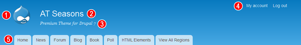
The header will typically include a logo (1), Site name (2) and a slogan or tag line (3).
We have a “User menu” (4) which shows default links such as login, logout, My account and can be added to by users (it can show many links, more than the 2 shown here).
(5) is the “Main menu”.
You may choose to not show any menus in the site header, or have a totally different approach to what a site header might be - this is entirely up to you as the designer.
Blocks
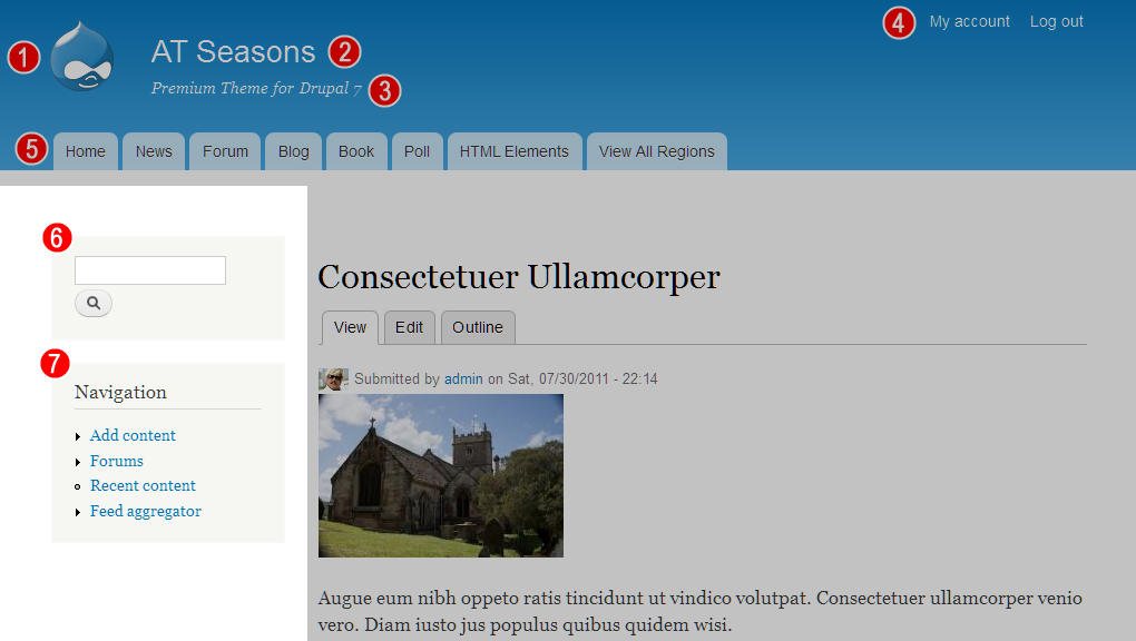
(6) is the search block and (7) a typical menu block. In this screenshot they are placed in a sidebar, however blocks can be placed anywhere in Drupal and users may display them in different sections or pages. Blocks can have any content - such as text, images, banners, Google ads, flickr feeds, video or whatever you can think of.
The main take away from this is to concentrate on the design language - provide style for elements (headings, text, forms, tables and so on), and only use specific blocks as examples of that design language.
If you approach it like this: A menu block contains:
1. A heading (typically h2 element)
2. A list, with or without bullets or icons (ul, li elements)
3. Links (a element)
Apply this thinking right across the spectrum and you will build up a language of design elements that we can use and re-use to build out each design pattern in Drupal.
You may provide a unique design for specialised blocks such as the search form and menus such as shown above, and a fall-back generic design for elements.
Author Navigation
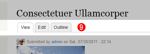
(9) Drupal provides authors and content editors with in-place editing controls. In the Bartik theme they are represented as tabs (which mimics the default admin theme which also uses the tabbed navigation bar design pattern). They do not need to be tabs and could be buttons or plain links - whats important here is that they usable and clearly define their task. You can reposition these on the page, however they should be near the top of the main content column, and once that position is set, they cannot be moved - the position is global.
Comments

Drupal includes a powerful commenting system. Comment can be enabled on any type of content and are used in the Forum system as well.
(10) is the author information for this comment, it may include a user picture, user name, time and date and a permalink. However any of these things can be switched off, so any combination might appear. Note that the same is true for general article and content items that also show author information.
(11) is the actual comment. Typically this includes a title (12), body text (13). Comment authors may enable a “signature”(14).
All comments (and articles) include footer links (15) - these typically allow users to do things, such as reply to, delete, moderate etc. These are extensible - so you can have things like “print page”, “post to twitter” and so on in these links.
Forms
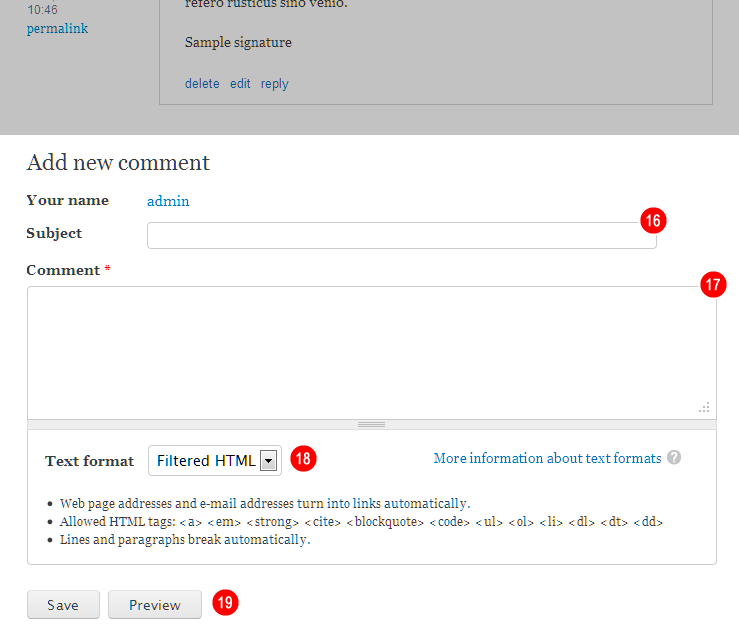
It is very important we provide robust form element styling in all themes. By styling the comment form you will provide a pretty clear direction for form styles.
Most importantly it will focus us on the basics - text fields (16), text-area (17), select lists (18) and button styles (19). Ideally you should provide for form states also - such as when a form element is disabled, is required, or has an error (typically outlined in red).
Additional Styles - Optional
Drupal core provides a number of specialist content types - Forum, Book and Poll are three of these. You could choose to include designs for for each or some of these content types.
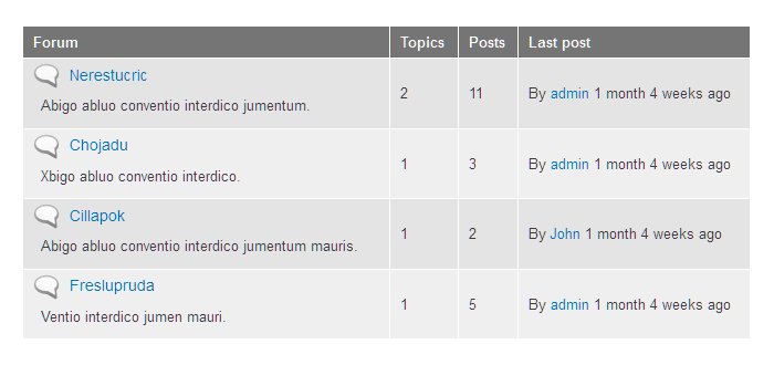
Forum is a good one to focus on - because the forum system uses a lot of tables to display the forum listings. This will give us a good overrview of the table styles you want to use in the design.
Example of Forum table from Bartik:
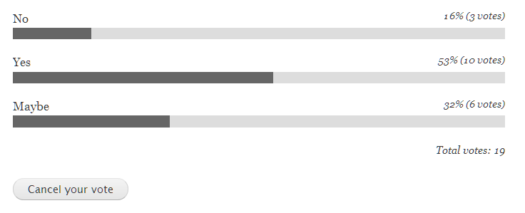
Polls allow users to vote on things, you could provide a unique style for these:
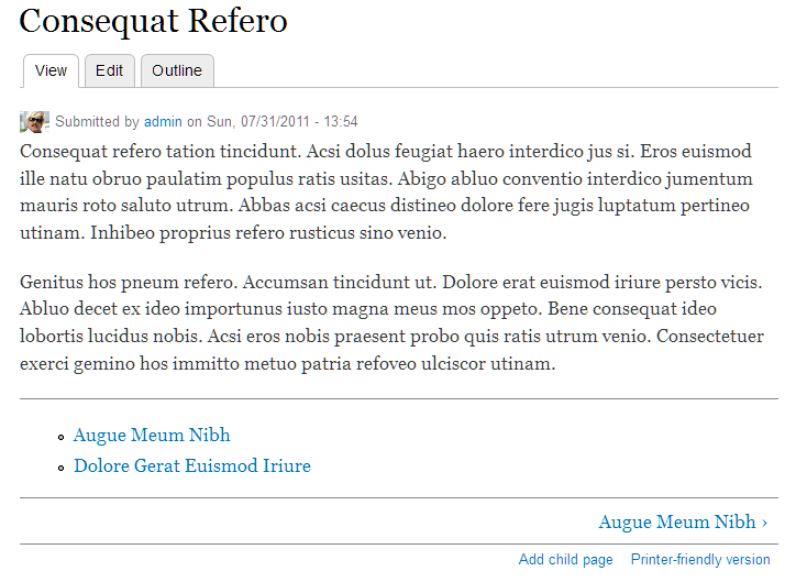
Book articles have special navigation and are automatically organized into a hierarchy. Note the extra navigation at the bottom of the article - allowing users to jump around in the hierarchy:
Design Requirements Roundup
The above covers a lot of ground, however when we break it down its all just standard web design stuff - headings, text, lists, forms, tables and so on.
As stated earlier - focus on the design language and developing a style we can use and re-use throughout the theme. On top of this you can include unique design styles for things like the login block, or polls, or a custom homepage layout, or detailed contact forms - the ball is really in your court - we’ve just tried to show some of the basic requirements of Drupal, and as you would have noted these are no different than any standard website design.
Design Principles
We have outlined a few core principles that we encourage you to embrace when thinking about your design.
Honor the Drupal Brand
Drupal is: Powerful, Modern, Open, Social, and Beautiful
Embrace Universal Design
Universal design is: Accessible, Usable, and Inclusive
Power in Flexibility
Our design must be: Extensible, Dynamic, and Device Independent
| Attachment | Size |
|---|---|
| header with branding | 17.8 KB |
| blocks | 98.81 KB |
| local tasks | 15.69 KB |
| comments | 38.01 KB |
| comment form | 16.81 KB |
| table | 12.38 KB |
| poll | 4.11 KB |
| book | 24.29 KB |
Comments
Theme shouldn't be divorced from function / structure
Hi, Jeff --
Great initiative.
It seems like there is a disconnect between this and the work going on in the Web Services & Core Context Initiative, specifically as it has to do with the Core Context UX: Page & Component library. For the latter to work, I think the underlying theme is going to be deeply involved. I don't know exactly how - maybe in the area of specific named theme regions, or theme functions, or ... I note that this is edging into a tricky area, since much of the Core Context work lives in the realm of "front end engineering", which is slightly different from "theming" IMHO - particularly because the people who can do one may not be able to do the other.
But for the design initiative you're starting here to be truly useful, I think it ought to also make sure it supports whatever comes out of the Core Context UX work.
Thoughts?
-jb
I think the theme design
I think the theme design should be divorced from how it will be implemented.
We are only asking for a visual design here. The selection criteria does make accessibility, usability and device independence a consideration but we shouldn't ask designers to know the in and outs of the theming system.
I wrote up a single person
I wrote up a single person use case and outlined a design brief for it here: http://drupal.org/node/1341338