
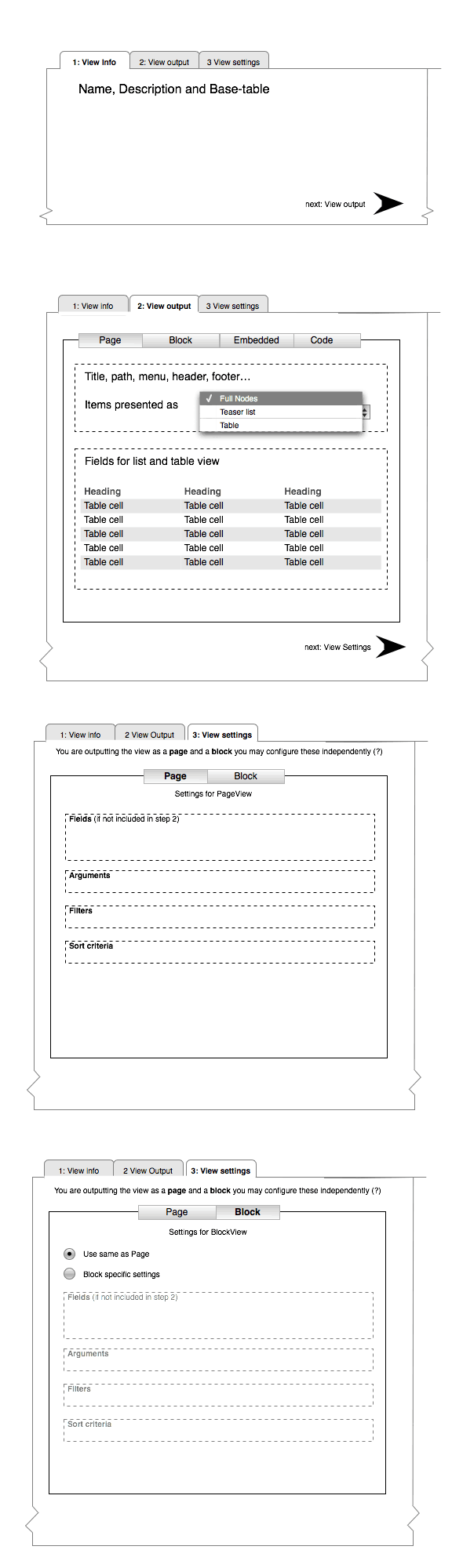
Hi. I'd like to document some links to Views2 UI mockups here. Links to the files have been bouncing around in IRC, maybe this can be a place for further thoughts on how Views2 could best present it's functionality to the user. I'll be updating any new screens here.
These all concern the “create new view” part of the UI, looking for ways to present all the available settings in a more compact layout.
first:
- views2-merlinsmockup.png
merlinofchaos' first html mockup, using 2 columns for some of the settings. This does win quite some space but may be not so clear in indicating which applies to what, it's not really clearhow these 4 litte blocks relate to the big one above. Also knowing the amount of options there are it might be a bit optimistic to try and cram them in half the available widht.
-
Views-UI-bottomdrawer-b.jpg
My personal feeling when creating a View in the current UI is that I'm "drilling down" through all the options. Based on that I came up with this, which sums up Relationships, Arguments, Filters and Sort Criteria in a vertical list but as tabs. This way the form for each could be in the same area. This introduces a new style of tabs which might be undesirable. -
Views-UI-doubletabs.png
So I mockup the same concept with the default horizontal tabs above. This loses the "drilling-down" feeling (which might be just a personal preference) but also disconnects the lower part from the upper. I know the new Views will make it so that Relationships, Arguments etc. can be set differently for each type of output you'll define for your View (e.g. Page-view can have other filters than the same view rendered as a block, right?) -
views-ui-3steps.png
Finally, I took some hints from Panels module, which has more linear, sequential approach in the UI, first do foo, then add bar, etc.
I tried to apply same to Views in this mockup. Don't know if this is possible, but I think a little hand-holding, step-by-step approach could be good for the complex beast that is Views.
I hope I'm helping here, and not confusing things more. Any feedback? It'd be nice to hear how non-devs go about creating a View. My personal analogy is that Views is to Nodes as Smart playlists (in iTunes) is to Songs.
| Attachment | Size |
|---|---|
| views2-merlinsmockup.png | 42 KB |
| Views-UI-bottomdrawer-b.jpg | 74.21 KB |
| Views-UI-doubletabs.png | 36.33 KB |
| views-ui-3steps.png | 44.15 KB |
Comments
I like...
views2-merlinsmockup.png - clean, small, this was my favorite so far.
Views-UI-bottomdrawer-b.jpg & Views-UI-doubletabs.png - are okay, bottom drawer looked nicer to me, doubletabs looked standard Drupal.
views-ui-3steps.png - reminded me of OS X apps, which isn't bad. Great start and I like wireframe more tha mockups since people don't get stuck on unimportant details.
Chris Charlton, Author & Drupal Community Leader, Enterprise Level Consultant
I teach you how to build Drupal Themes http://tinyurl.com/theme-drupal and provide add-on software at http://xtnd.us
thanks for looking
I got tired of making screengrabs too, I'll stick to wireframes in OmniGraffle from now on.
I think
Unfortunately, some of the concepts are wrong...
As a matter of fact, no. Only fields can change, but filters, sort, and arguments stay the same for every display type (the tabs in merlin's mockup).
Ok, thanks for explaining.
Good to know. I'll try to update the mockups accordingly.
Had a 'wild idea,' since I
Had a 'wild idea,' since I saw it already most if it in panels 2.
How about making all the different blocks (e.g. arguments, relationships, etc') - in JS panes. Like this user can do two things:
1. move them around as they wish, and to place them according to their needs.
2. collapse/ expand panes.
I prefer the last mockup
I prefer the last mockup (the 3-steps, Panels 2-ish one). If only for the sake of consistency in Views 2 / Panels 2 administration UI, I think this is the best. All 3 others are not 100% clear about the fact that you can't have settings for each different View output.
I agree with Wim, I like to
I agree with Wim, I like to panels 2 UI
I actually dislike
I actually dislike multi-page as it can take longer if you're working with a lot of views. I haven't looked at Panels2 to compare, but I like the first two mockups.
Right on
The current views UI is quite complicated, so I applaud any improvements. I'm happy to see this is being worked on.
My feedback:
The first one is way too crowded. There is no reason for the 2 by 2 arrangement other than to save space.
Second one is better. Disadvantage is the new tab style, as you said. And still feels a bit cramped.
Third one is worse. How does the second row of tabs relate to the first row? Hierarchical? Are they independent? It's not clear.
That leaves the fourth one. Which I actually like. Two rows of tabs, but the hierarchy is clear.
This could be one page with a bit of jQuery (e.g. jstools with Tabs (example)).
A few improvements:
- Leave out the word "View" from the tabs. It should be clear from the page itself that it's about Views.
- "Info" and "Settings" are too general (the whole page is about settings). Info could be "General". Settings, I'm not sure.
- Leave out the Next arrows. The steps should be clear from the tab design and order. (If there are two places to click on for the same action there's something wrong with the user-interface.)
Views UI 3 Steps
I really like views-ui-3steps as it doesn't display too much information to the user at any given time. The suggestion from gaele regarding JSTools with Tabs (this) would really speed up administration and avoid the frustration when doing a lot of Views manual labor tasks.
Yeah 3 steps looks good.
Yeah 3 steps looks good. Using jstools tabs - you mean no ajax calls between tabs unless there's a save/update? That'd be great yeah since I often have to check things back and forwards in the single page view.
+1
views-ui-3steps.png is awesome
.............................................
http://twitter.com/inadarei
three
three is my favorite of the bunch. I agree that views should be welcome to use a wide array of JS tools, I find myself annoyed even using views simply because the page takes so long to load at times, anything to make this more interactive and intuitive would be great.
vision media
350designs
Tj Holowaychuk
Vision Media - Victoria BC Web Design
Victoria British Columbia Web Design School
Tabs are nice
Using ajax/dhtml tabs to replace the dhtml field groups in the current UI could be a nice change. I don't quite understand the last mock-up, with "next" links -- I am constantly moving through the different settings in a view and don't consider it a serial process. Having tabs in the order the field groups are now would convey enough of a serial nature.
I'd also recommend having a class set on any tabs where settings have been defined, so that one can see at a glance that, for example, fields and arguments have been set but the sorting order has not.
Laura
pingVision, LLC
PINGV | Strategy • Design • Drupal Development
I agree
It would be nice to have a visual notice of which sections have been altered or not
vision media
350designs
Tj Holowaychuk
Vision Media - Victoria BC Web Design
Victoria British Columbia Web Design School
subscribing
subscribing
Bevan/
How does it look right now?
I have not had a chance to checkout the head of views2
Tj Holowaychuk
Vision Media - Victoria BC Web Design
Victoria British Columbia Web Design School
I might have a look at a design too
Will post shortly, is it still time ?
The Drupal Agency >> www.raincitystudios.com <<
Me on the Web >> www.couzinhub.com <<
I'm working on the UI right
I'm working on the UI right now, so yes there is time, but sooner is better.
You might like to demo
You might like to demo webnode before getting too far into this. I think there is a lot of great UI ideas (and bad ones too) there that are useful in views' UI. I wish I had time to document them better for you.
Bevan/
Bevan/
My Contribution
Here is my contribution, the view interface would use some Jquery to display TABS that would not need to reload the page if selected, and some Ajax (I think.. I'm just a designer ;) ) similar to the password check, to display info about required fields, and if the view validate or not to be submitted.
I Designed few steps, but basicaly it would work like the original view, but each field is in a tab. If a tab is required and not filled yet, there's a red light that indicate that the user should fill it. Some light are black if the tab is not required, but would turned green too if filled correctly.
I just modified the way Page / Block are displayed, and re-united them inside one Tab. Also, I didn't designed it, but you will notice that Exposed filters is missing, it's because I was thinking that it should belong inside the FILTERS tab.
Also, very important, I use the DRAG AND DROP to reorganize fields, filters, or sort criterias...
See the previews here :
http://www.couzinhub.com/Views2-UI/Views-2-UI-1.jpg
http://www.couzinhub.com/Views2-UI/Views-2-UI-2.jpg
http://www.couzinhub.com/Views2-UI/Views-2-UI-3.jpg
http://www.couzinhub.com/Views2-UI/Views-2-UI-4.jpg
http://www.couzinhub.com/Views2-UI/Views-2-UI-5.jpg
http://www.couzinhub.com/Views2-UI/Views-2-UI-6.jpg
The Drupal Agency >> www.raincitystudios.com << WE LOVE TO BUILD
Me on the Web >> www.couzinhub.com <<
Nice!
I like this one a lot. It is similar enough to the way the Views works now that it would be easy to get used to, and the tabs make it easy to see what things are done and what things still need to be filled out.
I think the views UI still
I think the views UI still needs to stay consistent with the theme for the majority, having different tab styles just makes it stand out more in an un-attractive way IMO,
vision media
350designs
Tj Holowaychuk
Vision Media - Victoria BC Web Design
Victoria British Columbia Web Design School
Great work Hub!
Morning Hub(!),
After having a day to sit on some thoughts regarding the Views UI that you posted yesterday, I thought that I'd share a couple points that should be noted. Not directed to your example exclusively, but I can't help but think of the possible problems of a user having to adapt to a new UI.. as apposed to something that's more generic and continual with other interfaces within Drupal.
I think the best way to approach a great UI design, not Views in particular, is for it to be easily adaptable with future modules. Something that's timeless and re-usable.
Notes for your design:
Validation of input fields.
- Instead of having graphical notations or icons to indicate required fields, what about defining a thick red border (or some other eye catching colour) around the input field? Personally, the red asterisks don't catch my attention enough and I sometimes overlook required fields. By removing icons, this would decrease having the need to package the module with unnecessary icons, and allow users to theme them if needed.
Drag and Drop fields
- Definitely needed. Love the implementation.
Fields tab
- Not a big deal, but something to point out. What if we had the "Add fields" reflected on both the top and bottom of the area that shows what fields are already shown. If a user has a lot of fields displayed, scrolling up and down to add fields would be a hassle. Same thing for the sort criteria "add criteria" box.
Other than that, looks great! Hopefully I can free up some time next week to help out.
Cheers!
Production Designer & Developer
Raincity Studios
I work at The Jibe Multimedia, Inc.
Good points
I like the red border ideas instead of icons. Even though I don't think that people would spend time in theming the views interface, as it's only for dev/theme-crowds, it's a good idea to try to stay away from too much 'iconisation'.
About the field thing, I'm not sure.. it means that we would have 2 fields to start, and that could be confusing, but maybe instead of having the add field at the bottom, putting it on the TOP ONLY would save some time. The user would just add the fields without having to scroll down, and then re-organize them with the drag and drop function.
And Steve... stop using big fonts, I feel scared now :) !
The Drupal Agency >> www.raincitystudios.com <<
Me on the Web >> www.couzinhub.com <<
Tab with red x is confusing
The tab with the red X is really confusing I think. It's better you use the Stop icon from the Tango icon collection up there as well as text saying "view not valid". That tab can very easily be confused with "delete this view" or "close screen/end editing".
Jakob Persson
Webbredaktören - www.webbredaktoren.se
Jakob Persson – Leancept – Results-only digital and marketing consultants – Personal blog
I totally agree, very good point
I'll work on the last tab, you're right it's very confusing. Also I've noticed that the SUBMIT button is missing... I think the submit button should be under the form, but not only when the last tab is active, on all of them, so you can submit the view at any time.
About the tabs, that's a good point. I actually used the new ZEN THEME default tab, as it is the one that most of the themers use for a new website, thinking that these tabs are not too fancy and they would fit it most of the designs.
The Drupal Agency >> www.raincitystudios.com <<
Me on the Web >> www.couzinhub.com <<
Views UI Status
What is the current UI status? Im sorry for asking but I dont have time at the moment to check out the repo, but im curious where the design is at
vision media
350designs
Tj Holowaychuk
Vision Media - Victoria BC Web Design
Victoria British Columbia Web Design School
...
Very early stages so not much to see yet. But it's starting to get attention now, so it is progressing.
-
www.alanpritt.com
Views 2 vs Views 1
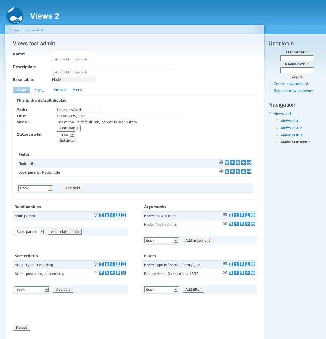
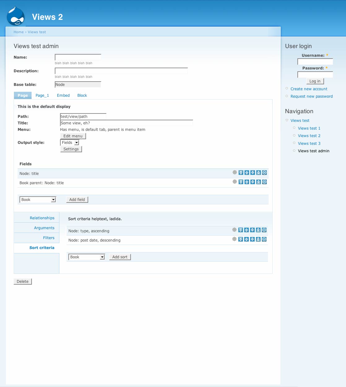
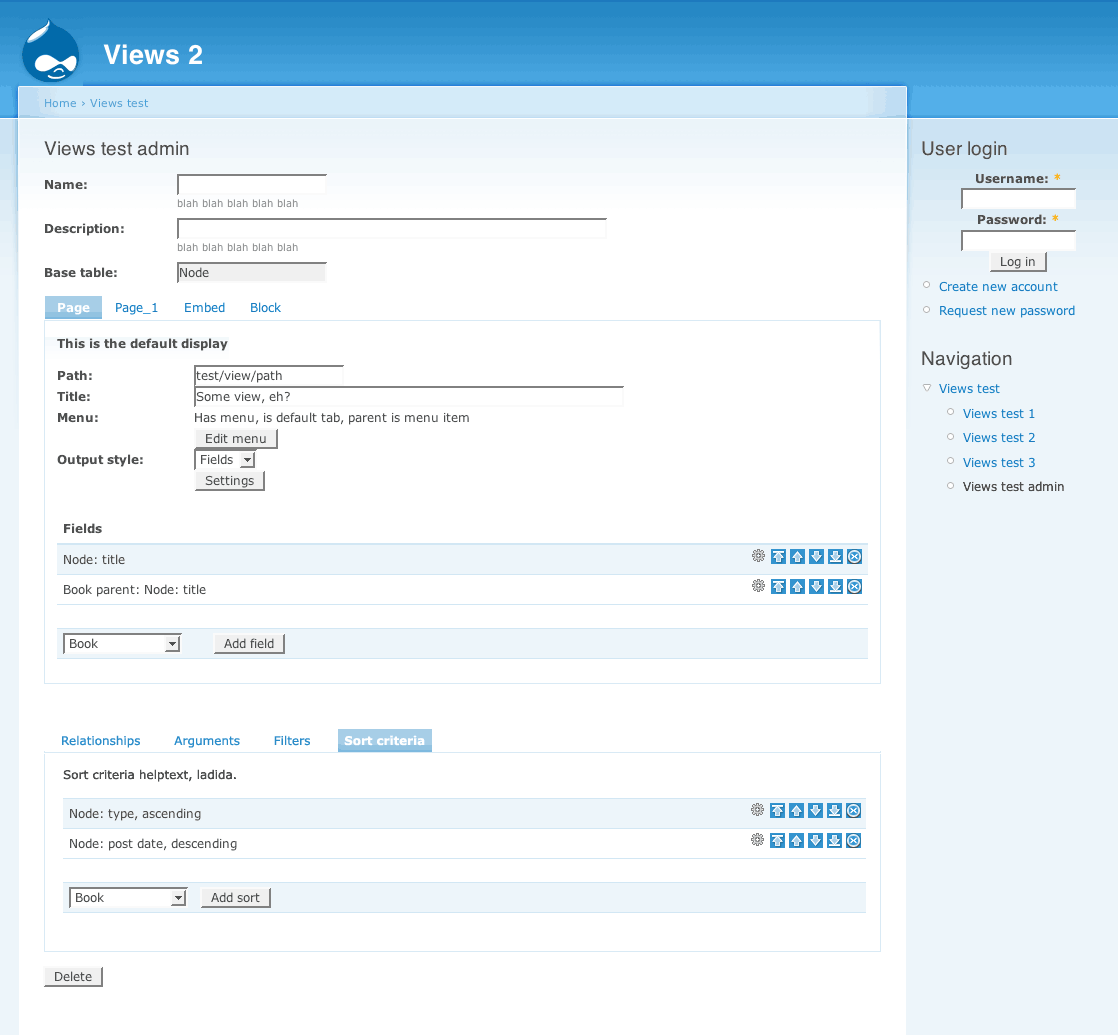
The current Views 2 UI status is ... humble beginnings. I'm trying to figure out a good way to structure the main page and then start editing all of the stuff.
I have a couple of ideas. One major problem with the most recent mockup is that it's purely a mockup of the Views 1 UI, and it doesn't take into account any of the new features from the earlier mockups. Things that the new UI must account for:
Right now, what I'm thinking of is starting with a summary of the entire view, and then each piece of the summary has 'edit this' links to let you go change it. We can use ajax, popups, or just go to another page to do the editing.
I have technology to edit just a piece of the view, so we can span multiple pages easily now, and we don't need to use javascript tabs to do it. I've been dithering about these tabs. However, we shouldn't use Drupal's tab system because it is a little too inflexible; I had problems with it in Panels 2 and I want to go a different direction here.
Could you elaborate this
Could you elaborate this :
"Each display has a style plugin. That style plugin may have an additional row plugin, if the style plugin supports it. Each of these items can have its own settings form that is unique to that plugin. This is one of the most challenging pieces of the UI because you have several dependencies to get to unique forms."
It's the only one I'm really having a hard time to understand...
The Drupal Agency >> www.raincitystudios.com <<
Me on the Web >> www.couzinhub.com <<
Sure. The style plugin tells
Sure. The style plugin tells views how to style the overall list; the row plugin tells Views how to style each item within the list. Not all style plugins can have row plugins, but for those that can, they're interchangeable. i.e, I want a list view where each item is a teaser; or I want a panel view where each item is aggregated fields.
Ideas we are working on in IRC
These are ideas we are working on in IRC now. They are very much incomplete and up in the air.
http://humte.com/files/ViewsUI.png
http://humte.com/files/ViewsUI2.png
http://humte.com/files/ViewsUI4.png
SVG version.... http://humte.com/files/viewsui2.svg
-
www.alanpritt.com
other data types?
Exciting! I noticed that Views 2 allows views based on nodes, users, comments and taxonomy. Are there hooks so that one could expose their own type of data, so it wouldn't have to be tied to nodes?
Aaron Winborn
Advomatic, Web Design for Progressive Advocacy, Grassroots Movements, and Really Cool Causes
Aaron Winborn
Drupal Multimedia (my book, available now!)
AaronWinborn.com
Advomatic
Yes indeed. And you can even
Yes indeed. And you can even use an alter hook to tell existing tables () how they relate to your base table, should that relationship exist.
That'll make Views much more useful as a generic query builder.
You just made my day! Thanks
You just made my day! Thanks for the great work you're doing! (Here comes Views RPG...)
Aaron Winborn
Advomatic, Web Design for Progressive Advocacy, Grassroots Movements, and Really Cool Causes
Aaron Winborn
Drupal Multimedia (my book, available now!)
AaronWinborn.com
Advomatic
Ok guys..
It's a little bit hard to follow but I think I get the general idea of the new functionnalities of views 2... I guess I should change my mockups a bit ... !
The Drupal Agency >> www.raincitystudios.com <<
Me on the Web >> www.couzinhub.com <<
Some notes from IRC
__Type > Display
The display has more to do with where the output goes than what the output is. Think of it as the portal: The 'page' display type means that it has a URL and menu possibilities. Whereas a block doesn't have any of that, but it has an interface to the block mechanism.
__Type > Display > ??
Within each display, anything that tells you how the whole of all of the records are presented is the style plugin. Anything that tells you how just one item is presented is the row plugin.
Tables don't get a row plugin because you've got to have the
<
table> and
Choose list format: List or Table
Configure list items: Teaser, Full, Fields
__ Type > Display > Format > Item
What do you want to display? Where do you want it displayed? How do you want the list formatted? How do you want each item styled?
What, Where and How.
What = basetable: node, users, taxonomy
Where = as a page, a block or something defined by another module
How = Unformatted or List or Table. Then narrow it down to item level: teaser, full post or handpicked set of fields.
http://www.yoroy.com/elders/drupal/viewsui-10.png
http://www.yoroy.com/elders/drupal/viewsui-10.svg
Updated contribution
Hi Guys, I worked a little bit more on the UI, after thinking about all the new functions of the Views 2 module.
Few new Ideas...
First one, the ability to show/hide the descriptions. I've notice that there is a huge amount of descriptions in the view interface, and that after a while, I never read them, so they just stay in the way. Hiding the description also really clears the layout.
I separated the view list from the Filters / Relationships, as to me filters and Rel. apply to all views. I'll change that if filters can be applied to each individual view. If Filters or Rel. apply to each display, it'll make things even easier as it'll just belong to the main window as a tab.
I changed the display of the filters/fields table, and think about using jquery to show/hide the settings of each row. If not expanded, a row can still be moved around with the drag and drop function, or deleted by clicking on the icon on the right. It really help visually not having all these settings always showing up.
To add a page/bloc/rss... the menu should be on top of the list, to avoid scroll down every-time you want to add a new one.
I created a 'sidebar' that list all the view created, and identify them with icons. (page/bloc/rss...). Was thinking also that it would be nice to be able to CLONE a page or block, as there is a lot of settings for each one of them.
For the settings of each Display (page/bloc/...) I still think we should use jquery tabs to avoid reloading the page as much as possible. I also would love having green/red colors that would tell me if the Tab is filled correctly or not, and a little icon on the right that shows if the view is valid or not.
I still need some clarifications about Style plugins and Relationships to come up with a coherent UI.
Hope you like it ;) !
http://www.couzinhub.com/Views2-UI-2/Views-2-UI-2-1.jpg
http://www.couzinhub.com/Views2-UI-2/Views-2-UI-2-2.gif
http://www.couzinhub.com/Views2-UI-2/Views-2-UI-2-3.gif
http://www.couzinhub.com/Views2-UI-2/Views-2-UI-2-4.gif
http://www.couzinhub.com/Views2-UI-2/Views-2-UI-2-5.gif
http://www.couzinhub.com/Views2-UI-2/Views-2-UI-2-6.gif
http://www.couzinhub.com/Views2-UI-2/Views-2-UI-2-7.gif
The Drupal Agency >> www.raincitystudios.com <<
Me on the Web >> www.couzinhub.com <<
I find your wireframes
I find your wireframes confusing because the user is to create 'views' while they are trying to 'Add a view'. I think the word for the inner 'view' (page, block, etc) is 'display'. Right Merlin?
I agree the red/green tabs help communicate the status / progress. But it is unconventional. I'm not sure if it's worth that trade-off.
Bevan/
Bevan/
Yes, 'display' is the right
Yes, 'display' is the right word. I introduced this confusion in my mockup to see if it made things clearer for newbies. But it causes too much confusion so it was a bad idea.
-
www.alanpritt.com
Wireframes for creating a new view.
Answer this question and you're set to start configuring a new view! Option A seems to be the favourite in IRC.
Some more important info to know:
Fields and arguments are display specific. And (for now), filters, sort criteria and relationships are global only.
A is definitely easier to
A is definitely easier to understand than B. B has too many 'blanks' to be filled that it isn't easy to understand or read.
I can see why relationships would be global across a whole website, but not filters or sorts. Surely they either view-specific or display specific.
Bevan/
Bevan/
Not global across a website,
Not global across a website, but global across a view. (This matters because I've been kicking around the idea that sort criteria and filters might be specific to just a given display; so that a block might have a different filter than a page, or two versions of the same page might have different filters).
general rules, overide
Would it be possible to set a 'general rule' for all the display, and then being able to override them in each display if needed ?
For example, with sort criteria, I would define a general rule to sort the nodes by 'creation date'. Then if I don't specify any sort criteria for a display, it will use the general one : 'creation date'. But if I create another display, that would be a block, if I would like it to sort the nodes differently, let's say by 'last update', I could override the general setting of the view to only apply it to the specific display.. does that makes sense ?
I took the example for sort criteria, but I imagine we could think about the same system for other things like filters or else... even if I think that filters is more of a general rule only...
The Drupal Agency >> www.raincitystudios.com <<
Me on the Web >> www.couzinhub.com <<
sort criteria and filters
I don't know the details of why views now have displays, but IMHO that defeats the purpose of displays. It brings us back to the same problem we have in views1 where you need to duplicate views in order to have multiple blocks, pages or other displays.
If this level of flexibility is required at the display-level I think it makes sense to make displays to inherit it's views' sorts and filters by default, but allow displays to override them too. But I think that's a very rocky track as the difference between a display and a view is then very quickly blurred and made confusing.
Bevan/
Bevan/
...
Yes, that's exactly what happens: create 1 display first, then add others that may override some of the default settings:
- Fields and arguments are display specific.
- Filters, sort criteria and relationships are global.
Displays will allow you do the things you'd create 2 almost idential views for now. Create a page with teasers and a block with specific fields for the same dataset.
I think we should map the creation of a new view as closely to the existing process: configure the view for 1 display first (creating the default settings), only after finishing that, you'll be able to add a new display and override the defaults with display-specific arguments and/or fields.
I've had plenty of use cases
I've had plenty of use cases for tweaking sorts and filters for very similar views, so this would save some duplication. Having the initial sort set unless overridden elsewhere sounds sensible too.
Of all the wireframes here I
Of all the wireframes here I find The first one by merlin easiest to understand: http://groups.drupal.org/files/views2-merlinsmockup.png
This is partly because it's fairly similar to views 1 and doesn't feel completely new. However that often-snubbed carry-over factor shouldn't be ignored for this UI, considering the vast majority of views 2 users will be migrating from views 1.
Having said that, there is room for improvement here and chunks missing. parts of other wireframes fill these gaps. For example, a first step is required to establish what type of view (node, user, comment) it is. Also the wireframes for the settings page / popup / thickbox for each relationship, field, filter, sort are missing.
I think the main thing I like here is that the displays are above the view-settings. An probably-good alternative to this visual separation is perhaps to have separate pages for global settings and displays, or even each display. The general rule thumb that applies here is "If you your form is too long or complicated, split into more pages".
The 2x2 layout of the global settings is possibly confusing. What about putting them in an accordion?
Bevan/
Bevan/
On second thoughts, I'm not
On second thoughts, I'm not sure accordion is an improvement here.
I'm far more convinced that there needs to be separate urls, forms and pages for:
Bevan/
Bevan/
I think that if we want to
I think that if we want to improve the UI, we need to avoid having to reload the page all the time. I've been working with views and panels a lot, and for example, I found one of the most frustating thing in both UI is that you reload the page all the time, even when you change the order of the fields or else.. it's time consuming, and totall un-productive.
Also, Views is really suffering from a huge lack of hierarchy in the presentation of the form. All the field are listed in a no-ending list and you don't see the difference between field / sort criteria / filters right away.
And we shouldn't feel like we can't change things because it's 'unconventional', especially if it's a visual help in the understanding of the process. Our only concern is to make the UI easy to use, and easy to understand, even (and especially) by users that are not used to drupal.
We should also really take advantage of all the latest technical improvement, like jquery / ajax / etc... to make the UI really interactive.
I really don't think, especially as a View user, that lots of different pages would be a good idea. Not only it would be a long process to create a view, but it would also be a drag to just access the information I want to edit. The actual view 1 UI has all the settings on one page, and I don't think that we should change that, except maybe for the introduction page where we put the information that will not be editable after creating the view.
The Drupal Agency >> www.raincitystudios.com <<
Me on the Web >> www.couzinhub.com <<
And we shouldn't feel like
And we shouldn't feel like we can't change things because it's 'unconventional', especially if it's a visual help in the understanding of the process. Our only concern is to make the UI easy to use, and easy to understand, even (and especially) by users that are not used to drupal.
I disagree with this. It is important that the Views UI conform to the UI of the rest of Drupal. Views is not an application by itself, it is an application within Drupal. Drupal sets certain expectations of UI; Views must conform to them or it is a poor player in the game.
...
"we need to avoid having to reload the page all the time"
Basically I agree. I think it is pretty obvious that it would be best to change the order of fields, etc through javascript. Dividing the page into separate URLs for each display/global settings is another question entirely. One for which I think there are both problems and benefits. If you put everything on multiple pages, you have to keep refreshing the page. Put everything on the same page, you risk succumbing to a complicated layout.
It's also worth considering this from the perspective of how each display will be accessed via local tasks.
"And we shouldn't feel like we can't change things because it's 'unconventional', especially if it's a visual help in the understanding of the process. Our only concern is to make the UI easy to use, and easy to understand, even (and especially) by users that are not used to drupal." (my emphasis)
I somewhat agree and somewhat disagree with Merlin here. Even when an application decides to use a different UI approach to everything else (for example in save dialog boxes) it is confusing because the user has to relearn the interface. So convention is really important. However, if it truly does make the interface easier to use then we shouldn't be afraid to fight convention; it would be silly not to since ease-of-use is the goal whereas following convention is a means to that goal. The way to judge is to look at the learning curve vs. the frequency of use.
-
www.alanpritt.com
Note that there is a point
Note that there is a point where fighting convention leads to massive code bloat, because we can no longer use Drupal's tools to do things. For example, those nice red-box error messages on form validation? That's all automatic. If we decide to do it differently (javascripted red tab, for example) that's a LOT of code that must be written for that feature. (Which is why I won't even consider that one).
I understand that
I understand that sometimes, an idea that seams easy for a designer like me might be very hard to code... In that case I totally agree that we shouldn't use a tool if it require too much code to build, and start to think about other ways to improve the IU. Maybe we should actually think about developing such tools not for views 2, but as a project in Drupal 7 UI. This way we can think about a general way to improve the UI in Drupal, and and make it available for all modules.
The Drupal Agency >> www.raincitystudios.com <<
Me on the Web >> www.couzinhub.com <<
Views 2 visualisation
This tries to visualize the hierarchy of available settings in views 2.
That's really useful. Do
That's really useful. Do you think we could also see a print_r of a views object? I would expect it to be analogous to the hierarchy you have communicated, and that we need to communicate to the user.
Often the actual backend data structure has a close relationship to the UI hierarchy / layout.
Bevan/
Bevan/
var_export of views object
<?php
      view Object
      (
          [db_table] => views_view
          [base_table] => node
          [built] =>
          [executed] =>
          [args] => Array
              (
              )

          [build_info] => Array
              (
              )

          [use_pager] =>
          [page_size] => 25
          [pager_element] => 0
          [offset] => 0
          [current_page] => 0
          [vid] =>
          [name] => views_test2
          [description] => A view being used to test some handlers.
          [tag] =>
          [view_php] =>
          [is_cacheable] => 0
          [display] => Array
              (
                  [0] => views_display Object
                      (
                          [db_table] => views_display
                          [vid] => 0
                          [display_plugin] => page
                          [id] => page
                          [access] => Array
                              (
                              )

                          [style_plugin] => default
                          [title] =>
                          [header] => header text!
                          [header_format] => 0
                          [header_hide_empty] => 1
                          [footer] => footer text!
                          [footer_format] => 0
                          [footer_hide_empty] => 1
                          [empty] => empty text!
                          [empty_format] => 0
                          [use_pager] => 1
                          [url] => views_test2/view
                          [block] => 0
                          [position] => 0
                          [display_options] => Array
                              (
                              )

                          [style_options] => Array
                              (
                              )

                          [filter_options] => Array
                              (
                              )

                      )

              )

          [argument] => Array
              (
                  [0] => views_argument Object
                      (
                          [db_table] => views_argument
                          [vid] => 0
                          [position] => 0
                          [tablename] => node
                          [field] => type
                          [relationship] =>
                          [type] =>
                          [style] =>
                          [default_action] => summary asc
                          [title] =>
                          [wildcard] => *
                          [wildcard_text] => All
                          [options] => Array
                              (
                              )

                          [default_argument] => ignore
                      )

              )

          [field] => Array
              (
                  [0] => views_field Object
                      (
                          [db_table] => views_field
                          [vid] => 0
                          [position] => 0
                          [display_id] => 0
                          [tablename] => node
                          [field] => title
                          [relationship] =>
                          [options] => Array
                              (
                              )

                      )

                  [1] => views_field Object
                      (
                          [db_table] => views_field
                          [vid] => 0
                          [position] => 1
                          [display_id] => 0
                          [tablename] => node
                          [field] => created
                          [relationship] =>
                          [options] => Array
                              (
                              )

                      )

                  [2] => views_field Object
                      (
                          [db_table] => views_field
                          [vid] => 0
                          [position] => 2
                          [display_id] => 0
                          [tablename] => node_revisions
                          [field] => body
                          [relationship] =>
                          [options] => Array
                              (
                              )

                      )

                  [3] => views_field Object
                      (
                          [db_table] => views_field
                          [vid] => 0
                          [position] => 3
                          [display_id] => 0
                          [tablename] => node_revisions
                          [field] => teaser
                          [relationship] =>
                          [options] => Array
                              (
                              )

                      )

                  [4] => views_field Object
                      (
                          [db_table] => views_field
                          [vid] => 0
                          [position] => 4
                          [display_id] => 0
                          [tablename] => node
                          [field] => status
                          [relationship] =>
                          [options] => Array
                              (
                              )

                      )

                  [5] => views_field Object
                      (
                          [db_table] => views_field
                          [vid] => 0
                          [position] => 5
                          [display_id] => 0
                          [tablename] => node
                          [field] => promote
                          [relationship] =>
                          [options] => Array
                              (
                                  [type] => true-false
                              )

                      )

                  [6] => views_field Object
                      (
                          [db_table] => views_field
                          [vid] => 0
                          [position] => 6
                          [display_id] => 0
                          [tablename] => users
                          [field] => name
                          [relationship] =>
                          [options] => Array
                              (
                                  [type] => true-false
                              )

                      )

              )

          [sort] => Array
              (
                  [0] => views_sort Object
                      (
                          [db_table] => views_sort
                          [vid] => 0
                          [position] => 0
                          [tablename] => node
                          [field] => created
                          [relationship] =>
                          [order] => ASC
                          [options] => Array
                              (
                              )

                          [exposed] => 0
                          [exposed_options] => Array
                              (
                              )

                      )

              )

          [filter] => Array
              (
              )

          [relationship] => Array
              (
              )

      )
?>
Switching
Swittching to omnigraffle... it's a bit too early for photoshop :)
The Drupal Agency >> www.raincitystudios.com <<
Me on the Web >> www.couzinhub.com <<
I've tried to regroup some
I've tried to regroup some of the ideas here to create a new UI preview. This version would be separated in two main pages. The first one would be the main informations about the view, and the second one would be the settings of the view. The second page is separated in two tabs, one for the general settings, and one for the Displays settings.
The Jquery tabs would only be used to switch between general and display settings, and also to navigate through the settings of a particular display.
I'm also thinking that there could be a third main tab that could contain the Display settings, but I like the idea of being able to quickly switch from displays to general settings. A third Tab would make this version closer to the 3 steps of Yoroy.
You can download the PDF here :
http://www.couzinhub.com/Views2-UI/views2-4.pdf
The Drupal Agency >> www.raincitystudios.com <<
Me on the Web >> www.couzinhub.com <<
W00T! :)
This is starting to come together now I think.
Nested tabs can be disorientating and require too many clicks. I also have reserves about tabs as the parts of multi-step. How about we make the first step of creating a view the view-add form which has 'Basic info', and nothing else. The second step is view-edit which is the same whether you've come from view-add or elsewhere. It has just one row of tabs:
This also resolves the language issue of 'View settings': It could mean 'see the settings here' or 'setting for this view object'.
The use of fieldsets here is alarming. We are trying hard to get away from fieldset overkill syndrome. On 'Displays' there will be an arbitrary number of fieldsets. This is what leads to fieldset-itis. See imagecache v1, adsense module, and node add/edit forms with lots of CCK for examples of this UI blunder.
Above, I suggested we use tabs for each display, however this is probably also problematic as there is an arbitrary number of displays, and the width of the screen is limited. Perhaps we need a table? What is the range of number-of-displays a view is likely to have? I'm thinking 1 to 10. Is that reasonable? Is use of a table justifiable here? My initial thought is no, but there aren't many other reliable patterns for managing an arbitrary number of displays.
The fieldsets on 'View settings' > 'General Settings' could work better as vertical tabs, as we are discussing over in the node add-edit form threads, and demonstrated in one of the first mockups: http://groups.drupal.org/files/Views-UI-bottomdrawer-b.jpg.
I still think each of these tabs should have their own page and url. However it seems to be a subjective matter.
@couzinhub I'm trying to get my head around omnigraffle. I'm having toruble working out why it's more useful than adobe illustrator and grokking it's usage. I'd love to communicate my ideas here with a wireframe, and this looks like a good opportunity. Would you mind providing the above pages as omnigraffle file/s?
Bevan/
Bevan/
OmniGraffle
OmniGraffle is nice when wireframing for two main reason : unlike illustrator, you can have multi-pages, and there is a lot of little-automated things that illustrator doesn't do, that are dedicated to wireframing (like the arrow thing and hierarchy)
here is my graffle doc :
http://www.couzinhub.com/Views2-UI/views2-4.graffle
And here is a link to the online omnigraffle tutorials that are really well done :
http://www.omnigroup.com/applications/omnigraffle/tutorials/
You can also download the extra objects for web-wireframing :
http://v1.garrettdimon.com/resources/templates-stencils-for-visio-omnigr...
Working on some modifications..
The Drupal Agency >> www.raincitystudios.com <<
Me on the Web >> www.couzinhub.com <<
On the issue of mulitple tab
On the issue of mulitple tab sets being confusing and disorientating: http://groups.drupal.org/node/8305#comment-25532
Bevan/
Bevan/
Playing around with tabs...
On this version, the first page is only seen when creating the view, and there would be only one page to edit the entire view. It's divided in two sections : Displays on top, and General settings on bottom.
Each section has its own tabs, BUT, as general settings have always the same amount of tabs, I think we can use horizontal tabs, and as there will be a flexible amount of displays, we should use vertical tabs. It is good in the way that you visually see the difference between displays and general settings.
I'm also not liking the collapsible fields, but I was thinking about an alternative, that would still be a collapsible field, but with some editable functions even when collapsed. This way you can still edit them without having to expand them. It might be a bit confusing on this wireframe because it looks like the fields, but some design options should easily fix this.
download the pdf here :
http://www.couzinhub.com/Views2-UI/views2-6.pdf
The Drupal Agency >> www.raincitystudios.com <<
Me on the Web >> www.couzinhub.com <<
There are a lot of elements
There are a lot of elements I like about this.
1) No weights. They are terrible UI. They make the user think, and do math. I won't put them in. I'd much rather stick with something like what I have.
See: http://nodequeue.logrus.com/admin/content/nodequeue/6/view/15
This UI isn't drag & drop, but it works with or without javascript. It's worse without js, but it works.
2) Access is per display; it may not be valid for all displays (tho, I might make it mandatory). I'm not completely sure that access is important enough to put on the first page, anyway. Also, I want to add a little UI to the access control so that a permission field can be selected from a drop down in place of selecting a role. (I have had issues with requiring roles for views that are heavily embedded in code). It'll be an either/or situation: Either you use the roles selector, or you pick a single access flag from a select box. Probably with js to help improve the UI for it.
3) If my site has 10 filters, the radio buttons are going to fail.
4) I'd like something better than a select box for adding fields/filters/sort criteria. There's no good sense of what each one. Right now I'm thinking radios in a scrollable div, that way the descriptions are right there. And instead of "Node: Title" there will be the 'Node' group and under that 'Title'.
5) I'm not sold on the tabs; I'm not convinced they will degrade usably.
6) I'm currently experimenting with a system where the base edit page is basically not editable, but gives you a summary of everything on the view and then leads you to separate pages where you can edit these items. Yes, this is more clicking; but it's less scrolling, and you can get a better sense of what you have in the summary data. http://views2.logrus.com/views-ui1.png is a really lame version, but it's actual working code, at least. =)
1) Nodequeue's approach is
1) Nodequeue's approach is definitely the best JS-less option. Joomla also implements this UI pattern very effectively. However DnD is even easier and more flexible. Do you think we can get it in to Views2 UI?
2) Access by permissions will indeed be very useful!
3) We both mentioned issues around the 'Full HTML', 'Filtered' input filters.
4) I think this could work well -- in a thickbox (or another page). If we're going to create a new frame or window for it, why don't we allow the adding of multiple fields at once? Could the backend support this?
5) Mull on it for a while and check out what we're doing with this idea on node-forms, especially v2 r6. It took a number of us some time to embrace.
6) Chx raised a very valid point in regards to number clicks. I think a 'view' of a View would be useful, but I don't think it's worth the compromise of the number of clicks. Note that any of these wireframes can be made into a view by simply making fields into text. An compromise is to have inline-editable fields. This involves a lot of asynchronous form validation which is tricky and tedious, but can make an excellent UX (user experience).
Bevan/
Bevan/
1) I'd have to write my own
1) I'd have to write my own as the Drupal 6 one relies on Drupal's weight concept for the js-less variant. I took a look at the code and I pegged it as requiring a few days for me to deconstruct. Doing drag & drop in tables is inherently difficult. Of course, if I do fake tables, I've already got some javascript drag & drop code lying around that I could probably repurpose (and in so doing I could end up improving the re-usability of that code a lot).
4) Actually yes, and that could be a very interesting time saver. Add a bunch of fields at once, then rearrange the order with a js re-orderer.
5) I actually love the tabs for the form page already. I'm just not sure I'm sold on it here. For one, it requires maintaining a lot of form at once. One of the nice things about this is that I can do it in pieces; and that really helps because the form is very very pluggable. Two different Views are going to have some distinctly different form elements, because of the structure of the view.
6) Well, the reason to add clicks is this: If I have links that take you off-page, when you click that link, you're going to run the risk of losing unsubmitted form changes, unless every link is a button and thus the form submits. Now, that's not actually impossible, mind you. Inline-editing can also solve some of that problem, but that's a difficult-to-degrade option.
5) I actually love the tabs
The wireframed interfaces v7 and v6 (a little more difficultly) could be implemented with each tab having it's own url.
This captures many of the advantages of smaller forms that you mentioned. For JS-enabled browsers each tab's link could be 'caught' and the loading of the new form could be done inline with an asynchronous query for the form. This would be kind of like a larger-scale inline-edit approach. I think jQuery tabs supports this accessible behavior.
The problem here is form-submission, which may need to be done any time a tab is clicked. (Also, would it be permanent to the views tables, or temporary to the user's session?) If we can overcome that issue I think we might have a great compromise of form-code-maintainability, fast interface loading (with ajax), and accessibility. Which add up to a great UI, UX and most of all views! :)
Bevan/
Bevan/
The problem here is
For degradability, that'd mean tabs have to be form buttons; that probably doesn't work.
On the plus side, I've already got it set up so that it'd be temporary...sort of to the session. It's actually stored in a table server side that is keyed to the session (so that the session doesn't become cluttered). So it's perfectly ok to split up the Views work across many forms.
For degradability, that'd
For degradability, that'd mean tabs have to be form buttons; that probably doesn't work.
Ah, yes. From a usability POV that would be nasty. An alternative that comes to mind is making all of the tabs submit buttons but that's even nastier...
Any other ideas?
Bevan/
Bevan/
Still playing..
And why not everything in vertical tabs ? We can do two sets of tabs, to separate displays and settings...
See PDF :
http://www.couzinhub.com/Views2-UI/views2-7.pdf
Lucky 7# ?
The Drupal Agency >> www.raincitystudios.com <<
Me on the Web >> www.couzinhub.com <<
Great! I have a lot of
Great! I have a lot of feedback, be patient! :)
"node list" in the summary at top of page 2 needs to be more flexible. The alternatives to 'list' are 'Full Nodes', 'Teasers', 'Table' and others (it's extendible, at least in views1 anyway). And "node full teasers" doesn't really make sense.
The drawers / vertical tabs work really well here. The 'Add Display' interface might work better on the LHS above or below the displays tabs / links in v6. v7 is very clean in regards to the UI, but it's often handy in many tasks to be able to see the display settings (Header, arguments) and global arguments or filters (or other combinations) at the same time, which isn't possible with v7.
Are the display types extendible in views 2? Or are we always limited to block, page, embedded, and feed? If not extendible, we could simply have four "Add Foo" buttons? This would help dramatically to contextualize wtf 'displays' are for both new and migrating users.
What's the initial state of a new view once you get to view-edit? Does it have any activated default displays? If not we need an empty state.
We also need to consider how drawers and vertical tabs look with only ONE drawer. This case will be common enough (especially if migrating from views1) to be pretty important. How can we make the interface make sense if there are no inactive drawers? With horizontal tabs, this is easy because users are used to a tab's typical visual appearance. Not so much with vertical tabs where the typical visual appearance doesn't work.
You have 'View type' in the display settings. I assume this is just left over from earlier wireframes and should be 'Display type'. What does this set? Is it possible to turn a Page display into a Block display or Feed Display?
Page displays don't have URLs, only paths (they're not the same). Also 'Title' is probably more important, at the very least it's one of the only fields that's consistent across all display types, and should be first.
Later we'll need to rethink this for blocks, feeds and embedded displays. Blocks and embedded displays don't have paths or menu items. Feeds don't have pagers, footers or headers AFAIK. Only pages have breadcrumbs...
Menu should be next to Path, as they are very closely related, in both task and function.
I like the idea of showing the most common fields for display settings even when collapsed. However, how does a user expand and collapse the rows of filters and fields, and the Header, Footer, Empty text, Menu item fieldsets? Shouldn't there be a expand/collapse button for this purpose?
Header, Footer and Empty Text should all go above Filters and Arguments. They are often the primary reason for creating a new display, while Filters and Arguments are probably usually secondary reasons -- many or even most of the time the global Filters and Arguments will be sufficient and the Display's Filters and Arguments will be empty. This one is probably subjective.
The options for Full HTML, PHP, Filtered HTML only make sense when you are editing the content of the text area and should only be visible when the text area is visible -- possibly with one extra click. However the 'Use page header' checkbox could go in the collapsed state of these fields as it's useful at all times.
I'm skeptical about the Filters and Arguments layout for Displays. Filters and Arguments for Displays are essentially an extension of the global Filters, Arguments, Sorts and Relationships in General settings. I think this should be reflected in the UI by having the same UI pattern for Filters and Arguments in Displays as the pattern used for global Filters, Arguments, etc. by putting Display Filters and Arguments in horizontal tabs.
Filters, Fields, Arguments, Sorts and probably Relationships in both Displays and a View's global settings all have arbitrarily complex settings and should be configurable with expand/collapse and reorder-able with DnD. Like you have in general settings on both pages 2 and 3, but not in display settings. (Collapsible fields are good IMO, collapsible fieldsets are often not. See the last half of this comment for the difference.)
I'm uncertain about the 'add Foo' UI for Filters, Arguments etc.. But I have no suggestions ATM.
Multiple select fields like on page 3 should be replaced with a checkbox group if there are less than say, 10 items.
Many of the things I'm discussing here are pretty detailed. Input from others, in particularly merlin, would be great here. Is the direction this is taking good, valid, and approved? Or are we wasting time?
Bevan/
Bevan/
Are the display types
They are totally extendible. Panels will have its own display time for sure; the insert view module should have its own display time, as well as the viewfield. There are some exciting possibilities there. A lot of what Views does is tied up in the display, and this can all be overridden. Modules can use this to embed Views seamlessly in very exciting ways, and also can put configuration together.
A view must have at least one display; on the initial add page (and I'm requiring add to be a two step process) you're forced to pick at least one display. Or possibly just one. Or maybe more. There's no reason, for example, there can't be multiple instances of that 'is a page styled as a list'.
This is changing considerably. Also, and this is really difficult -- 'node list' isn't available until you know that you're listing nodes. Because 'node list' has no meaning if you're listing users. Here's the hierarchy (I explained this elsewhere I think but it's worth explaining again):
View type is the table/object you're displaying: Node, User, Taxonomy term, etc. Display type is 'page', 'block', 'panel pane', etc, and they are 1::* per view; i.e, you must have at least one and there is no upper bound to how many you can have. I don't believe Feed is a display type. It's a 'how', not 'where'. This slipped into somebody's mockups and has been following for awhile, but I would like to pull this for now.
Heh. I've always called it URL and never thought about the distinction.
I still don't 'get' the
I still don't 'get' the differences and definitions of display style and row plugins. How do views1 views_style_plugins (full nodes, teaser, list, table) map to these in views2? Can you provide some examples?
Bevan/
Bevan/
List would translate to the
I think I'll need to
I think I'll need to checkout views2 to grok this. Is it in CVS head? How usable or stable is it?
Bevan/
Bevan/
Not stable enough to help
Not stable enough to help you.
Let me give you a situation that might help clarify it. It's one we ran into with the Views Bonus Pack and is actually the inspiration for why it's been split up this way.
In the Bonus Pack, we've got several plugins for the panels style. Each plugin is a different kind of panel. One downside is that they're all teaser plugins; that's all you can put in them. The panel doesn't really care what you display within it, but because View treats the list and each list item as a single entity in theming, if you want panel view with fields, that's a different style than panel view as teasers.
So what this new style means is that If I want to list teasers, I can; if I want to use panels to split a view across the left/right panes, I can put in teasers; or I can change the row style to fields and use simple templates.
IMO there will probably always be a fairly limited number of row styles. Fields + perhaps one specialized to the table type (i.e, node view for nodes, profile view for users, etc) is about all I can think of that makes sense there.
I asked similar questions in
I asked similar questions in IRC and thought I grokked it at the time, not sure if I still do now...
At the moment, there's no concept of a 'row style' plugin - so lists are unordered, tables are tables, teasers are teasers - you get what you're given. Row plugins make things a bit more granular.
So Display plugin: page, block, embedded etc.
Style plugin: list of x, google map
row plugin: unstyled, unordered list, teasers etc - formatting applied to each individual thing/row that's output in the view (currently nodes in views 1).
Actually on that note, has there been any ui work on how field level options will be handled? Things like imagefield/imagecache/thickbox , "as link" etc. if there is I think I probably missed it. At the moment it's fairly tricky part of the views 1 ui.
Actually on that note, has
No not yet. So far we've been trying to accomodate the bigger hierarchy of things. I agree that especially the 'Fields widgets' is a complicated one. As we drill down the levels of configuration we should have a close look at those as well.
Cool. It makes sense to go
Cool. It makes sense to go in that order, I don't have any great ideas on that front but will mull it over a little.
Not a good solution
The buttons you use are fixed width. I have 2560 pixels to work with on my screen, and I would like to have them as in the mockup Bevan served: http://drupal.geek.nz/static/node-form/default/1.html, where each drawer has a one line non-fixed width tab.
And aestetichally his looks much nicer because there are no buttons on each drawer title.
I guess the buttons are there to tell the users that pressing this is an action?
I'll quickly jump in to note
I'll quickly jump in to note that current tablerows drag-n-drop is D6 is not real smooth when rows in the table have different heights.
Which might very well impact the future Views UI - not critical, but sort of lowers the experience...
There's a patch that needs some eyes and love at http://drupal.org/node/196511 :-)
Maybe just using weight
Maybe just using weight would allow to have collapsable fields... why aren't we using weight already btw ??
--- scratch that --- no weight !
The Drupal Agency >> www.raincitystudios.com <<
Me on the Web >> www.couzinhub.com <<
I've created a prototype of
I've created a prototype of vertical-tabs / drawers for node-forms over at http://groups.drupal.org/node/8365#comment-25662
Go straight to the prototype: http://drupal.geek.nz/static/node-form/default/1.html
Bevan/
Bevan/
Nice! the styling is not
Nice! the styling is not perfect but I like this alot better than collapsible fieldsets
vision media
350designs
Tj Holowaychuk
Vision Media - Victoria BC Web Design
Victoria British Columbia Web Design School
Nice !
That looks really cool ! I really think that this should be use more often in drupal !
I was thinking about FILTERS lately, and I have a question : could it be possible that filters can be accessible in each display, not to override, but to refine a display ?
For example, I recently had to create few page-views related to each other, and using views1 I had to create a lot of different views. I thought that views 2 would help me to avoid that, but it will not if filters cannot be refined in displays. I mean that if I set a general filter for the view I am creating, I will not be able to disable this filters in a page display of the same view, but I will be able to add filters only for this display. And I could have an architecture of page views like this with only ONE view :
That would make sens to me as all these views are related as they filter the same node type. Does that makes sense ?
After thinking about that, I realised that it would be very helpfull to display the "default" filters of the view in each displays.
I also updated the latest UI into a new one, trying to grab most of the comment posted here (really not easy ! :) )
download pdf here :
http://www.couzinhub.com/Views2-UI/views2-8.pdf
I now have a 2-block layout : first one is the general settings with vertical tabs, and the second one is the displays, also with vertical tabs (this way would be version 7 with the possibility to view the settings and display at the same time). I Updated the first page to be able to create multi display at one, and that is also available in the main page. I added the multi-select form for filters/fields/... and some icons to show what blocks are expandable.
I hope that tabs are still a valid option right ?
The Drupal Agency >> www.raincitystudios.com <<
Me on the Web >> www.couzinhub.com <<
A different direction
This is based on merlinofchaos' idea (misinterpreted in my head).
Some elements are missing, but this gives a general idea.
http://humte.com/files/ViewsUI-summaries.png
-
www.alanpritt.com
If I understand the Idea,
If I understand the Idea, there would be a consistent lock that regroup all the possible settings of a display, and when you click on a setting, you can modify it in the box in the bottom ? If yes, I think it's a great Idea ! that would make the display a lot clearer. I'm not sure about the tabs though, but it's very close to what it should be already, and might just need some design.
The more I think about it the more I feel like we will have to have each display on separate URLs... :(
The Drupal Agency >> www.raincitystudios.com <<
Me on the Web >> www.couzinhub.com <<
I really like this basic
I really like this basic idea, I think. This breaks the form into very small chunks; lots of information is now hidden, but summarized so you can at least know what is there and what isn't. With the smaller form bits, I can give more guidance about what is going on, and this can degrade to just going to a new page insead of using the ajax area for the small form.
I don't like the two column tabs, but I think we're ok with tabs in general for the displays. Possibly reverting to the vertical design on those.
I would like to focus UI efforts on this model; we need to criticize this and figure out what's wrong with it, but I believe I want to go with this premise.
Updated UI with this idea
http://www.couzinhub.com/Views2-UI/views2-9.pdf
The Drupal Agency >> www.raincitystudios.com <<
Me on the Web >> www.couzinhub.com <<
This is looking very, very
This is looking very, very nice. Both alpritt's mockup and the updated pdf. The space is used effectively and there's ample space for the various settings that'll go in there. Huge, +1.
Can we split the discussion over to a new thread? Would make it much easier for people coming into the discussion to get a handle on where things are and this one is getting quite long now..
Step based
Here is mine. Currently all 8 steps,
http://drupal.org/files/issues/views_configuration_0.png
The idea behind this concept is to use jquery (in the step menu), an avoid any form for scrolling, as the user then loses overview. I think it's better than most of the solutions provided above, but it's not necessarily the final version. I want feedback that can improve this concept. Also, this one is designed to fit header based admin menus.
The svg source for inkscape is here: http://drupal.org/files/issues/views_configuration.svg__0.txt
(remember to remove the __0.txt ending if you wanna make changes)
(Delete me, post was meant
Edit: If I'm reading http://drupal.org/files/issues/views_configuration_0.png correctly it should be workable (note: I have used Views 1 for just a few days so Views is relatively new to me.)
The next button would however be best floated to the top left to be just under advanced configuration.
Having it close to the Create View Button (which is well placed to me) could confuse the user (referring to: http://groups.drupal.org/node/8365#comment-25763) on which one to click.
This solution has been
This solution has been already worked on, but with horizontal tabs, see comment on same page : http://groups.drupal.org/node/6288#comment-25147
or here :
http://www.couzinhub.com/Views2-UI/Views-2-UI-1.jpg
http://www.couzinhub.com/Views2-UI/Views-2-UI-2.jpg
http://www.couzinhub.com/Views2-UI/Views-2-UI-3.jpg
http://www.couzinhub.com/Views2-UI/Views-2-UI-4.jpg
http://www.couzinhub.com/Views2-UI/Views-2-UI-5.jpg
http://www.couzinhub.com/Views2-UI/Views-2-UI-6.jpg
The Drupal Agency >> www.raincitystudios.com <<
Me on the Web >> www.couzinhub.com <<
My vote is with horizontal
My vote is with horizontal forsure, and im not really a huge fan of the tabs for these they look out of place
Tj Holowaychuk
Vision Media - Victoria BC Web Design
Victoria British Columbia Web Design School
tabs is good
my vote goes towards having tabs. Whether they are horizontal, vertical-left or right is trivial thus that is a theme issue. Whatever we decide for, let's not lock our self down too much, as there will be several themes solving this differently.
The green==valid and red==invalid stuff is a nice asset - as it gives the user feedback during the process. Maybe we could come up with an even better visual element?
colorblindness
the green/red indicator is not good for red/green colorblind people. and that's something like 7-10% of men, not insignificant. it can work if it's not the only indication, but might be better to find a safer color combination.
http://www.digital-web.com/articles/color_theory_for_the_colorblind/ (some good web design theory for color blind accessibility)
http://critiquewall.com/2007/12/10/blindness (good photos for non-color-blind people to see what things look like)
http://en.wikipedia.org/wiki/Color_blindness (what wikipedia has to say)
Aaron Winborn
Advomatic, Web Design for Progressive Advocacy, Grassroots Movements, and Really Cool Causes
Aaron Winborn
Drupal Multimedia (my book, available now!)
AaronWinborn.com
Advomatic
does not hold water
good point, yes. But does your argument hold water?
How do the colorblind people deal with traffic lights? I know a person that is colorblind - and he says, you just have to learn how to deal with it. Simple as that. Where red is whatever color he sees and green is whatever color he sees, this set of rules is constants that he learns to live with.
Colorblind people learn to
Colorblind people learn to deal with traffic lights by positioning. If you use the same color in the same position, colorblind people can't deal with it.
no colors then
ok, so we can rule out the colorthingy that the mockup shows us.
I strongly agree with the
I strongly agree with the point that colors should be distinguishable to users who have difficulties differentiating colors.
I personally know a few users with color differentiating difficulties who use what they call color profiles, to help them differentiate colors more easily on their computers. Imho, the new admin themes for Drupal 7 ( initial wire frames are on: http://drupal.org/node/211075) should take users with color difficulties into account, the topic can be discussed further in a dedicated thread (usability group?)
Views 1 vs Views 2
I'll just point you back to this comment... http://groups.drupal.org/node/6288#comment-25248
-
www.alanpritt.com
We should create a New thread
We should create a New thread that set where we are with the different options, the UI is strating to go in too many directions, and we need more feedback from the actual Views module developpers !
The Drupal Agency >> www.raincitystudios.com <<
Me on the Web >> www.couzinhub.com <<
Sorry couz -- it's just me,
Sorry couz -- it's just me, one developer -- and most of my feedback has been in #drupal-views on IRC.
Yes, I plan to make a new thread. Am busy.
I've been shopping around alpritt's mockup and your PDF as the the closest thing to a working model, except on your PDF I'm telling people to ignore the 'general settings' section, which I don't think is necessary and adds a lot of extra clutter. I'll work on a post here.
Woow !
I'm surprised that such a famous module is only made by one person !
How do you imagine the access to the general settings then ?
-- trying to find out about the IRC channel thing that you talked about... --
The Drupal Agency >> www.raincitystudios.com <<
Me on the Web >> www.couzinhub.com <<
Continued thread is on:
Continued thread is on: http://groups.drupal.org/node/8429
If you've been working on
If you've been working on Views2 UI, you should read this: http://lists.drupal.org/pipermail/development/2008-February/028860.html
Bevan/
Bevan/