
We have been thinking and working quite a lot on node add/edit forms. There was bit of an Agreement to solve the problem of the overlong form by splitting it into tabs http://drupal.org/node/185814
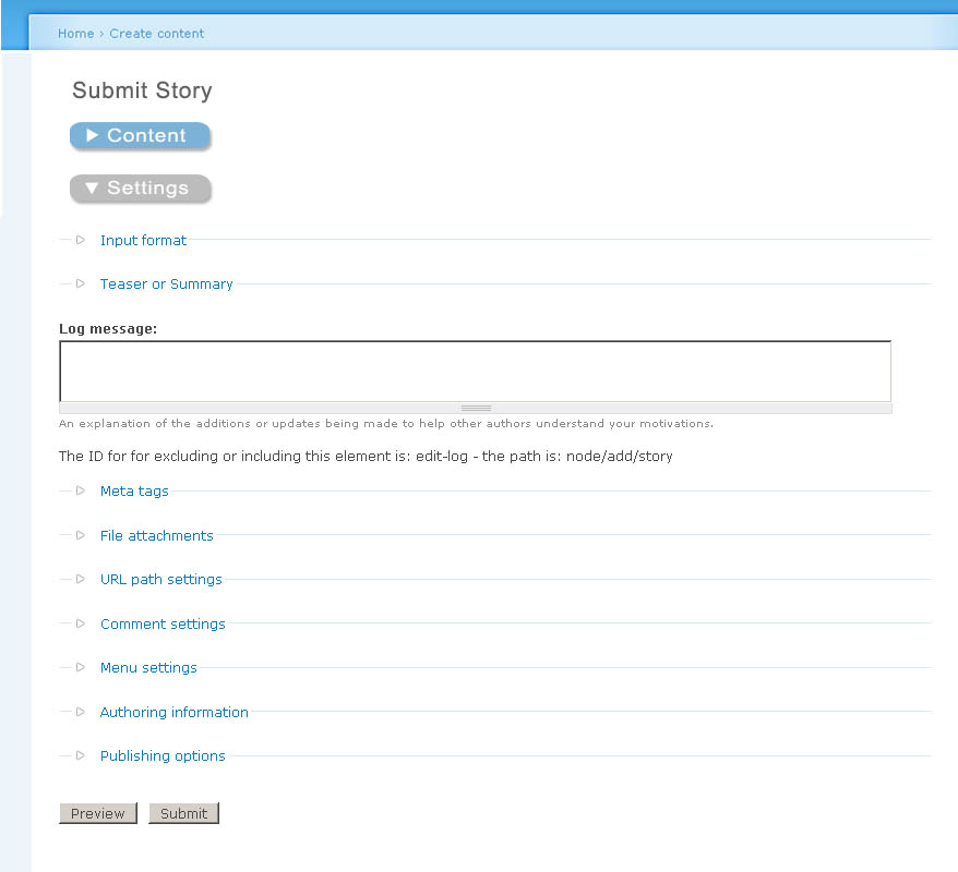
Though I like this approach, I recently came across an Alternative. It is inspired by the way the checkout form is done in Übercart. There are collapsible fieldsets, but very large ones. The trick is: when you expand one, the other one collapses automatically. So we could divide the node add/edit form into two areas: Content and settings as before. By default, the content area is expanded, and under the settings button there is information given that is created dynamically from what settings are present, following Alpritts Approach: http://drupal.org/node/190946
Colors are used to further emphasize where to click, you always click the blue button, while the grey one is expanded. Words are inappropriate, see the attachments to get the idea.
| Attachment | Size |
|---|---|
| Node-accordion-1.jpg | 71.85 KB |
| Node-accordion-2.jpg | 86.68 KB |
Comments
It's an interesting concept,
It's an interesting concept, somewhat analogous to a dashboard widget that you can flip over and change its settings on the back. In your alternative, the content fields are at the "front" and a the settings are at the "back" in a way. But I think having them in an accordion is not the best way to present it.. I would prefer two tabs, but you already know this :)
But good thinking, keep the ideas rolling!
Newbie to groups (Tough to
Newbie to groups (Tough to Navigate so I've been sticking to irc and d.o for the past year)
Here's what I think a user friendly input form could look like in Drupal
http://www.scribd.com/doc/1141057/Drupal5Nodesx1
Edit: Replaced the previous wireframe (http://www.scribd.com/doc/1132002/drupal5nodes) for the above wireframe with better tab sizes. The screen is for Node Edit with the 'Menu Settings' option selected.
Thre are a maximum of 5 tabs per row.
Horizontal length of tabs are automatically sized according to the number of tabs in a row.
Re-titled the Preview button into 'Preview All' so it could be more easily distinguished from the Preview Changes Button.
Edit: On mouse hover, the tabs could reveal their contents as well.
I really like the work I'm
I really like the work I'm seeing here.
I think there's a lot of potential in tabs, but also a lot of potential issues. I think accordion is better for a lot but not all cases. A combination could work very well, also 'summaries' should be considered here (http://drupal.org/node/190946).
Before we implement tabs on node add / edit we need to fix 'local tasks' and separate them into actions and navigational tabs.
I think customizability on form layout is required at the theme layer (possibly with the panels contrib module).
I will be doing wireframes collecting the ideas in these contributions as part of the Season of Usability (http://groups.drupal.org/season-usability)
Bevan/
Bevan/
I really like the work I'm
Totally agree with this!
I have made a quick example how another possible solution combining ideas of others and mine.
http://wobster.de/temp/node-edit-content.gif
http://wobster.de/temp/node-edit-options.gif
Really like the idea of sepearting between content and options to not show all the options to userst that don't need it and I also like the idea of still having the information available.
If anyone wants to continue the work (for example writing in propper English ;) here is the Phososhop CS2 file: http://wobster.de/temp/node-edit.psd
Cheers
Sebastian
Number of clicks and mouse movement
I heartily recommend http://www.cc.gatech.edu/classes/cs6751_97_fall/projects/!rodney/HAR_KLM.html or similar. It's bad enough currently to scroll down, click a fieldset etc but if you are adding more mouse clicks to the interface then we hardly achieved anything. Or I missed something?
Thanks for your feedback and
Thanks for your feedback and the link.
What the proposed edit form tries to do is to add a place where you find every important point without searching through scrolling through alot of usually irrelevant Information. The images don't claim to be anything ready for production. Rather see them as "this is how it could also look". I know about the conflicts this solution would have with alot of themes. Once there are graphics you can talk about them, this is why I made them.
In most cases editors only want to add content, then they don't need all the options like publishing information and everything that people don't have to deal with is something that saves time which is why I seperate Content from Options but make all the additional information/setting that one might need available at one place.
Now here you are absolutely right I add one click to switch between content and options ( Here I removed the extra click: http://wobster.de/temp/node-edit-1.gif )
All the other links are only anchors to display an specific option with similar function as the current "open fieldset" click only that I put all the items in one place. The function that tabs would provide is the same thing as well, only that I seperate Content from Options and add a Nodes summary.
Maybe this is more something for admin theme than for general node edit.
Thanks for the
Thanks for the feedback.
Regarding Wireframes.
Whats the best application to use to build the wireframes?
I'm using Inkscape for single page wireframes and Visio for multiple pages (I've used it before to show the userflow for wire-framing of 25+ screens and the advantage of Visio is that I can print out multiple pages onto one PDF File. )
I've tried Umbrello, Dia and Scribus. Inkscape seems to have more functionality than them and is easier to use while Visio has a bit of extra functionality than Inkspace such as multiple page support for a single file at the cost of being proprietary rather than OSS.
Best to be save in SVG format
Whatever you use, it would be good if you can save or export the wireframes as SVG if you want to share files.
I noticed openoffice comes with some built graphics of GUI elements too. I use OmniGraffle Pro, (which is Mac-only) in combination with this: http://urlgreyhot.com/personal/resources/omnigraffle_wireframe_palette
Edit: just found another, promising open source option:
Linux and Windows versions: http://www.graphviz.org/
Mac version: http://www.pixelglow.com/graphviz/
I can save the wireframes
I can save the wireframes for multiple pages as an XML Drawing with a vdx file extension
http://vdxtosvg.sourceforge.net/ is a vdx to svg translator
Dia has built in support for vdx
Most of my wireframes tend to have multiple pages from the same file (Opening them in Dia merge them into one screen)
here's a pdf of what I mean by multiple pages from the same file:
http://www.scribd.com/word/download_preview/1186365
I don't mind doing a wireframe or 2 as a mockup with Inkspace (as I've done in http://drupal.org/node/211075 .)
I'll look into graphviz and see if it has the functionality required.
Here's Another Way the Forms
Here's Another Way the Forms can be done
http://www.scribd.com/doc/1202599/Visiodrupal5nodesx2
Everything should be tab friendly.
Advanced Users can use the buttons on the right in the form to skip steps.
A Go Back or Undo Button can be added if required.
Edit: http://www.scribd.com/doc/1205019/Visiodrupal5nodesx21 (Re-styled the form a bit)
Looks good
VERY good at that. To add more, I could imagine adding a few more lines and shadows so that it really looks like a tabbed register on paper.
Styling isn't really one of
Styling wire frame buttons and wireframe tabs isn't really one of my strengths (I prefer to give a free-hand to the themers/templaters for styling how things look on the screen:)
http://www.scribd.com/doc/1249616/Drupal5nodes-v2x2
I've added gradients to the tabs, but they look more like Buttons than tabbed registers at: http://jbsecure.com/images/Address_Books/AB-139-0002_detail.jpg
as per what was written on: http://groups.drupal.org/node/8305#comment-25489
I've shifted the tabs over to the left hand side ( http://www.scribd.com/doc/1249616/Drupal5nodes-v2x2 ) . I'd like to see how brand new Internet users (who probably just learned how to E-Mail and activate registration requests by E-Mail) would react to where the tabs are placed. On a hunch I'd say if tabs went to the left and a user finished entering text into the body field, the new users could initially be clicking the tabs trying to figure out what to do next instead of entering data into the fields. User testing would probably be required to see on which sides the tabs would be best.
Edit:
Created a new wireframe with a few visual design enhancements: http://www.scribd.com/doc/1249777/Drupal5nodes-v2-x4
The tabs have been restyled. I'm more familiar with creating buttons than tabs, so for now the tabs look like buttons on the wireframe.
This really solves the
This really solves the problem of having more tabs than you can render horizontally! See this comment for my previous attempts at node form layout using subtabs.
Easy to implement
This is something that can be done more or less with just CSS. If not, then with a little help from JS. But there is no need to change the PHP side.
Actually kind of perfect
I was slightly blasé when I first saw this last night, but just before hopping into bed I suddenly got more excited about the idea. This is very good. Very, very good.
(Note: I'll refer to these as 'drawers' below, as that seems to becoming the recognised way of describing vertically stacked tabs.)
So why is this good?
Presuming we can keep each item short, we avoid scrolling. You scroll once to get to the configuration options and then can stay there. So it's less disorientating. Of course, if the settings become too extensive then this might not be true any more, but that is a rare scenario... at least currently.
A row of options means you can scan down the list easily to see what you can change. If you open a drawer, and move into it in order to change some settings, you can easily orient yourself back to the list of options; it's easy because the drawer you opened is highlighted. So you just go to the next one.
If you are not sure what is in each drawer, opening them one by one is easy and quick. First it uses javascript so everything is preloaded, making it instant. Second, the vertical nature means one has to move the mouse less to move from one tab to another than you would in a horizontal situation (i.e. it is always just the height of the tab).
it's always tidy. When one drawer is opened the others close, so you get the benefit of the accordion as above. However, you also avoid the disorientation problems.
All the settings remain in close proximity to the 'body' field. That means on a large enough screen (and it wouldn't have to be very large) you could have both the body and the image settings viewable at the same time. This is great for when, for example, you are uploading an image and wish to place it in the body field.
Can be degraded sensibly.
No problem with expanding; you can just keep adding more tabs on top of each other. This should hopefully discourage us from putting conceptually different items in the same fieldset and calling it something general and non-descriptive such as 'general settings'. (As I said above, there are limits on this expandability, but I don't think we have reached the point where our forms are that complex yet... if we ever do).
The vertical stacking makes them visually distinct from the tabs (local tasks), making it easier for users to separate the two concepts in their head.
Some further thoughts...
I'm not sure the 'next' button is necessary. I think it complicates matters because the user now has two navigation options. Users may feel they need to click on next in order to save their settings when that is not the case. And they would not necessarily want to go to the next option anyway.
Accessibility. How easily can you navigate through this on your keyboard? (We should probably consider accessibility more on a wider scale too.)
Conceptually, this would work with the summaries idea (http://drupal.org/node/190946). However, I'm not going to comment on that too much right now since this idea is simple and works on its own merits.
If there are a lot of tabs (like more than 7) it could become confusing, so a way of chunking items with spacers or header tags would be helpful.
Imagine that the user is clicking one by one through the drawers to check their settings. Whatever we do, let's make sure we don't have a button at the bottom of drawers named 'delete'!
-
www.alanpritt.com
Tabs on multiple rows are a
Tabs on multiple rows are a classic windows UI blunder. Technical folk that have grokked regular tabs "get" them. Others don't. They are also quite difficult to implement at the html/css layer.
I think a limited number of tabs under the node body with accordion under each tab with many fieldsets is better here. In a default drupal install there would be, for example:
The names of the tabs would need more consideration. CCK and other modules' fieldsets would go in a new tab called Content Fields, and might or might not be able to add tabs. There are disadvantages and advantages both ways.
My concern here is that we are adding an extra click to the user workflow for many tasks -- as chx pointed out before that is not necessarily an improvement.
Another useful idea here is to replace fieldset (accordion) titles (legends) with summaries of the setting. For example 'Comment settings' would become 'Comments disabled' and 'Publishing options' would become 'Published, promoted to front page). Obviously this requires a lot of new code to support the dynamicness of the titles. See http://drupal.org/node/190946#comment-681924 for more about that idea.
I plan to do up a wireframe of the above idea next time I sit down for the SoU project.
Bevan/
Bevan/
...
First of all the threading in these comments is confusing the hell out of me, so I apologise if I'm putting anything you say into the wrong context.
@multiple rows of tabs. I presume you are responding to http://groups.drupal.org/node/8305#comment-25362 above. If so then, yes, I completely agree. Although I do believe part of the problem is an awful implementation of it (where rows of tabs actually move), I don't think a good implementation would be much better.
Still I think I prefer it to accordion. One of the big problems we have at the moment, is that the collapsible fieldsets make our configuration screens dance around the screen; taking control of the page scrolling in confusing ways. Accordion would have exactly the same problem, but probably worse because it collapses other fieldsets other than the one you are operating on. I don't think it is awful when implemented above the fold (as in the Joomla admin), but even then it is slightly disorientating.
In your proposal above, the problem would be slightly worse because you are now putting all this into a tab. But you already commented on this issue yourself: 'My concern here is that we are adding an extra click to the user workflow for many tasks'. It's not just the extra click that is a problem however. It would also create a more complex layout visually, requiring the user's eyes to dance all over the place to find a setting. Also, this would bury settings a couple of levels deep. You have no idea what is in the 'Site Options' tab until you click on it, which means finding your menu settings, for example, is going to be confusing and people will miss them.
The handling of CCK fields is an interesting one, because they are generally considered content rather than settings, so you might like to keep them on the same hierarchical level as the body and title. However, this should probably be flexible since it will depend on the situation.
Obviously, I'm in favour of 'summaries' as I started the thread you cite. I actually believe it could be integrated well with the drawer idea below.
-
www.alanpritt.com
Agreed, these discussions
Agreed, these discussions can be tough to follow.
The multiple tabs solution has been, can I say, 'deprecated' as a solution in favor of a vertical tab/button solution: http://www.scribd.com/doc/1249777/Drupal5nodes-v2-x4
We'd probably have to make a story for each proposed (and can be made working) solution or a separate story with threads dedicated to each solution.
Since the Story is about Accordian Styling for the Node Add/Edit Form, I think I'll start a new story and call it the 'Vertical tab/button solution to Node Add/Edit Form.' or just a story for Possible Solutions to Node Add/Edit Forms.
Talking with chx about this,
Talking with chx about this, I commented on the 'vertical tabs'
Chx referenced http://jbsecure.com/images/Address_Books/AB-139-0002_detail.jpg as a real-life interface that everyone gets that works the same way.
Dynamic summaries instead of static titles would work here.
Bevan/
Bevan/
That views2 sketch
is extremely confusing with the "sort criteria helptext" being the same color as the tabs. It's, however, very nice visually that the tab has the same bg as the rest of the fields, reaching back to that real-life example I raised.
+1 for Steve JBs mockup in comment-25462
The stacked Buttons are really good. This concept makes use of the fact that in most options fieldsets a lot of horizontal space is wasted / not used. So only someone has got to code it...
What is even better about this: we can use it whether it be scrolling down to reach the options or inserting a tab (which I still prefer) http://kreativmango.no/dev/drupal/node-tabs/
Because the aim of shortening the node/add form shouldn't be lost out of sight. This concepts helps clarify it, but it remains just as long as it was before.
Life is a process
Life is a journey, not a destination
We have an answer; Protoyping
I'm working on a prototype of this which I'll post a link to shortly
Totally! The flipside of course is that you can't see multiple fieldsets at once. However AFAICT that is the only disadvantage of this.
local_tasks-for-actions vs tabs-for-navigation is another major usability issue that I'd also like to see fixed in drupal core by drupal 7.
I agree. The 'next', 'previous', and 'submit all' buttons are redundant.
While testing out yched's patch on misc/tabledrag.js I discovered that drag and drop on table rows is fully keyboard-accessible: You can move rows up and down with the arrow keys.
Something similar for vertical tabs is conceivable, and may already be available in the jQuery tabs package. If not, it would be worth contributing back to jQuery.
I had been thinking of horizontal tabs above the vertical tabs for that, but this is a much better idea and isn't disorientating nor requires more clicks (as you pointed out).
The handling of CCK fields is an interesting one, because they are generally considered content rather than settings, so you might like to keep them on the same hierarchical level as the body and title. However, this should probably be flexible since it will depend on the situation.
I hadn't considered that (emphasized) case. I think it should default to having a group of drawers (as you suggested) for each module (or other logical group) of fieldsets. It should also be possible to make a CCK field 'content-oriented' through CCK's UI and have it display with the body. Further CCK's fieldgroup module should allow further customizability of how fields are configured within the drawers and drawer-groups.
Totally. Now we need to convince the folk working on a similar issue with multiple tab-sets: http://groups.drupal.org/node/6288#comment-25588
Bevan/
Since this node is no longer
Since this node is no longer about Accordion and the threading and discussion is becoming unwieldy, let's continue the discussion and re-thread over at Proposed Solutions to Shortening the Node Add/Edit Form
Bevan/
Bevan/