
After months of tinkering with our Drupal distro and the custom theme to go with it, I finally got a chance this weekend to run a user test. The subject, Diana is not computer savvy. For example, a link or button has to look click-able (shouldn't it always!) for her to click it. When I asked her to create a blog post, she clicked the blog navigation link and wondered why there was no form for her to complete. She did not immediately see the "Create content" link. Diana uses a Mac and admits she is right brain dominant.
I made use of Steven Krug's advice on how to do basic testing. I did the test over Skype, connecting to North Carolina from Argentina. I asked Diana to complete 3 tasks while I listened to her think (I asked her to think out loud). I made sure she was comfortable and that she knew it was OK to break things and make mistakes, which said was a great relief to know. I would listen and not offer any instructions or advice unless she was genuinely stuck.
Task 1: Create a blog post
We're using a customized admin menu with a larger font size and 4 menu items for site editors. Diana (a site editor) clicked the main navigation menu link called Blog which took her to the view display of the latest blog posts. Although clearly visible at the top of her screen, and even though she did previously mention the "new black bar at the top", she did not tie the "Create content" link with creating a blog post. So she wondered out aloud, why there was no form to complete. I kept quiet. Finally she said, "Ah maybe it's under Create Content. I'll look there".
Here's how our form looks...

Notice we have a very simplistic form with floating buttons. We also have an anchor link that takes one straight to the form and jumps over the content at the top of the page. So when she clicks "Create Blog" she sees the form and nothing else. The floating buttons have a really high z-index so they remain visible even with Tinymce toggled into full screen mode.
Diana completed the task very easily. She did not scroll down after adding her title, topics and content. She just clicked "Save" and was really happy that she managed to add content to her soon to be launched site.
I was ecstatic, because we work with lots of right brained folk who use computers only because they have to and this was the smoothest "Create a blog" test I had ever experienced. We're definitely getting rid of the admin menu though. Admin menu is for developers and advanced users. It's not for editors and site authors. It's dead and boring and does not look click-able. Nobody would want to create content using admin menu. We're going to use colorful floating icons with a fixed position to replace the 3-4 menu items for users of this role.
Task 2 & 3: Edit a blog post and add an image to it
Here's what our published blog post looks like

Diana did not have any difficulty in discovering the "Edit" link hidden behind the gear icon. She went to it after perhaps 5 sec. She said, "Hmmm how do I...oh, it must be behind the gear. Yes there it is".
She decided to shorten the title and change the topic of the post and had no problem with that. When it came to uploading the image, it took her a few seconds to scroll down to find the image upload form. Initially Diana thought the image icon in TinyMce was for uploading images.
Here's what our image upload form looks like...
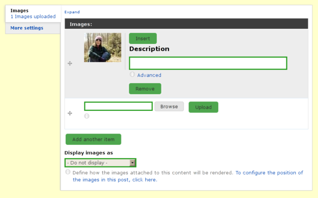
Diana clicked the upload button first, not the browse button. It took her at least 15 sec to figure out that the "browse" button opens up the browse to file dialog. She located the file she wanted and then clicked upload. She counted out aloud with progress bar, "20%, 45%, 67%, 90% done!" and was quite happy to see the image was uploaded. She then clicked the thumbnail. Nothing happened and she wondered why. She said that she expected to see the image inside her content. She looked around for a few moments and then saw the "Insert" button, which she clicked. The image appeared in her content and she was happy.
Although she had successfully competed the three tasks, I decided to ask her to re-size the image and to do it just as she would in her document editing program. This also went smoothly.
Summary
The uncluttered form and floating buttons seem to work. I'm going to test them out on a few more people.
The "Create Content" links should be more attractive and clickable.
The thumbnail image inside the cck image upload field should be clickable and should stick the image into the content when clicked.
The pecl upload progress extension is definitely worth configuring.
Perhaps using http://drupal.org/project/wysiwyg_imageupload module in addition to the standard way of uploading images may be resolve the confusion with the Tinymce image button.
p.s why do we have to complete captchas after every preview?
Comments
Fantastic work, Mojah!
Mojah, I think you've hit on the key to making Drupal more user-friendly for content managers who are not that computer-savvy: Get away from the standard Admin interface to a cleaner, simpler look.
Also, you've demonstrated something very important — Usability testing can produce useful results quickly, without access to an expensive lab or fancy equipment. And you don't even need to be on the same continent, let alone in the same room, as your test participants.
Great work! And, I admit I might have missed something — are you making this interface available to everyone, or just tempting us with this display of your good work? :D
Thanks for the comments
Thanks for the comments Cliff. It helps getting feedback from the design community.
We're contributing most of the small ui enhancements back in the form of a starter theme, which is work in progress. But it's good enough to use on projects...just takes a little getting used to.
The distribution won't be available on d.o, but I'll definitely make the code for the UI hacks available. We've already contributed several modules (so far unnoticed) back to the community and there are few more that need some polishing before release.
<like>
+1
Thank you for this write up.
Thank you for this write up. I added a couple more groups to the audience of this post.
Great test, and great
Great test, and great results, but you seem to have neglected to specify the Drupal version in your writeup? It might help the searchers to discover your idea.
Joel Farris | my 'certified to rock' score
Transparatech
http://transparatech.com
619.717.2805
Thanks. D6...but I'm sure
Thanks. D6...but I'm sure some of this would help D7 designers.
(Aaaargh, dang captchas. But I'm logged in he thinks!)
Drupal version
It's obviously Drupal 6. Drupal 7 has an overlay.
It has an overlay, but people
It has an overlay, but people who hate the damned thing (like me) can easily turn/leave that crap off. So that's not a for sure indicator.
The Boise Drupal Guy!