Hi Guys,
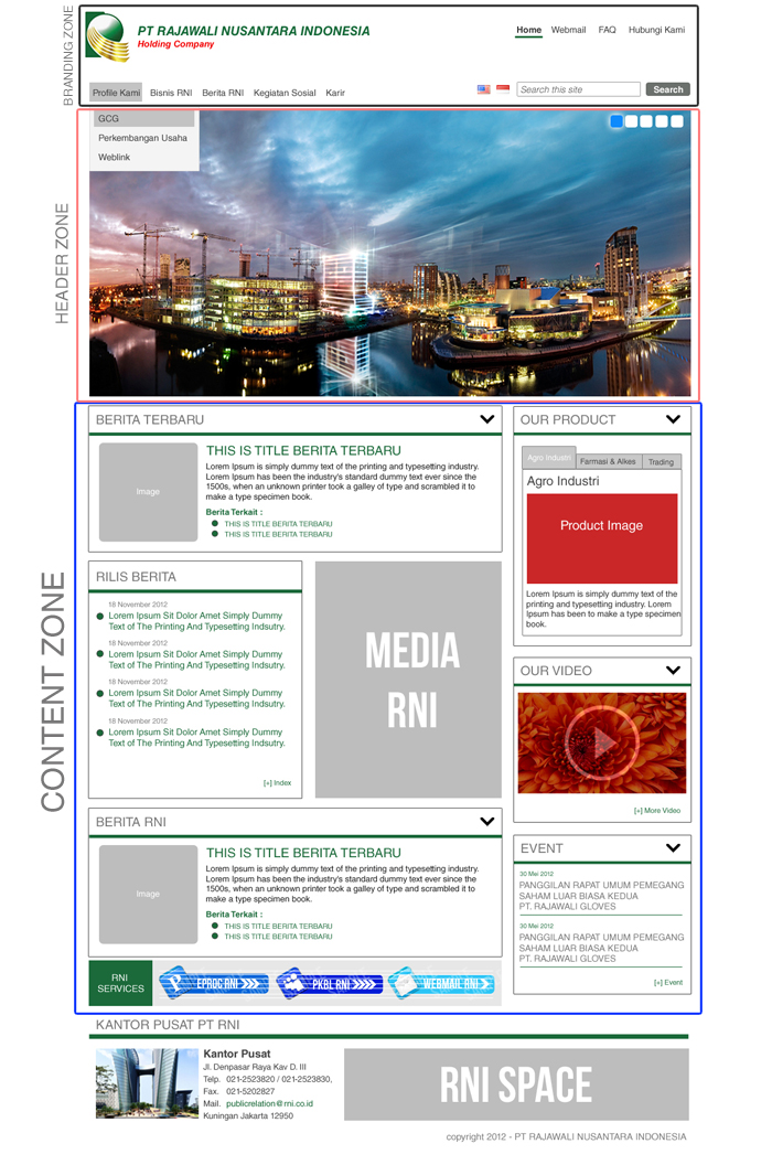
Recently I have bee working with this website project, the layout of project is like (the attachment example1.jpg)
I have been troubling, when set the content zone with 2 region which is Content (8 Grid) and Sidebar Second (4 Grid).
Now I want to make the some block like "Rilis Berita" Block to be Grid 4 (i applied the block class module and using grid-4 class) and the image (Media RNI) also inside block (giving also Grid4) i think its okay, but after seeing it on tablets and mobile its not very nice, seems the block not have a perfect width with another blocks, i mean because the grid-4 class is not automatically re-size.
you can see the site test on rni1.drupid.com. and try to re-size it, I have also trying using views column class module but not working with blocks. Any Idea I can make it nicely re-size when seeing it on tablest or mobile phones.
Thank you before.
| Attachment | Size |
|---|---|
| example1.jpg | 401.68 KB |