
Last weekend, I had the pleasure of rolling out my first Drupal mobile site! After listening to Drupal founder Dries Buytaert talk about the mobile web taking over, I lit a fire under myself to get this done.
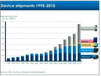
Dries' Presentation Slide
Luckily, I discovered it’s easy as pie in Drupal:
The modules that I had to install to get it functioning well are collapsiblock, menu block, and mobile tools.
- Collapsiblock is just what it sounds like. It enables javascript collapsible blocks. You set defaults on if the block is collapsed by default, always collapsed, or collapsible.
- Menu Block enables you to take a certain subsection of your Drupal menu system, and display it in a block.
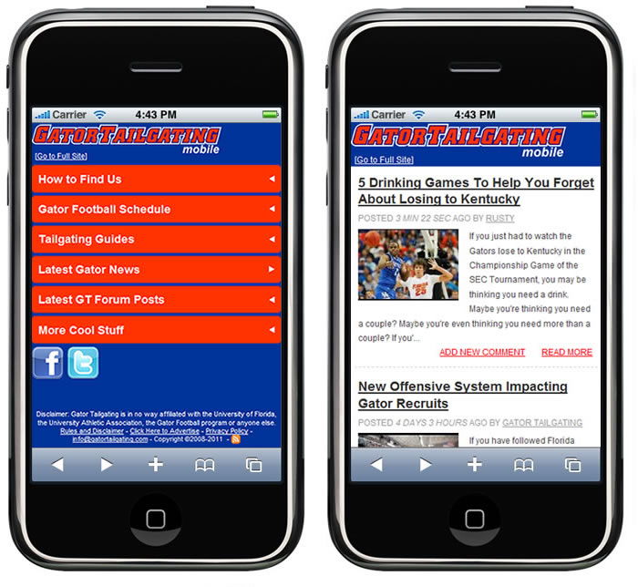
- Finally, Mobile Tools does the grunt work, and detects mobile devices. If it finds a mobile device user-agent, it redirects them to m.gatortailgating.com, and also switches the theme to your mobile them.
The final amount of work was just straight up D6 theming. I created a copy of the custom GatorTailgating.com theme, and modified the page.tpl.php and associated CSS files.
The final time it took to put this together was something around 6 hours… which to me is pretty amazing. It really speaks to Drupal’s power. Check it out on your IPhone, Droid or (hopefully not..) Blackberry!
PS. For all you Gator Drupaler's out there. We're having a huge Orange & Blue Game tailgate. Stop by and I'll throw you some free food & beer!
Comments
Looks Sweet on my Droid
Nice job really looks good on the droid (full site works good also ...)
Joe Moraca
WebDevGeeks.com
Nice job! Did you have any
Nice job! Did you have any problems getting the site to "zoom in" to fit the mobile device properly? I first attempted to create my own mobile theme with a zen sub theme of my own that used all percentages and ems. When I tested it with my iPod touch, it was "zoomed out". I ended up creating a sub theme of the Nokia Mobile theme and using the Mobile tools so it works now. I still don't know why my site was zoomed out though. Did you ever run into this problem? Is your theme a zen sub theme?
Thanks for the compliments. I
Thanks for the compliments. I definitely did run into this problem (this theme is not a subtheme of zen). The solution is to add the following meta tag to the header section in the page.tpl.php:
<meta name="viewport" content="initial-scale=1.0;">Here's a google search w more info
Premium Drupal Commercial themes
I also found that solution in
I also found that solution in another forum and when I added it to my page template, it did zoom in all my text, but I found I could scroll to the right and there was a ton of white space. It was like the text was wrapping in the correct scale, but more of the page existed to the right with nothing on it. It was really odd. It made for a "loose" navigation b/c if you were on the iPhone and didn't move your finger down in the correct motion, then you would see the page slip to the right. I'm sure this meta tag is the correct solution, I just had something else goofy in my design that was causing the white space. Thanks!
famous
Mike,
I saw your mobile app on a screen of drupal mobile sites featured in an acquia webinar on mobile technology!!! It stands out with that Orange and Blue!!
famous !!!
Joe Moraca
WebDevGeeks.com