Posted by hpz on May 28, 2012 at 8:12pm
Dear all
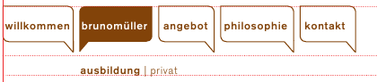
I started using Omega and want to use a main menu with dropdon feature. See the attached screenshot, please.
Could anybody point me to the right method to use with omega? Should I use the nice_menu module? Is there another menu module which supports responsive layouts?
Thanks for any hint!
Hans-Peter
| Attachment | Size |
|---|---|
| dropdownmenu.png | 9.13 KB |
Comments
http://drupal.org/project/superfish
http://drupal.org/project/superfish works great with Omega and adds some great extra menu functionality for touchscreens. i.e. dropdown menus that actually work on touchscreen, iPads, iPhones, etc all included.
Have fun.
I agree with @quantos...
I agree with @quantos... Superfish module works great for this.
Roger
_________________
Art has gone to the dogs
GoodeGallery.com
Thanks, I will try superfish
Thanks, I will try superfish :-)
Yes, i agree superfish and
Yes, i agree superfish and omega is good combination. Can anyone let me know how to make superfish menu responsive ?
Thank you
Tejas Mehta
http://ivanchaquea.com/creati
http://ivanchaquea.com/creating-responsive-menu-omega-subthemes.html Ivan has come up with a great way to do responsive menus for omega. You may want to check it out.
an idea i had for responsive menus
I have been easing Omega into client projects for about a year now, learning it along with responsive/ adaptive and I have picked up quite a few handy little tricks along the way. Once work slows to a managable level, I plan on publishing some of what I've learned.
For menus, I have gone several different avenues. The default is fine on a touch device, so long as multi-level menus ( drop downs ) aren't important in your use case.
I am really in love with the mega menu style, and am using Menu Mini Panels. The problem with mega menu or any drop down I use, on a touch device, it is tricky to get to the second tier without firing the top level: ie
<ul id="main-menu"><li><a href="/">Home</a>
<ul id="second-menu">
<li><a href="/about">About</a></li>
</ul>
</li>
</ul>
Problem: can't get to "About" with out clicking "Home" in typical drop down on touch device.
Could use JS to disable clicking on top menu, but not always desirable either (how to click "Home" now?).
Problem is worse with Menu Mini Panels, as the panels get all munged, the menu content is not always just links to other pages, or natural page hierarchy. Plus, just enough of the menu pops in before the page disappears that the user knows they missed something.
One of the adaptive / responsive techniques I've seen is to rewrite the unordered list as a select list. The nice thing here is it pops the native mobile device's select tool, which is bigger on screen ( above the content ), easier to use if you have a lot of menu items. For me, it also eliminates the mega menu problem, too.
What I am doing is when the media query hits the mobile break point, I fire a javascript function that grabs the menu, copies the class and id structure and rewrites as a select input with options.
Now, a select box on it's own won't send a user to an anchor, so I store the link location as the value of the select option, and have a little js listener that redirects to the page selected.
When the screen goes greater than the mobile break point, I fire another js function that writes back the unordered list structure, complete with ids and classes. Menu Mini panels doesn't even know it happened. It uses the (old btw) QTip library to listen to an anchor, doesn't care when the anchor is rendered.
Pretty slick in my opinion.
I'll post my js some time. I am actually using a good bit for my mobile optimization.
Hope this helps someone.
Responsite menu minipanels
Hey Scott, I'm giving Menu Minipanels a whirl and looking for a way to make them responsive. Your solution sounds great -- if you get a chance to upload your code, I'd love to check it out! :)
Sort of ugly, but functional
First, I listen for the body class to change:
Drupal.behaviors.sscResize = {attach: function(context) {
$('body').bind('responsivelayout', function(e, d) {
if( $(this).hasClass('responsive-layout-mobile') ) {
prepareMobile();
} else {
prepareDesktop();
}
});
}
}
I have two functions that handle all of the changes, prepareMobile, prepareDesktop.
In prepareMobile, I fire a function that rebuilds the menu as a select
function mobileMenu (elm, id) {$(elm+' li').each(function(index, element){
var selectedItem = '';
var sel = $(elm+' li a').attr('class');
var classList =$(elm+' li').attr('class');
if ( $(element).hasClass('active-trail')) {
selectedItem = "selected=selected";
}
$(element).replaceWith($('<option value="'+$(element).find('a').attr('href')+'" '+selectedItem+' class="'+classList+'" rel="'+sel+'">'+$(element).html()+'</option>'));
});
$(elm).each(function(index, element) {
var classList =$(elm).attr('class');
$(element).replaceWith($('<select id="'+id+'" class="'+classList+'">'+$(element).html()+'</select>'));
});
// menu select
$('select#'+id).bind('change', function () {
var newUrl = $(this).val();
window.location = newUrl;
});
}
I grab all of the important attributes and store them as attributes in the select list and options. I store the URL in the value of the option.
Finally, I add a listener so that when a new page is selected, it redirects to that page.
The prepareDesktop basically just goes the opposite direction.
Couple of notes:
This is far from the most efficient way to do this. It touches the DOM so many times, and I think that slows it down. Might be better to read the entire thing in once and write it once.
It is a bit slow at times, you can definitely see the menu rewrite when you are on a slow connection/ lower powered device. Might just be my site, haven't had time to investigate.
Also, it would be more "mobile first" if the original menu were output as a select in the first place, then change to a list when you reached a desktop layout. Not sure how this would affect menu minipanels though.
Currently, I only have this on my company site. I have another site where I am hiding the entire menu, I have a second copy of the menu in the footer and I am using an off-page method. Seems to be much faster, and people tell me it is more intuitive.
Please report back as to your approach and findings.
No submenu with Omega
[FRANCE]
Hello, I use Omega Template and I don't have submenu since the install.
Submenu is actived ans parent link is OK.
I install Superfish and actived without result.
I miss something ?
Thank you for your help.
Jeff
I don't think submenu will work as you want
Will you post a link?
I think the default menu will only show the first level by default. I think a solution for you would be to install the menu block module. Create a menu block with the proper level of nesting, etc. Drop it in the block where you want the menu.
I just checked the issue queue and it looks like it should work, but with certain configurations, there are some issues with various versions of Superfish.
I would suggest trying the Menu Block route and checking the Superfish issues if you have problems.
Good luck!
[ FRANCE ]Hi,Thank you for
[ FRANCE ]
Hi,
Thank you for this answer, but, infact my problem is with the main menu. The menu where you can found the categories products.
This problem is just for me ? because I don't change nothing after the installation.
After I install Superfish, because i Read something about that..
But, it seems a basic possibility and very necessary..
Do you have a suggestion ?
Jeff
Can you post a link?
Hey Jeff, I'd like to help, but I am not sure exactly what menu you are referring to. Categories sounds like a taxonomy menu, but I think you maybe having problems with the main menu, correct?
Maybe if I can see the site, I could be more help.
Here : Just the basic install
Here : Just the basic install ..
http://filz.fr/63nxhv
My problem is the main menu (Grey) I can't see submenu.
All in the dashboard have a good configuration to show it. (i Think ;) )
"To carry" must have a submenu..
Thank you
I am afraid this setup won't work
It appears you are using the built-in Primary and Secondary menus, and I am fairly certain they will not render more than one level. I found this post with a solution: http://drupal.org/node/1018698#comment-3915920
As I mentioned, an alternative solution is to disable the primary and secondary menu in your theme settings, and using the Menu Block module and placing your menu block where you want your menus to be will work. You can set the menu depth and other options with this module. Not sure how it works with the Superfish module, I typically roll my own CSS solution.