
Hi,
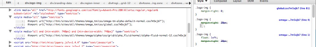
I'm trying to get my custom fluid css to load AFTER the global.css to provide an override of some of my elements (logo-img in this example). Unfortunately I'm not able to do this for some unknown reason. Attached is a screen shot of firebug showing that my custom css "omega-tm-alpha-default-normal.css" is indeed being loaded but it's being loaded before the global.css (not what I want).
I'm under the impression that the global.css is the file that is supposed to be over-ridden when a successful media query is executed.
Does the problem lie in the weight of the custom css file?
You can also see from the screen shot that the alpha-fluid-normal-12.css is being loaded AFTER my css files.
Does the problem lie in my file name?
Thank you for any help.
-Dan
| Attachment | Size |
|---|---|
| custom-omega-css-problem.jpg | 48.75 KB |
Comments
It may be a weight issue
I have a custom styles.css file that I needed to load first, so my .info file looks something like this:
css[styles.css][name] = 'Main Styles'
css[styles.css][description] = 'Your main custom CSS file.'
css[styles.css][options][weight] = '10'
css[global.css][name] = 'Global Styles'
css[global.css][description] = 'Your custom CSS for the global version of your website.'
css[global.css][options][weight] = '11'
If you wanted yours to load after global.css, then I guess you would use a weight greater than global.css in your .info file.
James Sinkiewicz
Drupal Site Builder and Generalist
http://MyDrupalJourney.com
Exactly what James
Exactly what James suggested.
Yours would look something like this:
css[foo.css][name] = 'Foo Styles'css[foo.css][description] = 'Your custom CSS to override the global css styles of your website.'
css[foo.css][options][weight] = '12'
Thanks but..
Thanks James and Die but doesn't adding a css to your info file make the css file get loaded all the time and not just when the screen size is appropriate?
ie. I only want my custom css to load and override the global when the screen size is bigger than mobile (400px wide).
I'm under the impression that the media query is supposed to do this. I guess I'm curious as to how exactly it does it. Does the media query change the weight of the css or does it just modify the html header code on the fly some other way?
I was hoping to find the answer in the docs and before having to read through the omega and jquery guts.
Thanks again.
If that is the case, then you
If that is the case, then you need to use your subtheme css files and need to be named correctly:
my-name-alpha-default-narrow.css
my-name-alpha-default-normal.css
my-name-alpha-default-wide.css
my-name-alpha-default.css
AND your theme's media query weight settings need to match the css files. I don't use the "fluid" layout and in my opinion, there is no real use for it. The Fluid layout is meant only as an alternative to the Narrow layout. You should not use both.
For more information, see my blog post at:
http://www.mydrupaljourney.com/articles/2011/06/24/omegas-grid-layout-se...
James Sinkiewicz
Drupal Site Builder and Generalist
http://MyDrupalJourney.com
no real use for it..... Wow!
By "no real use for it" you mean to say the fluid method in general is not useful? Wow, I'm shocked.
I for one, can't stand fixed width designs whether they adapt/respond down to mobile or not. I think all 960 grids and fixed width layouts defeat the purpose of HTML which is fluid by design and nature.
Some articles on the benefits of Fluid:
http://groups.drupal.org/node/60928 "It will fill the screen at all sizes"
http://www.webmonkey.com/2011/06/tips-tricks-and-best-practices-for-resp... "can accommodate any screen size"
http://www.alistapart.com/articles/fluidgrids
All that being said, that you very much for your link to your blog post. I have some questions for you regarding your blog post which I"ll post over there in respect for keeping this thread on track.
You misunderstood me
The mobile them is not 960 grid and so it is "fluid" of sorts. There is little use for another fluid layout to replace the "fixed" narrow layout. If you want the normal layout to be fluid, then just turn it off, adjust some settings and mobile layout can take over the screen size normally handled by "normal". I guess I could make the same argument for the other omega layouts. They are just a "suggestion". You can change any of them anyway you want with the flexible subtheme.
James Sinkiewicz
Drupal Site Builder and Generalist
http://MyDrupalJourney.com
Figured out my problem
Answer posted here:
http://groups.drupal.org/node/238598#comment-775578