Hi,
Iteration 8 is now available for you to browse and comment on. Last week the redesign took a pretty drastic change in direction so this week's release isn't as massive as we have worked to consolidate changes to the IA, reacting to feedback from the testing and to trends we have established in the community feedback.
Last week Leisa posted her thoughts on why we have moved in this direction and you can read her thoughts here:
http://www.disambiguity.com/drupalorg-redesign-iteration-7-for-your-review
Leisa will also be posting again shortly to further discuss our thoughts and reasons for recent changes as well as talking specifically about the modules section.
The link to the latest iteration is below:
http://drupal.markboultondesign.com/iteration8
Key points for this week:
1. Modules. Changes have been made to this page and we would welcome specific thoughts on categorisation. Keep an eye out for Leisa's post too.
2. Changes to the top level navigation, to include Documentation and Download and Extend.
3. Iteration 7's 'Choosing Drupal' page is now renamed to 'About' with minor content changes as we continue to rethink this section for next week.
4. Overhaul of the Get Involved page
5. 'Commercial Services' from iteration 7 is currently named 'Marketplace' BUT we are still fine tuning the content and giving this whole section more thought so we can get it just right, taking into consideration all the feedback.
6. Search page has been refined
We hope you like what you see and look forward to reading your thoughts, in particular, any feedback on the changes in the above list. It's not too late to have a say on the re-design and tell us what you like, what you don't like, and just as importantly - why!
Thanks again.
Rob.
On behalf of Mark Boulton Design
Comments
Well Done
Good job with the improvements! I really can't think of much to say; the design is fantastic. The only little things that come to mind are:
1. Homepage, left column: "If you already like what you see then why not start creating your site now: Get Started!" I think there should be an option for those who aren't ready: "More About Drupal" and/or "Try the Demo."
2. "Get Started" link at the top doesn't make sense since it just takes you to a place with links to Download/Extend, Docs, and Support (all of which are accessible through that same top menu already).
3. My guess is that Forums will be the most visited section in Community & Support... So at least the latest posts from the forums should appear on the Community & Support page. Maybe some key links too (write new post, forum categories, etc).
I'm really excited about the new design. Mark, Leisa, Carolyn, Rob and everyone else on that team deserve a big hug from us... :)
Ildar
--
Web Design in Hamilton, Ontario, Canada.
--
Hamilton web design
Great Work / 2 remarks on HP
Hi,
Great works. my 0.02 euros:
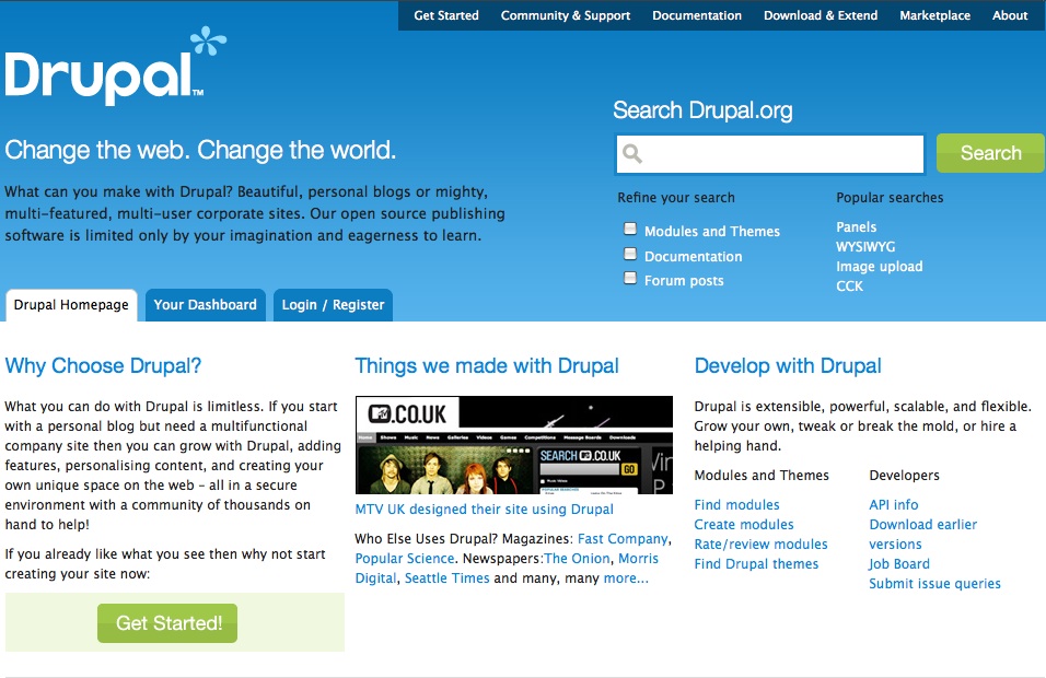
1) on HP, not sure that "310,721 people in 24 countries speaking 14 different languages" is very clear. Users? Customers? Drupal Association Member? I suggest something like: "Drupal Community: 310,721 people in 24 countries speaking 14 different languages".
2) Not a lot of place for news. I mean that's a good reason to come back to the site and feel the vibes. Is it that useful to have the forums posts (given the small available room, rotation will be huge)
Cheers,
Denis
Great!
A little pedestrian thing- in the prototype listing page, adding property for a:visited {color:purple;} or something would help the visitor, because they can see what they have missed or not missed. I used a tool to edit the CSS of the page to make it easier for myself).
I feel like I may have seen a mention of this before, and I don't know if it is something you officially decided, or if it's just filler text: but the extraneous "THE" in "the Drupal Core" is throwing me off, making me twitch. As far as I know, it's Drupal Core, as in "Download Drupal Core", and "That's in Drupal Core", etc.
I love the Dashboard, I get it now, it makes sense! I love it.
I really like the Get started page, the arrows > the links under them.
Great improvements in all sections, if I listed them all - this post would be too long.
In the Choosing Drupal page, there are 3 sub-headings. Features, Benefits, What do I need. I'm not convinced by Benefits. The current links/text in Benefits is tended to in the next section: community. How about "Advantages" of Drupal instead? Then you can mention the strong, broad, diverse community; the security, transparency of open-source. Benefits makes me think "what am I getting out of this?" (the resulting profit) Whereas advantages might denote the attributes or quality of Drupal itself? (the conditions or circumstance for profit)
I wonder- and maybe people think breadcrumbs are for fairytales- but I'm looking for some "you are here" navigation to indicate where one is in a given region, for example, the news section... where is it residing?
http://drupal.markboultondesign.com/iteration8/news.html
I'm really interested in how documentation is dispersed, and placed in appropriate places, making it easier to find. Interesting to note things that were 'in handbook' have been moved to logical at-hand places.
e.g., http://drupal.markboultondesign.com/iteration8/community_irc.html - within the community area
and module-specific documentation moved to the sidebar links of a module page:
http://drupal.markboultondesign.com/iteration8/modules_detail.html
I assume we'll see little "+ Add documentation to this module" links on a module page- and somewhere in there the documentation fairies will be able to see an overview of all documentation amended, updated and added to the site?
Interesting as it also changes the way the documentation is managed. I assume you're working closely with Add1sun on this.
Especially those important 'locked' pages, like the 'getting involved' page which is currently part of a Handbook, but in the new site is:
http://drupal.markboultondesign.com/iteration8/getinvolved.html
Sorry I've been so busy and unable to view the other iterations, looks like such great work has gone into this. Thanks for posting! It looks very close to done :)
Looks cool! I love the
Looks cool!
I love the "310,721 people in 24 countries speaking 14 different languages", Definitely love to be Excited about the Drupal community on the Home page!
The Banner area in the Homepage looks a little too big. The Popular searches is cool, but should it read Recent searches?
Netlink Technologies Ltd
http://shyamala-drupal.blogspot.com/
Shyamala
Unimity Solutions
Nice job.
So again, still vast improvement, so i hate to criticize, but I know you're looking for feedback, so here are some thoughts:
Dislikes:
"Change the web, why Drupal, Things we've made, and the 310721 people..." are all about what Drupal is and who's using it, and are most appropriate for outsiders.
In contrast, "develop" and "search" are for insiders. IMHO, this page should be more for outsiders, because insiders will have the ability to create their own dashboard.
Search is so big that it's taking control over critical thinks like what drupal is and why choose it. Perhaps try combining these two to add emphasis, and maybe rolling up the refine/popular into an advanced category.
The Choosing Drupal page feels like a better approach.
Likes:
- Like the module example, but think a screencast should be mandatory for each module.
With the 'develop' heading -
With the 'develop' heading - I think it's worth having something for 'outsiders who are also developers' - of which there's plenty, I'm not sure the current segment on the front page necessarily caters for those people though - not that I've got good ideas on what else to put there, and agree that insiders know where to go if they need that stuff. Disagree on search though - lots of people need to search early on depending on how and why they hear about Drupal.
Agree 100% about 'get involved'. The right sidebar is good but the 'community spotlight' really looks like consumers of Drupal - 'we needed a site and we chose Drupal', in the first there's no mention of Drupal contributions, in the second it's a footnote, and not obvious what they did or how, the third is OK but makes us sound a bit like a cult ;). I'd like to see less consumer case study, more profile/interview - this is Jeff Noyes, he does x, x and x in the Drupal community, he works for x company where he does x and x with Drupal (or maybe has a day job that has nothing to do with Drupal) - webchick was doing these for her 'contributor spotlight' posts, and while the balance is probably somewhere in the middle, at the moment it's more about 'why I chose Drupal' than what people are really doing in the community. Obviously it'll need to be real people when it's implemented, so I might have just wasted a paragraph complaining about something that will be down to us to do properly anyway.
Big no on mandatory screencasts - if we're going to make anything mandatory it should be code style and basic security audits - which would reduce our contrib modules by half probably. Also something like 'token' doesn't have a UI at all - it's just a shared module/API between lots of others. Space for them definitely. Screenshots should be mandatory for themes though.
Overall I like the direction this is heading - and I'm looking forward to seeing the updates to 'about' etc. Will need to take a serious look at the module categorisation before commenting on it - although I like the idea of subcategories.
edit: also - the Acquia image is supposed to be an ad as far as I know - comments on the previous iteration were saying it should be labelled explicitly as such. I'm not sure if we need to explicitly label ads or not - but hopefully it'll be obvious what is and what isn't either way.
Search Clarity
In re-reading my post, I'm not positive I was clear, so let me try again and see if you still disagree.
I agree that search will be heavily used by insiders and outsiders. By no means am I suggesting loosing it, or drowning it with other content. However, right now it's arguably the heaviest feature on the page - which I think is an injustice to the messaging of What and Why Drupal.
ah ok
Yes I think although it's good to emphasise it, it's maybe over-emphasised on the front page (I like the header on all the non-front pages though). My main concern is that it'll push the 'dashboard' right down the page when you're logged in.
I agree
I think the search section on the home page seems to drown out the main purpose of that page - which is to download Drupal (or at least find our more about Drupal). I think it is best not to emphasis so much on the search section (seems like everything needs to be searched to learn more, which is definitely not the case with Drupal)
--
http://nimbupani.com/blog
http://nimbupani.com/
refine search
I'm curious about the choice for those three checkboxes under 'refine search' on the home page. I'm missing one very valuable source of information there: the project issues. I think the third checkbox should be "forum posts and issues" or something like that. I think forum posts and issues can share a single checkbox, because usually when I'm looking for a solution for your problem, you can't tell beforehand if it will be in a forum topic or in a project issue.
search issues
That seems like a decent addition to me - regular users will need it a lot, and it's a very quick way to find answers to support questions.
I really like the "Get
I really like the "Get Started" page! I must have missed this from a previous iteration.
Here is my constructive criticism for the homepage:
"Things we made with Drupal" should be more concise, maybe "Drupal showcase" instead.
The "Popular searches" might be a bad idea, and not representative if most people are still using Google to search Drupal.org.
The links under "Develop with Drupal" don't seem to be well-organized. I think "Create modules" should be a developer link and the "Job Board" probably doesn't need so much prominence.
For the "choosing Drupal" page, I don't think the "What do I need section" is on a logical par with the Features and Benefits sections, which are much more general info. Perhaps this can be moved down the page.
The new design looks
The new design looks great.
I am curious, who will be theming the site once the design is done?
These people
http://groups.drupal.org/drupalorg-theme-developers
Sign up now!
Drupal community adventure guide, Acquia Inc.
Drupal events, Drupal.org redesign
I really like what your
I really like what your doing with the site so I'm sorry to be negative but there's a few changes that came to mind. I'm not sure if the design is finished or if this is something I should be commenting on because you may already have plans for this.
I feel the links in the header with the dark blue background should have rounded corners on the bottom.
The links in the header that already have rounded corners on the top aren't anti-aliased so they look a little jagged
Maybe even rounded corners on the search input box would look nice.
The rest of the page on the home page (below header) feels a little cluttered. A little more padding between "Why Choose Drupal?", "Things we made with Drupal" and "Develop with Drupal" would help. And maybe a background to distinguish between them.
I'd like to see the footer looking similar to the header with a blue gradient so it distinguishes it apart from the page.
Documentation section needs love
There's still a whole lot of simplification to be done. One of the areas that needs some KISS love is the documentation area. For instance the subheaders are too confusing and overlapping:
So when I have a specific issue, should I go looking in documentation? Tutorials? The knowledge base? It's really unclear what the difference between it all is. Here are some suggestions:
Another great feature would be that, confer the homepage, the search on the documentation pages would automatically do a refined search for documentation. People are more likely to do a quick search for their issue than going through the directory structure manually.
looking good, but the logo
looking good, but the logo looks a little woosy if you ask me.
--
theamoeba
http://www.amoebasys.com
http://www.itsolv.net
http://www.espresso-online.info (blog)
I must be the only one still
I must be the only one still surfing at 1024 x 768 while at work, lol. Over all I like the design but the header wastes A LOT of valuable 'above the fold' real estate for me. At home, on my wonderfully spacious pivotable lcd in portrait mode it's great. Maybe 2/3s of its current size would be better but still retain that spacious feeling.
Also, I realize it's not themed yet, but there still seems to be a lot of text. I really liked the http://wavemaker.com example Dries pointed out on another thread.
I don't think it wastes too much in the header
I don't think it wastes much in the header, it's nice to have some breathing room where the design is not too dense. It could be tightened up a bit though. Especially with the search box which seems to be jumbo sized for some reason.
Overall it's a GREAT direction in a new site design! I really like where it's going.
www.remixin.com | www.johnarroyo.com
John Arroyo | www.arroyolabs.com | www.johnarroyo.com
When can we talk about the design/theme?
I've also got concerns about the size of the header, the way it doesn't scale and also the way that the site feels cramped. I like a site that fills the window as I've said from Yes! My width! My Font!... on down. Basically, I'd like a fluid/liquid site but am not sure if I'm jumping the gun by suggesting this or whether this decision has already been made. If not, please can we make this work with fonts at 20 and browser window width at 1700?
So, when can we talk about it?...
Cheers Daniel
Header, modules, sub-domains, internationalization
Some remarks:
1) the first thing in the site should be "Getting Started", not "Search"
The search is still not in the right place. As Noyz said, "search" is for insiders. For people who already know something of Drupal.
Think of someone that arrives in drupal.org for the first time? What's the first thing they'll do? Perhaps use the search, since that's the most proeminent thing. But... should they know what to search? Search for "Drupal" in Drupal.org? Use one of those popular searches that will lead to intermediate users' stuff? Not very helpful.
I think the most important thing for first-timers is "getting started" page. They want to know two things: "what the heck is that?" and "how do I use it?". We must provide this info.
2) primary links as primary links
The primary links "Get Started"... "About" up there are too hidden. On the other hand, stuff like "Home page", "Dashboard" and "Login/register" are too visible. "Login" and "Dashboard" are stuff for insiders and moreover are normally placed in the top of the page.
Can't they switch places - primary links goes to the primary links position (i.e., below header) and users' information goes to the top of the page (i.e., the dark blue box up there)?
3) module categories
Can we break down the module categories a little bit more? Is not helpful look for modules in a list of 200 modules in a generic category.
4) sub-domains
What has been decided about sub-domains? I mean, "docs.drupal.org", "community.drupal.org", "project.drupal.org", etc...
Or there's no decision yet?
5) big footer is great!
love that. Very easy to navigate.
5) i18n
And, by the way, any hope to get the website internationalizated?
hmm, i like the
hmm, i like the wavemaker.com site - very simple and effective. i think, as has been raised, that there is way too much text - the site is beginning to look like a bazaar. The wordpress.com site is also a nice and simple type design - little bland, but simple.
not to put too fine a point on it, i think that the logo sucks! :) and what happened to the community plumbing slogan/statement? seems to have gone missing ;)
i think that the site is way too busy and if you are going to use rounded corners, use them everywhere - aghem... the top menu in blue.
other than that its getting on quite nicely.
--
theamoeba
http://www.amoebasys.com
http://www.itsolv.net
http://www.espresso-online.info (blog)
I don't mind the logo, I'm
I don't mind the logo, I'm not to keen on the "r" in the logo though. And I don't really like the light blue *
I do however like the search and think it's rather functional but it's taking up to much space, I don't see a need to know "Popular searches" and feel it's only there to fill in space.
I also think we need to use "text-align: justify" and add an extra bit of padding on the text of the page.
Here's a bit of a mock up, not sure the "r" looks to much better but I think you get the idea I think it should be rounded.
I like it!
I really like the new "r", nice job! It feels a whole lot more consistent now.
mambo splash
Thamas points out on Drupal.hu (http://drupal.hu/forum/drupalorg-redesign#comment-21277) that the splash looks exactly like the Mambo splash: http://mambo-foundation.org/ Erm, not good to use the same visuals as a competitor!
splash vs. Mambo
Look how much this kind of splash is associated to Mambo: http://images.google.com/images?q=mambo%20cms (hint: pretty much!)
need new logo
Wow, that is incredibly close. I think it's back to the drawing board with the logo. The original logo has some character to it, it just needs a facelift, not a redesign.
I like the new wordmark though. It's not like Duplo's, it's actually very different.
John Arroyo | www.arroyolabs.com | www.johnarroyo.com
Yikes
Let's move away from that.
Check this out guys
My friend did a sweet tweak to the look of the current one in a mockup. Check it out :)
http://groups.drupal.org/node/16950#comment-58257
I think the 2 changes together will look very unique.
Thanks
-J
http://www.motiv-designs.com
http://www.pennalternativefuels.com
http://arborwebdevelopment.com
My thoughts exactly
My thoughts exactly... it's just like Mambo. We really need to change that.
duplo wordmark
Thamas also says on http://drupal.hu/forum/drupalorg-redesign#comment-21277 that the wordmark is considerably similar to duplo: http://en.wikipedia.org/wiki/Image:Duplo_logo.svg
Duplo is ok, Mambo's a problem
Duplo is just a short word that happens to have four letters in common with Drupal. No matter what we do, it's going to look vaguely similar. But the fonts are different and the markets are totally different, so it's not really an issue.
Mambo is much more of a problem. It could easily be seen as just a slight variation on their design.
2 cents
I go a little against the grain with the top section. I kind of like it. It looks good for new/potentially new drupalers and seems to direct my eye. As a long time drupal user I don't find it helpful. Then again, I rarely visit the drupal homepage anyway. Should that change after the redesign?
Matt Farina
www.innovatingtomorrow.net
www.geeksandgod.com
www.superaveragepodcast.com
www.mattfarina.com
search tab on OOo Web site
I'm not sure if this has already been suggested, but I was intrigued by the tabs on the search widget of the OpenOffice.org site. http://support.openoffice.org/index.html
I thought it might help to see another way of approaching a "tabbed' interface for searching (I know they aren't using it that way, but I was intrigued by it).
Featured Module block rotated per week?
Hi,
Could there be a featured plugin block on the drupal front page?
This could rotate based on community votes or download stats daily or weekly etc.
For example here is a new one:
http://drupal.org/project/plugin_manager
Lets give such initiatives a promoting hand, will we? :P
****Me and Drupal :)****
Clickbank IPN - Sell online or create a membership site with the largest affiliate network!
Review Critical - One of my sites
I like that idea, if not on
I like that idea, if not on the homepage at least in a good position on the "Download & Extend" page
Search functionality
Is there a plan to improve the search backend?
All of the discussion about the search box is pointless if the search backend isn't improved.
For example, if you search for "cck" with either the d.o site search or the "Search Downloads," the CCK module page is not in the first several pages of results. If you search google for "cck", the first result is the CCK module page.
Great idea.
http://drupal.org/node/246398
The patch needs some work.
I agree with the search
IMHO, the current drupal design is hard to beat both in appearance and function - are we really doing something even better ? for example, the bottom nav while handy, at least in looks, is in overall so mundane as it is aped in almost all web2ish sites; the overall design also, incl. logo is not as unique as current drupal site. ( logo is mambo-ish, if the droplet can't be used create at least something as unique)
last thing, do not decrease default font size - we have been accustomed to large nice font, its difficult to downgrade.
"Search Drupal.org"
Does it really need to say "Search Drupal.org?" I mean, without it, does anyone think it's going to search another site?