What we will achieve (hopefully):
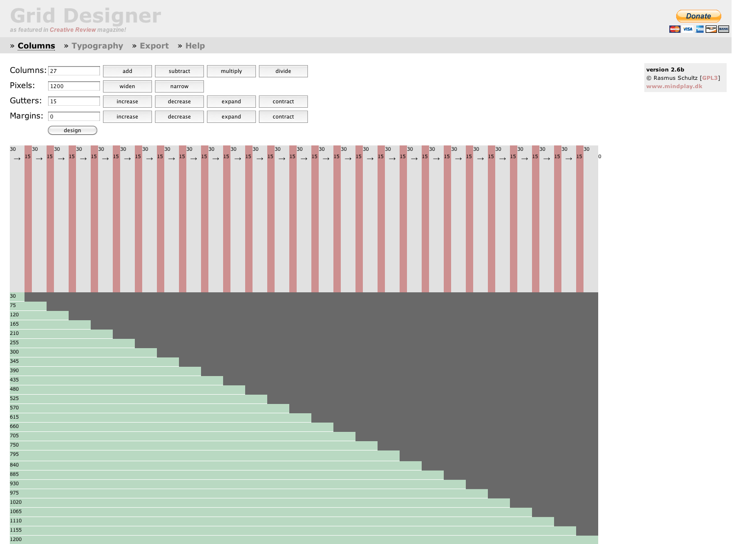
We will be creating an simple non-fluid width grid: http://goo.gl/gNBR0 (or see the attached Image)
27 Columns
1200 Pixels wide
15 Pixel Gutters
0 Pixel Margins
We will have 2 layouts for the Omega Responsive Grid: Wide (non-fluid) & Mobile.
Notes:
1) We will not go into how you have to change your CSS files
2) I will not have a RTL (RightToLeft) version.
Requirements:
Working Omega 3.x subtheme. Best practice not to have an underline "_omega" in your theme-name. Otherwise it will look strange in the hooked filenames (yourtheme_omega_omega....). If you are unsure on how to create a subtheme visit this page first.
In the following example my subtheme is called "ksno" (important! Replace ksno with your subtheme name!).
What we will have to do:
1) look into alpha.info
2) edit your subtheme .info file
3) place and rename the corresponding css files in sites/all/themes/yourTheme/css/grid/yourTheme_default/wide
4) edit your css Files (not covered in here)
5) rename alpha-default*.css files
6) change the Grid settings in Layout configuration /?q=admin/appearance/settings/yourTheme
7)add css files to subtheme .info file
8) Bingo!
Let's get started!
Step 1 (peek into alpha.info):
Locate alpha.info and take a look in it. We will not hack the theme core, so looking only!
/sites/all/themes/omega/alpha/alpha.info
Locate the part where the CSS Grids definition is:
; CSS GRID SYSTEMS

grids[alpha_default][name] = Default (960px)
grids[alpha_default][layouts][fluid] = Fluid
grids[alpha_default][layouts][narrow] = Narrow
grids[alpha_default][layouts][normal] = Normal
grids[alpha_default][layouts][wide] = Wide
grids[alpha_default][columns][12] = 12 Columns
grids[alpha_default][columns][16] = 16 Columns
grids[alpha_default][columns][24] = 24 Columns

grids[alpha_fluid][name] = Fluid
grids[alpha_fluid][layouts][normal] = Normal
grids[alpha_fluid][columns][12] = 12 Columns
grids[alpha_fluid][columns][16] = 16 Columns
grids[alpha_fluid][columns][24] = 24 Columns
Because we will only create 2 versions (wide/ mobile) we will only need the following parts:
; CSS GRID SYSTEMS

grids[alpha_default][name] = Default (960px)
grids[alpha_default][layouts][wide] = Wide
grids[alpha_default][columns][24] = 24 Columns
Step 2 (edit your .info):
Put these 3 lines into your .info file and change them accordingly to your subheme Name. In this example my .info file is located under /sites/all/themes/ksno/
My changes are:
; CSS GRID SYSTEMS

grids[ksno_default][name] = My new 27 Cols Grid (OMG!)
grids[ksno_default][layouts][wide] = Wide
grids[ksno_default][columns][27] = 27 Columns
Note the [ksno_default] part! It must reflect your subtheme name, including the _default part.
Step 3 (create directories and css files):
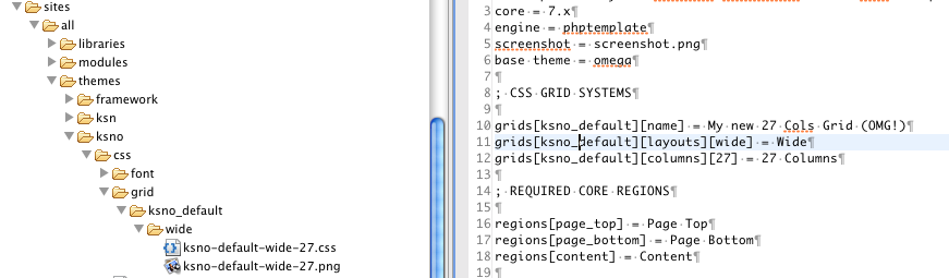
Go into you subtheme folder and create the following structure (see the attached Image)
grid/yourTheme_default/wide in your/sites/all/themes/yourTheme/css folder.
For this example my structure would be: sites/all/themes/ksno/css/grid/ksno_default/wide.
*Note the ../ksno_default/.. naming. It reflects to the [ksno_default] we put in your .info file in the previous step!
Copy the 2 files
alpha-default-wide-24.css
alpha-default-wide-24.png
from /sites/all/themes/omega/alpha/css/grid/alpha_default/wide/ into your
/sites/all/themes/yourTheme/css/grid/yourTheme_default/wide/
rename those two files according to your .info file. In my example they are renamed to
/sites/all/themes/ksno/css/grid/ksno_default/wide/ksno-default-wide-27.css
/sites/all/themes/ksno/css/grid/ksno_default/wide/ksno-default-wide-27.png
See the attached File MyFileStructure.png for a look at the final structure. Also note the 27 reflects the 27 columns in my .info file.
Step 4 (edit your css Files):
Edit the css file to your need. You also need to resize the .png file , so it fits visually to your columns. (column width + gutter width)
It all depends what kind of columns and gutters do you have. I changed the files by hand. (Hey rome was build by hand, too... many hands!) You can generate your layout on http://grids.heroku.com/ and accordingly modify your css file.
*You can also skip this step, because it's the hardest. If all goes according to plan, you can edit them later. First you verify if the files get loaded. To do so let's continue to Step 5.
Step 5 (rename alpha-default*.css files)
You must also rename the ksno/css/ksno-alpha-default.css and ksno/css/ksno-alpha-default-{narrow,normal,wide}.css files to ksno/css/ksno-ksno-default*.css. This is because you have changed the alpha_default grids' name to ksno_default. Otherwise they will not be included.
Step 6 (change the Grid settings in Layout configuration /?q=admin/appearance/settings/yourTheme):
Clear the drupal cache first, then go to your subtheme settings at /?q=admin/appearance/settings/yourTheme
In the "Grid Settings" tab, there is a dropdown at the top called "Grid System". The new Grid system you just defined in your .info file will be listed along with the Default 960 and Fluid grid systems. Choose your new layout and adjust the grid layout settings or media queries as desired and save the page.
Clear the drupal cache again. (you can never do this too much! ;-) )
Step 7
Include the css files in the sub-theme .info file
For example:
stylesheets[all and (max-width: 1008px)][] = css/yourTheme-alpha-default-wide.css
stylesheets[all][] = css/yourTheme-alpha-default.css
stylesheets[all and (min-width: 1008px)][] = css/grid/yourTheme_default/wide/mysubtheme-default-wide-12.css
(thanks to jshamley for pointing this out!)
Step 8
It's a bingo! (Be proud of yourself and your new grid layout)
| Attachment | Size |
|---|---|
| Grid Designer 1200-27columns.png | 94.64 KB |
| MyFileStructure.png | 50.79 KB |
Comments
No PNG overlay
It doesn't to find the renamed png overlay (subtheme-default-normal-24.png in my case), while it doés respond to the subtheme-default-normal-24.css.
Edit:
Found the reason why. I only need two layouts: normal and narrow, so I put this in my .info file:
grids[kenia_default][name] = Standard 960grids[kenia_default][layouts][narrow] = Narrow
grids[kenia_default][layouts][normal] = Normal
grids[kenia_default][columns][24] = 24 Columns
But apparently the narrow shouldn't be in there, so this solved it:
grids[kenia_default][name] = Standard 960grids[kenia_default][layouts][normal] = Normal
grids[kenia_default][columns][24] = 24 Columns
The PNG is back, but what about the narrow layout now?
CSS files not being imported
hi - I followed the directions here, but my css files in sites/all/themes/mysubtheme/css/grid/mysubtheme_default/normal/ are not being imported into the site. surely I'm missing something simple.
any ideas would be greatly appreciated
I think you need to change
I think you need to change the name of your CSS file to use hyphens "-" instead of underscores "_".
So if your subtheme is named "mysubtheme", then the CSS files would use this pattern:
sites/all/themes/mysubtheme/css/mysubtheme-alpha-default-normal.css
sites/all/themes/mysubtheme/css/mysubtheme-alpha-default-narrow.css
sites/all/themes/mysubtheme/css/mysubtheme-alpha-default-wide.css
etc.
Roger
_________________
Art has gone to the dogs
GoodeGallery.com
the underscores are folder
the underscores are folder names, file names do have hyphens. thanks for the help.
I had to include my stylesheets in the .info file. my custom grid is working now!
stylesheets[all and (max-width: 1008px)][] = css/pbs-alpha-default-narrow.cssstylesheets[all and (min-width: 1008px)][] = css/pbs-alpha-default-normal.css
stylesheets[all][] = css/pbs-alpha-default.css
stylesheets[all and (min-width: 1008px)][] = css/grid/pbs_default/wide/mysubtheme-default-wide-12.css
CSS Files
@jshamley. Including the css files in the info file is a decisive step. I am trying to get my new grid to work. Not yet there. Question: are the css files loaded in the order they are listed? Are the css files in the 2nd and 4th line the same?
IE7 & IE8
I originally couldn't get my grid to work, and had added the stylesheets manually like @jshamley did, but I found that the media queries here weren't getting the secret omega magic that makes them work on IE7 & IE8.
After a lot of troubleshooting and rereading the instructions on this page, I realized that I still needed to go into the theme settings in Drupal and enable the grid I had setup (bangs head on desk). Once I did that everything starting working (including in IE) and I didn't need the stylesheet declarations anymore. Just a quick note for others that the instructions here really do work even if you're deep in the .info file and it seems hopeless.
Damn it Drupal!
I also had problems with enabling my grid. Thanks to your comment I had finally succeeded to enable it! All I have to do is to revert to default 960grid and then again re-enable my new grid! Stupid caching problems.
Best option is to install Devel module and enable "Rebuild the theme registry on every page load". That will save you from headaches caused by theme registry cache.
Yeah, It's a little confusing
Yeah, It's a little confusing at first. But once the files are named properly, it's all good.
Roger
_________________
Art has gone to the dogs
GoodeGallery.com
grid image does not apperar
Hi,
I have a probelm after I have create the new grid I don't see the grid.png can you explain me how can I solve it?
I have copy the css and png file in this directory:
sites/all/themes/mytheme/css/grid/mytheme_default/normal/mytheme-default-normal-24.css
sites/all/themes/mytheme/css/grid/mytheme_default/normal/mytheme-default-normal-24.png
mytheme.info include:
grids[mytheme_default][name] = My Grid (990px)
grids[mytheme_default][layouts][normal] = Normal
grids[mytheme_default][columns][24] = 24 Columns
stylesheets[all and (min-width: 990px)][] = css/grid/mytheme_default/normal/mytheme-default-normal-24.css
can you help me what ists wrong?
kind regards
drew
Hi Drew. What's the full name
Hi Drew. What's the full name of your theme. Does it have underscores?
Hi, thanks for your answer
Hi,
thanks for your answer :-). I don't no but now it works. I needed to delete the cache several times
kind regards
drew
Question on misc. responsive css
So I've set up my custom grid and it works but how do I add my misc responsive css files since I would want to kept the styles and the grid styles separate? Like for example, I copied a starterkit to make into a subtheme. Then made the custom grid in the subtheme. What do I do to the css files (YOURTHEME-alpha-default.css, YOURTHEME-alpha-default-narrow.css etc) to make it work?
kim.le, this was driving me
kim.le, this was driving me nuts too! After about 5 attempts, I read all the comments, and noticed that you also need to add the css files to the sub-theme .info file. I have added this as step 7 so that others won't have the same problem.
Hopefully that fixes it for you. It did for me! ;)
What about custom grids and responsive design?
I can't wrap my head around this. I can get my custom grid working just fine, but when it comes to a responsive design and custom grids, there's a disconnect.
I define my custom grid systems, in the .info file:
; CUSTOM CSS GRID SYSTEMS

grids[asi_omega_default][name] = Custom 24 Cols Grid for ASI
grids[asi_omega_default][layouts][normal] = Normal
grids[asi_omega_default][columns][24] = 24 Columns

grids[asi_omega_default][layouts][narrow] = Narrow
grids[asi_omega_default][layouts][fluid] = Fluid
And then I define my new grid css files by width (following examples above):
stylesheets[all and (min-width: 320px) and (min-device-width: 320px), (max-device-width: 739px) and (max-width: 739px)][]  = css/asi_omega-alpha-default-fluid.css
stylesheets[all][] = css/grid/asi_omega_default/fluid/asi_omega-default-fluid-24.css

stylesheets[all and (min-width: 740px) and (min-device-width: 740px), (max-device-width: 959px) and (max-width: 959px)][] = css/asi_omega-alpha-default-narrow.css
stylesheets[all][] = css/grid/asi_omega_default/narrow/asi_omega-default-narrow-24.css

stylesheets[all and (min-width: 960px) and (min-device-width: 960px)][] = css/asi_omega-alpha-default-normal.css
stylesheets[all][] = css/grid/asi_omega_default/normal/asi_omega-default-normal-24.css
But the output is never quite right. I notice when using Omega's default grids, I get this kind of output:
<!--[if (lt IE 9)&(!IEMobile)]>
<style type="text/css" media="all">@import url("http://asi.dev/profiles/asi/themes/omega/alpha/css/grid/alpha_default/normal/alpha-default-normal-24.css?m8idhn");</style>
<![endif]-->

<!--[if gte IE 9]><!-->
<style type="text/css" media="all and (min-width: 320px) and (min-device-width: 320px), (max-device-width: 739px) and (max-width: 739px)">@import url("http://asi.dev/profiles/asi/themes/omega/alpha/css/grid/alpha_default/fluid/alpha-default-fluid-24.css");</style>
<!--<![endif]-->

<!--[if gte IE 9]><!-->
<style type="text/css" media="all and (min-width: 740px) and (min-device-width: 740px), (max-device-width: 959px) and (max-width: 959px)">@import url("http://asi.dev/profiles/asi/themes/omega/alpha/css/grid/alpha_default/narrow/alpha-default-narrow-24.css");</style>
<!--<![endif]-->

<!--[if gte IE 9]><!-->
<style type="text/css" media="all and (min-width: 960px) and (min-device-width: 960px)">@import url("http://asi.dev/profiles/asi/themes/omega/alpha/css/grid/alpha_default/normal/alpha-default-normal-24.css");</style>
<!--<![endif]-->
Is there something I'm missing, or doing wrong? Or is this just not possible with custom grids?
Dan Moriarty
www.electriccitizen.com
underscores vs dashes
You have to replace the underscores with dashes in the theme name in certain places. See "underscore in subtheme name causes problem".
Also note the comment in the directions above:
In general, I think it's easiest if you pick a subtheme name that does not have any underscores so you don't even have to think about where to change the underscores to dashes.
Thanks!
Now I get it, and it works. As someone said earlier, and I didn't understand, "folders underscores" and "files hyphens".
I agree about the subtheme name without hyphens too, but in this case, I was trying to keep the same name.
Dan Moriarty
www.electriccitizen.com
What about CSS weight
Now everything is working here, and my stylesheets with custom grids are being included by Omega. But how do I get my custom "Narrow" CSS to appear AFTER my theme CSS, such as global.css?
As it is now, all these responsive stylesheets are loading BEFORE global.css. But I want them to be overriding global.css, as needed.
I know with stylesheets like global.css, I can set weight like this:
css[global.css][name] = Your custom global stylescss[global.css][description] = This file holds all the globally active custom CSS of your theme.
css[global.css][options][weight] = 0
But with these custom grids and CSS, where do I set a weight?
stylesheets[all and (min-width: 740px) and (min-device-width: 740px), (max-device-width: 959px) and (max-width: 959px)][] = css/asi-omega-alpha-default-narrow.cssstylesheets[all][] = css/grid/asi_omega_default/narrow/asi-omega-default-narrow-24.css
Dan Moriarty
www.electriccitizen.com
Omega stylesheets
When I first started using Omega, I was confused about the CSS files too. I wrote this to remember:
http://www.mydrupaljourney.com/articles/2011/06/30/omega-starterkit-css-...
James Sinkiewicz
Drupal Site Builder and Generalist
http://MyDrupalJourney.com
Omega Tools
Does this take into account all the settings that omega tools automatically creates in your info file? Cause when looking at this and the info file it creates i am confused.
my info file has this in it already...
settings[alpha_layouts_alpha_fluid_primary] = 'normal'
settings[alpha_layouts_alpha_fluid_normal_responsive] = '0'
settings[alpha_layouts_alpha_fluid_normal_media] = 'all and (min-width: 740px) and (min-device-width: 740px), (max-device-width: 800px) and (min-width: 740px) and (orientation:landscape)'
settings[alpha_layouts_alpha_default_primary] = 'normal'
settings[alpha_layouts_alpha_default_fluid_responsive] = '0'
settings[alpha_layouts_alpha_default_fluid_media] = 'all and (min-width: 740px) and (min-device-width: 740px), (max-device-width: 800px) and (min-width: 740px) and (orientation:landscape)'
settings[alpha_layouts_alpha_default_fluid_weight] = '0'
settings[alpha_layouts_alpha_default_narrow_responsive] = '1'
settings[alpha_layouts_alpha_default_narrow_media] = 'all and (min-width: 740px) and (min-device-width: 740px), (max-device-width: 800px) and (min-width: 740px) and (orientation:landscape)'
settings[alpha_layouts_alpha_default_narrow_weight] = '1'
settings[alpha_layouts_alpha_default_normal_responsive] = '1'
settings[alpha_layouts_alpha_default_normal_media] = 'all and (min-width: 980px) and (min-device-width: 980px), all and (max-device-width: 1024px) and (min-width: 1024px) and (orientation:landscape)'
settings[alpha_layouts_alpha_default_normal_weight] = '2'
settings[alpha_layouts_alpha_default_wide_responsive] = '1'
settings[alpha_layouts_alpha_default_wide_media] = 'all and (min-width: 1220px)'
settings[alpha_layouts_alpha_default_wide_weight] = '3'
do i have to delete this?
Hi,Thanks for the guide. I
Hi,
Thanks for the guide, very good tutorial :)
Sam.
Grid changes not being picked up
I have followed all the above, however, although the grid stylesheets are being picked up, it doesnt seem to be picking up the new grid settings, just using the alpha-mobile.css for setting the grid, regardless of display size...
Any ideas?
Also, baf139 mentioned the media queries. I changed these in the admin, although the info file doesnt update to reflect the changes? I would have expected this to update?
Another minor correction
As of 2012 Nov 18, Steps 5 + 7 conflict:
In step five, we rename ksno-alpha-default.css to ksno-ksno-default.css etc, for your css files in your theme's css file.
In step 7, we see (partial clip)
stylesheets[all][] = css/yourTheme-alpha-default.css
Suggesting that step 5 hasn't happened yet. Shouldn't step 7 be
stylesheets[all][] = css/yourTheme-yourTheme-alpha-default.css
I wish to verify my observation before updating the page. It fixed what ailed my setup.
Can not enable display of grid
Everything about my custom grid works, except for one thing: the grid png itself.
My file names and path match the recommended pattern:
In my custom grid path:
subtheme/css/grid/subtheme_default/Normal/
subtheme-default-normal-6.css # loads in my page as expect
subtheme-default-normal-6.png # Apache can access this file without error
I've customized the png file to match the above layout parameters, which is here.
in my subtheme.info file:
grids[subtheme_default][name] = 1000px by 6 column grid
grids[subtheme_default][layouts][Normal] = Normal
grids[subtheme_default][columns][6] = 1000px by 6 column grid
I've cleared my theme registry and all caches, cleared my browser caches to no avail. I see in alpha.inc where the overlay background image is concatenated (or not if path isn't valid) but I don't see why
Clarity of naming conventions
Until I read a comment in the Omega issue queue: http://drupal.org/node/1843482#comment-6753212
I was very confused about how/why things were named in this tutorial. It's hard to follow the example since the grid name example matches the theme name and then uses a generic term like "default".
I didn't know if I should overhaul the complete tutorial above but perhaps this will help someone. I was trying to create a custom grid system with two different fluid grid layouts. So I named my subtheme "water" and my grid layout system is called "hydro".
My directory structure looks like this:
sites/all/themes/water/css/grid/hydro/narrow/hydro-narrow-12.css
sites/all/themes/water/css/grid/hydro/narrow/hydro-narrow-16.css
sites/all/themes/water/css/grid/hydro/narrow/hydro-narrow-24.css

sites/all/themes/water/css/grid/hydro/normal/hydro-narrow-12.css
sites/all/themes/water/css/grid/hydro/normal/hydro-narrow-16.css
sites/all/themes/water/css/grid/hydro/normal/hydro-narrow-24.css
(These grid files were copied from the alpha fluid system, as in alpha-default-normal-12.css)
sites/all/themes/water/css/global.csssites/all/themes/water/css/water-hydro.css
sites/all/themes/water/css/water-hydro-narrow.css
sites/all/themes/water/css/water-hydro-normal.css
(the water-hydro.css applies to both narrow & normal layouts but not the mobile layout)
I was struggling with getting my water-hydro-narrow.css and normal css files to load in the proper order as I couldn't find a way to both declare a media query and a weight for these files. Turns out if you just name them properly, the Omega theme will pick them up and you don't need to declare any custom CSS paths in your .info file at all.
I just added the following lines to my subtheme settings file (water.info):
grids[hydro][name] = 'Water Hydro Grid'grids[hydro][layouts][narrow] = 'Fluid Narrow'
grids[hydro][layouts][normal] = 'Fluid Normal'
grids[hydro][columns][12] = '12 Columns'
grids[hydro][columns][16] = '16 Columns'
grids[hydro][columns][24] = '24 Columns'
Then chose the new "Hydro Grid" as the grid system for my subtheme "Water". Note, this is in the "Grid Settings" tab, at the top, there is a select box called "Grid System".
-Kendall
www.kendalltotten.com
Thanks for this
It helped - I was confused about filenames, hyphens and underscores.
I don't understand why, but after fixing everything per your example, it still wasn't working. It wasn't until I followed the step in c.l.murphy's post below that everything finally started working.
It was definitely a combination of the original recipe, your clarification and the media query tip in c.l.murphy's that worked for me.
I am on a slightly out-of-date version of commerce kickstarter 7 - I really should upgrade.
Yes please
Kendall I found, and I think others would agree, that the explanation is confusing. I am still not certain if I need to change anything in the .info file under THEME SETTINGS (Defaults) with my custom grid plus a few other questions. Is there somewhere a detailed explanation of what Omega does with the settings in the dot info file?
Thanks
Tony
Problems with my normal grid png file not displaying
I am confused, and I cannot see my grid png file, all kinds of other grid images but not the one I have created.
In step 5 you say:
"You must also rename the ksno/css/ksno-alpha-default.css and ksno/css/ksno-alpha-default-{narrow,normal,wide}.css files to ksno/css/ksno-ksno-default*.css. This is because you have changed the alpha_default grids' name to ksno_default. Otherwise they will not be included."
In step 7 you say:
"Include the css files in the sub-theme .info file
For example:
stylesheets[all and (max-width: 1008px)][] = css/yourTheme-alpha-default-wide.css
stylesheets[all][] = css/yourTheme-alpha-default.css
stylesheets[all and (min-width: 1008px)][] = css/grid/yourTheme_default/wide/mysubtheme-default-wide-12.css"
Now you use the yourTeme-alpha and not yourTheme-yourTheme-default.
So which one is it?
I need to create a normal layout grid of:
984px
12 columns
Column width: 78px
Gutter: 2px
My info file:
;CSS GRID SYSTEMS
grids[constantia_r_default][name] = Constantia_r (980px)
grids[constantia_r_default][layouts][normal] = Normal
grids[constantia_r_default][columns][12] = 12 Columns
stylesheets[all and (min-width: 980px)][] = css/grid/constantia_r/normal/constantia-r-default-normal.css
styelsheets[all][] = css/constantia-r-alpha-default.css
Still don't see my grid.
And these lines are very confusing:
*/-->
<![endif]-->
*/-->
Doesn't that mean I will see my grid.png file only on ie9???
And by the way, I don't see it on IE9 either.
I cleared cache, I reverted the theme, I cleared cache, I selected my grid, I cleared cache, I cleared cache, I cleared cache.
Nada.
Somebody kill me please...
Step 7 is not necessary if you did step 5
I edited step 5, but someone else added step 7. In my own working .info file, I did not do step 7. Take out those lines and see if it works.
This is a wiki. Please feel free to edit the page to correct it if you know it is wrong.
My completely working theme is named "tav", and is 16 columns, with zero-width gutters. This are the only lines I added to
tav.info(besides editing the identifying lines at the top):grids[tav_default][name] = Default (960px, no gutters)grids[tav_default][layouts][narrow] = Narrow
grids[tav_default][layouts][normal] = Normal
grids[tav_default][layouts][wide] = Wide
grids[tav_default][columns][16] = 16 Columns
This is a listing of the files in
sites/all/themes/tav(minus some special-case template files specific to my site only):tav/css/grid/tav_default/narrow/tav-default-narrow-16-rtl.css
tav/css/grid/tav_default/narrow/tav-default-narrow-16.css
tav/css/grid/tav_default/narrow/tav-default-narrow-16.png
tav/css/grid/tav_default/normal/tav-default-normal-16-rtl.css
tav/css/grid/tav_default/normal/tav-default-normal-16.css
tav/css/grid/tav_default/normal/tav-default-normal-16.png
tav/css/grid/tav_default/wide/tav-default-wide-16-rtl.css
tav/css/grid/tav_default/wide/tav-default-wide-16.css
tav/css/grid/tav_default/wide/tav-default-wide-16.png
tav/css/README-TAV.txt
tav/css/README.txt
tav/css/nice_menus_tav.css
tav/css/tav-tav-default-narrow.css
tav/css/tav-tav-default-normal.css
tav/css/tav-tav-default-wide.css
tav/css/tav-tav-default.css
tav/css/global.css
tav/preprocess
tav/preprocess/README.txt
tav/process
tav/process/README.txt
tav/templates
tav/templates/README.txt
tav/logo.png
tav/screenshot.png
tav/tav-alpha-mobile.css
tav/tav.info
tav/template.php
Step 7 not necessary for me as well
Thanks, dhalbert. I had issues until I read your post. Once I removed the lines I added as part of step 7, the grid overlay displayed correctly. Thanks for taking the time to list your files. It was very helpful.
I'm so confused
I have done every which way and more as described above but it still doesn't work! Time for the experts! I have created successfully my new grid, but I can not get any of the responsiveness.
What I wanted was a grid that is 1140px, 12 columns, 20px gutters, in a "wide" layout. When you reduce the screen size it would pick up the normal responsive Omega layouts (narrow, normal, mobile)
Here is what I have in my .info file
grids[amomega_default][name] = 1140px
grids[amomega_default][layouts][narrow] = Narrow
grids[amomega_default][layouts][normal] = Normal
grids[amomega_default][layouts][wide] = Wide
grids[amomega_default][columns][12] = 12 Columns
My directory files:
amomega/css/amomega-amomega-default-narrow.css
amomega/css/amomega-amomega-default-normal.css
amomega/css/amomega-amomega-default-wide.css
amomega/css/amomega-amomega-default.css
global.css
amomega/css/grid/amomega_default/narrow/amomega-default-narrow-12.css
amomega/css/grid/amomega_default/normal/amomega-default-normal-12.css
amomega/css/grid/amomega_default/wide/amomega-default-wide-12.css
I will say when I pick my grid in the "grid system" drop down, under media query for each layout, it just says "all" vs min-width:740px...which I think is the problem, but I can not seem to change these values.
I believe this follows dhalbert's advice, but responsive is not working. Any suggestions?
Never Mind
Never mind...while in the admin->appearance->settings->amomega, I copied the media query from the 960 layout for normal and narrow and pasted them in to my new layout and now it is working. I hope it doesn't blow up when I log out! Is this the way you are suppose to get the media query info?
Thank you c.l.murphy !
I was about to utterly lose my sanity. This worked for me.
Thanks!
Why step 7 is not necessary
As dhalbert mentions, step 7 is not needed. Here is an elaboration as to why it isn't needed.
Once the new grid system is chosen in the theme configuration settings,
the grid css files are automatically loaded.
However, by default, omega does not fill in the media queries for you in the configuration form so you need to do this on your own for each layout (this would be the real step 7).
Once you've done that, you can inspect the page and see the media queries are loading the grid files.
Another thing I found is that this line: settings[alpha_grid] = 'GRID_NAME' in the info file is not updated to reflect the new chosen grid system (this depends if the settings are maintained in code or the db).
Simply update it to the new grid name, for example: (the real, optional - step 8)
settings[alpha_grid] = 'mytheme_default'
Your various break-point css files will now load properly. If they don't, make sure you renamed the css files in step 5 correctly. The convention is:
[THEME_NAME]-[GRID_NAME]-[WIDE/NORMAL/NARROW].css
(use only hyphens)
Hope this helps some out :)
Strange error when naming custom grid
First off, thanks for all the great info in this thread :)
It has helped me a lot!
There's only this one annoying thing I can't get to work properly.
When naming my custom grid I get an error and the name will not show up inte the drop down list where you select your grid. I get a blank entry that I can select and the grid system works.
From the .info file
grids[THEMENAME_default][name] = 'NAME'
Error:
Notice: Undefined index: name in alpha_retrieve_grids() (line 783 of /.../sites/all/themes/omega/alpha/includes/alpha.inc).
We use Omega 3.1
Thanks in advance!
Extending the existing alpha_default grid to 1920 pixels width
If you want to extend the existing alpha_default grid to 1920 pixels width, please have a look at post #10 “How to add a new layout size” (https://drupal.org/node/1607748).
Narrow not working
Help....good news is since my April 10th post, my new 1400px grid is responsive. It is loading all the css files both grid and normal. However, it reverts back to alpha-mobile.css for my narrow.
I have 5 breakpoints:
Mobile: >200 <449: loads amomega grids and css
Phoneland: >450 <679: loads amomega grids and css
Narrow: >680 <950: loads amomega css but loads alpha-mobile.css for grid (creates a stack grid vs 3 column grid-4-3 that I want).
Normal: >951 <1139: loads amomega grids and css
Wide: >1140: loads amomega grids and css
I am using panels for the content area with layout omega-12-threecol-4-4-4 as the layout. I don't know if that is the problem. I just is weird that only the narrow is not working correctly. Why is it working with the alpha-mobile.css file for the grid. And yes, when I check the "head" with firefox inspect is is loading the amomega narrow grid.
What I want: Mobile/Phoneland to stack, Narrow, Normal and Wide to have 3 columns.
Is this possible? Any suggestions? I know I can fix the amomega narrow css but that sort of defeats the purpose.
debug column png not displaying
I followed the instructions above and everything seems to work except for two things.
None of the zone/regions above content re-sized and the debug column png did not show.
I suspect the first is because some values were already in the variables table.
On the second it is because the grid layout enabled value is set false (though it is set true in the UI), The pngs are rendered if responsive is turned off.
line 402 in alpha.inc
if ($grid['layouts'][$layout]['enabled'] || !$responsive) {What controls enabled value? Surely it is that the theme is enabled? Even disabling and re-enabling did not affect this value.
I suspect this issue arises when you clone your theme from a version of omega you have already enabled.
This actually breaks my grid
FIXED!!!!! Forgot to fix the margins on the grid.
I followed the instructions and got all my css files that I care about, to load. I haven't bothered with files like global.css right now because I'm not that far along. However, I have a huge issue! I edited my them to do a 13 column layout with an 18 px gutter and a 58px column and that worked, I think?
I tell my theme zones to be 13 columns across and then I divide my regions up. SIdebar one = 3 content=10 columns.
This breaks the theme. The blocks just want to sit on top of one another and not be side to side. What am I missing?
Any help would be great. I'm not ready for Omega 4 yet. Just now starting to learn sass and compass.
Here is an example page: http://dmta.right-brain.net/our-services# (note I haven't updated my png grid yet.)
I hope someone can help me out here...
Rebecca
The generated css from http://grids.heroku.com/ was not working
Until I replaced every underscore in the generated file by a hypen.
In the css every _ must be a - so that for example .container_48 and .grid_1 changes to .container-48 and .grid-1
THANK YOU!
Thank you very much! :D
This tutorial really saved me a lot of time!
It worked like a charm.
Congratulations!