
Posted by rgs on December 1, 2011 at 9:49pm
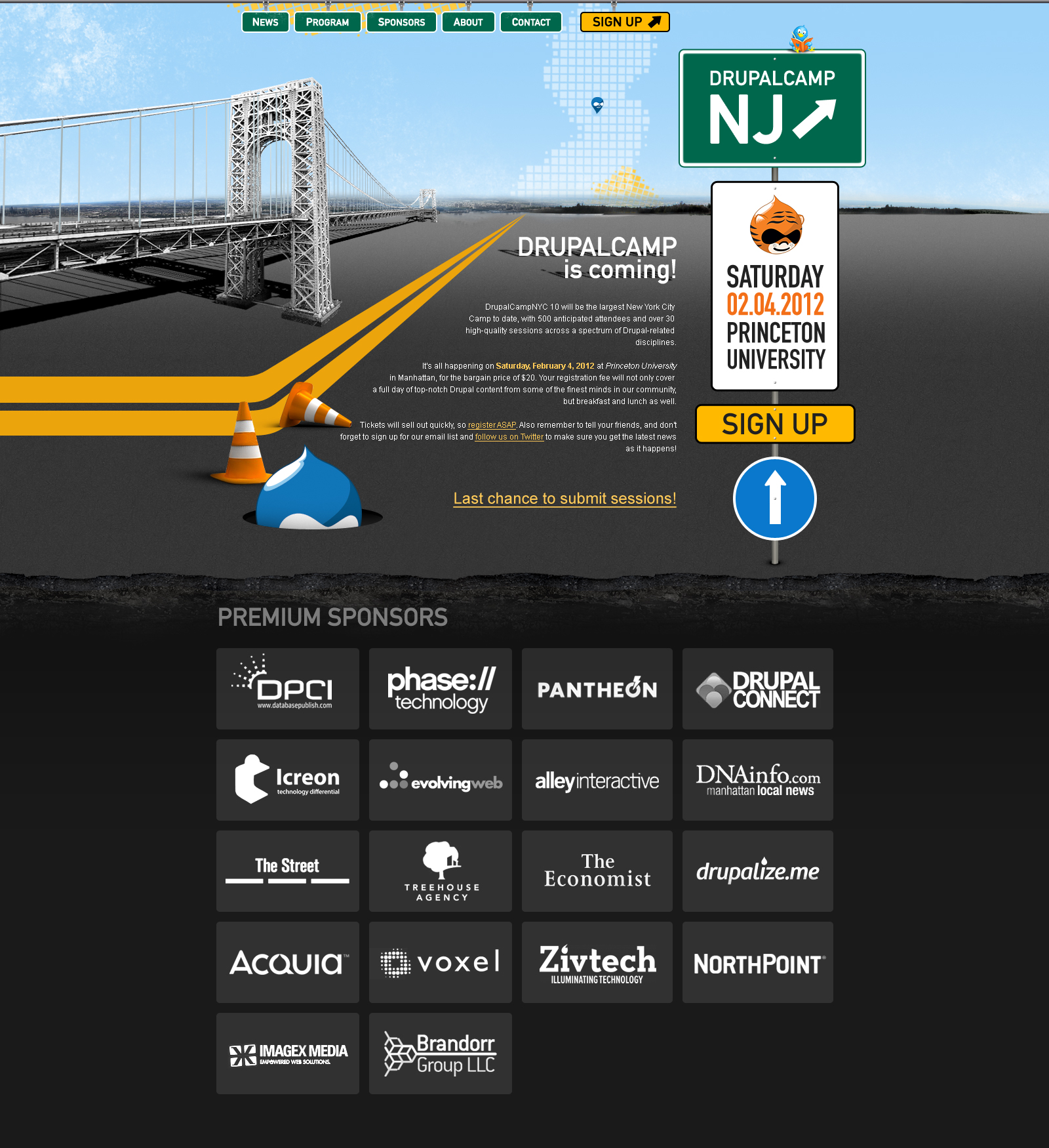
See attached NJ Drupal Camp Theme design
THANKS FOR ALL THE GREAT CONSTRUCTIVE FEEDBACK AND HANDS ON WORK.
PLEASE SEE THE UPDATED HOME PAGE ATTACHED.
I am calling this the final version as we have got to move things forward in the workflow and we've incorporated many of your great suggestions.
| Attachment | Size |
|---|---|
| NJ Camp 2012 draft theme design.pdf | 1.29 MB |
| home_final.jpg | 1.01 MB |
Comments
Please note
As mentioned in a different thread. Blink incorporated a variation of one of notmike's logo designs in this theme design.
Ray
Looks pretty good. I like the
Looks pretty good. I like the road signs, but I think the chopped bridge looks a bit awkward.
Great
I like the road / Garden State Parkway theme. Prefer the blue menu items (on page 1) over the green ones.
Very Nice
I like the exit signs and road themes. Very Jersey. I initially liked the blue menus, but I started to like the green ones because they matched the Drupal Camp NJ sign.
NJ Drupal Camp Theme design
I like it.
The part with the sponsors below the surface of the road is brilliant. Perhaps that design element could be used for a content rich footer (or a normal footer) on every page?
I have to agree with David about the chopped bridge. I wonder if there is a better solution for the close end of the bridge, because otherwise, I really like the bridge.
I love the pixelated NJ on the horizon. I see there is a right-side-up and and upside-down Druplicon. I like the upside-down one better, with the point downward like a map marker.
Princeton Athletics Department owns that variation of the tiger. We may have to get permission to use it.
Michael
Princeton Athletics Tiger
Since we would likely never get permission to use one of the Princeton Athletics tigers, a few suggestions are to use an original tiger illustration, an orange and black Druplicon, or a tiger-striped Druplicon. A while ago, I did an orange and black Druplicon (below).
Orange Druplicon EPS
half bridge looks good
The half bridge actually shows how heavy fog can affect visibility, and princeton/NJ has seen its share of heavy fog
Umm....where are the
Umm....where are the construction cones??? :-)
Now there's a "constructive"
Now there's a "constructive" comment. ;-) Cones would be awesome.
Probably doesn't reflect the
Probably doesn't reflect the image you're hoping to present but I can't help but think that this font is somehow appropriate.
@banghouse: I'm originally
@banghouse: I'm originally from NJ and didn't get the Tigers reference...though I am from Monmouth County, so Princeton is far, far away and thus relatively unknown :)
WizOne Solutions - https://wizone.solutions - Drupal module development, theme implementation, and more
FillPDF Service - https://fillpdf.io - Hosted solution for FillPDF
How about this
http://enews.princeton.edu/Princeton-Druplicon.png
... or this?
How about this
... or this?
You can download this as an EPS
here ... http://www.princeton.edu/~stephenm/drupal-stuff/Princeton-Druplicon.eps
This looks really cool.
This looks really cool. Though I agree with Mike about the shape and color. You guys are pretty talented.
Tiger Druplicon
Here is another take on the idea of the tiger Druplicon.
I was trying to keep the shape closer to the official Druplicon and also use Princeton orange (PMS 158).
Also the whiskers are just dots to make the shape easier to die-cut. 7 whiskers for D7 and 6 for D6.
That is awesome.
That is awesome.
Can you add a little tiger
Can you add a little tiger ear on the near side like the one from Steve?
I'm tempted to change the logo for the meetup group!
Ears
I can try to add ears after work. I think I already exceeded my "20-percent time" by working on it this morning.
Thundercats!
Thundercats!
Tygra
Jesse nailed it. I could not figure out how to give him a white mouth, so I used Tygra from the Thundercats as inspiration (classic Thundercats, not 2011 Thundercats).
The black is probably better.
The black is probably better. Most of the time the image is going to be small, so you'd probably lose it if it was white.
Great
I like the shape and color of notmike's logo but the nose and mouth of enginpost's logo. The D6 and D7 dots are also very clever.
I second this comment and the
I second this comment and the other comment that ears would also make it better. At the same time I'm thinking, even though it looks cool and is a good idea, I'm not sure how many people outside of NJ will get the reference to the Princeton Tigers. Though that may or may not matter ultimately. I just know I wouldn't have understood the reference by looking at the image alone. I only get it from having been involved in this conversation. Maybe I'm the exception? Maybe it doesn't matter.
Tiger
The tiger wouldn't be a symbol for the DrupalCamp itself, it will just represent Princeton University since we were not allowed to use the Princeton Athletics tiger.
I would hope that people associated tigers with Princeton since it is (arguably) the oldest collegiate mascot.
Merge the Two
I like the look of both. I think the ears add a better symbolism.
"The best way to predict the future is to invent it." - Alan Kay
mike has my illustrator files
I believe Mike and I were both using Illustrator and I sent him my file. Let the mashup begin! Have at it Mike. Lot's 'o good ideas.
Steve
He has ears now.
I drew brand new ears, taking the zig-zag hair idea, but giving them more of a feline shape.
I wanted to retain the Druplicon eyes, nose, and mouth, so that he is a bizarre tiger/Druplicon hybrid.
Tiger Druplicon EPS
Tiger Druplicon Hits the Mark
I think its perfect now. I people don't get the tiger before, they will after arriving.
Maybe the school mascot will come down and dance for us.
"The best way to predict the future is to invent it." - Alan Kay
New version
Have attached a new version and updated the body of the original post.
Ray
Spelling of DrupalCamp NJ
One thing I noticed in the text of the dev website, the EventBrite site, and the Twitter account is the inconsistent spelling of DrupalCamp.
On the Eventbrite site, it is spelled Drupalcamp and Drupacamp.
On the Twitter site, it is spelled Drupal Camp.
On the dev website, it is spelled Drupal Camp and Drupalcamp (look at the grab bar title).
We should probably standardize on DrupalCamp, one word with intercaps (upper camel case). That seems to be what most others use.
It is a very minor thing, but while correcting "Drupacamp" on Eventbrite, it makes sense to fix it everywhere.
--
BTW, @davidhernandez handed a box of DrupalCamp NJ postcard flyers off to us, and I will be taking them to DrupalCamp NYC tomorrow. They look great.
I fixed it on Eventbrite -
I fixed it on Eventbrite - don't have access to the others (yet).
Fixed on
website and twitter
Ray