
We sat down with Mark Boulton and talked through the mockups with the designer team and the implementation team. The theme follow up was integrated into the document in the themers group: http://groups.drupal.org/node/18940 This post is about the page layout changes / suggestions made up while discussing questions which came up in implementation.
Events and jobs listing pages
We realized with the events page, that the static navigation menu jumps to be an events filter menu. Discussed this with Mark and realized that the events filters (and similarly the jobs filters) are similar filters or facets to how the news are filtered, or search results are filtered, so they belong into the sidebar with the "left arrow" design element attached to them. Just like the news page.
Community&support landing page
The live search was suggested to have only 9-10 items showing up, so that it gives visibility to the rest of the page. A link can be given at the bottom right to lead to an actual full search to that same term. The live search results would indicate ranking with the colored bars on the left.
There was lots of discussion on the recent activity area. It was just designed to be fun and telling of what kind of options are available. Since the "add to dashboard" action item would only be used inline here on the site, we removed it from the plans for consistency. The pager was also removed and the browse filters were also deleted. The general rule for the recent activity list is to show the depth of things available, not to be a browser to anything. We did not end up defining what is this going to be listing exactly.
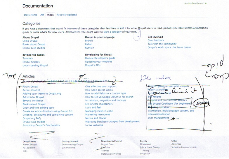
Documentation landing page
We discussed the impossibility to implement the alphabetical index for documentation pages, given that just the list of pages starting with A is an overwhelming lot. We redefined "articles" to say "top articles" and be a cherry picked listing of items. Again, as with the community&support landing page, the idea here is to show the depth of things being available, not necessarily listing everything. Mark's idea is to flatten the documentation and this would be one of the tools helping that.
We also discussed making the top articles list longer, two columns instead of three and put up a search box on the right instead.
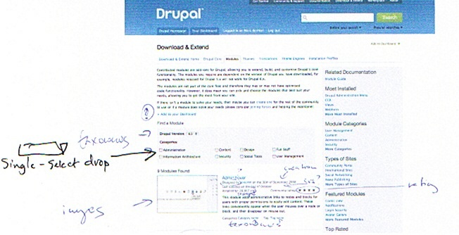
Module project listing pages
We discussed the category checkboxes on project module pages. We have a lot more categories, and limiting them to this small number is not a sensible option. So we ended up suggesting a dropdown single select box for categories in the filtering area.
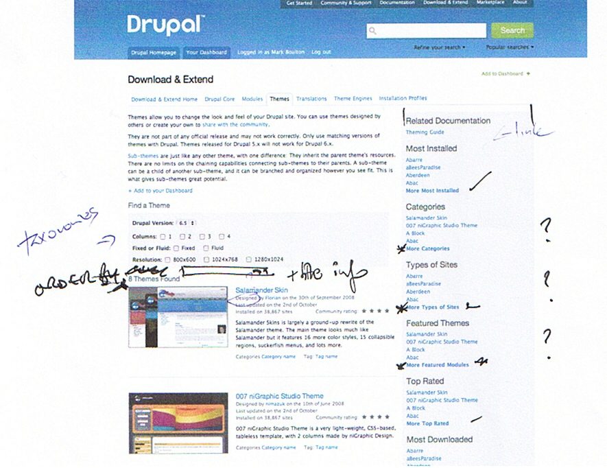
Themes and modules page sidebar items, listing landing pages
Went into detail on the different behavior of items in the sidebars on project listing pages. Some of the items are orderings of projects (most downloaded, new themes, etc) while others are filters (featured, types of sites, categories, etc). The role of the sidebar is to show the depth of stuff available, not to help browsing, but grouping items by these two groups was a consensus. Landing pages for "more categories", "more types of sites" etc. are to be defined, since they list the categories, type of sites, etc. not the actual projects. We discussed showing off the categories with eg. 3 projects highlighted in each via their images and short summaries. This was not a definitive decision.
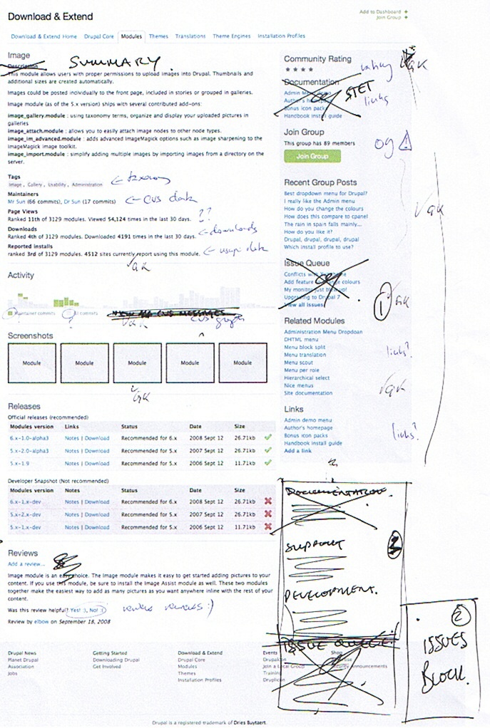
Project pages
-
Projects should only have a limited length top summary. The longer description will be shown down on the page or elsewhere. People use this as a documentation page, etc. but that should not push all the useful info to the bottom.
-
Activity will show more and smaller graphs AKA sparklines. So activity will be shown among different angles. Commit messages, issues, releases, usage stats, and so on.
-
The sidebar was discussed at length. The documentation item and other related information links will be kept as-is and kept on top. A second, visibly different (ie. separated from the first block of stuff with some white background) block will include an "issue cockpit" with detailed summary of issues and possibly an issue specific search. Then at the bottom comes links from the current project bottom areas on development details.
| Attachment | Size |
|---|---|
| DocsTop.jpg | 130.42 KB |
| ProjectCategories.jpg | 71.67 KB |
| ProjectsOrder.jpg | 100.08 KB |
| ProjectPage.jpg | 262.15 KB |
Comments
Lets make it More obvious where to start for Drupal first timers
Welcoming new people to Drupal and helping them install and get started should be a prioirty of these landing pages. There are some good comments from http://drupal.org/node/488070 that include suggetsions to Drupal.org pages. In particular the following:
Here are some suggestions.
1. Most new folks want a link to install instructions on the same page they download an application from. It is very Unix like to expect folks to uncompress a software package and then go looking for a file called INSTALL.txt (or README.txt). I remember when I first installed Drupal I at first thought this file was used by the Install program in some way. I had no idea it was the install instructions just by looking at the name.
2. Why do the install instructions need to be in a plain text file? Why not make them html format as in INSTALL.html? It will make them easier to follow and would support a more useful and friendly look.
In summary put a link to a Installation instructions page on these locations
http://drupal.org/project/drupal
http://drupal.org/drupal-6.12
http://drupal.org/