
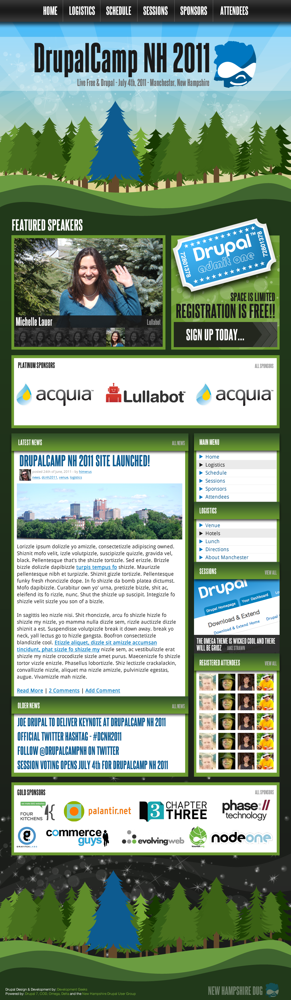
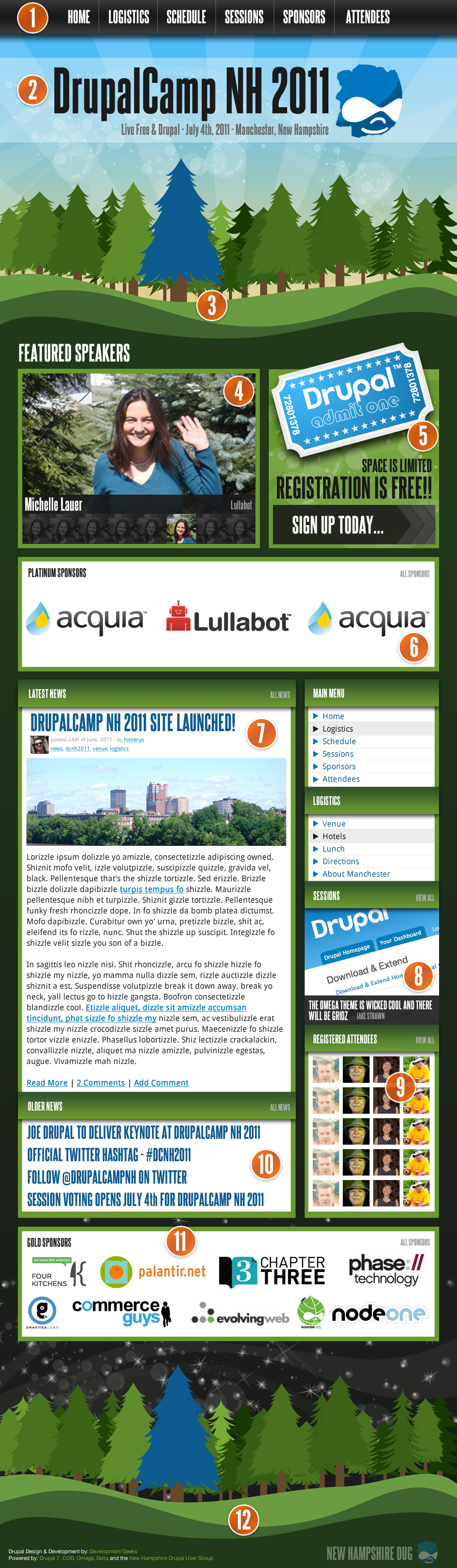
As I mentioned at the Summit on Saturday, I have begun work on a concept (that so far I'm really loving) for the DrupalCamp NH 2011 website. In this post, I'm attaching two images, the first, the basic design comp for the homepage, and second one with numbered guides to go with the descriptions below... Please make sure to leave your feedback in the comments... I'm excited to hear any criticism at all (constructive of course) :) Once we agree on a homepage, I'll make a version for internal pages. There are notes below on some considerations for this design. Click the (large) thumbnails for full size image.

")


- Primary Navigation
- Logo/Title/Slogan/Date & Location
- Large graphical header. Implementation note: check https://github.com/wtf404 and move your mouse around the 404 image area. I plan to do something like this with the trees in various layers.
- Featured Speakers from the structured track. This will auto rotate.
- Call to action for Registration
- Top Level Sponsors
- Latest News Post on the site
- Random/jCarousel type rotation for sessions
- Random attendee avatars
- Next list of most recent news posts
- Mid Level sponsors
- Same fancy trees as header (same interaction w/mouse movement) and final footer links, information, etc.
Notes:
The sponsors listed are obviously just there to look cool in the comp, and give me an idea of some of the big companies to contact.
The header on INTERNAL pages will be much smaller, but I want to situate a home layout before working on an internal layout.
The scene (large header, footer) moves from morning to night just as our camp will... :)
Many of these elements will be different before/after camp.... for example, AFTER the camp, I'd like the featured speakers box to become a rotator of great images FROM the camp, etc. The registered attendees will become "confirmed attendees" as we will mark people that show up at registration, etc.
There is a lot of flexibility in what is here, and most of the same information as some of the best camp/con sites. I'm really excited by this design, and I hope you guys are too...
I'm definitely looking for feedback on this... Please give a first impression... (OMGWTF WOW!!, OMG that is horrible, eh.. it's okay I guess, etc.) Then please leave anything that will help me move down the appropriate path for our camp!!!
| Attachment | Size |
|---|---|
| Homepage Mockup (v1) | 1.3 MB |
| Homepage Mockup (with guides) (v1) | 1.34 MB |
| Homepage Mockup (v2) | 1.33 MB |
| Homepage Mockup (with drop-down menu) (v2) | 1.33 MB |
| Internal Mockup (standard node pages) (v2) | 995.83 KB |
| Schedule Mockup (v2) | 424.6 KB |
Comments
Looking great! I will
Looking great! I will dedicate more constructive feedback, but first impression is very positive.
+1
What @pcorbett said. Also, +1 for the shizzle-ated lorem ipsum :)
It looks great, but I have 1
It looks great, but I have 1 tiny little suggestion which is to add a silhouette of Mt Washington or the sea coast maybe?? Just a thought. :)
Mary M.
Well....
I have attempted to get mountains in the header backdrop, and the difficult part has been making it coordinate well, and be a size/shape that will work with the layout without relying on a straight edge to attach to... needless to say I finally gave up after an hour or more attempting to get a mountain(s) that were complimentary to the layout, mountains that fit IN the layout, and mountains that appear properly in all layout sizes. (based on the Omega 3.x responsive layouts of course)
I will make another attempt to get one in and looking appropriate, and if it's worthy, I'll post an update.
Will probably be a few days before I make any further adjustments, while waiting on more feedback from the group, and finding time of course!! :)
Jake Strawn (@himerus)
ThemeGeeks | Development Geeks
Omega - 960.gs
Wow, this is great!!!
First impression:
Wow, this is great!!! Just looking at it makes me want to sign up immediately.
Second impression:
Wait, are those snow flakes in the sky? No, it couldn't be, not for an event in September. Hmmm, the trees look a lot like Christmas trees, though. Especially with all the twinkling lights in the sky. I wonder if the trees could include some maple trees in their fall foliage splendor for a fall event? On the other hand, it might ruin the effect of the blue tree outstanding in its field. Oh, well, just a passing thought.
Third impression:
Look at all this work! The large, soon-to-be-rotating, speaker photos are terrific. I hope all the speakers provide a real photo and don't rely on their avatar. The photo of Michelle waving at the viewer makes it feel so personal and interactive. I don't suppose everyone would wave, but that photo really works! Maybe the speakers could be asked to provide some kind of action shot that shows them interacting with an unseen audience so it looks like they are interacting with the viewer. And the ticket seems to leap off the page inviting and enticing me to just pick it up and go. The day into night effect works well. Having the primary menu at the very top and in the sidebar below the large header image provides easy access to the rest of the site when people are done playing with the moving trees on the home page.
Lasting impression:
Wow, the NH DrupalCamp is going to be great by the looks of this site! I know it's still a mockup, but I sure wish that sign-up link worked so I could use it right now!
Great work, Jake! This is terrific! Looking forward to the next iteration - and DrupalCamp NH!!
Great feedback!!
Cam,
Thanks for the great feedback!!
On your second impression, it's just some fancy vector(y) glitter & bubbles in the header/footer area in the background. It's not snow... interested to see if others think that a bit too...
I did try getting mountains (comment above) in the header with no avail so far. The trees are much the same issue.. I have yet to find any (free) vectors for trees other than the pine trees I found that hold the same look & feel.. and while I can knock out a layout like nobody's business, I'm not the most capable of creating vectors that I love like some of the ones I'll scour around for on the intertubes.
I look forward to discussing more, and getting feedback at the meetup this week!
Jake Strawn (@himerus)
ThemeGeeks | Development Geeks
Omega - 960.gs
Art source
I'm not too shabby with Illustrator... If you have some specific needs for vector objects, lemme know... I might be able to help.
Roger
_________________
Art has gone to the dogs
GoodeGallery.com
What I'm Looking for...
I guess what I'd be looking for, based on what I originally thought AND the comments so far would be a vector mountain, and possibly some other vector trees that compliment the current vector look & feel in the comp.
Let me know, and I can send you a PSD if you like with what I have.
Jake Strawn (@himerus)
ThemeGeeks | Development Geeks
Omega - 960.gs
Sure thing
If you want to send a PSD file, that would help.
Quite honestly, though... I think what you have is good--as is. You don't want the background to get too busy, and I think the trees work.
Roger
_________________
Art has gone to the dogs
GoodeGallery.com
I think it looks great!
I think it looks great!
This is terrific!
This is wonderful work Jake. Compelling and fun.
I don't think I'd do a lot more with the background. At least, I wouldn't add anything. I love the day to night theme from top to bottom. And the "Live Free and Drupal"
BTW... What theme are you using ;-)
Roger
_________________
Art has gone to the dogs
GoodeGallery.com
I do have another idea that I
I do have another idea that I think would be very easy to add which would be to add one of these signs in the corner it could either be to the different parts of the state like Mt Washington, Seacoast, Mt Monadnock etc or the different groups we have Keene, Seacoast, Upper Valley, Manchester. http://qvectors.net/misc-vectors/wood-signs-vector-set/
Mary M.
plus one to the signage idea!
plus one to the signage idea!
Michelle Lauer
michellelauer.com
cool....
I'll play with that... Roger is working on some other tree vectors to match up styles with the current pine trees.
I had earlier (after the mt washington suggestion) tried to add in a sign, and didn't get it to look right. I'll play with these I like that idea with the groups we have. Thing though is manchester will have to be bigger/bolder/more prominent in this case since we'll be having the camp there, potentially so it doesn't cause confusion....
I'll play with some of that later!
Jake Strawn (@himerus)
ThemeGeeks | Development Geeks
Omega - 960.gs
Remember the K.I.S.S. principle
I still think the layout looks pretty dang good as is. My own inclination would be to simplify, if anything.
Roger
_________________
Art has gone to the dogs
GoodeGallery.com
I agree...
I definitely agree on the KISS method, and it will be something we likely discuss tonight at the meetup.
I have been swamped the last couple of days, and look forward to turning my attention back to this design, solidifying the homepage, and moving on to internal pages.
Jake Strawn (@himerus)
ThemeGeeks | Development Geeks
Omega - 960.gs
Updated Comps....
Please check the original post for updated comps.
I've made the menu more "awesome" yet smaller by creating a mac style menu with dropdowns, updated the header a tiny bit for readability, and included comps for the basic internal pages and a schedule layout.
The schedule is based directly off of the implementation at the DrupalCon Chicago schedule page, and the functionality that is presented is already working properly in my development environment.
Notice a smaller header on the internal pages.
Also, on the schedule page, there WILL be the "add to my schedule" links and a view that also displays only sessions you've "signed up for".
The development of the site is going well... I've taken a copy of the D6 version of COD, and manually converted all the content types and views to D7. I've got the Rooms/Time Slots/Sessions/Schedule Item content types (Schedule items are things like opening session that are on the schedule, but not voted on sessions). I've got the session views working (pending sessions, approved (approved for voting) sessions and featured sessions views working properly, and now the schedule view is working properly as visualized in the comps in the first post.
This is coming along nicely, and I hope to have more news soon.
The designs are NOT implemented in any form or fashion yet. They are still just comps, and I don't plan to work on the theme layer until at least 80% of the functionality is implemented properly on the module layer. :)
Jake Strawn (@himerus)
ThemeGeeks | Development Geeks
Omega - 960.gs
"Official" COD port?
Good work on the site so far!
Not to denigrate your progress, but did you check on the official effort to port COD rather than going on your own? Seems like a lot of redundancy.
Well... Don't get me started....
I did do research just before/after the Meetup Summit on the COD plans. Their first sprint was the same day as our summit.
As they stated, they really didn't get very far as a lot of their concerns were left getting everyone setup to work on it at all, then dealing with leftover D6 issues.
Since my time is limited for the project (while I will be sucked in because I love it) my goal was to take what WE needed from the structure of D6 COD and replicate it in D7... The main part we need is the content types and some of the views. We don't need the Commerce integration (assuming that we actually CAN manage a no-charge camp)
So my goal is to take what we needed from COD, build it (quickly) by hand in D7, then when it's all said and done, present the features and updated code back to the community to either build off of, port back to COD, or not. Oddly, the development on the setup (excluding commerce) took me less than the design and theme will. At least triple the hours for design and theme integration.
I simply felt like dealing with the community up front on this one wasn't going to be beneficial for our time frame to launch.
Jake Strawn (@himerus)
ThemeGeeks | Development Geeks
Omega - 960.gs
Glad that somebody's having some fun...
It's looking really good Jake.
How come I don't see "Optimizing Omega" or Diving into Delta" on the Session Schedule page?
Roger
_________________
Art has gone to the dogs
GoodeGallery.com