
 With DrupalCon Chicago over, the ads on the home page are a little less interesting. We could use some graphic design help. The old site had larger size ads, but we have changed the size and style. The style guide is moving to Drupal.org, but the original is a complete source, including branding. Ads can be a 300x100 image, or a smaller image with text. We are currently running:
Donate to the Drupal Association
Help build a successful ecosystem around Drupal.
Get Drupal Security Announcements
Keep your site secure.
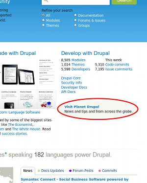
Visit Planet Drupal
News and tips and from across the globe.
Drupal Association News
Helping Drupal flourish.
Join the Drupal Association
Help build a successful ecosystem around Drupal.
(These are ads for the Drupal community, they are not for sale.)
Please post your designs here in comments.
Comments
Question, should the adverts
Question, should the adverts follow the same styling as the "Get Started" design that's currently in use? I've got a few different ideas I'm working on that I've based solely on the style guide for the d.o redesign and as a style has already been initiated with the current ad I'm thinking further ads should follow that style unless that's to be redesigned as well?
It should definitely be
It should definitely be inspired by the current site design & branding. I think we can get away with a bit more creativity, and can even measure how well different designs perform.
Simple style ideas
Please take a look at the following:
http://dl.dropbox.com/u/22945280/drupal.org/donate_no_ribbon.jpg - Idea 1
http://dl.dropbox.com/u/22945280/drupal.org/donate_ribbon.jpg - Idea 2
Just a couple of ideas I've been playing with, working on a more "corporate" feeling design at the moment. The style guide and current site design can swing either way at the moment so I've tried to keep the designs simple without going down a particular style. The second idea is a bit of a wildcard as it has the most depth when compared to the rest of the page elements so consider that a bit of an experiment.
Feedback welcomed.
Getting a really good
Getting a really good donation page near the top of my to-do list. For now, memberships are easier to do than donations. Once that is in place, I'll probably be running both against the text ad to see what performs well. Thanks for doing these.
Oh and I'll want a .png,
Oh and I'll want a .png, since .jpg can be lossy. A copy of the source file in Photoshop/The Gimp/Illustrator/etc format would be useful to have for future changes.
General comment: look into
General comment: look into what design element you can introduce that on the one hand matches (extends) the given design language and on thee other hand clearly sets these elements apart as advertisements.
A more specific comment would be about the text: maybe lead with 'Join the DA' instead of 'Donate to the DA'. Even if that is what we ask for in the end, try to lead with something that appeals to the visitor. "What's in it for me?"
There's currently 2 DA
There's currently 2 DA requests above one to Join and another to Donate, I just used Donate as it was the first in the list but I'm guessing both need to be covered?
In terms of setting the elements apart, as the redesign is quite simple in terms of layout, color and overall feel I was trying to keep that in mind with the adverts, afterall the idea is to make the content the primary focus for visitors right? On d.o the most contrasting graphics are currently the showcasing images which attract a visitors attention straight away, by not so much mimicking but using a similar level of detail for the adverts the first 2 things that would "stick out" would be the showcase and adverts. If that is the intention I'll go to town on the adverts and get more creative but I don't think that's going to be the best solution. I could be wrong, I'm just trying to work with the info in the style guide and keep it consistant.
It's difficult to think of what will attract people when you've already been attracted if that makes sense. Designers would want to see something interesting, developers something functional and visitors something that says "ease of use".
@drumm I've got all 5 ads in
@drumm
I've got all 5 ads in the second style/idea near a finishing point. If you prefer the First idea's style I can easily change the ads to reflect that style so the choice is yours. When completed I'll attach the png's and PSD's.
Great, I think the second
Great, I think the second style works well.
Hi all, we have created the
Hi all, we have created the D7 branding and marketing assets so we thought that we would look at these banners too, let me know any ideas, comments you might have
http://dl.dropbox.com/u/7679604/drupal%20banners/300x100_asociation.jpg
http://dl.dropbox.com/u/7679604/drupal%20banners/300x100_news.jpg
http://dl.dropbox.com/u/7679604/drupal%20banners/300x100_planet.jpg
http://dl.dropbox.com/u/7679604/drupal%20banners/donate.jpg
http://dl.dropbox.com/u/7679604/drupal%20banners/security.jpg
It uses the fonts and colors of the d.org homepage and tries to add a visible element to it, with an easy-to-get icon for each message.
twitter: @jojototh
drupal.org user: mogdesign
CEO http://mogdesign.eu
Do these have to be the most prominent element on the page?
I would rather see a color treatment that sets these apart as being banners instead of the heavy font weights. The All-caps seems out of style too. The icons look a tad rushed, esp. the planet and news ones. Maybe consider using part of the existing badges for the DA membership one.
Overall, these designs seem to try and make the banners the most eye-catching elements on the page. Do we want that?
Do we want that?
Kind of?
Information about security updates, infrastructure & community initiative news from the Drupal Association, and stuff seem like pretty relevant pieces of information for users of the d.o home page.
That being said, I'm the Assn's membership coordinator, so I'm definitely biased toward having an easy way for people to find the Association's pages. Association Memberships help pay for the server infrastructure improvements for d.o and some of the large initiatives like the redesign and the git migration, so I definitely think they deserve a spot on the front page.
Alltooeasy.co.uk
We took the same approach of having "logos/apps" on our new D7 site www.alltooeasy.co.uk
Might be another approach?
http://www.alltooeasy.co.uk
@yoroy As I said above imo
@yoroy
As I said above imo the adverts don't want to be the immediate focus but should have some depth so they are atleast visible. At the moment the text "placeholders" blend in with the content and aren't really that noticable as banners so I think the idea to have graphical banners is to achieve visibility primarily. That said, I don't think they should be overdone, we need to get the right mix so they don't detract from the sites design or give the wrong impression.
Here are the designs I've
Here are the designs I've been working on, still need to do some tweaking but as this is turning into a discussion I thought it would be wise for more examples to be produced.
http://dl.dropbox.com/u/22945280/drupal.org/banner_join.png
http://dl.dropbox.com/u/22945280/drupal.org/banner_donate.png
http://dl.dropbox.com/u/22945280/drupal.org/banner_planet.png
http://dl.dropbox.com/u/22945280/drupal.org/banner_security.png
http://dl.dropbox.com/u/22945280/drupal.org/banner_news.png
Much better.
Andy, these are a big leap forwards. I would say use a little more white in logos. Even just a touch.
Maybe consider changing the background of each tab the icon sits on too?
http://www.alltooeasy.co.uk
These look great!
I'm all for these designs. Using the ad platform, we'll be able to A/B test all of the designs to see what is best performing. This also goes with some of the tag lines. When we're ready, I'd love the editable files (hopefully psd/ai/editable eps?) so we can fine-tune the text.
Full disclosure: I've been hired by the Association as the membership coordinator, so I'd be all for changing some of the text to be more effective.
Need a bit more time but they're getting there...
Yeah they're coming across too dark at the moment I'll keep chipping away at them. I still want to keep them simple without too much detail but your right about the contrast, i'll add some lighter color.
I had thought about alternating the background colors from the blues to the greens which is a possibility, just need a bit more time to try it out. In terms of going for a completely different color I'm sticking to my guns with the style guide, maybe going up and down shades of the listed colors but introducing entirely new colors will draw too much attention I think.
Kind of what I was touching on above with the showcase/case study images. They stick out to me and I doubt the adverts are expected to have as high an importance, just my opinion of course I'm open to suggestions.
Modified banners
Hi! I work with Jozef from Mogdesign, we have modified our banners, the font looks more like the font on drupal site and we used the same green color scheme
so here are they:
http://dl.dropbox.com/u/7679604/bannerss%20drupalista/association.jpg
http://dl.dropbox.com/u/7679604/bannerss%20drupalista/donate.jpg
http://dl.dropbox.com/u/7679604/bannerss%20drupalista/news.jpg
http://dl.dropbox.com/u/7679604/bannerss%20drupalista/planet.jpg
http://dl.dropbox.com/u/7679604/bannerss%20drupalista/security.jpg
give us your feedback! thanks!
Feedback
The blue on the green works best. Plus your fading it to white. So the contrast isn't too great.
I'd be compelled to click on that.
I'd say keep all the motif/objects made of blue and white and keep the background green.
Coming together nicely though.
http://www.alltooeasy.co.uk
I love all the designs that
I love all the designs that people have proposed, but have to echo yoroy's comment.
These should be relatively subtle compared to the rest of the page. While they are "ads" we don't want them to feel like a flashing monkey banner since the main point of the homepage is more about learning about and downloading Drupal.
knaddison blog | Morris Animal Foundation
Is there a way to refrain
Is there a way to refrain from using money or the $ sign on the donate banner? Reminding people that there's money involved can generate bad feelings even if people are willing to give money.
Other than that, I love the green. Love, love, love it.
As subtle as I can go.
Taking into account what yoroy and greggles have commented on I think the issues are how bold the ideas are becoming, the contrasts are clearly too harsh and the symbols/icons are becoming the centre of focus.
@yoroy and @greggles is this more of what you guys were thinking of http://dl.dropbox.com/u/22945280/drupal.org/donate_simple.png?
I've been following this
I've been following this discussion, I must say, this approach makes much more sense.
Brings balance to the page and it's not the most eye-catching element on it, it definitively works much better.
Maybe a little too subdued?
I'd love to A/B test this against your previous designs. Personally, I think it's a tad too subtle. The redesign uses bright colors at high contrast, but I think this might be fading into the background a little too much.
I think visually you are on
I think visually you are on the right track with the earlier posted graphics, apart from the color which is reserved for "calling attention" there are others in our scheme you can use https://infrastructure.drupal.org/drupal.org-style-guide/colour.html (e.g. light blue). It definitely doesn't hurt to bring more iconic elements to the banners, however do keep in mind that we do not have an iconic style on Drupal.org - so as yoroy concluded correctly, they currently look a bit rushed, repeating existing icons and toning them down a bit - should help them get less attention.
@Andy Britton Your banner is too toned down, it doesn't look like a banner to click anymore.
I've been catching up on this
I've been catching up on this thread and I agree with the others: button must look actionable/clickable but it mustn't dominate the page.
I don't think the 'ribbon' can be used because it introduces a graphical element that is too different from the existing look and feel. We can also see if Mark Boulton can art direct here, or at least provide some feedback.
Note that in these button ads: https://infrastructure.drupal.org/drupal.org-style-guide/advertising.html
You can see it is pretty toned down, and has a darker gray border over the gray background. Using the blue background could be use for 'house ads' and gray for 'paid' advertisements.
Whatever is decided, record it here because (ack) I just realised converting the style guide to d.o. was assigned to me, and perhaps link to the comment on http://drupal.org/node/947638?
==================================
http://about.me/lisarex
Followup to say, Andy, thank
Followup to say, Andy, thank you very much for doing these. I think they'll be great. :)
==================================
http://about.me/lisarex
Thanks for the comments Lisa,
Thanks for the comments Lisa, I agree that the ribboning brings a new element to the design which differs too much. That idea was more of a water testing exercise to see how creative these adverts could go which I agree aren't fit for this purpose. If you/we could get either some direction or feedback from Mark Boulton that would be greatly appreciated, some direction from the start would of been a bonus as the style guide is quite open.
I'm begining to think whether these ads/banners should be graphics at all or whether this is something that could be achieved with css and the use of a button like the "Get started with Drupal" button under the "Why choose Drupal?" block. Generally graphical adverts are quite bold and primarily try to attract a users attention, by using icons/symbols is this going to be too much detail even when toned down?
new versions of banners
Hi!
I read the comments and decided to do some changes in banners i did
In the DONATE banner i removed the dollar sign
thanks for that feedback @psuway
http://dl.dropbox.com/u/7679604/bannerss%20drupalista/donate_v2.jpg
and also i decided to create a new version of them with the "icons" i did with white color. So the icons themselves wont attract to much atention but the green color of the banner will.
http://dl.dropbox.com/u/7679604/bannerss%20drupalista/v3/300x100_securit...
http://dl.dropbox.com/u/7679604/bannerss%20drupalista/v3/300x100_planet-...
http://dl.dropbox.com/u/7679604/bannerss%20drupalista/v3/300x100_news.jpg
http://dl.dropbox.com/u/7679604/bannerss%20drupalista/v3/300x100_donate.jpg
http://dl.dropbox.com/u/7679604/bannerss%20drupalista/v3/300x100_associa...
thank you and give me your feedback! :)
The greens have been a bit
The greens have been a bit problematic due to low contrast issues http://drupal.org/node/946344, watch out for that.
Please provide future revisions in PNG format, JPEG's lossiness worries me.
Hi i understand, so here are
Hi
i understand, so here are the links for PNG`s and i also checked the green color
http://dl.dropbox.com/u/7679604/v4/association.png
http://dl.dropbox.com/u/7679604/v4/donate.png
http://dl.dropbox.com/u/7679604/v4/news.png
http://dl.dropbox.com/u/7679604/v4/planet.png
http://dl.dropbox.com/u/7679604/v4/security.png
I put
I put http://dl.dropbox.com/u/7679604/bannerss%20drupalista/v3/300x100_associa... and http://dl.dropbox.com/u/22945280/drupal.org/banner_join.png into rotation, and Paul has some access to view the CTR and such. The old CTR for this one was 0.07%, so it should up.
I'll take a look at the others when I have some time this weekend or next week.
A week later
Results after a week of A/B testing are in on the Join the Drupal Association banners are in. The blue banner is performing better than the green one, so I'm recommending that we focus on the blue banners.
Perhaps we could A/B test the Association news banner?
Two weeks later
We've been testing three versions of the Association News banners. None of the versions have been pulling ahead, so we're going to keep running all three and test some new slogans.