One sentence:
Drupal admin comes down to filling out forms, so write clear and consistent labels, and where needed, use descriptions to help people make a decision and move on.
Two paragraphs:
Drupal administration comes down to filling out and submitting forms. Many, many forms. Considering that, you can imagine it is worth the time and effort to write clear and efficient user interface texts. If your proposed change to the core code
- Check your labels for consistency and concrete. Use nouns.
- Doublecheck for each form element if you really need descriptions. Use only to help people make a decision and move on. Lead with a verb.
- Page help text not longer than 3 sentences. Avoid multiple paragraphs, focus on the high-level explanation of "what you can do on this page".
Resources:
- Checklist
- Guidelines
- Examples
Some pages:
General guidelines:
- Cut 50%, cut 50% again (“no matter how cool your ui, it would be better if there were less of it”)
- Just enough to help people make a choice.
- Focus on user tasks and goals (not edge cases or other specifics)
Drupal specific do’s and don’ts
Don’t use the word ‘Drupal’. It is implied and complicates install profiles and distributions with other names
There are a few words that you want to avoid using as they are not part of the Drupal tone of voice. For example, avoid “Please” and “sorry” and “Don’t”, “must”, “should”, “shouldn’t”. More here:
A longer list of vocabulary do’s and don’ts is here url.
Elements of ui copy:
- Page title
- Tab labels
- Page help
- Form element label
- Form element description
- Button label
(missing: status, warning & error messages)
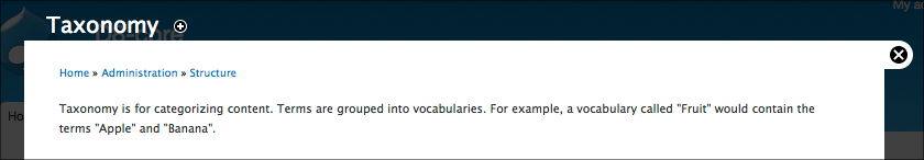
1. Page title
Not that much that can go wrong here. Preferably one or two words. Make sure that the link that points to this page uses the same word(s) as the actual title. This way you 'keep the promise' you make when people click it.
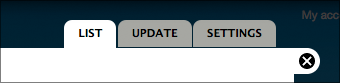
2. Tab labels

One or two words max. Use nouns. “Settings” should always be the last one. If there’s a default listing page, label it “List” only.
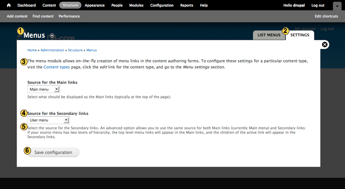
3. Page help
Use page help for a high-level explanation of what you can do on this page. Only if this is necessary because the functionality is relatively complex or abstract. As always, focus on matching user expectations on what you can do here.
Guidelines:
- Don’t use “On this page…” or variations thereof, these are unnecessary words.
- Use simple words or a quick example to explain the main concept of the functionality.
- As always, keep it short. If more explanation is needed, add one link to a d.o. documentation page for further information.
4 & 5 Labels and descriptions
Each individual form element (text field, checkbox, select list, etc.) has a label and (optional) description associated with it.
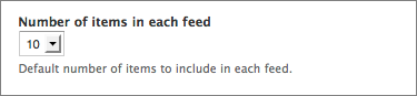
Label
Use primarily nouns for the label. Keep it as short as possible but don’t hesitate to add a few words if that would remove the need for adding a description.
Description
Use the description to help people decide what to fill out if the label itself isn’t clear enough. Focus it on the task at hand and make it actionable. It helps to lead with a verb: “Use…”, “Choose…”, “Select…”
Guidelines for an effective description
- Don’t repeat the label. Sounds obvious but it happens quite a lot.
- Focus on the task at hand. Don’t use the description to document edge case behavior but provide just enough information for users to make a decision and move on.
- Keep it short. Ideally one line. If you need more than 2 lines to explain what is needed for a single form element you might want to rethink the functionality.
- Don’t provide a description if the label provides enough information.
| Attachment | Size |
|---|---|
| UI-text-elements.png | 97.69 KB |
| tabs.png | 11.95 KB |
Comments
I am a tad bit confused, how
I am a tad bit confused, how is this different from http://drupal.org/node/604342 ?
Besides the obvious bits like
Besides the obvious bits like images, examples and a short and even-shorter version and a different structure overall, not much! :)
I mostly did this to try and come up with wording that is more actionable and to provide some first example screenshots. Also, I keep forgetting where these pages live in the handbooks…