Posted by tarekdj on April 4, 2012 at 5:07pm
Update (04-03-2013): Adding source file
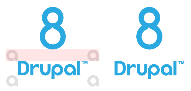
Update: wordmark fixed. Thanks to cweagans!
This is a D8 logo proposition. Please give feedback.
![]()
| Attachment | Size |
|---|---|
| d8-logo.jpg | 61.67 KB |
| drupal_8_logo_blue_rgb.eps_.tar_.gz | 220.73 KB |
Comments
Looks nice
Although I'd like to see something based on a derivation of the infinity simbol that's been used as Druplicon's eyes.. We won't get a chance for another version of Drupal using an 8 until Drupal 18 arrives sometime in the next three decades :)
Sorry, but this is a no-go
Sorry, but this is a no-go in its current form.
Please check the word mark usage guidelines. The drupal wordmark cannot be that close to the other components of the logo (there is supposed to be a bounding box around the main word mark). IMO, you could remove the word mark entirely (only have the 8) and it would work well. Good first pass, though!
--
Cameron Eagans
http://cweagans.net
Info is here:
Info is here: http://drupal.org/drupal-media-kit
--
Cameron Eagans
http://cweagans.net
Nice catch cweagans ;). logo
Nice catch cweagans ;). logo updated. Thx
Great to see someone thinking
Great to see someone thinking ahead! Good start.
Some thoughts –
I also like the idea of working in the infinity symbol, though literally lifting elements from the Druplicon may not be the best way of doing this (I don't think that was being suggested!)
And while the Drupal.org style guide is technically only for d.o, there are other colours in there that have been selected to be harmonious with the primary blue, so I see a bit of scope there too.
I have worked something up with all this in mind. I can't attach to my comment so it is here: http://dl.dropbox.com/u/3204588/drupal-8-logo.png
The workmark usage policy is
The workmark usage policy is in place for a reason: to protect the branding of the project. The exclusion zone is not optional, nor are the available color options. In addition, the wordmark usage policy is not just for Drupal.org: it's for anywhere that the Drupal wordmark is displayed.
Even in the header of GDO -- an official Drupal.org site -- the exclusion zone is observed.
We absolutely cannot use something that has any elements inside the exclusion zone, or uses a non-approved color for the wordmark (Spot blue, black, or white)
--
Cameron Eagans
http://cweagans.net
I was not suggesting the
I was not suggesting the wordmark colour is open to change, but the 8 could be. And of course the exclusion zone is important, but when the 8 is an appendage to the wordmark, it is complementing, not competing with it.
This is really only a slight issue on the right-hand side of the wordmark, where the exclusion zone starts from the TM instead of the last character like on the other three sides, so if the number is inline to the wordmark, the kerning would look totally out.
The inline Drupal 7 logo responded to this in exactly the same way: http://groups.drupal.org/files/728x90.jpg
Here is what the 8 would look like inline with the exclusion zone strictly applied: http://dl.dropbox.com/u/3204588/drupal-8-bad-kerning.png
Way too much distance.
So it's about being sympathetic but also using common sense :)
I quite like it.
http://dl.dropbox.com/u/3204588/drupal-8-logo.png
I quite like it. I think what cweagons said was fair. Does it need the brand mark so close - also seems like thats a no go.
I was toying with the 8 symbol for a while - its tantalizingly close to the infinity symbol, but I would stear clear of that minefield. I think the suggestion is already there too.
Hourglass - maybe one to avoid too. :p
The drop/licon in the logo is a nice touch too. I keep looking at the letterforms of the Drupal logo and thinking there is something there.
But this is a tricky one I guess and simple is the way.
Does the current '8' look any different looped the other way (flip vertical)
As to me the loop is back to front.
Just my $0.02 - but overall I like it.
Much stronger on the white BG too. even in the last preview demonstrating 7's kerning/vs policy.
http://dl.dropbox.com/u/3204588/drupal-8-bad-kerning.png
http://www.alltooeasy.co.uk