Last updated by varunity on Sun, 2014-12-07 16:58
Litely has very good user interface elements for managing their content, some of this can be used as inspiration for Drupal's mobile user interface. I tried the CMS on Litely photo editing app. Below are screenshots of the app's core functionalists. This app , as the screenshots show, has a very good design that uses contrasting colors and very light translucent icon. The app has a very good user experience is these ways:
-
The app has an easy and lightweight design that makes you feel more immersed in the experience
-
Contrasting colors make import information easy to find and access
-
Translucent sliders and icons make the content of the app easier to comprehend
Screen Shots:
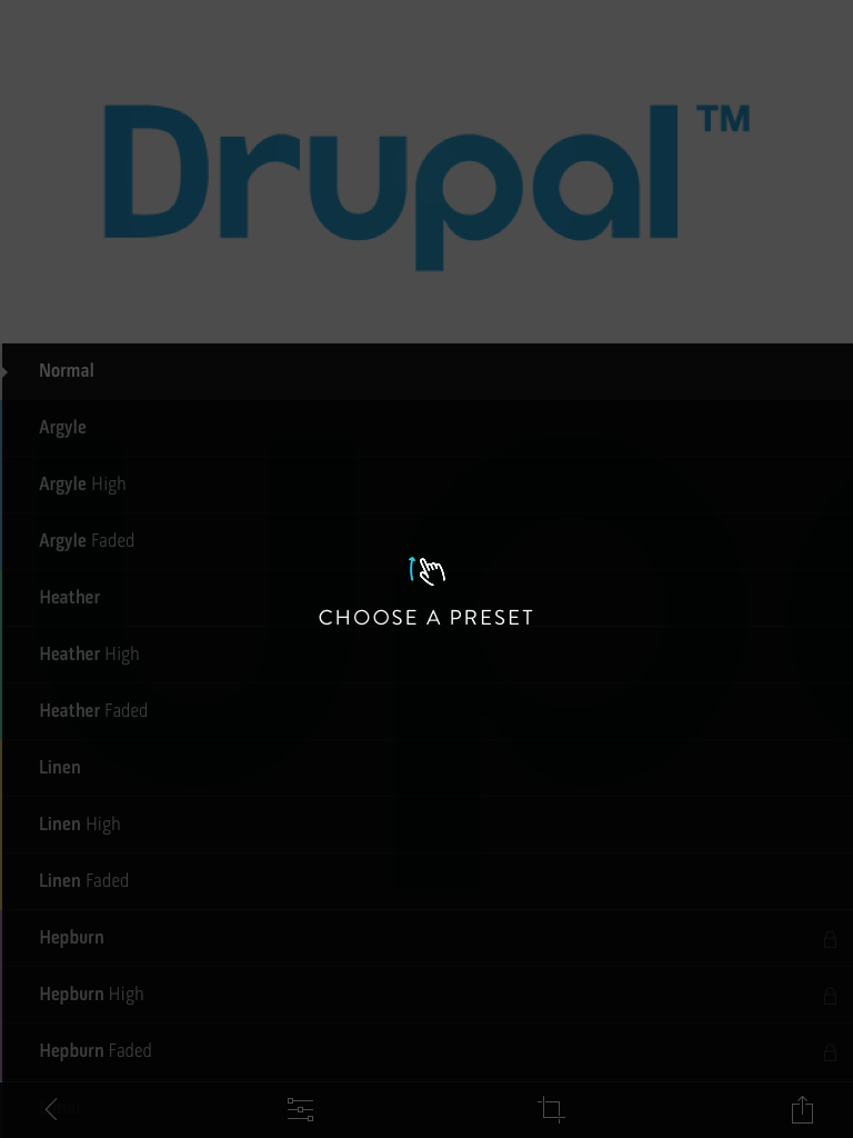
This picture below demonstrates the general appearance of the app , black. The text and Icon pop out because of the color content and this really enhances user experience. This screen shot shows the selected picture being eddied with presets.
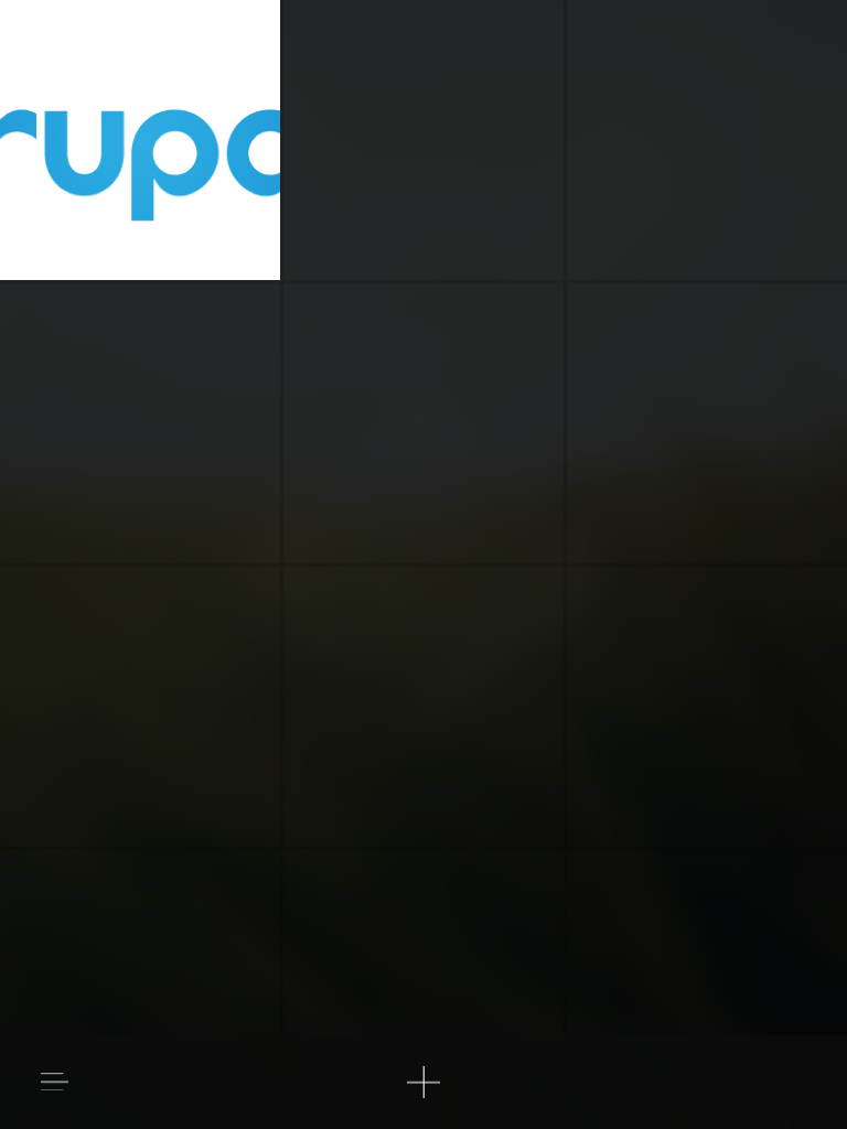
This picture shows the home page of the application. The box design and faded background help the content/preview really pop out as interesting and easy to focus on.
This picture shows the auto enhance section while editing the picture. The user experience was very nice and enabled the user to utilize the CMS to its full extent. The color contrast and alignment of useful buttons and text added to the UX.

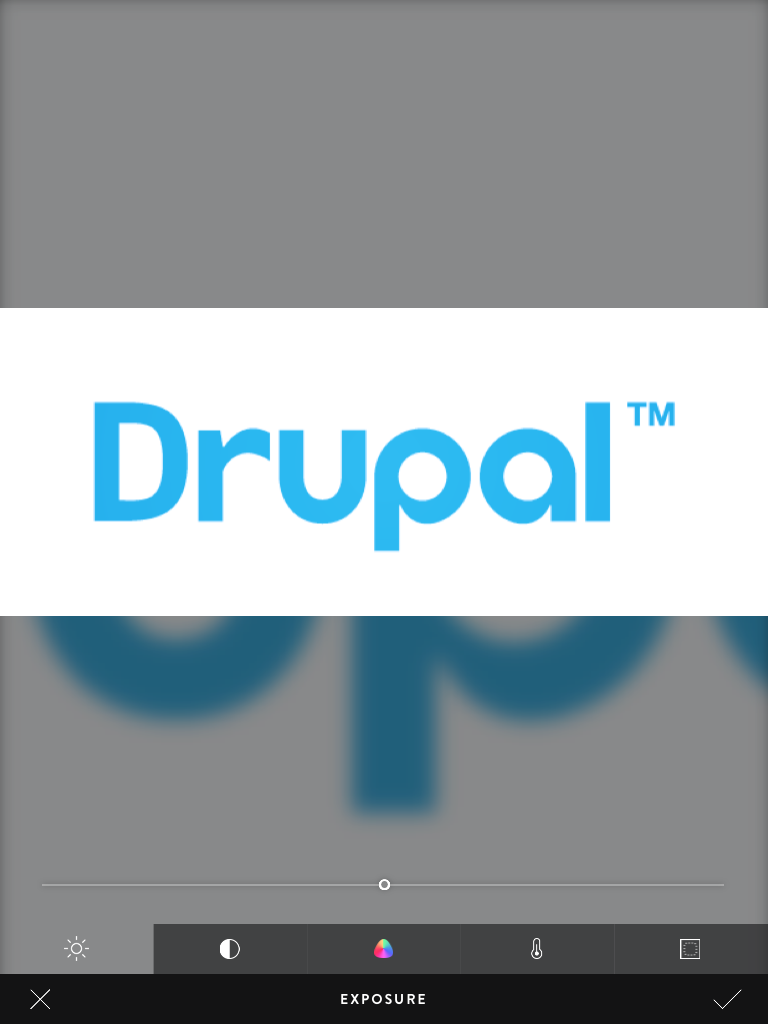
The picture below is the section of the app that controls the color exposure. What is nice about the CMS here is that the translucent sliders and icons. They make the user feel like there is functionality without cluttering up the space.
Conclusion : The app's UX was very nice based on my experience editing a sample picture. There are a lot of themes and concepts that can be derived from Litely.