
Posted by Noyz on July 30, 2010 at 2:43pm
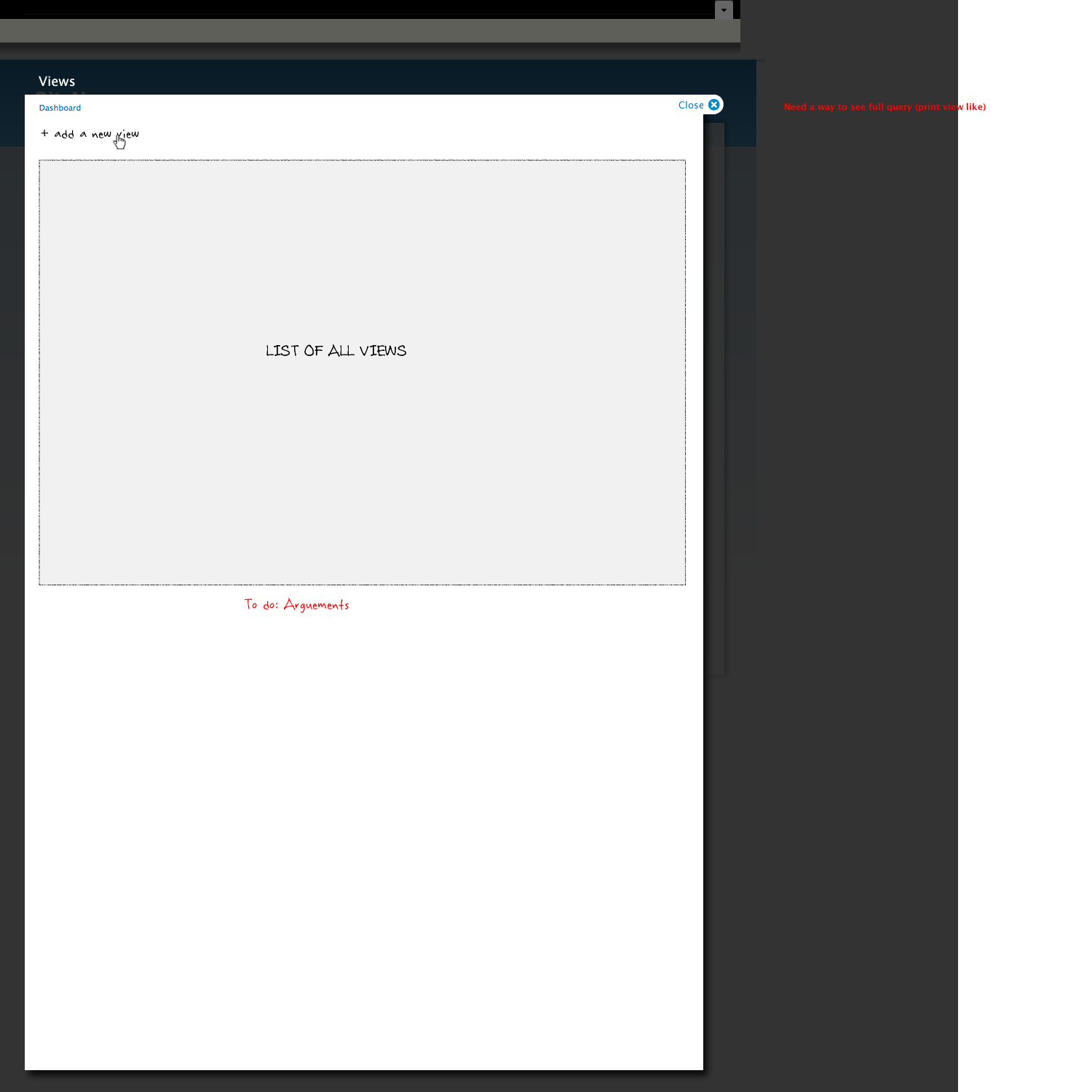
I've since started designing a variant of views that's specific to DrupalGardens, but thought some of you might like to see the concepts I came up with for the non DrupalGardens version of Views..


| Attachment | Size |
|---|---|
| 01_List_of_views.png | 40.45 KB |
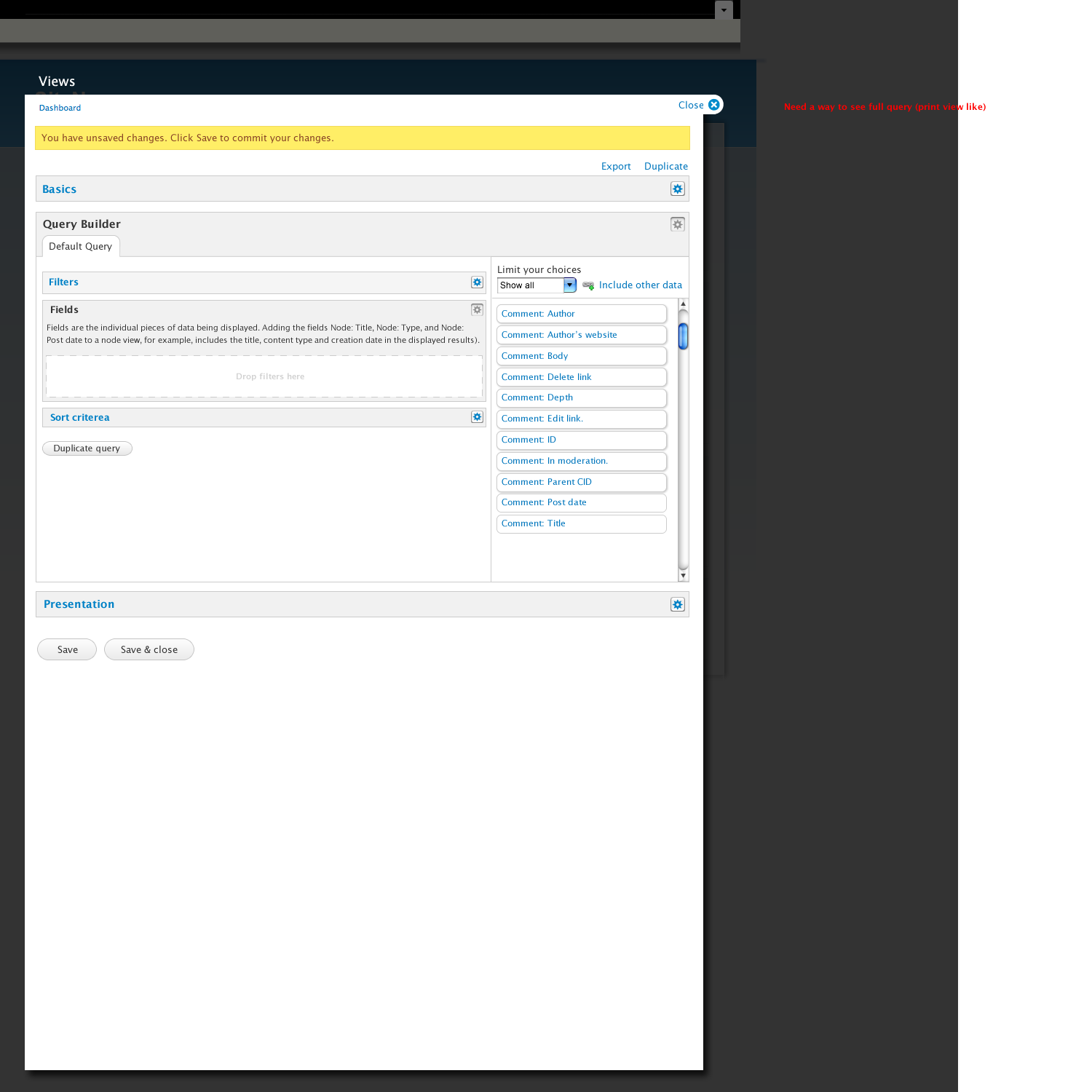
| 02_Basics.png | 49.73 KB |
| 03_B_Start.png | 74.02 KB |
| 04_Drag_filter_node_type.png | 75.07 KB |
| 05_configure_node_type.png | 95.42 KB |
| 06_updated_node_type.png | 77.69 KB |
| 07_Drag_Node_publlished.png | 79.88 KB |
| 08_configure_node_pullished.png | 86.65 KB |
| 09_Result_node_published.png | 81.02 KB |
| 10_Fields_start.png | 76.89 KB |
| 11_Drag_Node_title.png | 77.83 KB |
| 12_Configure_Node_title.png | 96.58 KB |
| 13_Result_Node_title.png | 73.96 KB |
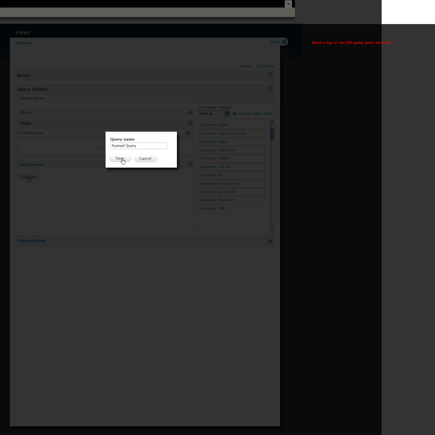
| 14_Duplicate_state_-_name_state.png | 64.19 KB |
| 15_Duplicate_state.png | 75.78 KB |
| 16_Query_Duplicated.png | 77.06 KB |
| 17_Presentation_start.png | 102.74 KB |
| 18_presentation_result_drag_page.png | 123.67 KB |
| 19_presentation_conigure_page.png | 131.94 KB |
Comments
Ok, wow. There's clearly a
Ok, wow. There's clearly a lot of stuff where either you or whoever made the notes wasn't sure about some of the bits in here, so unlike my last review where I focused on the tidbits I wasn't sure about, I'm going to go the other way on this one and focus on the things about this design that interest me:
1) The organization of the data is completely different, but it seems like an interesting way to think about things. It makes me want to go through everything that's in a view right now and see where all the settings should be placed.
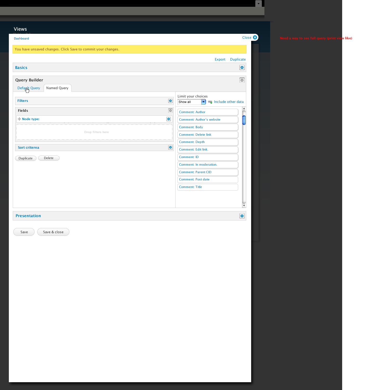
2) The concept of the display seems to now be split into two. There's the alternate queries and then the currently named display is reduced to just presentation and you choose which query a given presentation display uses. That's a very interesting take on the existing system and I want to think more about what that means, both as an experience and from the more technical point of view.
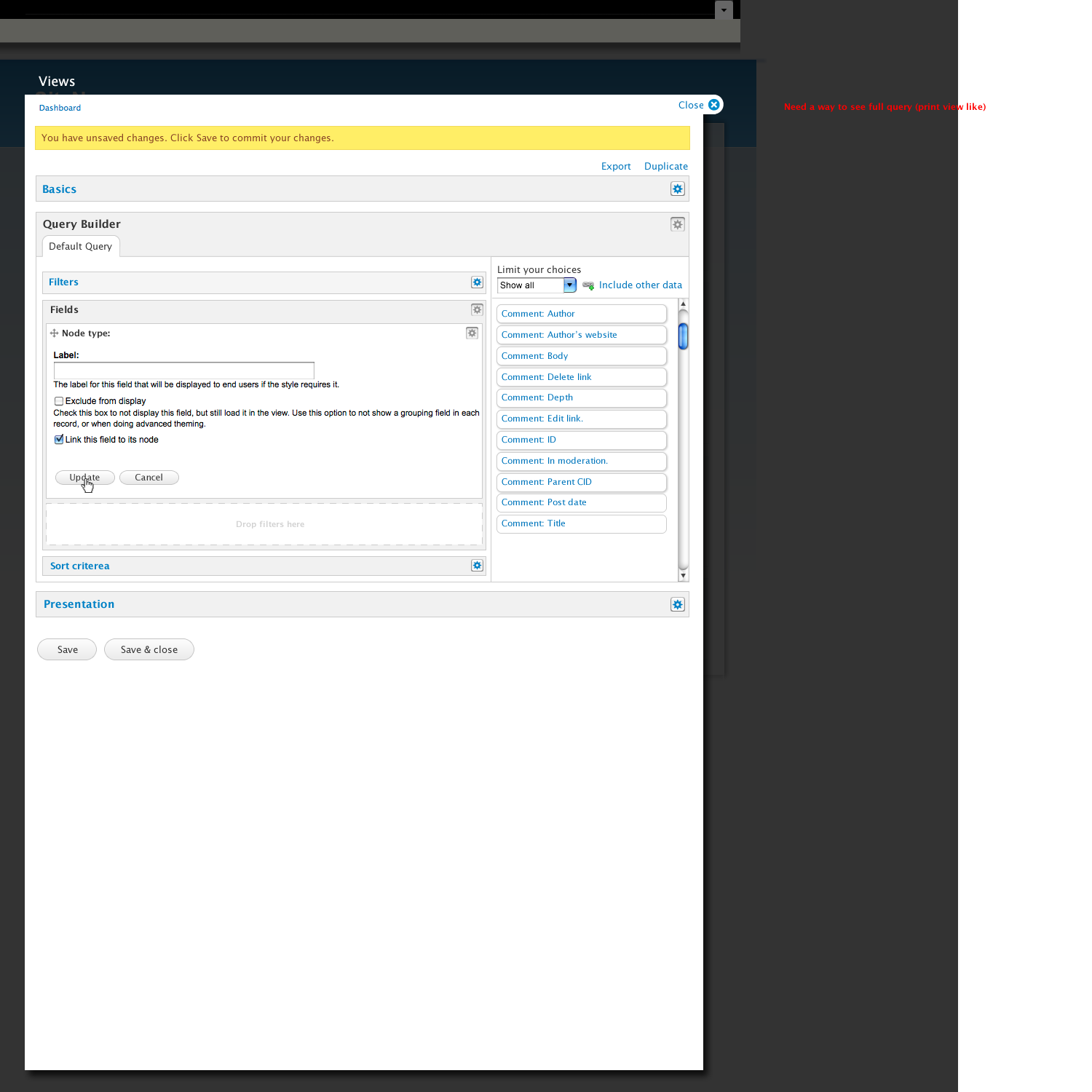
3) One thing this doesn't model well is that as Views grows, it's getting more plugins which means a lot more two-stage editing models, which is how 'styles' have always worked. i.e, you select a style, and then you configure that style. In fact that selection seems to be missing from the mockup. This goes even farther in Views 3 where you do the same for the pager, which now has rather a lot more settings, and exposed form works similarly.
Expert Views hacking versus first-time Views wizard?
These look really nice, and clearly improve the UX. I like the idea of trying to move towards what people are actually doing when they're setting up the view. But the "workflow" of user interactions - if you took out the drag-and-drop way in which they perform them - still seems similar to Views 2, and I'm wondering if there's a way to improve that without making it too wizard-y and hard for the Views expert. These are the few things that spring to mind:
1) Expert: could there be an expert mode, where you see all these things more plainly? Typical power-user views work involves clicking around a lot, and drag-and-drop and waiting for things to expand can become a chore, because it's basically become a way of hiding information. Hiding is good for the first time you go through - like a configuration wizard - but for the second and subsequent times you really need a big massively non-directional dashboard, not a semi-linear workflow you have to step through. Right now, this hides things so much it's almost a step back to Views 1, where page, block etc. were all in collapsed fieldsets. Having the Views 2 dashboard for a view, where you can see at a glance everything that's been added, really does help.
2) Medium: you have a long list of items beginning "Comment: ..." but then drag over an item beginning "Node: ..." This suggests that merely bringing over the Views 2 list of checkboxed items and making them drag-and-drop isn't solving the underlying problem of there being a LOT of items in that list for even a medium-sized site. I've had junior developers spend hours wondering why they can't find CCK Date fields in that list, because they're all under "Date: ..." and not "Content: ..." . Maybe there needs to be more IA work on that long, long list? Maybe rather than splurging everything and having a tiny filter box that the user inevitably has to use, it needs to be architected somehow in advance, without that visual repetition of Comment: Comment: Comment: Comment: Comment: taking up so much real estate. Maybe... everything that's a code object in Views - display plugins, fields etc. - needs to be taxonomizable, given we've got taxonomy already in Drupal. Maybe we need to dig into filters the same way that taxonomies let people dig into node content.
3) Basic: clients and newcomers to Drupal simply do not get why one thing is a filter and one thing is an ordering function. To do that, you almost need to already know on a very vague level what a query builder is trying to build for you. For example, I'm always asked to put a "postcode filter" on a geographical query: but that would literally mean "only show me things with this postcode." What they want is a "postcode sorter", which sorts by distance from the postcode. I'm wondering... is there any way to represent this on the (non-expert) interface more clearly? Something like the semi-graphical workflowing that Noderelationships module reveals to its subtabs on the content types admin area. This might provide a way to improve on the Views 2 method of visually representing displays as variants on the main view, and the point @merlinofchaos mentions regarding splitting the concept of the display, if they were all just parts of a slightly Heath-Robinsonesque plug-together system you can see all at once.
Maybe this concept just needs to be considered as the first-pass wizard, and really UXed to the max to get as many people into creating views, but leaving the nuts-and-bolts Views 2-ish version available if you go back in and edit it. But it's lovely to see this in a D7 context, with the emphasis on using lots of the page, on big display areas and large fonts, and on trying to create visual hotspots and thus improving findability.
I generlaly don't like the
I generlaly don't like the idea of 'expert' mode vs 'novice' mode. My entire understanding of UI is that if you feel the need to make this separation, then you've already lost. Plus, it's harder to maintain, more code to write, and therefore even more prone to error.
The categorization of 'Date' fields is provided by the module itself, so there's really nothing that Views will ever be able to do with that. All we can do is go back to date.module and ask why that categorization was chosen. 'Taxonomy' for something like this would be overkill, if for no other reason than because taxonomy is a database entity and you're talking about code entities. They don't really have any relation other than being the same concept. As it is, we've already got a simple category system. We could possibly add a keyword system too but I haven't found that they really help, especially when you consider that you're talking about a pool of data that no single developer/designer or entity actually has responsibility for. This is a general problem with modularity and it's frankly unfixable, other than to try to identify what the problems with the categorization are and try to educate the module developers.
(I can't wait until D7's nicely tuned category system breaks completely after a good-sized site adds 75 modules and some percentage of them badly categorize themselves =)
The only answer I can think to the filter vs sort criteria issue is education. Honestly, when users ask for the wrong thing it is rarely, if ever, the right answer to humor them. Instead the answer is to try to educate and make sure that pain points that are often repeated have the best education available. Maybe it means more clearly defining what filters actually are in the UI, or maybe it means providing a nice introduction that more clearly explains it. I think Views has already done quite a bit of what it can do there already.
Honestly? I would never try make Views usable to someone who doesn't understand the difference between sorting and filtering.
Note that when you're talking location filter, that is both a sort and a filter, which might be the true root cause of the confusion. From a high level viewpoint, it is a filter. It's just that you're also sorting. It's another version of a relevance filter where more relevant terms float to the top. For those concepts, sorting and filtering are intertwined conceptually, even if they are still broken into separate pieces in the UI. So in this case, I don't think it's actually about educating the user as educating the developer. =)
I have been meaning to
I have been meaning to comment on this for a long while, either way here goes my response. For reference I did a short usability test with four people back in 2009, for my presentation on Complex interfaces. Its not a big group, but good enough to get a picture of the problems. I classified three primary mental spaces :
What will you display, this is strongly tied with how. Will I display a title, a comment only the comment author?
Where will it be displayed and as what? Will it be displayed as a page or as a block or something else?
In a grid, in a table, in a slideshow? How will I display it?
So with these three mental spaces, I looked at the proposed views interface which I find far more intresting then all the others proposed before (also because these seem more achievable). To qucikly comment on some remarks, we should indeed have no expert/novice interface this is a UX FAIL. We should look into the scalable parts, especially in the presentation section - I feel there is more then enough space for this in the proposed ideas. I do not think this feels like a wizard but rather a interface that takes more assumptions on flow, without "not" allowing others.
Basic
Makes complete sense, probably has far to much significance in the interface.
Query builder
Arguably this is the strongest favorable part of this idea, it creates far more focus on the "what". However we need to be very conscious how much of this isn't in the area of the "how" ie the presentation. On the actual interface, we can probably go without drag and drop (its sexy I know, but not necessary - will make it easier to be more accessible). We need to rethink the "limit your choices" this has to be more intelligent then now, especially with a lot of fields - this interaction will need more care.
We are using a lot of fieldsets within fieldsets, we need to use color to make the active one more clear or find a more subtle way to imply parents.
Arguments should go here? Its somewhat of a "When" but could probably be sibling with the "what".
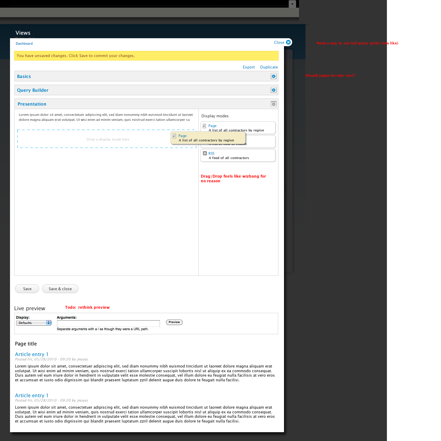
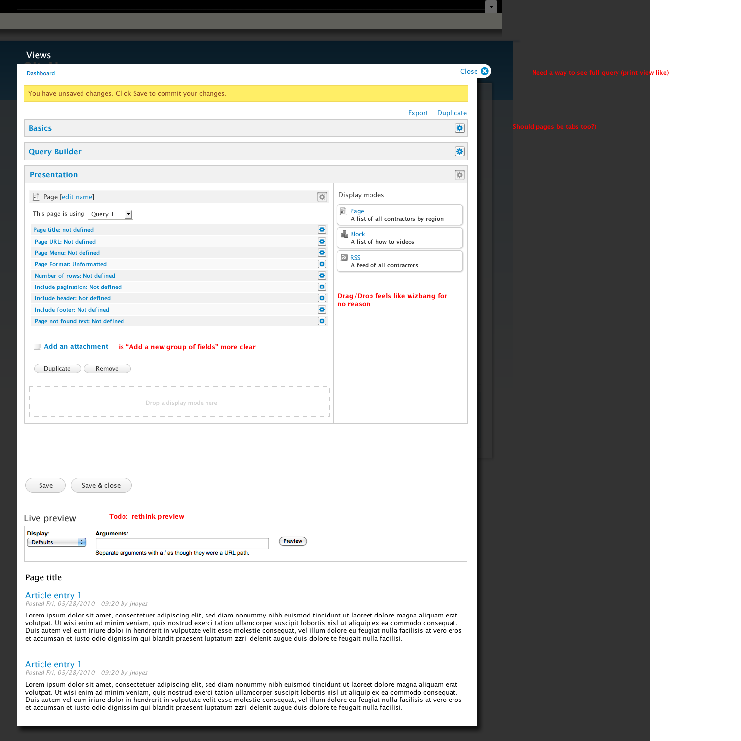
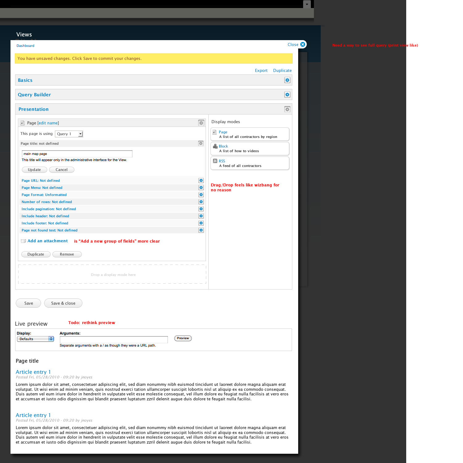
Presentation
This feels somewhat empty still, I don't see settings for table/grid ect - I feel that is one of the most important parts beside the display modes. Again great use of the space, we have to seriously look at this how it deals with plugins though - as that is the biggest problem for this part of the interface.
We are still not levering the preview good enough, I feel the preview should somewhat live inside the presentation. Because you can't really evaluate presentation without a preview. Either way presentation probably still requires a lot of work, but again a lot more calm and breathing space in the interface.
I think we shouldn't derail this discussion on specifics like sorting and filtering, but rather the fundamental concepts and whether those are more clear in this idea. I would love to know more about what jeff didn't take into account, and what wont work. Took my time to keep this short :)
Preview is at the bottom
just like adding fields, you can add display modes. Each display mode has formats. The interaction is the same from top to bottom.
I think this UI is a decent improvement for Views as it is today. However, it doesn't solve my real need. The UI doesn't help users make the leap from "I need a page showing all the titles in my site", to "I need a View that is a page on my site showing all the titles on my site." Anyone outside of Drupal is not going to know to create a "View" - and that's just step 1. As of right now, I'm trying to solve the problem where newbies can create pages that happen to be views - and advanced users can just jump right to views.
Probably just stating the
Probably just stating the obvious, but I'd go for the 'let me make a list of stuff' scenario. A page not for showing 1 thing but a list of things. The analogy that made it click for myself was the smart playlist in itunes. Not a hand-picked list but a list of things coming from a bunch of 'advanced search' settings.
I continued/restarted
I continued/restarted conversation about Views 3 UI and these concepts at http://groups.drupal.org/node/90854
Bevan/