
Access Control Page does its Job - one big scrolling Motogp, but at least serial and logical. Still I hate scrolling and like the idea of how much can be put on one page but still distinguishible. For Comparison check Joomla Admin pages - they overdo it, in my opinion, but it is amazing how much you can physically put on a page just by use of smaller fonts and color coding. So this is what I basically use.
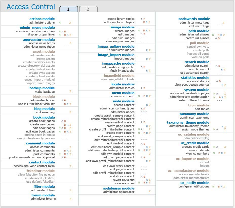
It is my second attempt at access Control Page - something quite similar is buried in some issue... ;) I aim at having it integrated with module activation, if this does not overload the UI. If a module is greyed out here this may mean that there have no rights been set and only Admin can see it. But it might also indicate that the module is not activated at all. Gonna figure out later. Hopefully image-1 is fully self-explanatory (wasn't it if you gotta explain it it is still too complicated?) But sure: If the Initial of a Role is visible, it has access to the adjacent feature of the module. I added extra dashes if the module is not greyed out to make it easier distinguishable which is enabled and which not.
I delibarately and malevolently deny any CSS boundaries, this is how I would like it to look like. For the self-adjusting columns I once saw a solution: there was a javascript module that did the trick. Would have to make it a jquery plugin to do the trick. I had quite a large number of modules installed (nasty Ubercart), so i preferred tabbed pagination over scrolling (as I mostly do ;) )
Hers is Multicolumn Javascript: http://randysimons.com/overige/multicolumn/
image-2 shows what you see clicking on any point inside a module: the big Javascript Popup comes up, so one can click Fields more easily. Due to a somewhat sloppy Implementation of mine the Letters do not even match the Initials of the Role names neither does the number of five on the overview match four in the big window - but you get the idea. F
For those who say: but If I want to work on several modules at once - well, look at image-3. This might be a Javascript nightmare to put into reality, but it would sure be nice.
Images are quite big, more than 900px wide, sorry. But should be viewable...
Funny, only one is taken.
More here:
Image-2
Image-3
| Attachment | Size |
|---|---|
| Image-1.jpg | 105.46 KB |
Comments
What if you wanted to give permissions quickly?
While this visually seems like it could be easier to read, it doesn't seem nearly as speedy a process as the current, mile long permissions check boxes. This would def. be of benefit to new-bees but I'd hate to have to deal with the permissions page more then I already do :). Why not a grid with some Jquery to isolate / highlight a single row / column and then add in the select all option (per module)?
"Moodle? What's moodle?"
http://elearning.psu.edu/
http://elearning.psu.edu/projects
http://drupal.org/project/outline_designer
http://drupal.org/project/html_export
Ex Uno Plures
http://elmsln.org/
http://btopro.com/
http://drupal.psu.edu/
Maybe both
It sure could be possible to click on an empty space where the letter for the role should be and activate it directly this way - saves you some clicks. Better for "Pro" users. For Newbies the popup like layed out should be default.
Life is a process
Life is a journey, not a destination
Sounds good to me then :)
I'd +1 that approach
"Moodle? What's moodle?"
http://elearning.psu.edu/
http://elearning.psu.edu/projects
http://drupal.org/project/outline_designer
http://drupal.org/project/html_export
Ex Uno Plures
http://elmsln.org/
http://btopro.com/
http://drupal.psu.edu/
Self explanatory
"Hopefully image-1 is fully self-explanatory"
Not to me. I still don't understand the coloured letters, they seem completely random (unless you check them in the popup, but you shouldn't have to look at a reference card to understand what they mean).
Some people seem to think that an interface is easier to use when you can see everything at once, but that's not the case at all. It can be easier if you already know the interface like the back of your hand, but to someone who only uses it once every couple of days it's a nightmare. I'm still trying to learn how to configure a simple list in Views 2, and these screenshots are very reminiscent of Views 2.
Don't make me think!
By the way, why is all the text right-aligned?
What are the tabs for?
What do the dashes mean?
I don't like the idea of a popup, it requires an extra two clicks - open and close - for each module. To me that would seem more time consuming than scrolling down in.
...
The Views 2 UI has become more complicated because the capabilities of the module are so much more complicated too. That's not an excuse, since I agree that those who don't use the module regularly are likely to get lost. But if we kept the original Views 1 UI with much scrolling it would have been a nightmare for beginner and expert alike. As it stands it is a very efficient design for the expert user.
I do agree with you in the case of the permissions page though. As far as I can tell, scrolling seems to work effectively here.
-
www.alanpritt.com
The mockup is look nice.
The mockup is look nice. Anyway, How can this design solve the long (and longer) module and permission list? Will you extend it to 4 column or fix at 3 but allow more vertical length?
How about group the permission of Core modules together on the top (since it'll be the most frequently used) and move contributed modules/permissions after that.
Hey I could see that pop-up
Hey I could see that pop-up permissions used here as well ( http://groups.drupal.org/files/drupal-admin.jpg )
Would be quite a big usability perk to not have to even go to the permissions page if just installing a module and not adding a role.
I like the idea for adding a role though!
IMHO +1 for context sensitive menus throughout drupal.
Craig Bertrand
Craig Bertrand
Thanks for mocking these
Thanks for mocking these up.
image1 -- feels way too busy -- you trade scrolling for the same info in multiple columns, which translates into a more text-heavy screen. -1
image2 -- huge +1 -- this simplifies things immensely. The focus on one module is a nice improvement.
image3 -- could be useful -- the functionality of image2 is much cleaner
The single biggest usability issue I see, however, is still configuring perms for the node module when you have multiple cck node types. I'd love to see the same type of popup UI as image2 for individual node types.
Cheers,
Bill
FunnyMonkey
Tools for Teachers
FunnyMonkey
What's are the current issues?
This discussion lacks any info about what's currently wrong with the permissions page, scroll bars are not a usability issue.
Current issues that I know of (D6):
How can these issues be solved?
Good points.
http://drupal.org/node/30984http://drupal.org/node/73874#newand here in terms of turning permission declarations into an array http://drupal.org/node/248598.I also strongly agree that scroll bars aren't in themselves a usability issue - different coloured letters representing whether roles have a permission or not, instead of a simple checkbox, probably would be.
current page is not that bad
Hi,
Thanks for the mocks. Interesting things to think about. The main thing I keep thinking however, is that while Drupal has loads of pages/interfaces I find to be obnoxiously unusable and developer centric, I don't see the Access Controll page as one of them. I think that if a user has enough brains to know they need to be on the Access Controll page, then they can figure out the Access Control page. The the interface is easy to use and laid out in a logical manner. Sure it's a loooong page, but I don't see this as a usability problem.
The only major problem I see with the Access Controll page is non-standard implementation of Access Control by modules. I have been tripped up on more than one occasion by various modules not implementing Access Controls in the [what I thought to be] standard way of no boxes checked = everyone gets access.
Cheers!
/km
Modules that do their own
Modules that do their own access control (i.e. not on the permissions page) are definitely an issue. A lot of this is down to authenticated user not being an actual role. So there are modules that reverse the way permissions work entirely, stick them in fieldsets on other configuration pages etc. etc. A big help would be allowing modules to pull permissions in Drupal (so have content type permissions on the content type administration pages etc.) - but still have them on the main page. Duplication doesn't hurt from that point of view, but it needs to be consistent.
agreed
Of all the things that people got confused by at the University of Minnesota study, this page wasn't one of them. They got confused by individual descriptions on this page, but not by the overall "sea of checkboxes".
I'd say that a complete redesign of the UI on this page could be valuable at some point, but is not the highest priority nor the easiest place to start. Small issues to fix specific modules where those specific modules have bad ideas is probably more valuable. And...making small tweaks to this page would be more valuable, IMO, than a complete redesign.
--
Open Prediction Markets | Drupal Dashboard
knaddison blog | Morris Animal Foundation
Good comments
I am definitely pleased that this enacted a lively discussion. Gotta say that a lot of things said are very valid, especially the rather critical ones.
Well, indeed, the permissions page is just about usable, quite similar to the module enable/disable page, say Modules page.
But, outside the drupal world: No, that much scrolling is not O.K. Definitely not. Only Drupal users got used to it.
And sure it is hard to get everything on one page, maybe impossible and even messing things up.
But worth a try ;) Another solution possible is Tabbing. Would it be: alphabetic? By Category (for this we need better categories). I will make Mockups of this later. Maybe some other rather graphical people jump in and can create something visual that takes up ideas expressed in the comments.
Especially Rowanw's comments are easy to integrate, I think...
As for the column count: Maybe it has even to be cut down to two columns, If a sidebar comes in. I still dream of a sidebar-less Admin theme that has only dropdown menus and/or horizontal ones. What could we do with all that space...
Ah, and for my funny letters: it is just random. Actually they should be the first letter of each Role. A bit hard: what to do with roles that start with the same letter (anonymous, authenticicated, admin, oh my god... ah, but Admin is not shown, phew..)
Life is a process
Life is a journey, not a destination
Tabs
People are more likely to scroll down than to click a link to get to the next page, also everyone has a different viewport size so you can't prevent scrolling for everyone. Tabs are not meant to be used for paging either, it wouldn't make any sense (http://www.useit.com/alertbox/tabs.html).
Another attempt on Mockups
So how about this. I still don't give up the columns, but this is largely uncluttered. Note the control buttons on top to adapt it to your liking. Easy Javascript, not too hard to do I think. Modal dialogs are also kept, as they got little objections... and the just look nice ;)
Module greyed out/light brown means only Admin can access it / no access has been set.
Access-control-2a.jpg
Access-control-2b.jpg
Access-control-2c.jpg
Life is a process
Life is a journey, not a destination
more clicking
I personally don't like having to click a module name to see its perms. I would rather be forced to scroll, but have everything expanded. It's too easy to overlook something if you have to click each module to see its perms IMO.
Ctrl+F
Another benefit of having everything on one page is the fact that you can use Find (Ctrl+F) to search for something. If all permissions are hidden in dialogs there's no easy way to do this anymore.
Scrolling vs klicking
O.K., I gotta give in at least a bit...
Scrolling or clicking might be about the same: it is one action to be performed (as well as Ctrl+F).
So in the end it would be good to find a good middle path.
The options to have Details visible, for which Controls Buttons are in the top region of the second mockup, could as well be permanent, or at least the default could be changed in an extra place.
So - if someone wants to see the details, they are there.
Catch: Concerning coloring of Modules: Though the solution I propose may be awkward. But maybe in a better worked out way: Coloring text to indicate its status is a very powerful UI asset (at least I believe that) and is totally absent in most parts of Drupal. Everything is blue. This means giving away an extremely simple and flexible tool. Same for font sizes. In Drupal, mostly everything is the same font size - except headings and descriptions. And the default font size is way too big (Garland) - that's why I use Aquasoft theme for Backend purposes.
Still I cannot but say: yeah, most of what all of you say is right. If the Access control page is one of the better ones in Drupal: Well, let's keep what's good in it and improve the rest. Just by Css Formatting, it could be reduced to half the length, while still as readable or better as before. I fear one day I'll be the last human on earth that does not want to scroll.... :'( :D
Life is a process
Life is a journey, not a destination
It's not like I love
It's not like I love scrolling, but although I'm a big fan of the Views 2 UI (sadly not using it regularly yet), the permissions page really is a lot of very repetitive information - a permission and a checkbox for each role. Having the letters for roles adds a level of indirection to that process - I have to read and know what a letter stands for rather than just seeing a tick in a checkbox.
+1 to removing some padding here and there.
+1 to making it easier to focus in on individual groups of permissions - but I think this can be done by collapsing individual modules, having urls like admin/user/permissions/module-name (which could be thickboxed) etc.
New plans
O.K., I let this be for now. Obviously neither the best nor the most urgent place to start ;)
Got quite some ideas in my head that go from here (and may gain more consensus ;) ): about integrating Modules page, settings, access control and the largely underestimated "by module" page by webchick.
Should I start a new story for that or continue here?
Life is a process
Life is a journey, not a destination
Beside the
Beside the scrolling/clicking problem, I think we could add some functionalities to this page that could really increase its efficiency. I, for example, always set a role with all the access, just as an admin role, and I get Sooooo frustated to have to check all of the 2 billions checkboxes every time I set this role. So if we could have a 'check all' for each module and for each role, that would be awesome.
And continuing with this idea, I would like to see each module more separated from each other, maybe by an odd/even color or else, to increase the readability when scrolling.
Ask and you shall receive
RE: "always set a role with all the access, just as an admin role, and I get Sooooo frustated to have to check all of the 2 billions checkboxes every time I set this role. So if we could have a 'check all' for each module and for each role, that would be awesome."
http://drupal.org/project/adminrole
FunnyMonkey
Tools for Teachers
FunnyMonkey
Solved?
Isn't the "check all" option part of D6 by ctrl+click?
Life is a process
Life is a journey, not a destination
not for the admin page
This is true in D5 for most checkboxes, but for the user access/permission page it was deemed too "dangerous" to be allowed to give permissions so quickly easily. I go back and forth whether I agree with that decision, but most I agree with it.
--
Open Prediction Markets | Drupal Dashboard
knaddison blog | Morris Animal Foundation
In my opinion the Access
In my opinion the Access control page suits administrators needs. In D6 they made a great step forward by fixing the position of the table head. This way the roles are always visible. Another great advantage of the current Access control page is the ability of quickly check all permissions for a certain role eg: administrators.
I think it would be better to seperate the Access control page, used for setting permissions for all modules, with the module page, where we should be able to set permissions per module. I've already thought a lot about how we could do this. See: http://groups.drupal.org/node/10919#comment-38640
roles in module header row
Just noticed this today while using the access control page, maybe it has been mentioned here. It would be very helpful if the roles were shown in the header row for each module, not just at the top of the page. I find myself having to scroll all the way to the top to remember which column is which role.
I'm not sure that we should
I'm not sure that we should change the way drupal 6 already deal with this problem. Now if you scroll down, the header actually stays in the page, so it's always available o the user.
The Drupal Agency >> www.raincitystudios.com <<
Me on the Web >> www.couzinhub.com <<
ah cool. that should be good
ah cool. that should be good then. can you tell I don't use D6 much?