
Display Suite uses Field UI to add all its extra features in two ways
- Extra vertical tabs at the bottom for the various options: layout, styles, region to block, custom fields
- Adding a region column in the table, adding the 'Limit items' textfield next to the format and the 'Field display' link for the markup and label.
I think the solution of the vertical tabs has turned out fine and doesn't really need improvements here (unless someone disagrees of course). The area which could need some improvements though are on the table itself.
Attached is a screenshot of the problem I see which bother me from time to time and is also identified at http://drupal.org/node/1242620:
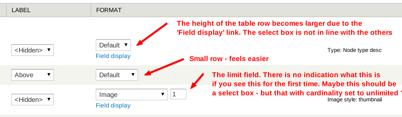
- The 'Field display' adds more space to the row itself, so table simply becomes larger. Depending on how much fields you have, you really need a big screen.
- When a field has a cardinality set to more than 1 or unlimited, you can enter a number. This is now a textfield and it's not clear immediately for new users.
Suggestions to make this a cleaner:
- Move these options to the configuration button like some fields already have (think body with limit of teaser). We don't need to depend on the Field formatter settings API since DS already overrides field rows.
- Add an extra column (say 'Extra') or where limit and Field template (if enabled) will live. This might clutter the interface maybe
- Your idea
Note, on a technical point of view, this is not about a complete rewrite of Field UI - so the goal is not to create a new project of this. However, Field UI uses a theming function (theme_field_ui_table) for the table which we can override if needed to make our goals real. There's also a pre render function field_ui_table_pre_render() which we should be able to take over, anyone can already experiment with this.
Thoughts, go nuts!
Comments
field display position
... doesn't bother me that much. It makes sense like it is now.
http://maroqqo.com
Same here. And this is for
Same here. And this is for administrators. Someone does not just wander around in these interfaces without reading about it first.