
Posted by snufkin on November 25, 2007 at 9:10pm
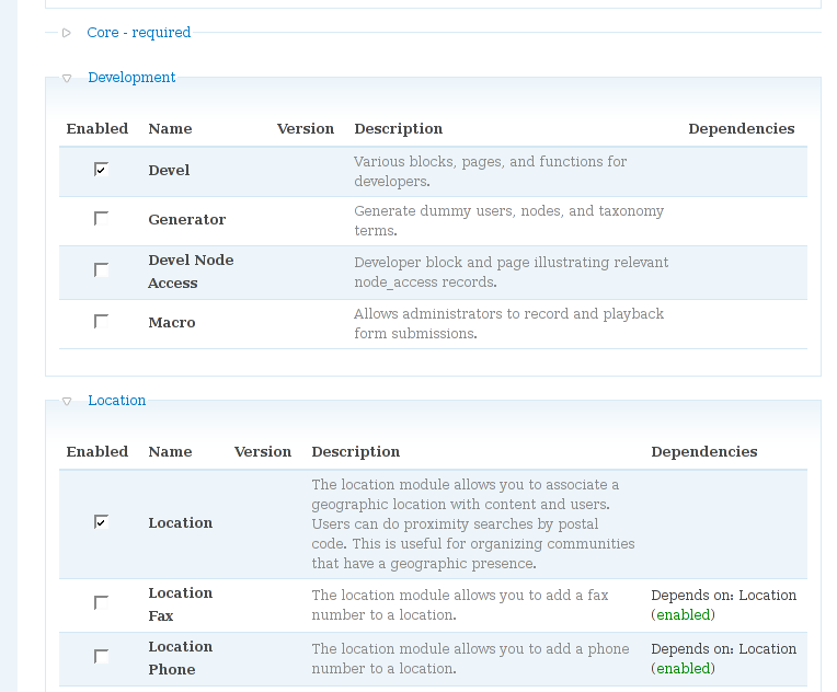
One of my main problems with Drupal UI was the module install page. The checkboxes are very small, especially considering that is the interacting part in the form, and there is way too much information in the description column. The length of the list is another issue too.
To solve the first pair of my problems i added some minimal hacking to system.module, and created a script that checks the module checkbox when the row of the module is clicked. I attach the screenshots, javascript and diff file for Drupal 5.3. What do you think?
The next step could be adding a hover style to the table rows, so the user is being guided which module he/she will install. Then place more submit form buttons, maybe bottom of every table of modules.
| Attachment | Size |
|---|---|
| new_module_install.png | 47.47 KB |
| tabletoggle.js_.txt | 579 bytes |
| system.patch_.txt | 2.78 KB |
Comments
Labels
There's also a standard way to kinda achieve this.
By using label tags on the module name and the for attribute, you could checked/unchecked the box by clicking on the name.
It's not the same but would still help.
Clicking anywhere in the row also doesn't seem very intuitive to me. On the other hand clicking on a field's label is a common behavior.
But have you seen the ongoing work on the modules admin page? It seems the checkboxes would be replaced by buttons, so it could also solve the size problem.
http://drupal.org/node/192962
I saw that page, and im
I saw that page, and im fully for the brainstorming, but in my opinion we should consider a more basic change of approach. Is there a way we can add labels into this table?
I agree, in itself its not, because there is no indication that anything would happen. What I would like to see is to reduce the importance of the input field, and relying mainly on the module row as input. Adding some hover effects would help the intuitiveness.
On the module page we need two things:
a) have a clear indication of the status of the module
b) be able to turn it on and off (and possibly uninstall)
The status indication should not be done by button, because text is harder to process than lets say colour coding. Maybe a styled checkbox and colour coding. With this I think I mainly agree with the issue. But to turn it on and off is a task that is done often, I don't want to play Counter Strike, trying to hit that button, which would be there only for the reason of installing (e.g. selecting the module) anyway. Leaving it out would save us space, which makes the page look cleaner.
I also removed the "modules that depend on this module" entry in my example, because in my opinion that is useless information. Its simply too much, its not possible to just look at an installed module, and see quickly what will happen when I remove it. Even with the "depend on" displayed I mistakenly tried to remove modules that are needed -> the system warns me anyway, so why display?
Good example case for design
Good example case for design patterns in drupal core.
Bevan/