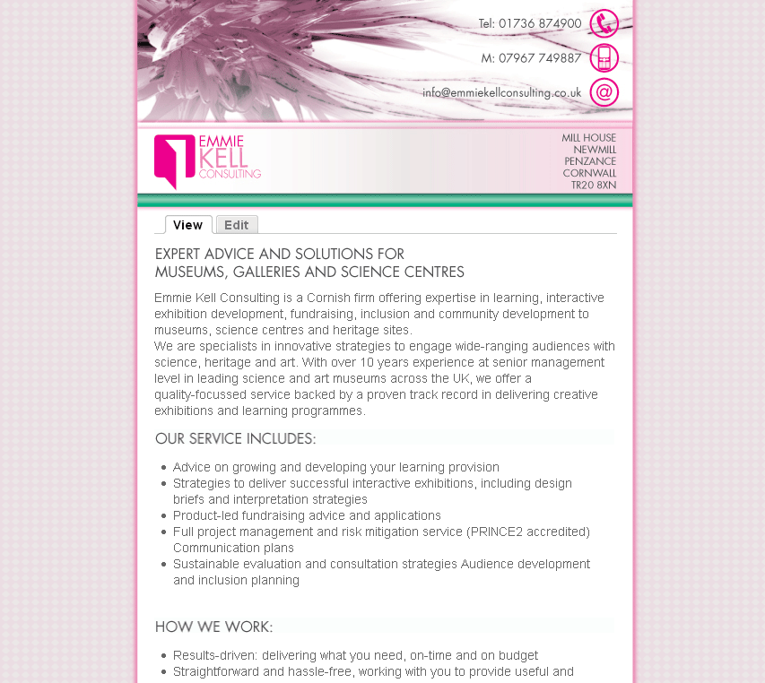
Very clean and minimilistic style, although I'm not so sure about green with pink.
The Green bar may also pull peoples attention from the text, which isn't always a good thing.
I also noticed that your contact details are too far right (outside of the layout) in FF3 RC1.


Comments
Very clean and minimilistic
Very clean and minimilistic style, although I'm not so sure about green with pink.
The Green bar may also pull peoples attention from the text, which isn't always a good thing.
I also noticed that your contact details are too far right (outside of the layout) in FF3 RC1.
Other than my minor critiques, very nice.
great looking site you have.
great looking site you have. yep, the footer is way over in firefox and safari too; on a mac.
opps thanks
I think I fixed it now
Thanks guys ;o)
as for the green
without it the the site look like a tampax ad.
so it need it.
green titles?
maybe you could put a splash of green in other places, like the h2 titles. (edit: images, now that i look more closely. maybe you want sifr there?)
Aaron Winborn
AaronWinborn.com (my blog)
Advomatic, Web Design for Progressive Advocacy, Grassroots Movements, and Really Cool Causes
Aaron Winborn
Drupal Multimedia (my book, available now!)
AaronWinborn.com
Advomatic