
At ideup!, on the 6th of June we tested Drupal 7's Bartik theme. The target was to verify which parts of the whole theme were well organized and easy to be adopted by the users and which ones did not.
Summary
The good news are that there is nothing critical that could turn wrong the impression of a newcommer ;-D.
The bad news are that the format of the comments confuses completely to users, so as the change password fields. Plus, there is such a thin line between the forum and the blog look and feel that users hardly find any difference between them.
Who did we test, and how did we test them?
We gathered 10 people who did not know Drupal and had a basic experience with Internet. They came to the Usability Lab one by one and completed the test with very few instructions before starting. They were asked to think aloud and while one person asked to perform each task, other would take notes about the result of each one. Each session was recorded with desktop, mouse and face capturing.
We installed a Drupal 7 instance with the following configuration:
- Bartik theme.
- Spanish.
- Automatic user account activation (so when a user registered the admin did not have to validate his account).
- All core modules enabled except openid, testing, trigger and update manager.
- Basic content for each content type and some of the most significant blocks were displayed in the sidebar.
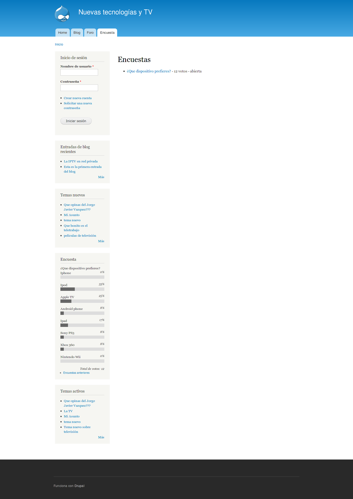
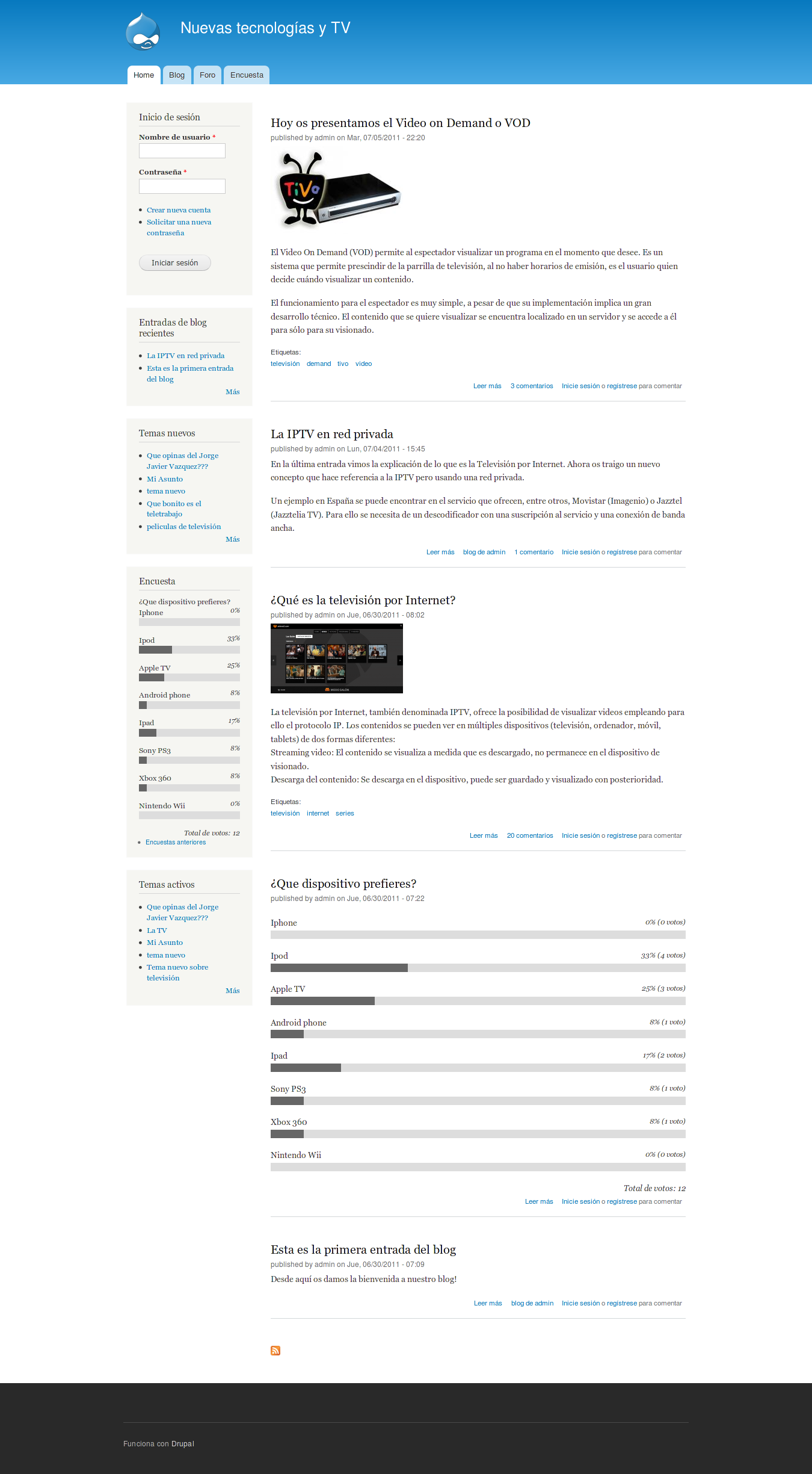
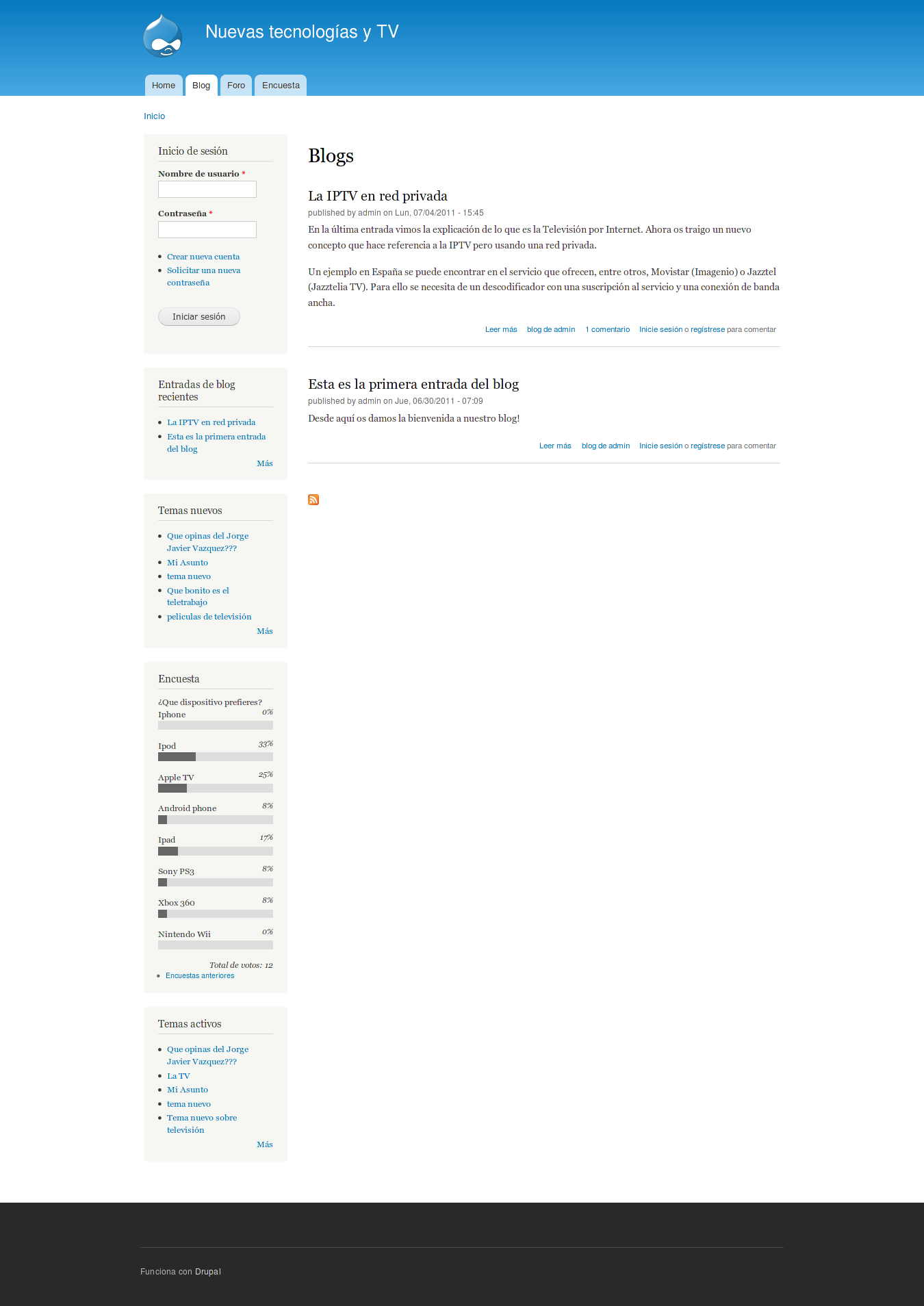
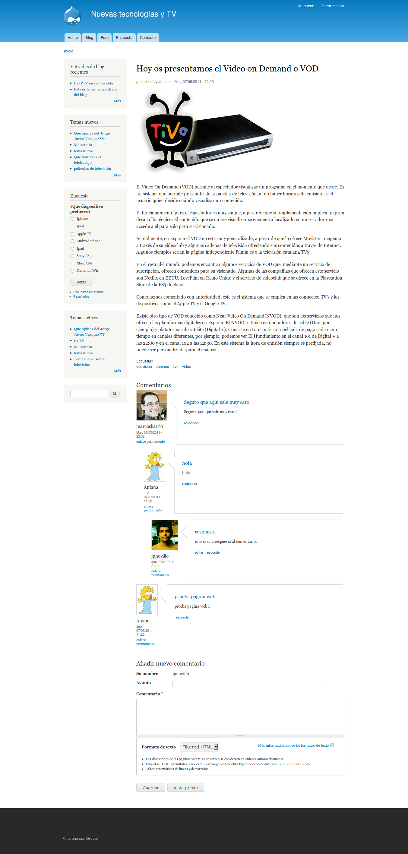
Here are 4 screenshots to give you an idea of what the site looked like to a user:
What did we ask them to do?
Users were asked to perform the following tasks:
- Register in the site.
- Log in.
- Change accoutn password and upload a picture.
- Comment a blog post.
- Edit own comment.
- Reply to a comment.
- Vote in a poll.
- Change vote in poll.
- Post a reply in the forum.
- Create a new forum topic.
- Search for keywords.
- Send a message through the contact form.
Here is the test that we handed out to each participant.
Results rating
As suggested by the usability team, we have given to each observation a weight with the following meaning depending on its value:
0 = I don't agree that this is a usability problem at all
1 = Cosmetic problem only: need not be fixed unless extra time is available on project
2 = Minor usability problem: fixing this should be given low priority
3 = Major usability problem: important to fix, so should be given high priority
4 = Usability catastrophe: imperative to fix this before product can be release
Plus, we have specified how many users experienced this out of 10.
What tested well?
Apart from what is stated in the next section, the user experience was smooth.
What tested poorly?
Registration
-
R1: users missed their username at the top right corner in order to know they were logged in. 5 users. Rating: 2.
- R2: right after registering, users did not realize there was an alert stating that they had to open their mailbox to read registration instructions. 2 users. Rating: 1.
- R3: users missed some more information when they logged in for the first time, such as how could they access to their account details or log out. 5 users. Rating 2.
User Account
The "change password" procedure at the user account form is very confusing.
-
Some failed attempts of changing it:
- UA1: Someone tried to change his password and add a picture at the same time without retyping his old password, when the page reloaded alerting him about it, the uploaded picture was lost. 2 users. Rating 2.
- UA2: Users could not find the Change password fields. They actually did not know those two were to change it. They expected something like a fieldset with a "Change my password" label. 7 users. Rating 3.
- UA3: Users found easier to "Request for new password" rather than changing it in the account settings page. 2 users. Rating 2.
- UA4: Users did not easily find the logout link. 3 users. Rating 1.
Comments
Users do not understand the comments structure at all.
When replying to a comment, the markup does not state clearly enough that this is a reply to that comment, specially when there was another reply before.
- C1: Users were asked to answer a particular comment from a list of comments and they did not see the Reply link. Instead they created a new comment with the form at the bottom of the list. 6 users. Rating 3.
- C2: Users were looking for a Facebook I Like button instead of a reply button when viewing comments. 2 users. Rating 0.
- C3: When writing a comment, users mistakenly clicked on the right button (Preview). Some said that the left button normally is a Back or Cancel button, not a Submit one. 2 users. Rating 1.
- C4: Logged in users typed their name in the subject field of a comment. Others found useless a subject field in the comment form. 2 users. Rating 1.
- C5: Users got puzzled when they saw the Format selector in the comment form. They did not understand what that was. 5 users. Rating 1.
- C6: Users felt that comment replies could be clearer if they were stated as "In reply to [subject]...". 4 users. Rating 2.
- C7: Users found the comment blocks too big and therefore hard to read replies they had to scroll quite a bit in a long list of comments in order to reply to a specific one. 5 users. Rating 3.
Poll
Users found very hard to change their vote.
- P1: Users did not easily spot the Poll link in the primary links menu. 2 users. Rating 1.
- P2: When willing to participate in a poll, users clicked on the poll block title and answers, but nothing in it is clickable (apart from the "previous polls" link. 4 users. Rating 2.
- P3: Users expected the voting block should auto submit when selecting an option. 1 user. Rating 0.
- P4: Users who wanted to change their vote would like to change it straight away rather than cancelling and voting again. Some users did not find a way to change it. 4 users. Rating 2.
Forum
Users do not differentiate the forum from the blog.
- F1: Users did not feel their new forum topic was created successfully. Once created it is displayed, but they expect it to be visible at /forum so after seeing it created they try to go to /forum to find it, but they don't. 3 users. Rating 2.
- F2: Users had the feeling that the forum was a blog. 5 users. Rating 3.
- F3: Users felt that the forum block "Hot topics" did not belong to the forum, but that it had topics related to the page you were viewing at the moment. 2 users. Rating 1.
- F4: Users searched for the poll and forum links first in the left column rather than in the primary links menu in many ocassions. Sometimes they would actually ignore the primary links menu when looking for something. 2 users. Rating 1.
Search
- S1: Users said they would like to see the content type name on a search result. 1 user. Rating 1.
Overall Results
If we should focus in something, our impression is that the comments structure and flow and the change password feature need to be reviewed.
Next Steps
These findings should be evaluated by the Community and mayor issues addressed at the issue queue. We encourage testing of the other themes available on a brand new Drupal 7. I am still not sure if we need a spreadsheet such as the one created for the Minesotta testing (it depends on the amount of issues we will have to create).
In order to accomplish the improvements, a sprint of two weeks will be created with the most critical tasks (I would be happy to help on that). Following sprints will contain issues of less priority and sub issues which emerged from the previous sprint.
Credits
This study was carried out at the  office at Madrid by the following people:
Useful links
These are the recordings of the 10 participants doing the test:
- Candidate 1
- Candidate 2
- Candidate 3
- Candidate 4
- Candidate 5
- Candidate 6
- Candidate 7
- Candidate 8
- Candidate 9
- Candidate 10
| Attachment | Size |
|---|---|
| estudio_drupal.doc | 25 KB |
| home_1.png | 303.56 KB |
| blogs.png | 137.83 KB |
| blog_node.png | 493.29 KB |
| forum.png | 113.38 KB |
| poll.png | 104.26 KB |
| ideup.jpg | 16.44 KB |
Comments
This is absolute gold. Thanks
This is absolute gold. Thanks for doing this and making it public. I can see a number of issues here we could fix fairly easily. Does anyone know of any tickets that address any of these points?
fs.io
drupalcontrib.org
Great stuff.Now to make most
Great stuff.
Now to make most of your efforts: Best try line out or find a pattern which were the biggest (repeating?) issues in the process and file issues for them.
You should create a unified tag for easy findability, like "ideup user testing" or something similar and also with "usability" so it is found in a more general way.
Do you have more detailed transcripts of the tests or maybe even videos? It would be interesting to see how and where single users got stuck.
I like your summary very much, but it is kind of the last filtering step. One would like to be closer to the source and draw one's own conclusions.
Life is a journey, not a destination
Super!
These are great findings! Thank YOU so so so much for doing this. Efforts like these are instrumental.
Building on @eigentor's points, I would suggest:
Once again, this data is fantastic! I know it is a lot of work :) I am sure everyone in this group would have loved to read this.
Dharmesh Mistry
UX Researcher | Acquia,Inc.
Yep, another big thank you
Yep, another big thank you for doing this.
To identify the most serious issues it would be good to see something like "3 of 5 participants experienced this issue", "5 of 5 participants experienced this issue" etc. That last issue would then be the more serious one and more in need of fixing than the first one.
Let us know how we can help you adress dcmistry's suggestions!
To yoroy's point
Yep, prioritizing issues based on frequency (3 out of 5, 5 out of 5, blah blah) is great!
Besides that, we should also take into account the following:
The following 0 to 4 rating scale can be used to rate the severity of usability problems: http://www.useit.com/papers/heuristic/severityrating.html
0 = I don't agree that this is a usability problem at all
1 = Cosmetic problem only: need not be fixed unless extra time is available on project
2 = Minor usability problem: fixing this should be given low priority
3 = Major usability problem: important to fix, so should be given high priority
4 = Usability catastrophe: imperative to fix this before product can be released
Based on all these factors, you could decide where a problem lies.
Hope this is helpful!
Dharmesh Mistry
UX Researcher | Acquia,Inc.
Updating the report...
Hi everyone,
Thanks for the feedback. We are rewriting the report again based on your suggestions. We will also provide the test given to the participants and see how could we publish the videos without breaking privacy policy. I will speed up things tomorrow to have it as soon as possible.
Regarding creating a tag and a set of issues, I would rather let it to you first to analyze these results once we get to the desired format and then create them.
Cheers
Senior Developer at Lullabot
https://www.lullabot.com/who-we-are/juampy-nr
Sounds good!
A big THANK YOU once again :)
Dharmesh Mistry
UX Researcher | Acquia,Inc.
Results updated
Hi everyone,
I have updated the test results with the suggestions, and currently the videos are being uploaded to Vimeo and will be linked here during the day. I am also taking the change to check out 2 or 3 of them so I can verify the number of users who experienced the things we listed.
Once all videos are up and the numbers have been reviewed, I will post another comment.
Cheers
Senior Developer at Lullabot
https://www.lullabot.com/who-we-are/juampy-nr
Videos uploaded
I have uploaded 9 of the 10 videos. There is an issue with the pending one. We will hopefully upload it tomorrow.
During the day I will watch 2 or 3 of them to verify the numbers for each observation listed.
Senior Developer at Lullabot
https://www.lullabot.com/who-we-are/juampy-nr
Ready to create issues
As I could not find the time to verify the number of times someone faced any of the observations listed, I will create the most frequent issues at Drupal.org so they can be discussed and if needed, fixed.
Senior Developer at Lullabot
https://www.lullabot.com/who-we-are/juampy-nr
Issues under work
Issues for the most frequent scenarios were created and some of them are under work.
http://drupal.org/project/issues/drupal?text=ideup&status=Open&prioritie...
Senior Developer at Lullabot
https://www.lullabot.com/who-we-are/juampy-nr