Posted by Anonymous on February 29, 2012 at 9:31pm
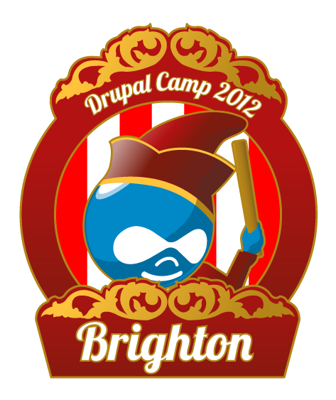
Thoughts? I think I prefer the original druplicon nose #DrupalCamp #Brighton http://flic.kr/p/bzrH8F http://flic.kr/p/bzqLSk
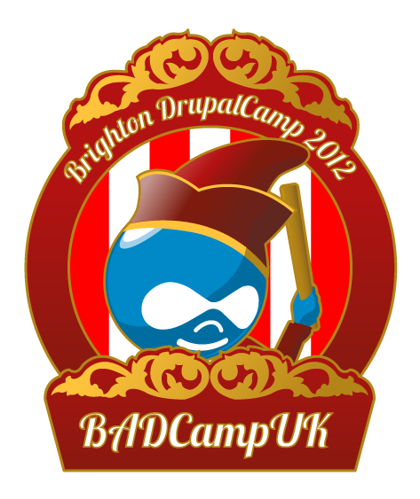
Text OK? Do we want BADAss or BADCampUK in there anywhere?
Final changes soon so say now or forever...
[update 3/1] OK decided to keep Druplicon's nose the way it is - see attached ;)
| Attachment | Size |
|---|---|
| drupalcamp_normnose.png | 73.15 KB |
| drupalcamp_logo_final.png | 76.59 KB |
| drupalsite.png | 179.7 KB |
| drupalcamp_site3.png | 179.48 KB |
Comments
Changing text...
What do we think of this one?
Now I see the text I actually prefer the original one ;)
please someone say something!
Lovely
The first one is better. IMO.
[Hi Steve]
Site design
Thanks, I agree ;) You never know till you try though!
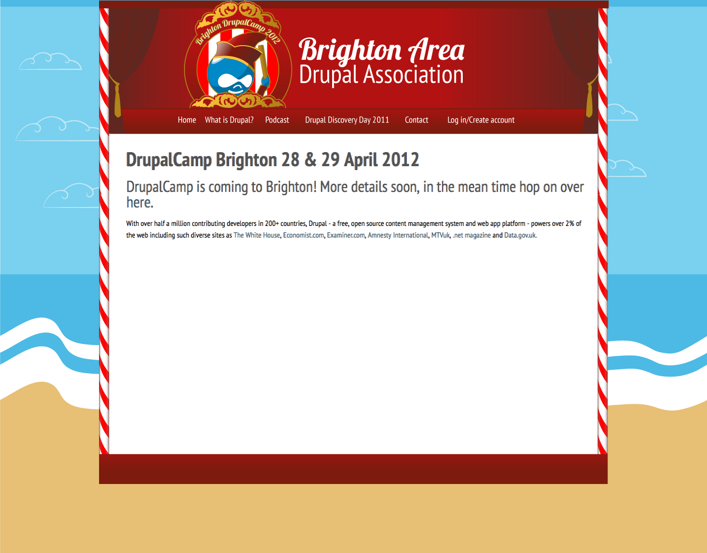
How about the first go for the site design?
I like the 1st one, but why
I like the 1st one, but why does it remind me of a popcorn tub. no offense.
popcorn tub
Heh, but is that a problem?
lol, nope, i like popcorn
lol, nope, i like popcorn
Site design good too
I like it, but if you have time I suggest experimenting with richer sea and sand. They feel weak compared to the rest. Would also add an ornate base to the punch & judy box. Some kids heads in front of it too?
But it all depends on the time you have: what you have there is good enough to go live with. Everything else is optimising.
COD
...and here's the final version with girthier poles ;)
So now it'll be cut up and I'll be hassling a themer to help or screaming CSS insults soon enough...!
Update
Nice design :-)
thanks!
it's all down to lucyirving.com's ability to help manifest my thoughts ;)
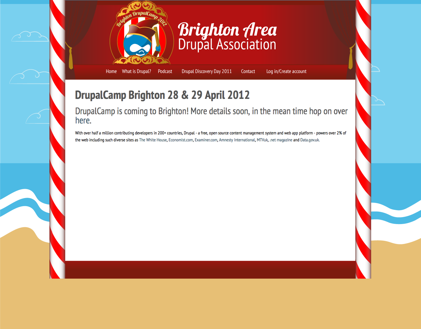
The sea has to have a little
The sea has to have a little animation adding to make it roll into the beach in waves...
Rachel
no.
That is all ;)