
Thank you Charles Novik for pointing out this great resource: http://www.printrunner.com/default.aspx?ID=71
PrintRunner offers services to make us 500 stickers 4"x4" in size in under $100 (not counting shipping costs).
I would like to get us authentic new york city drupal user group stickers. Something we can identify with and help spread out the word about our DUG. Charles is going to send me his design for the graphic and i'll then edit this post to include it. This is intended to be the first draft and I'll be happy to receive new design suggesions submissions to improve our representation.
Also if you guys know of other printing companies that may cut us better deals do not hold your breath, tell us about it!
To get the ball rolling i've started a chipin widget where you guys can help sponsor the NYC DUG Stickers http://nycdrupal.chipin.com/nyc-drupal-stickers
Thank you for your support.
Update:
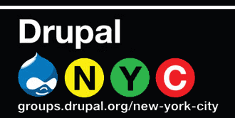
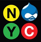
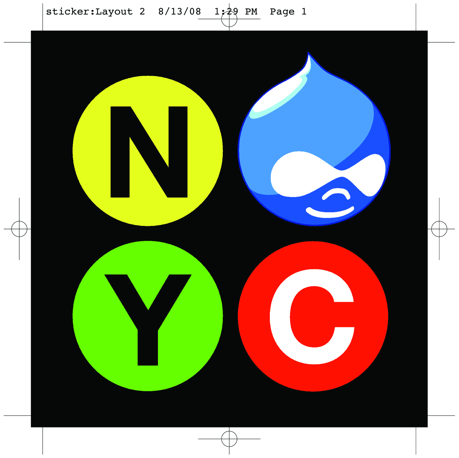
Thank you Charles Novick for sending us these two designs to choose from.
|
|
Changes by Johnathan Berger
|
|
Chipin Completion Update
Thank you all that have sponsored and voted on this itteration of NYC Drupal User Group stickers!
Here is the list of sponsors ( As specified by paypal )
- David Burns
- Jerad Bitner
- Michael Goldsmith
- Color Art Systems, Inc.
- Eric Duran
- Andrew Bayroff
- Oleg Terenchuk
P.S. Send me an email if you believe your name should be on this list and i've missed it.
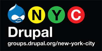
Thank you Charles Novick and Jonathan Berger for providing the design.
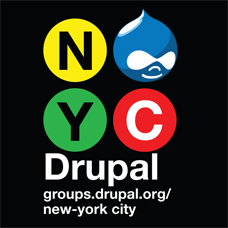
This is the sticker design that i will be sending to the printer: 
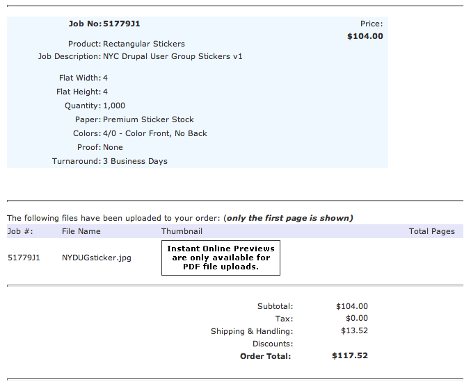
Order receipt - Aug 13th
Click here to see the order receipt
| Attachment | Size |
|---|---|
| Rectangular-DrupalUG-logo.jpg | 13.85 KB |
| DrupalUG square.jpg | 77.92 KB |
| drupalnyc_sticker_square_mini.gif | 6.52 KB |
| drupalnyc_sticker_white_line.gif | 8.01 KB |
| NYDUGsticker.jpg | 591.16 KB |
| NYDUGsticker_small.jpg | 18.25 KB |
| order_receipt.png | 42.67 KB |
Comments
Great Idea
Litwol and Charles,
Thanks for taking this initiative. I don't think I've ever picked up an NYC Drupal Group sticker. This will be going right on my MacBook Pro. Everyone, if you have an extra buck or 2 to throw at this, that would be great. The soon we get these stickers the better.
http://thethisorthat.com
http://abitburnt.com
I personaly really like the
I personaly really like the square version. what do you guys think ?
------------------
Sometimes interesting things appears on http://litwol.com
nice! one addition
The NYC subway branding uses a horizontal line near the top (Vingnelli originally included the line on his shop dwgs to mark the bracket that would hold the sign in place; the guy making the sign thought it was a graphic element and printed it!)
Horizontal Line
You are correct about the horizontal white line. I will add it once all the comments are in and if we go to press with either design.
I like the square one
I like the square one better. I especially like it without our URL. I think that if you don't have a "printable" url, it shouldn't be included. It distracts from the important elements.
Mike
missing hyphen
On the square one with the url, part of the url is unhyphenated.
I like the wordless square and the rectangle without the bar - I don't like the url with line break. I'm glad to see this design used for something! Now I just need a laptop to stick it on :-)
Jean Gazis
www.jeangazis.com
www.webhostny.com – Drupal hosting
Jean Gazis
www.jeangazis.com
www.webhostny.com
would http://nycdrupal.org
would http://nycdrupal.org be considered a "printable" url ?
------------------
Sometimes interesting things appears on http://litwol.com
Can we get the reverse
http://www.drupalnyc.org, or http://www.drupal-nyc.org, are these available?
When printed or use for marketing it show be shown as www.drupalnyc.org or www.drupal-nyc.org
drupalnyc is already taken
drupalnyc is already taken by some one (i've done some research on it and couldnt find whom that was).
This is not really a rule, but it seems that other groups are also following similar format such as http://ladrupal.org (sorry dont have other examples yet)
------------------
Sometimes interesting things appears on http://litwol.com
drupalnyc is already taken 2
I just think the nyc gets a little lost visually and in pronouncing like in your example http://ladrupal.org, but i am down for whatever you guys decide.
no!
considering that the debate about having a site outside of this drupal group has not happened yet, I am very much against using anything but the groups.drupal.org url. I think it would be a really bad idea.
Actually, this debate has
Actually, this debate has happened before. I had a similar idea about 2 years ago. The idea got nixed. However, the group was a lot different back then. I think it's worthy of discussion in a slightly more formalized way that "I like it" and "I hate it."
If this does come to pass, there are going to have to be some major stipulations on who will actually own the site, where it will be hosted, etc. Back in the day, I purchased nydrupal.org, and I've noticed that litwol has acquired a number of different urls that could be used. Who knows who owns what else. In the best interest of the group, the url would have to be donated to, and controlled by the group itself. I'm not saying that this would happen, but let's say that person X owned the url and let the group use it, and we decided to spend the time to build an external site, but we did something in a way that person X didn't like, we wouldn't want that person getting mad and taking it down, because they owned the url. Childish? Yes. But it's a potential sticking point that the group should avoid.
Mike
ok
yes, the debate about fracturing the community by having a site outside of this group has been had before. And the group consensus was that it was not a good idea.
before anyone starts talking about what the new URL should be, the issues raised in that past debate should be addressed.
as you mention, primary in that list is ownership and control. There are a lot of other issues too that would be healthy to debate.
the money you and oleg have spent on domain registrations would be much better spent by sending it to the Drupal Association to help fund the community infrastructure we use. I've also seen this sort of thing become a huge burden, diverting energy and time from organizing to keeping the site up to date. I think there needs to be detailed and compelling arguments made to justify a separate site. such arguments have yet to be made.
I'm not saying that we
I'm not saying that we should be discussing what the new url is going to be. First of all, that's really one of the least important issues. I'll reiterate though, just because the idea got nixed before doesn't mean that it's not relevant now. Be a little more open minded to ideas that you don't like. You're doing a lot of sqawking about a very minor issue, and turning this into a tempest in a teapot. Perhaps your time would be better spent testing patches or developing a new module instead of worrying about how I spent my money two years ago.
shorter is better
nycdrupal.org works for me, but it needs to go to this site!
Can't people just go to groups.drupal.org and find NYC easily enough?
Jean Gazis
www.jeangazis.com
www.webhostny.com – Drupal hosting
Jean Gazis
www.jeangazis.com
www.webhostny.com
Good idea!
I think I would probably be just fine with a redirect, the groups url is pretty rough to give people.
I just don't want an outside site itself.
Advomatic
CNDP, LLC
I second the redirect idea
I second the redirect idea. Creating a whole new site outside the groups.drupal.org structure just diverts people's attention.
Although if we use the example it should shown as NYCdrupal.org The capitalization makes it an easier read.
Designs
I also like the square one but I think we should use both with and without the url. Seeing that we are also using these for promoting the group we need one with informative text like the url and the name Drupal. Then when we use it for any events like drupal camp 2008 example we can use the same type styles for other text.
see: http://groups.drupal.org/node/13735#comment-44940
I actually like the break as it shows the main group site but then is demarcated to new your city visually giving it a better read.
The square logo with out the type is also good as a stand alone logo.
I like them
Aesthetically it looks better without the bar but has more meaning with it, I like the bar. The URL is a bit of a problem for me though, maybe it it was less noticable. My faverite is the square with no words. Great job guys.
-sg shalo
Shouldn't the "C" circle be blue?
Since there're actual "N" and "C" trains, we may want to use the real colors (ie, blue instead of red for the "C"). That being said, is there any reason to pick a particular color for the "Y"? Is there any color that would symbolize something drupal-y? Think "yellow, _______, blue". I got nothing...
colors
Yes the official color for the C Line symbol is deep blue but that would make the Drupal logo stand out less. So while this design is not a 100% accurate representation of NYC Subway graphics, it is certainly reminiscent of them and makes a visual connection.
color swap
excellent point! The official NYC condoms use the same "helvetica-in-a-circle" trick to look like subway lines, and they swap ALL the colors
This is probably no accident. Maybe there's some currency in using non-standard colors? More refreshing to the eye? Less familiar and invisible?
Those ads might be posted in public transit...
... making the letters potentially confusing. Probably they didn't want to have it look too much like an actual MTA sign. Also probably the MTA has trademarked the exact subway line designs.
It's the idea of the subway and the style, it doesn't need to be an exact knockoff.
Jean Gazis
www.jeangazis.com
www.webhostny.com – Drupal hosting
Jean Gazis
www.jeangazis.com
www.webhostny.com
No url?
Given the issues surrounding an alternative domain, I'd encourage the stickers to be printed without a url. As grammarian pointed out, anyone can find the group by typing "Drupal NYC" into google. Although visually my favorite is the square logo with no text, perhaps the sticker should include the word 'Drupal' for all the folks out there who wouldn't recognize the blue Drupal logo.
http://www.thomasturnbull.com
http://twitter.com/thomasturnbull
Square No URL is my Pref
For stickers definitely no URL is my vote. I'm torn on whether to put the word Drupal, but on balance I like the more "enigmatic" approach of leaving it off - much cooler.
Peter
I think we should have the
I think we should have the word 'Drupal' somewhere on that sticker if nothing else. otherwise people wont recognize what the droplet means. it may arize curiocity but people will have no means of searching for what it is later if they dont know that its 'drupal'
------------------
Sometimes interesting things appears on http://litwol.com
I kind of like it
I kind of like it understated, without the word "Drupal." For those of us in the "know," the Drupalicon is enough, while for people who don't know about Drupal already, the name "Drupal" is a bit much. It's strange to read, and people are more inclined to recognize the logo than the name anyway.
Mike
the NYC
I personaly like the square NYC logo (the one with out any text). It makes it looks simpler and cleaner.
Stickers chipin is closing
Stickers chipin is closing on Aug 18th and we are still 54$ short. I've already chipped in, have you?
------------------
Sometimes interesting things appears on http://litwol.com
only missing $24 more
only missing $24 more dollars.
Remaining cash
I will add in the last bit. Just tell me how.
Cash in hand
No need for link, found it and used ChipIn.
Thank you everyone for your
Thank you everyone for your support. We will be ordering the stickers very soon.
------------------
Sometimes interesting things appears on http://litwol.com